1/2
This Unexpected Kitchen Cabinet Color Is Becoming More Popular Every Year
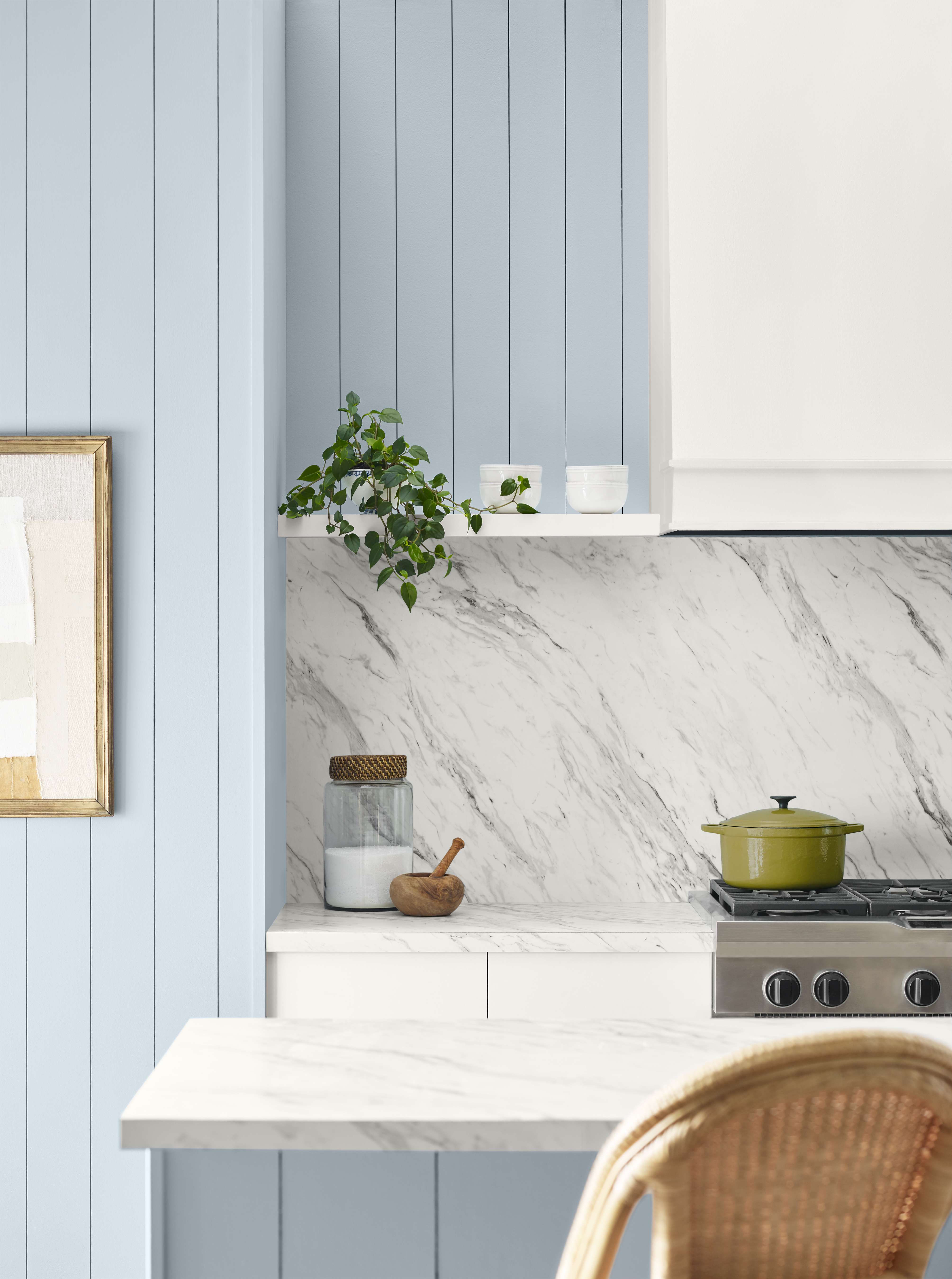
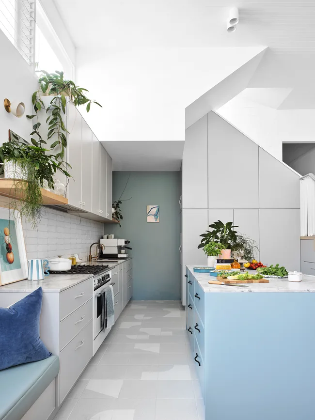
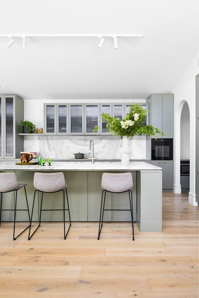
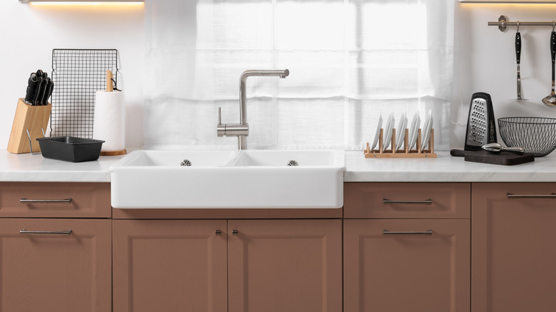
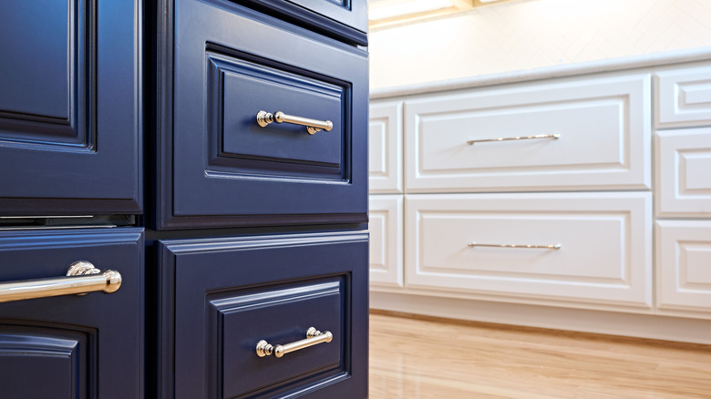
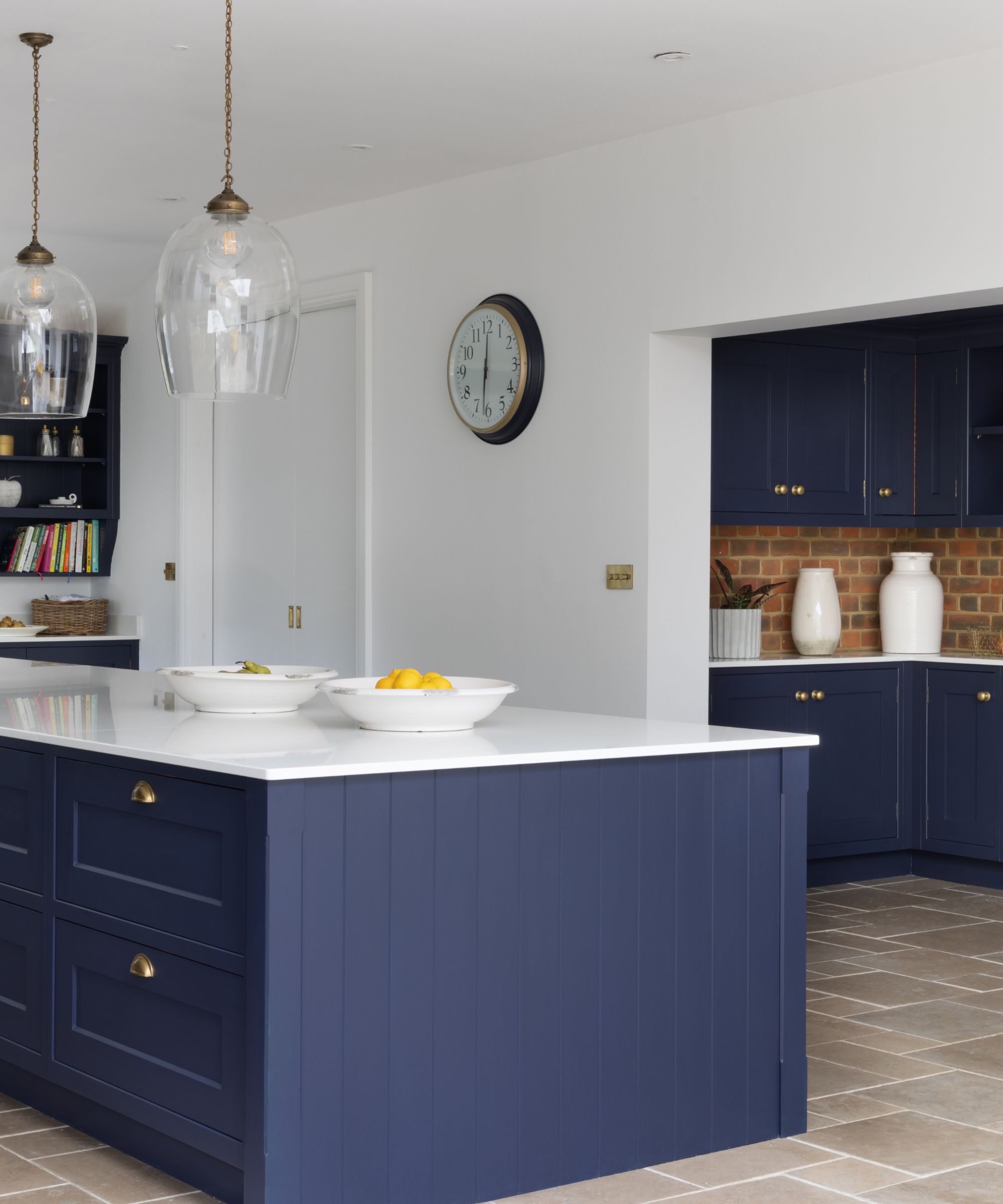
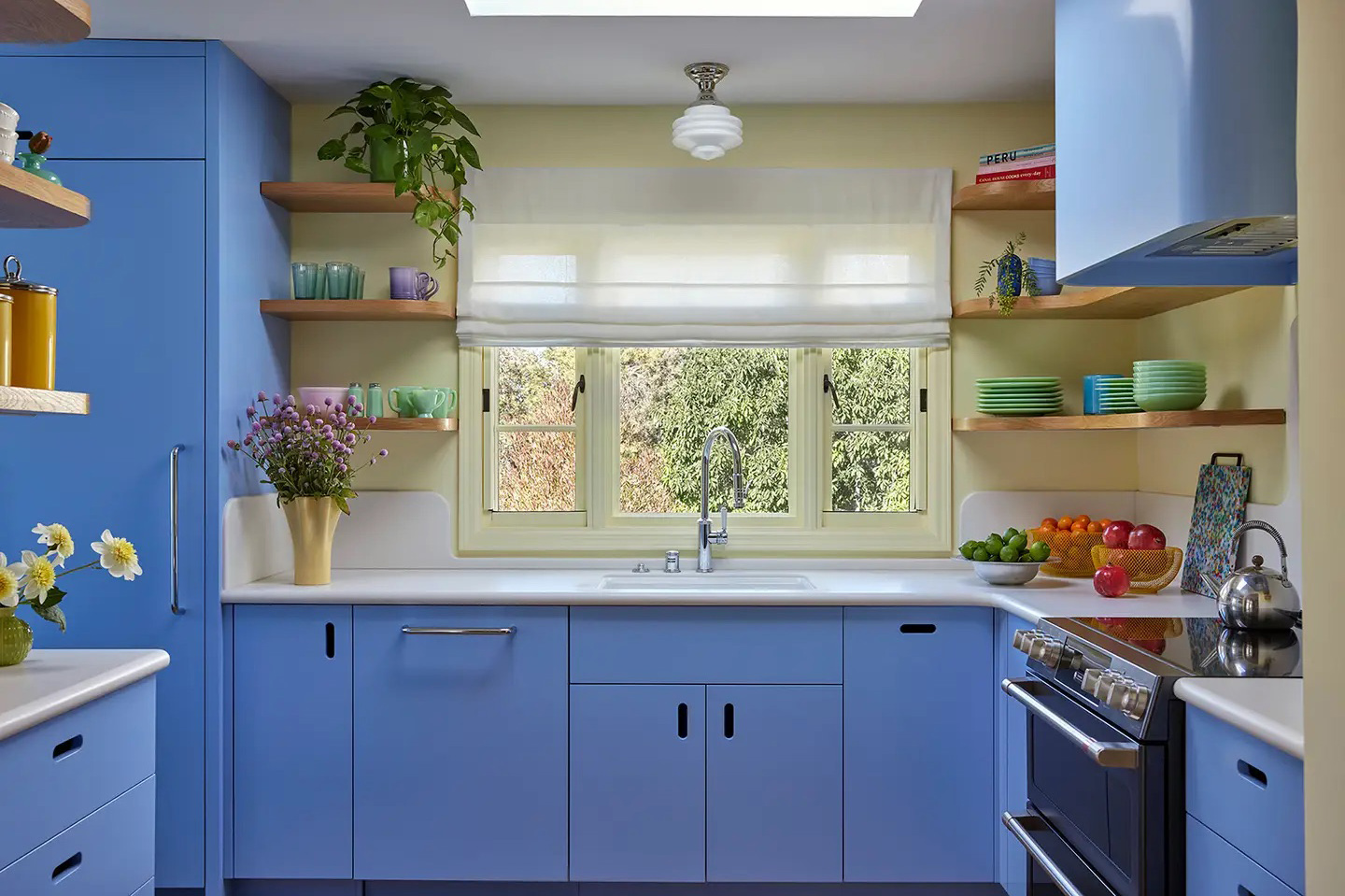
The article discusses the increasing popularity of periwinkle as a kitchen cabinet color, highlighting its emergence as a trending hue in interior design. Initially, interior designer Leah Ring, founder of Another Human, selected Benjamin Moore’s Summer Blue for a client's Los Angeles kitchen not for its trendiness but for its emotional impact. Ring believes in the power of color to influence mood and chose this periwinkle shade to evoke happiness and energy in her client, a therapist and entrepreneur. This choice proved prescient, as periwinkle has since gained significant traction in kitchen design.
Evidence of periwinkle's rising popularity comes from a study conducted by Swift Direct Blinds, a U.K.-based window-treatment supplier. Their analysis of Google search data revealed a nearly 400 percent year-on-year increase in searches for periwinkle kitchen cabinets. While classic colors like white, black, and blue still dominate the market, periwinkle’s surge is interpreted as an offshoot of the broader blue trend. Over the past year, various shades of blue, including baby blue and cornflower blue, have become increasingly common in kitchens. This natural progression suggests that variations with stronger violet undertones, such as periwinkle, are now capturing public interest.
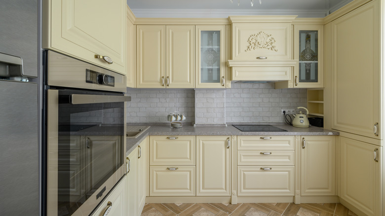
The article showcases examples of periwinkle kitchens to illustrate its aesthetic appeal. One notable example is a Stockholm apartment designed by Westblom Krasse Arkitektkontor, which features periwinkle cabinets paired effectively with pale yellow walls and backsplash tiles. This combination suggests that periwinkle harmonizes well with certain complementary colors. The article also notes that if Scandinavian design, often regarded as influential in global trends, embraces a color, it indicates its potential for widespread acceptance. This endorsement from a design-forward region lends credibility to periwinkle’s burgeoning popularity.
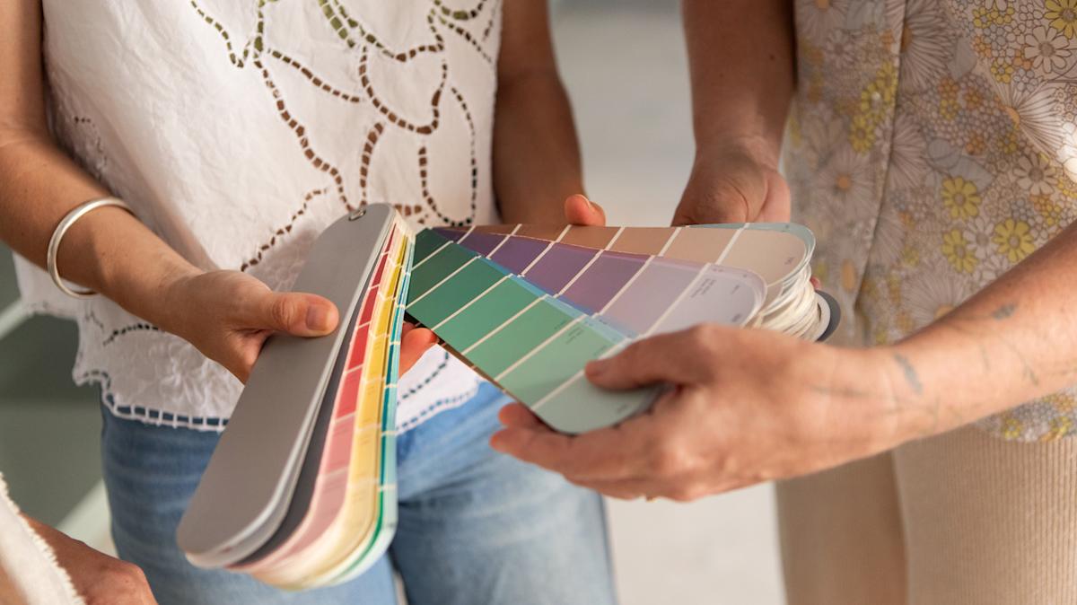
To further assist readers, the article provides a curated list of periwinkle paint options from various brands. These include "Periwinkle" by Behr, "Summer Blue" by Benjamin Moore, "Cake Shop" by Backdrop, and "Perfect Periwinkle" by Sherwin-Williams. This practical guide enables individuals interested in incorporating the color into their own kitchens to easily find suitable paint products. The article emphasizes that this unexpected shade, with its blend of blue and purple, offers a fresh and vibrant alternative to more traditional kitchen color palettes, potentially revitalizing the space and influencing the occupant's mood positively, much like Leah Ring's initial intention.
In summary, the article positions periwinkle as a rapidly emerging and emotionally resonant color for kitchen cabinets. Its increasing visibility in design projects and significant growth in online searches indicate a broader shift in design preferences, moving beyond conventional blue tones to embrace more nuanced and psychologically impactful shades. The trend is supported by both expert designer endorsements and market data, suggesting a sustained presence for periwinkle in future kitchen design. The combination of its aesthetic versatility and perceived mood-enhancing qualities makes it a compelling choice for homeowners seeking to update their kitchen interiors.
#KitchenCabinets #PeriwinkleColor #InteriorDesign #ColorTrends #KitchenDesign #HomeRenovation #PaintColors #DesignInspiration #HomeDecor #KitchenCabinets #PeriwinkleColor #InteriorDesign #ColorTrends #KitchenDesign #HomeRenovation #PaintColors #DesignInspiration #HomeDecor
0개의 댓글이 총 표시됩니다.
 아직 댓글이 없습니다
추가로 마음에 드릴 만한 콘텐츠
This Unexpected Luxury Color Is Quietly Taking Over Kitchens Everywhere

15 Cabinet Paint Colors That Look STUNNING in Any Kitchen

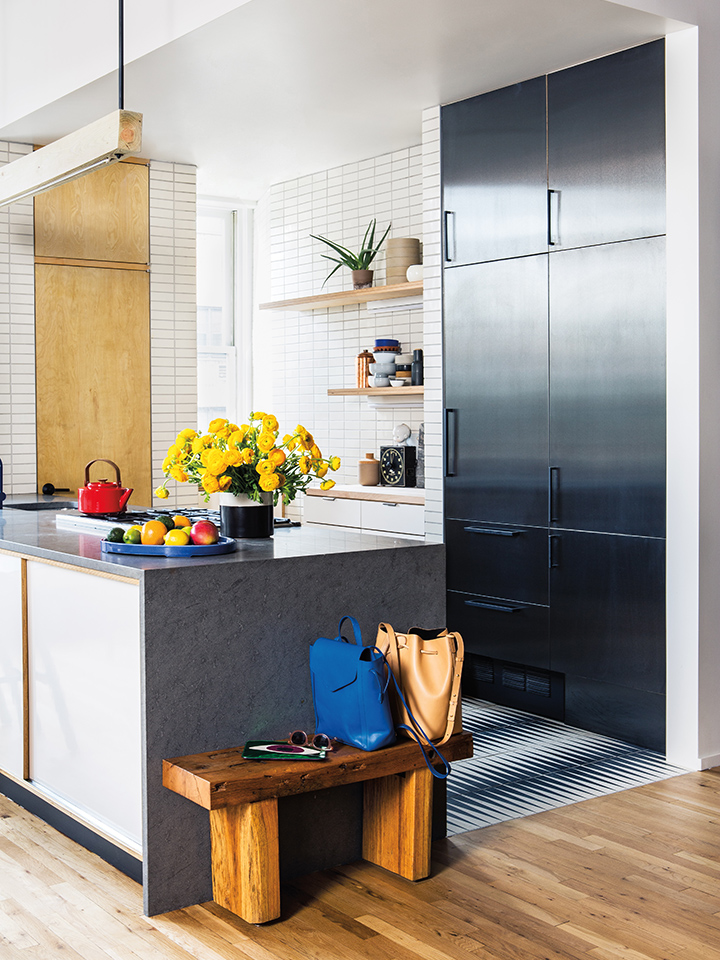
4 Fresh Takes on Contemporary Kitchen Cabinets

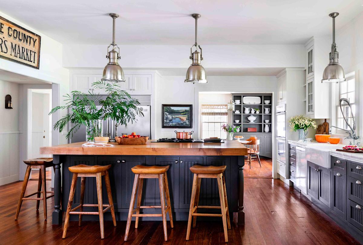
The 2 Cabinet Colors Designers Say Make Kitchens Look Outdated

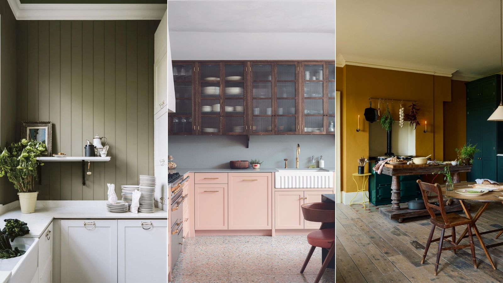
5 outdated kitchen cabinet color trends to avoid if you don't want your kitchen to look unfashionable, say designers
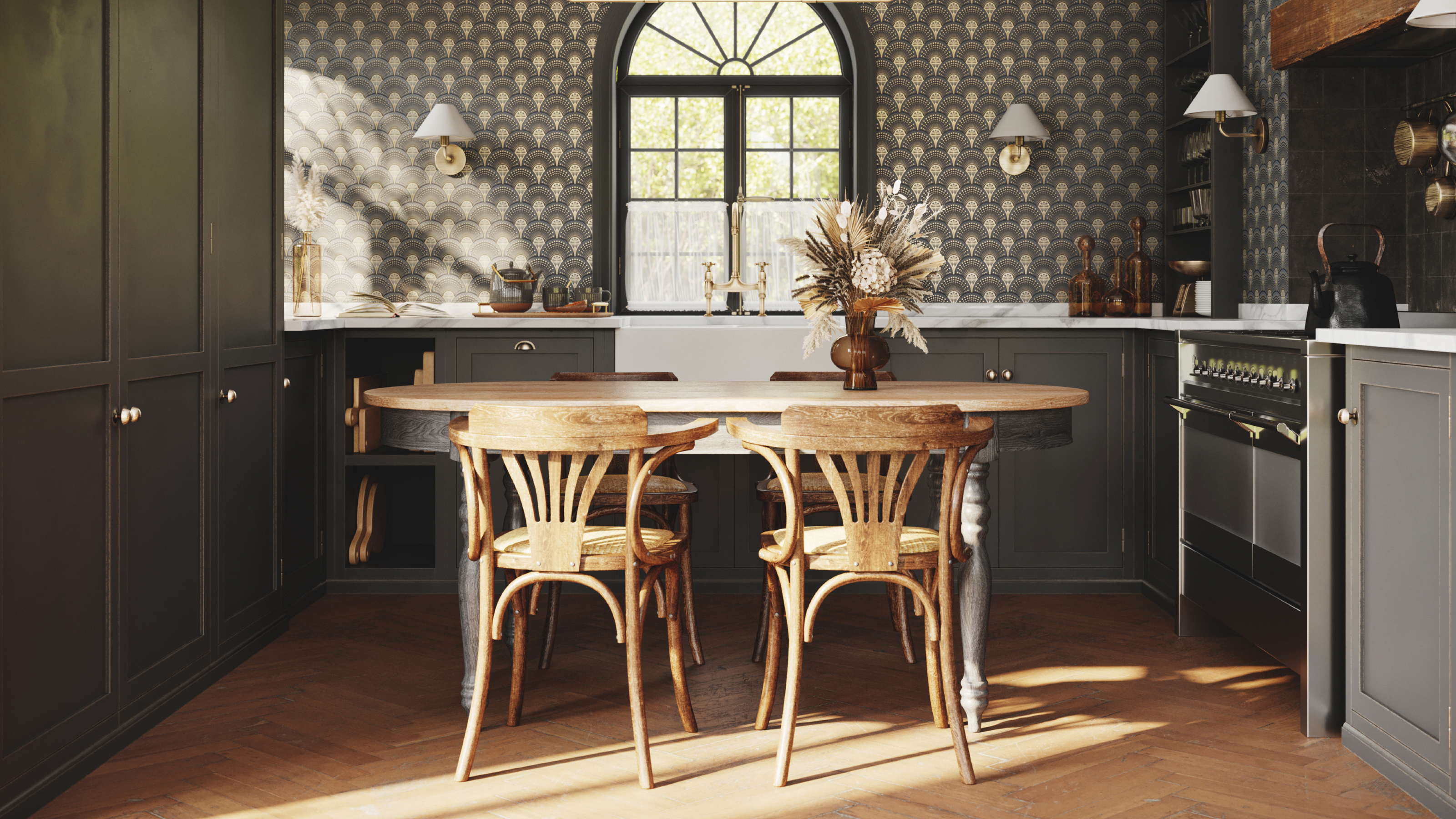
8 colors you should never paint kitchen cabinets according to the experts

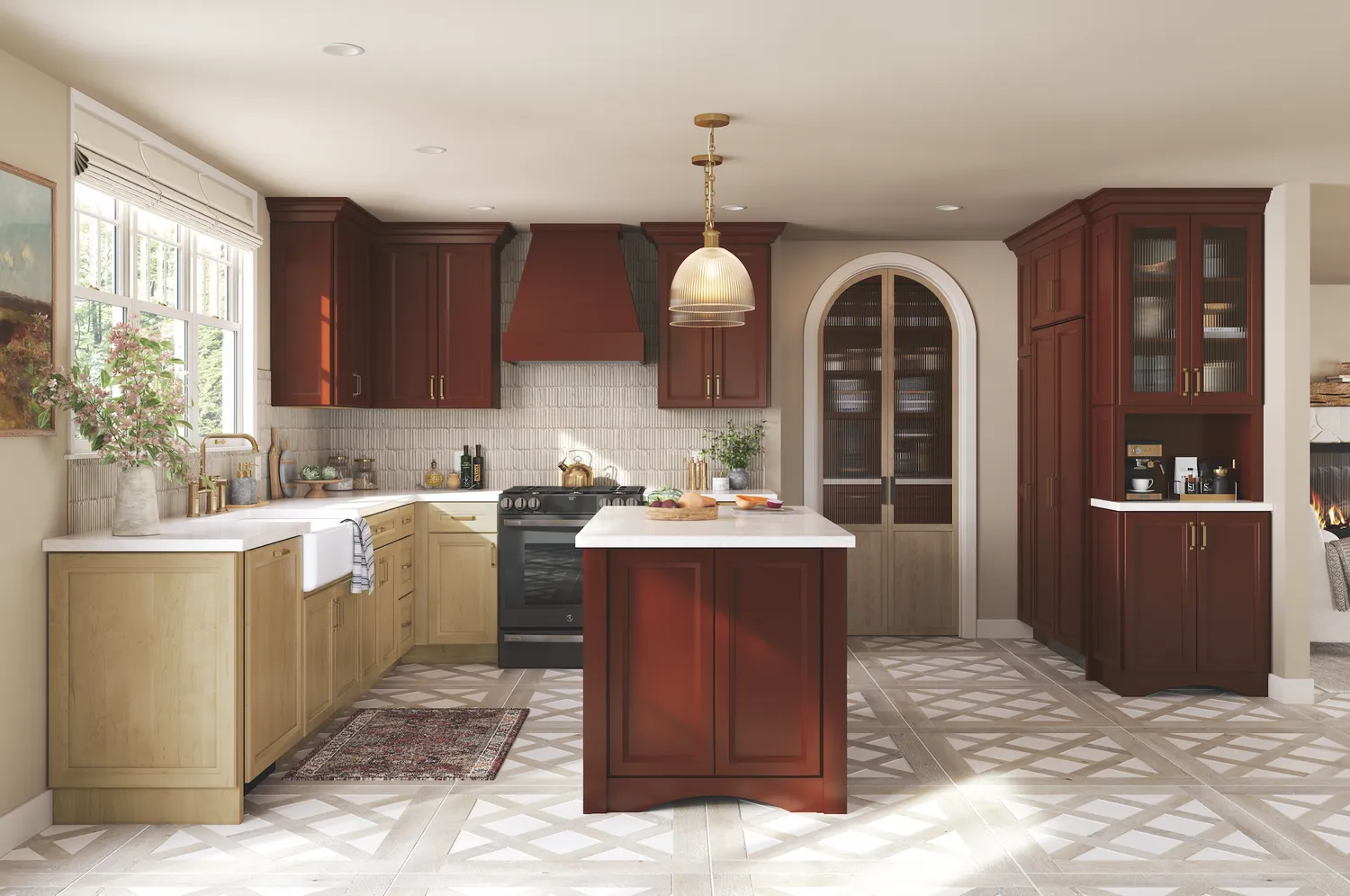
'90s Kitchen Cabinet Colors Are Back—and Better Than Ever

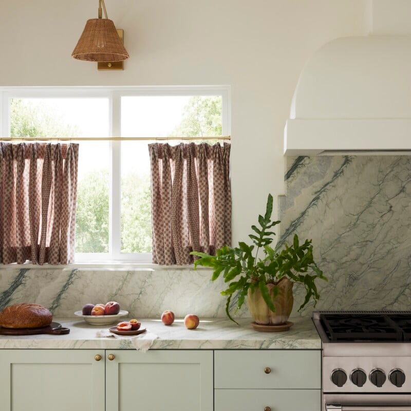
Designers Predict the Next “It” Kitchen Cabinet Color

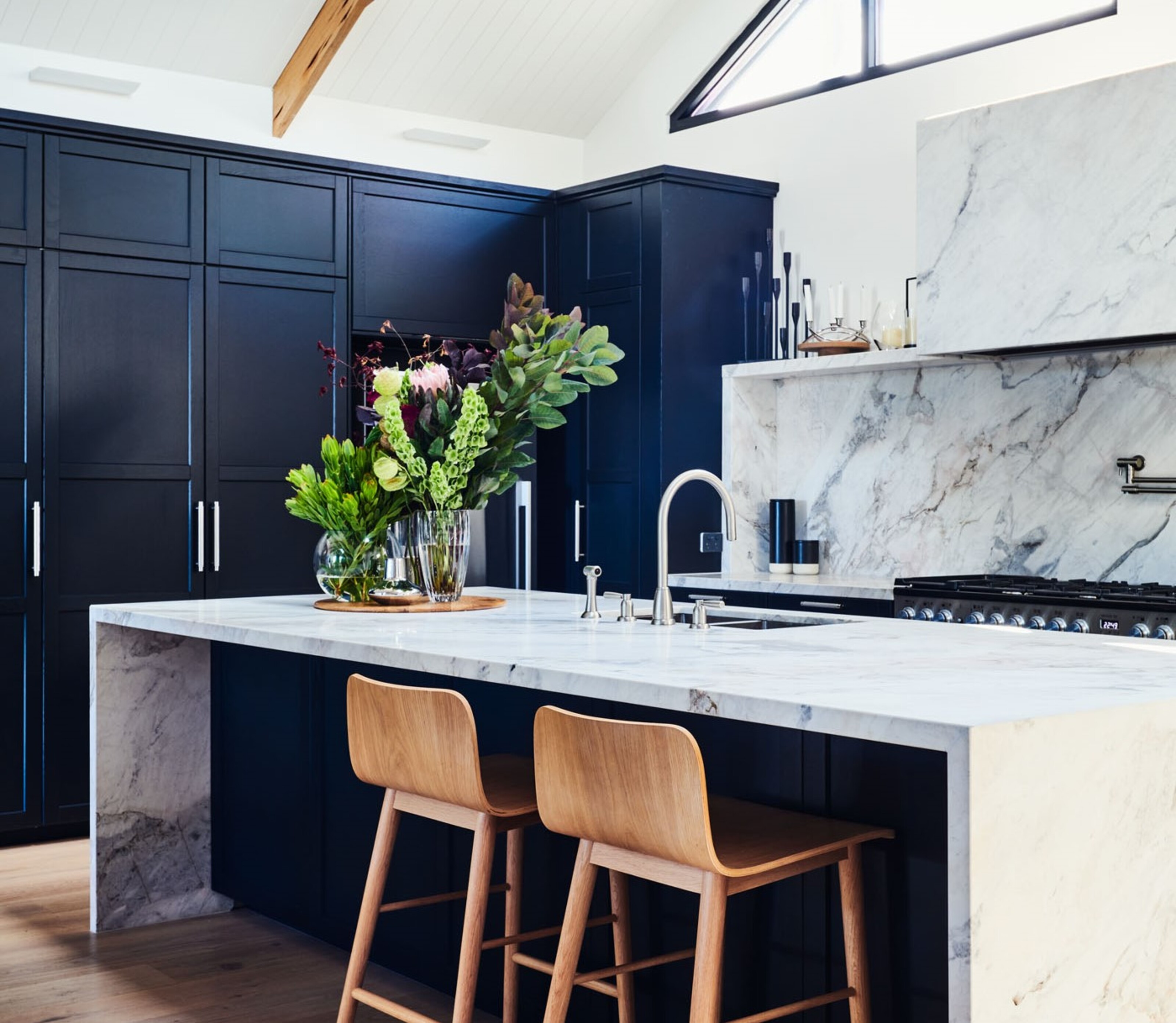
5 kitchen cabinet colors interior designers are avoiding for 2024 - and the shades they're picking instead

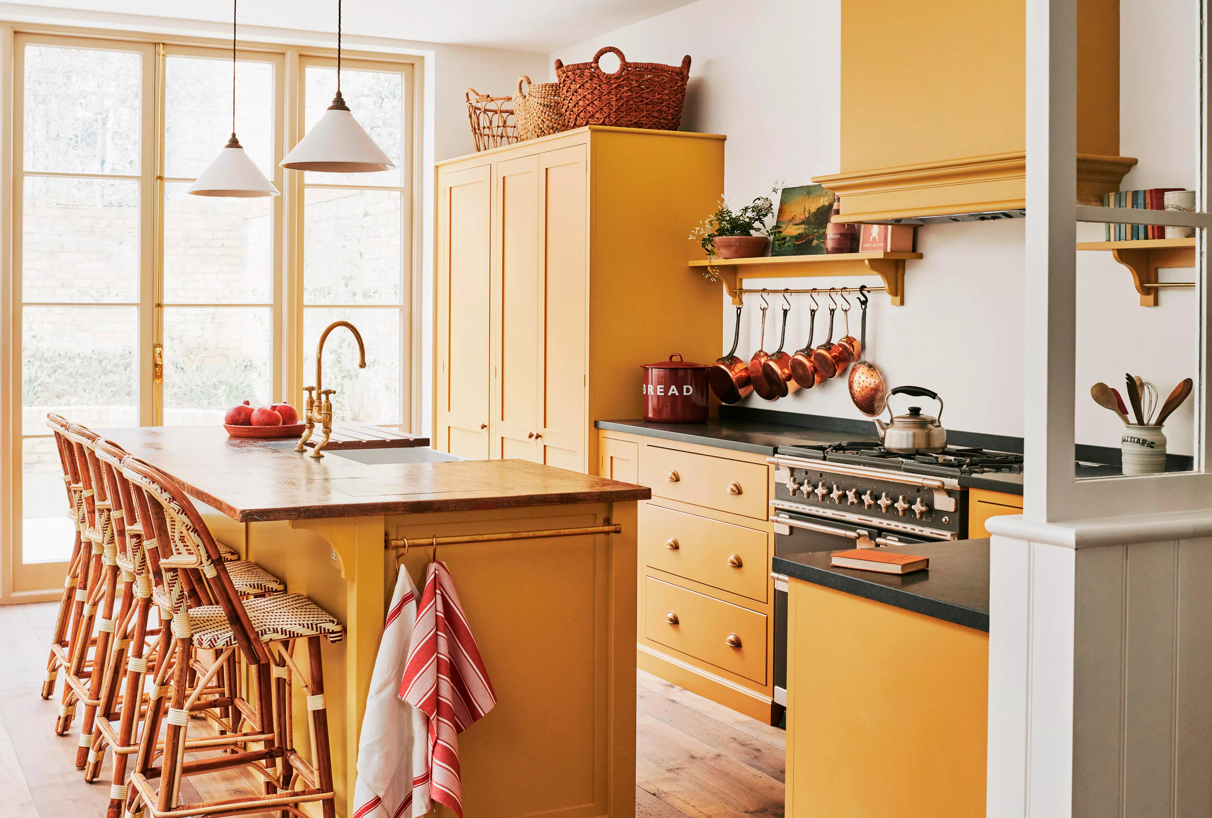
This Is the New "It" Color for Kitchen Cabinets: Here's How to Pull It Off

7 outdated kitchen cabinet colors designers say you should wave goodbye to, plus what to try instead

5 fail-safe kitchen cabinet color combinations that always work
The Retro Kitchen Cabinet Color That's Making A Comeback

17 bright kitchen cabinet colour ideas to try in your home

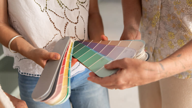
9 Outdated Kitchen Cabinet Colors We Hope To Never See In 2026

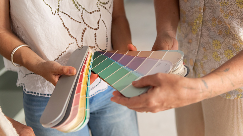
9 Outdated Kitchen Cabinet Colors We Hope To Never See In 2026
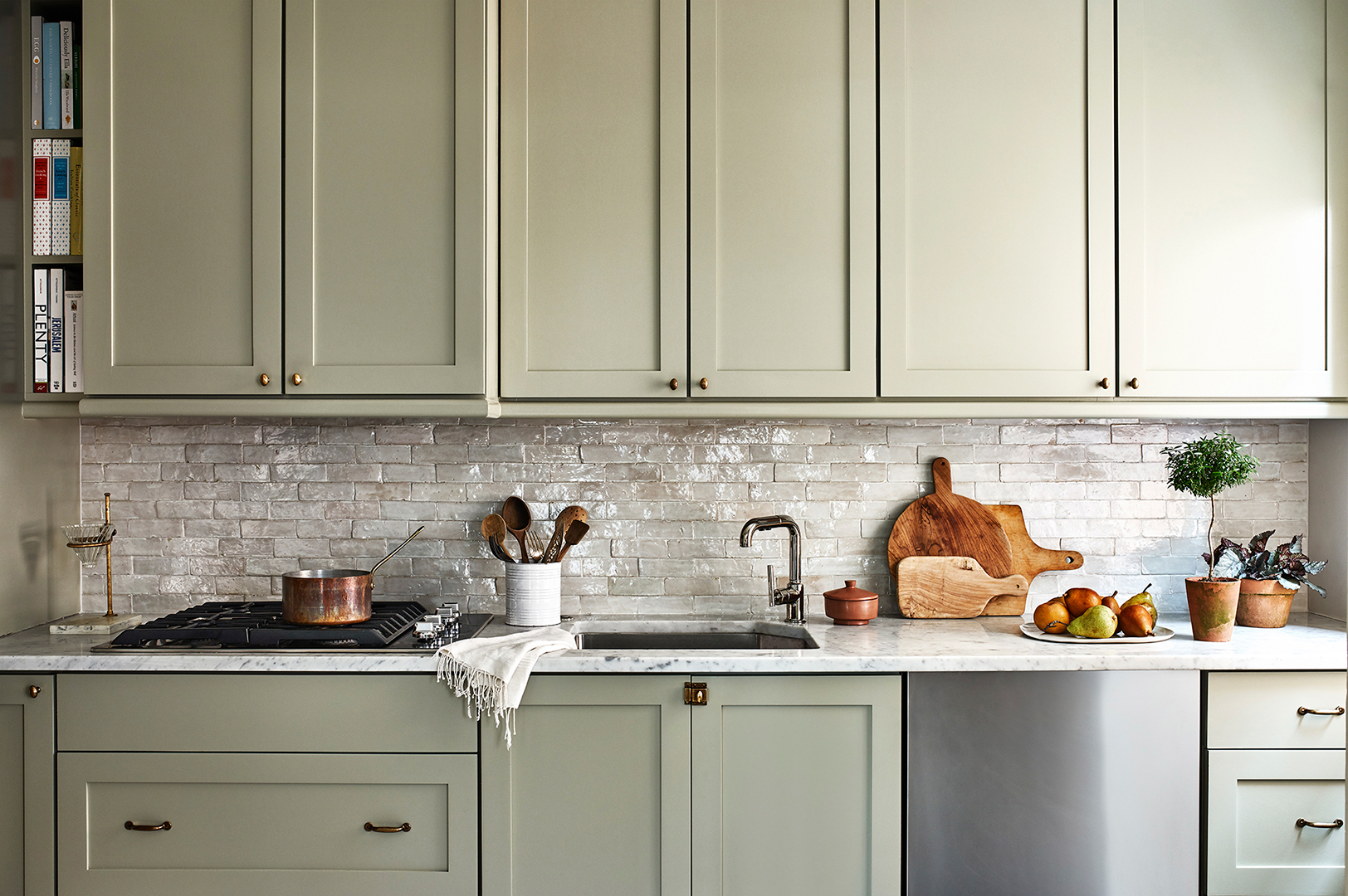
And the Next It Kitchen Cabinet Color Is…
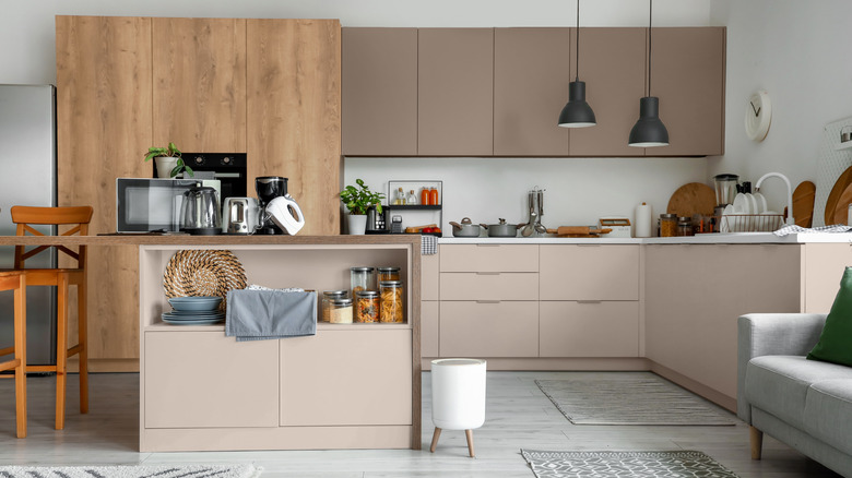
10 Trendy Kitchen Cabinet Colors You Should Try In 2025
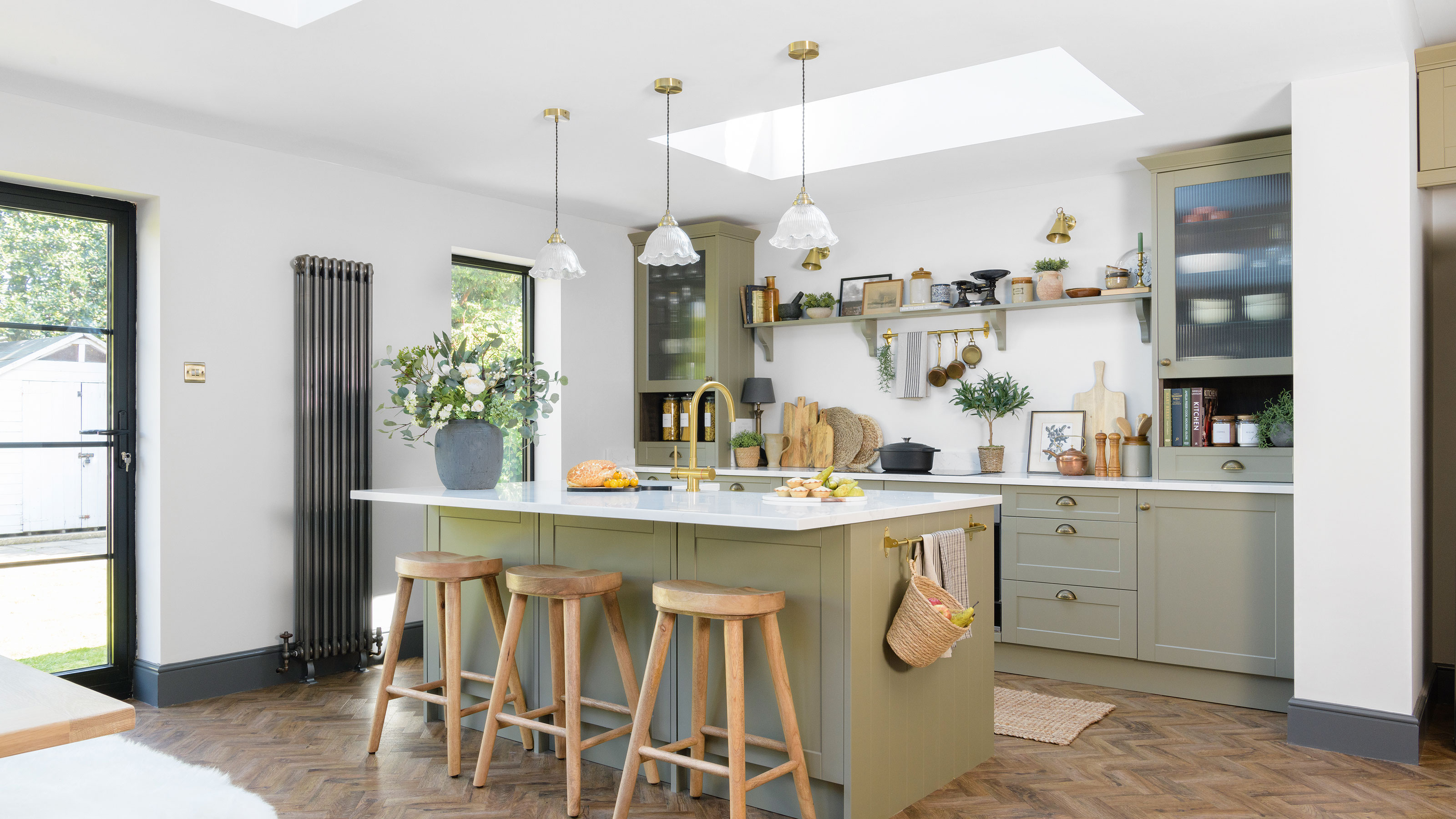
5 kitchen cabinet colours to avoid in 2024 - and what to choose instead, according to experts
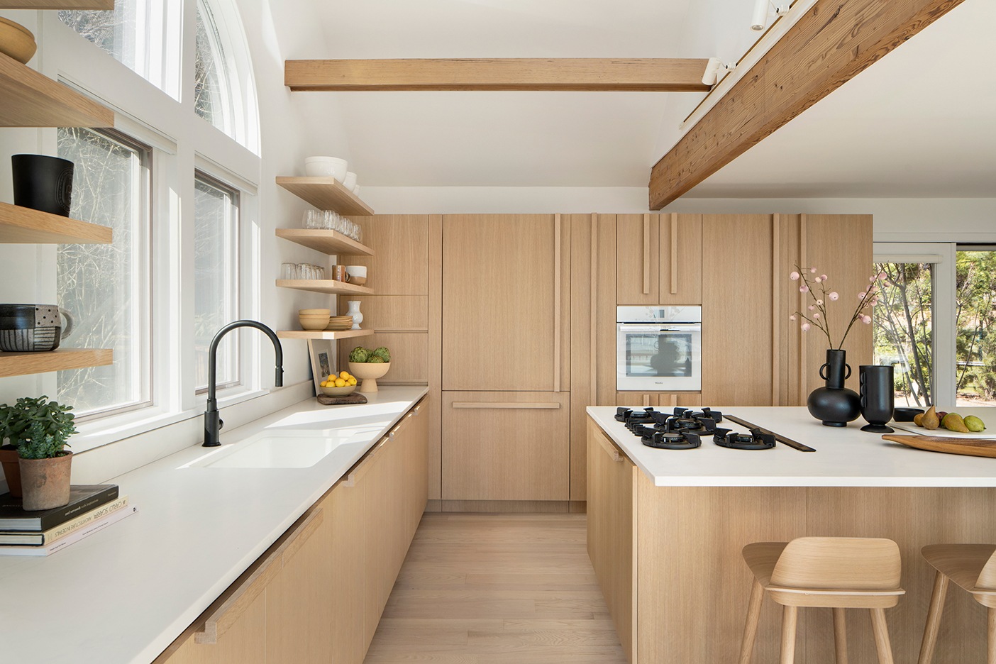
We’re Calling It: This Cabinet Style Will Be Just as Sought-After as the All-White Kitchen