1/9
Steffen Wagner Talks Us Through His Funky Typography and Creating ‘Thoughts in Frames’
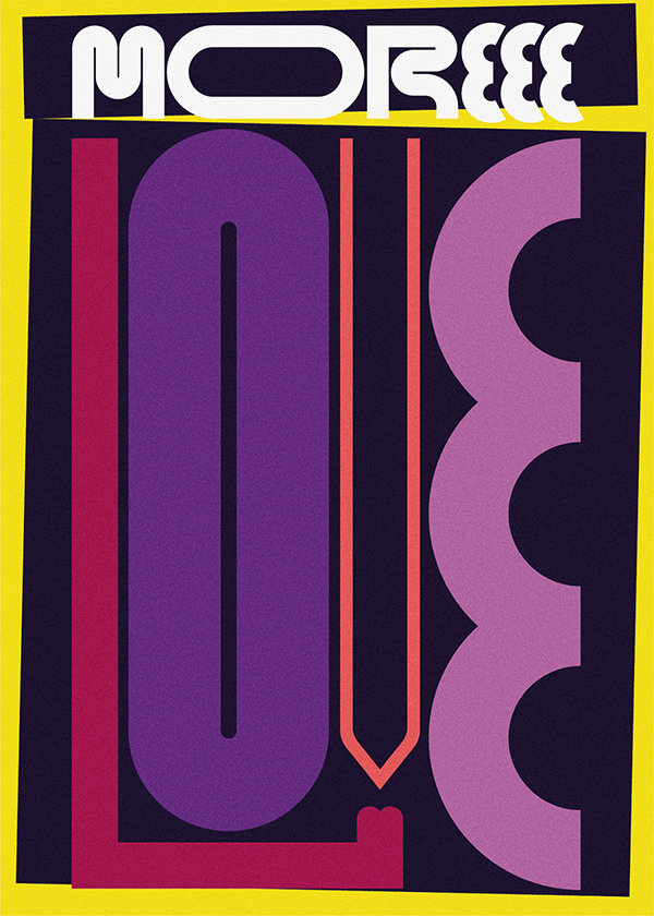
This article features an interview with Berlin-based graphic and product designer Steffen Wagner, known for his unique approach to typography and expressive design. Wagner discusses his artistic process, inspirations, and the evolution of his personal and professional work. He explains his preference for muted tones in his personal projects, describing his color palette as "funky-retro," though he is gradually incorporating brighter and more provocative contrasts. When starting a new piece, Wagner emphasizes the importance of beginning simply to allow ideas to flow, aiming to visualize the core message or value through the artwork itself, sometimes obviously, sometimes subtly. He creates prints for galleries, shops, and individuals seeking to artistic enhance their homes with specific, identifiable messages, conceptualizing his work as "thoughts in frames."
The interview highlights a distinct difference between Wagner's personal design aesthetic and his brand work for clients. While his personal projects often feature dynamic typography and whimsical geometrical shapes with muted tones, client work may require a different visual approach. He acknowledges the ongoing challenge of wanting to integrate his personal style into client commissions but notes a recent shift where galleries, shops, and magazines are now actively seeking his distinctive style for commissioned pieces. This development marks a transition of his hobby into his primary professional activity. Wagner expresses a dream of designing for The New Yorker but appreciates all clients who offer opportunities to explore new ideas and values.
His artistic inspirations include cubist pioneers like the early Mondrian and Picasso, whose works he greatly admires. Wagner reveals that he typically conceives the sayings and quotes used in his typographic prints before he starts designing. These words are drawn from a vast collection of personal experiences, ideas about life, and reflections on the world, serving as a basis for thought-provoking art that reflects his life attitudes. He describes his graphic aesthetic with three words: playful, striking, and thought-out. His playful approach involves abstracting letters to the point of near unreadability, making the artworks striking as they require viewers to engage more deeply to decipher the message. The inclusion of hidden elements that subconsciously influence the viewer further underscores the meticulous thought process behind each piece. Wagner humorously states that if he weren't a graphic designer, he would still find ways to incorporate design into other roles, like a window cleaner or cashier, demonstrating his profound passion for his craft.
#SteffenWagner #GraphicDesign #Typography #ProductDesign #ArtisticProcess #ExpressiveDesign #CreativeInspiration #FunkyRetro #HomeDecoration #SteffenWagner #GraphicDesign #Typography #ProductDesign #ArtisticProcess #ExpressiveDesign #CreativeInspiration #FunkyRetro #HomeDecoration
 아직 댓글이 없습니다
The Zeitgeist Edit — The Design Moments an Editor Is Talking About in November