




1/13
Peek inside the vibrant dream home of Farrow & Ball's colour curator
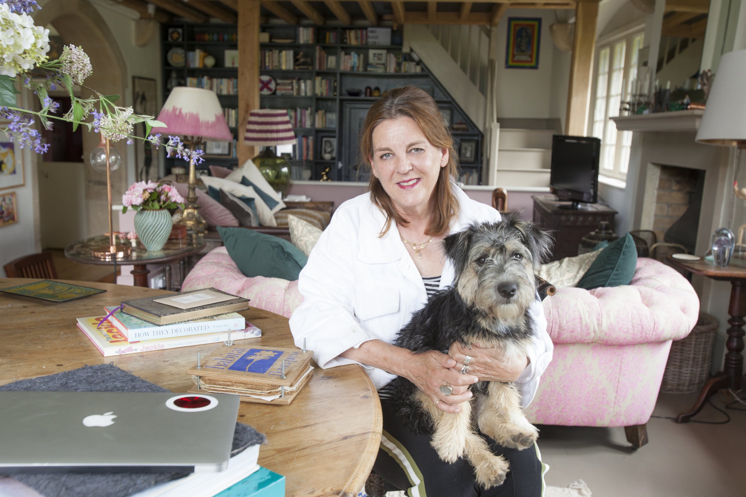
This article offers a glimpse into the home of Joa Studholme, the colour curator for Farrow & Ball, located in a 19th-century converted schoolhouse in Somerset. Studholme, responsible for many of Farrow & Ball's popular paint colours and their whimsical names, discusses how her home serves as both a personal canvas and an inspiration for new shades. The house, which she shares with her husband and their dog, Tufnell, features distinctive elements such as huge arched windows overlooking rolling hills.
Studholme details the colour choices throughout her home, starting with the entrance hall painted in 'Bancha,' a Japanese green tea-inspired hue she created to extend the feeling of the garden indoors and evoke protection. Her journey with Farrow & Ball began in 1996, and she is slated to appear in a TV show about the company's 75-year history. The hall transitions into a library area with bookshelves painted in 'Railings' to create a cozy atmosphere, contrasting with the main living area's vaulted double-height ceilings, a former classroom, which is painted in 'School House White,' a soft white created by Studholme to harmonize with exposed limestone and reflect light.
She explains her creative process for developing colours and names, noting that sometimes the colour comes first, as with 'Bancha,' and other times the name, like 'Stiffkey Blue,' inspired by childhood memories, or 'Cromarty,' derived from a shipping forecast. 'Nancy’s Blushes' was named after her daughter’s teething cheeks. The article highlights unique features of the schoolhouse, such as an elevated floor in the living area, originally designed to prevent children from looking out windows during lessons. Studholme and her husband frequently debate whether to lower this floor for more space, weighing it against losing the views.
Practicality also influences her choices, as seen in the floor of the living area, which she painted in 'Mouse’s Back,' an earthy, forgiving shade chosen for its ability to merge with garden mud and create warmth. Studholme advocates for painting walls, ceilings, and woodwork in the same colour, arguing that white ceilings do not necessarily make spaces appear larger and that painting window frames the same colour as walls directs focus to the view rather than the frame. The sitting room features concealed up-lighting that highlights the rafters and Tom Dixon silver globes for a contemporary touch.
The home's decor emphasizes sustainability, with furniture sourced from previous homes, family inheritances, antique fairs, and flea markets. Studholme describes her approach as 'not overthinking things.' The kitchen incorporates a 'Babouche' yellow accent around a window reveal, chosen simply for fun, and features colourful bistro chairs as recent additions. The interior of the floor-to-ceiling kitchen cupboards is adorned with Farrow & Ball wallpaper samples, a lockdown project she suggests for those hesitant to use bold colours. She also mentions 'Jitney,' a colour she created to mark the end of 'grey mania,' inspired by a bus from the TV show Gossip Girl. Studholme observes a growing preference for earthy colours due to increased connection with nature during lockdown. The article concludes with her clever decor tips, including painting a stained lampshade, using wallpaper samples in an apothecary cabinet, and creating an illusion of light in a narrow corridor with a two-tone paint scheme.
#HomeDesign #InteriorDesign #FarrowAndBall #ColourCurator #ConvertedSchoolhouse #PaintChoices #SustainableDecor #HomeRenovation #JoaStudholme #HomeDesign #InteriorDesign #FarrowAndBall #ColourCurator #ConvertedSchoolhouse #PaintChoices #SustainableDecor #HomeRenovation #JoaStudholme
 아직 댓글이 없습니다