




35 Colorful Front Door Ideas That Will Seriously Up Your Curb Appeal
The color of a front door plays a crucial role in enhancing a home's exterior aesthetic and curb appeal. While classic colors like white or gray offer a timeless look, embracing vibrant shades can infuse personality and make an entryway distinct. Bold hues such as yellow, lime green, coral, or turquoise are presented as effective choices to instantly uplift a home's appearance and create a welcoming focal point.
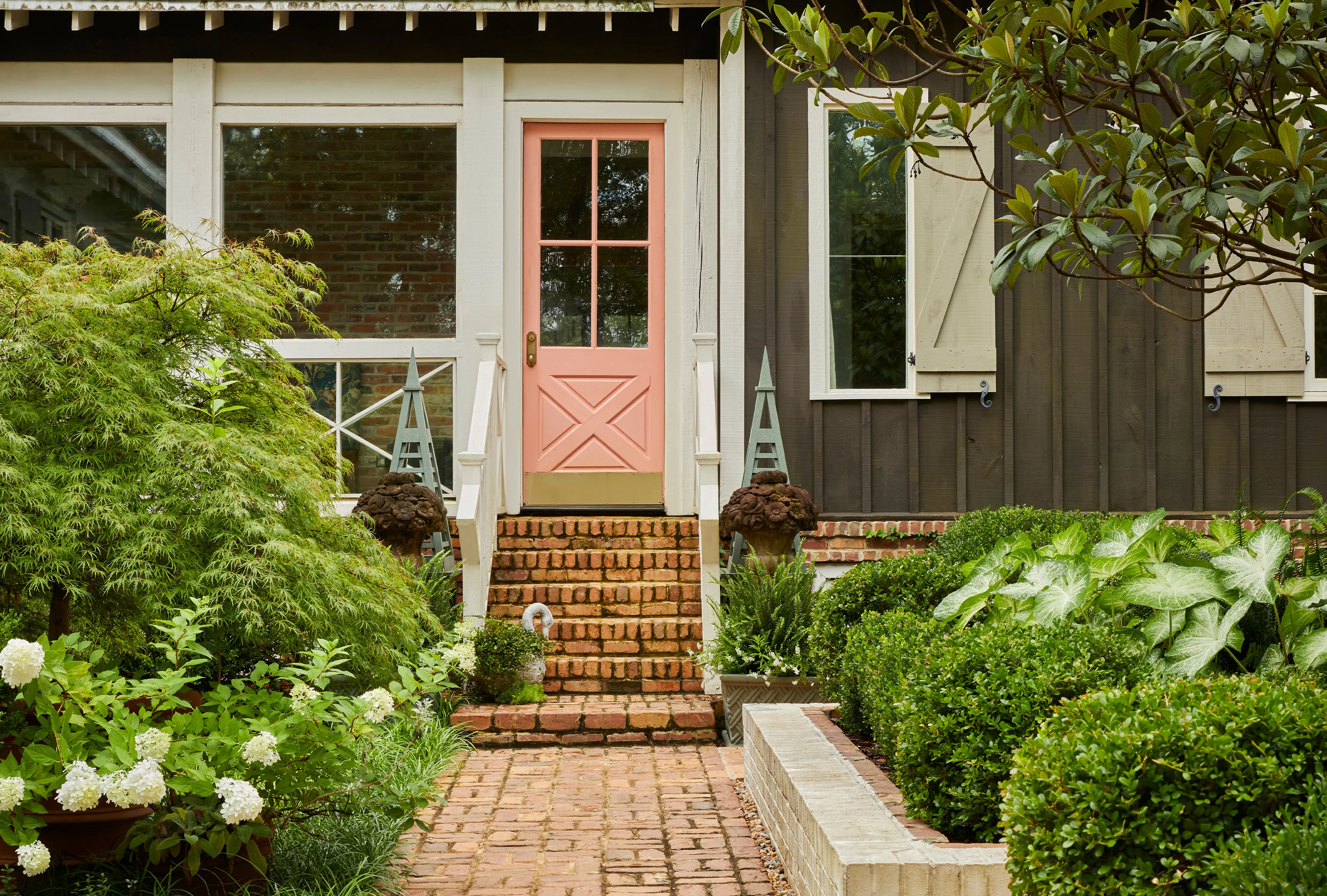
The article explores various color options and their impact on different home styles and existing exterior palettes. For instance, a bright teal door provides a striking contrast against an all-neutral, wood-sided home, while lime green coordinates harmoniously with warm wooden decks and metal accents. Cobalt blue energizes a monochromatic exterior, and hot pink adds a bold, fun element that can be balanced with vintage and modern decor. Peachy pink can introduce a whimsical touch against a moody, dark green exterior and lush garden, creating a woodland wonderland feel. Mint green offers a sweet, vintage-inspired pop of color that remains timeless against a neutral backdrop.
For contemporary homes, which often feature minimalist facades, a canary yellow door can introduce warmth against cool metal and gray siding. Traditional homes can benefit from a ruby red door, providing a distinctive visual element that complements white trim and gray siding. Electric green is suggested for homes with a neutral dominant color, where extending the color to inner doors can enhance its presence. A cheerful yellow paired with navy blue creates a strong, contrasting, and unexpected combination. An orangey-pink coral hue can draw the eye and act as a focal point on an asymmetrical exterior, especially when repeated in patio furniture for cohesion. Highlighter yellow, an electric neon shade, energizes and accents traditional door designs, with a recommendation to test swatches and pull the color onto nearby trim for blending.
Dusty pink, derived from the light hues of bricks, blends seamlessly with the exterior, especially when complemented by light blue window shades. Tomato red, applied to painted mullions, offers a unique take on a classic door, evoking a "tomato girl summer" vibe. Deep turquoise, vibrant and energetic, stands out against neutral home exteriors and varied landscaping. Coastal blue evokes a calming, deep-sea feel, especially when mixed with natural wood tones and coastal decor. Sage green, from the same color family as the home's exterior, creates a tone-on-tone effect, brightening olive tones and creating a cohesive look when extended to fences.
Punchy pink French doors add sweetness to quaint cottages, contrasting effectively with neutral exteriors and enhanced by whimsical window boxes. Mustard yellow can be extended to door trim to amplify its visual impact. A dark red door, paired with a gray-blue siding and white, offers a fresh take on the classic Americana color scheme. The article also delves into using the color wheel to select a bright front door color, suggesting monochromatic, contrasting, or complementary color schemes. Examples include a yellow-orange door with bright blue siding for a bold facade, and salmon pink with non-traditional orange and blue shades that follow color wheel principles.
For homes with intricately carved or detailed wood doors, painting accents like tall door shutters can add color without concealing the wood. Navy blue complements orange hues in bricks, acting as an opposite on the color wheel for a visually pleasing effect. Strawberry red against a dark gray exterior creates a modern contrast, with personalized touches like "hello..." painted on the door's window. Terracotta pink matches Spanish-style influences in brickwork and lighting. Orange creamsicle draws attention to the entryway amidst large greenery and stone siding. Sky blue on a door with distinctive details, possibly achieved through woodwork or decals, makes a unique statement. Chocolate brown warms up a white and black exterior while maintaining a neutral palette. Bold red, especially against brick steps, makes a hidden door a focal point. Neon green on doors with windows feels more manageable, especially when tones are mirrored in surrounding decor. Butter yellow, surrounded by striped curtains, creates a grand, low-maintenance entryway. Sapphire blue, mirroring bold tiles with blue pops, achieves a put-together entry, softened by tropical plants. Black blue, with its subtle blue undertones, contrasts beautifully with beige and white exteriors, enhanced by turquoise planters. Finally, a warm cherry stain highlights wood grain, offering a cozy alternative to paint, with symmetrical planters adding to the welcoming feel.
#FrontDoorColors #CurbAppeal #HomeExterior #PaintColors #HomeImprovement #ExteriorDesign #ColorSchemes #DoorStyling #DIYHomeDecor #FrontDoorColors #CurbAppeal #HomeExterior #PaintColors #HomeImprovement #ExteriorDesign #ColorSchemes #DoorStyling #DIYHomeDecor
 아직 댓글이 없습니다