1/26
The 14 Paint Colors Featured in Our Favorite Green Kitchens
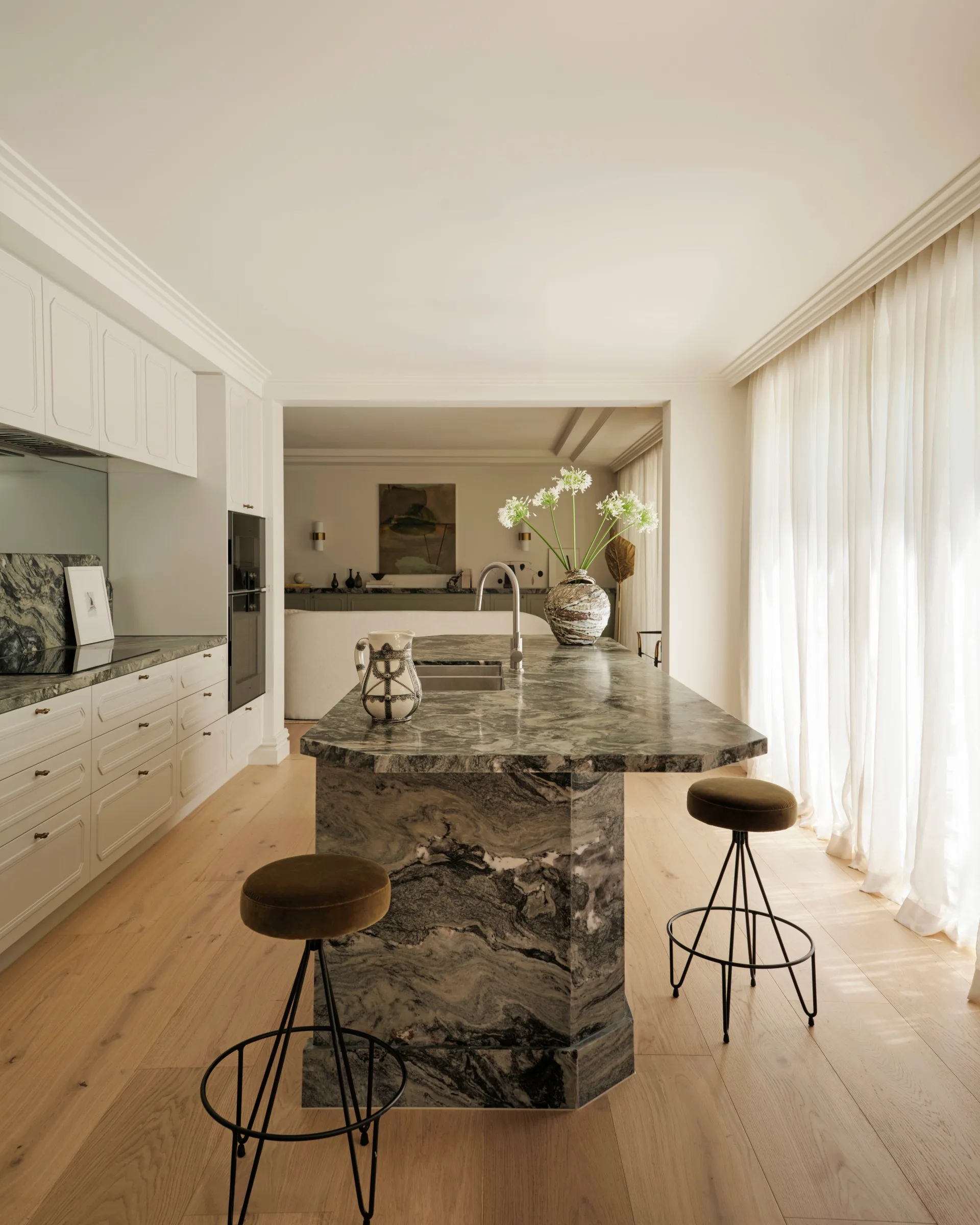
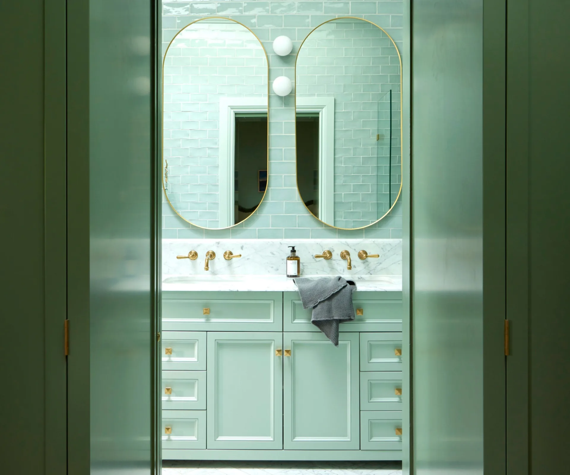
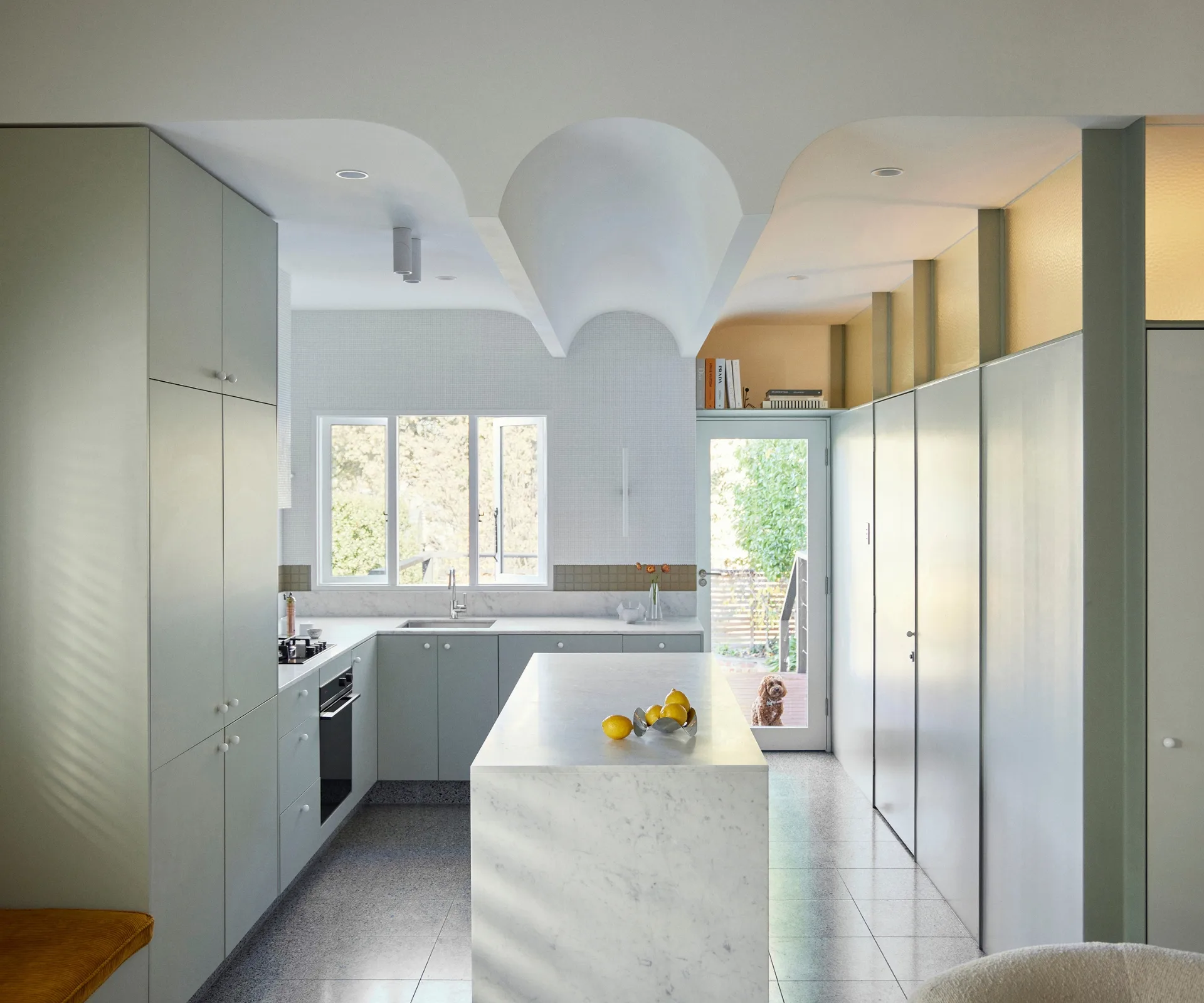
The article explores the increasing popularity of green hues in kitchen design, noting that PPG's declaration of 'Night Watch' as 2019's color of the year sparked a trend toward soothing green shades. Green, symbolizing growth, energy, harmony, and nature, is recognized for its calming properties, making it particularly effective in busy spaces like kitchens. The right shade of green, such as a warm sage or restful moss, can foster a sense of tranquility amidst daily culinary activities. The discussion emphasizes that with a wide array of green paint names available, selecting the ideal one for kitchen cabinets can be a focused process.
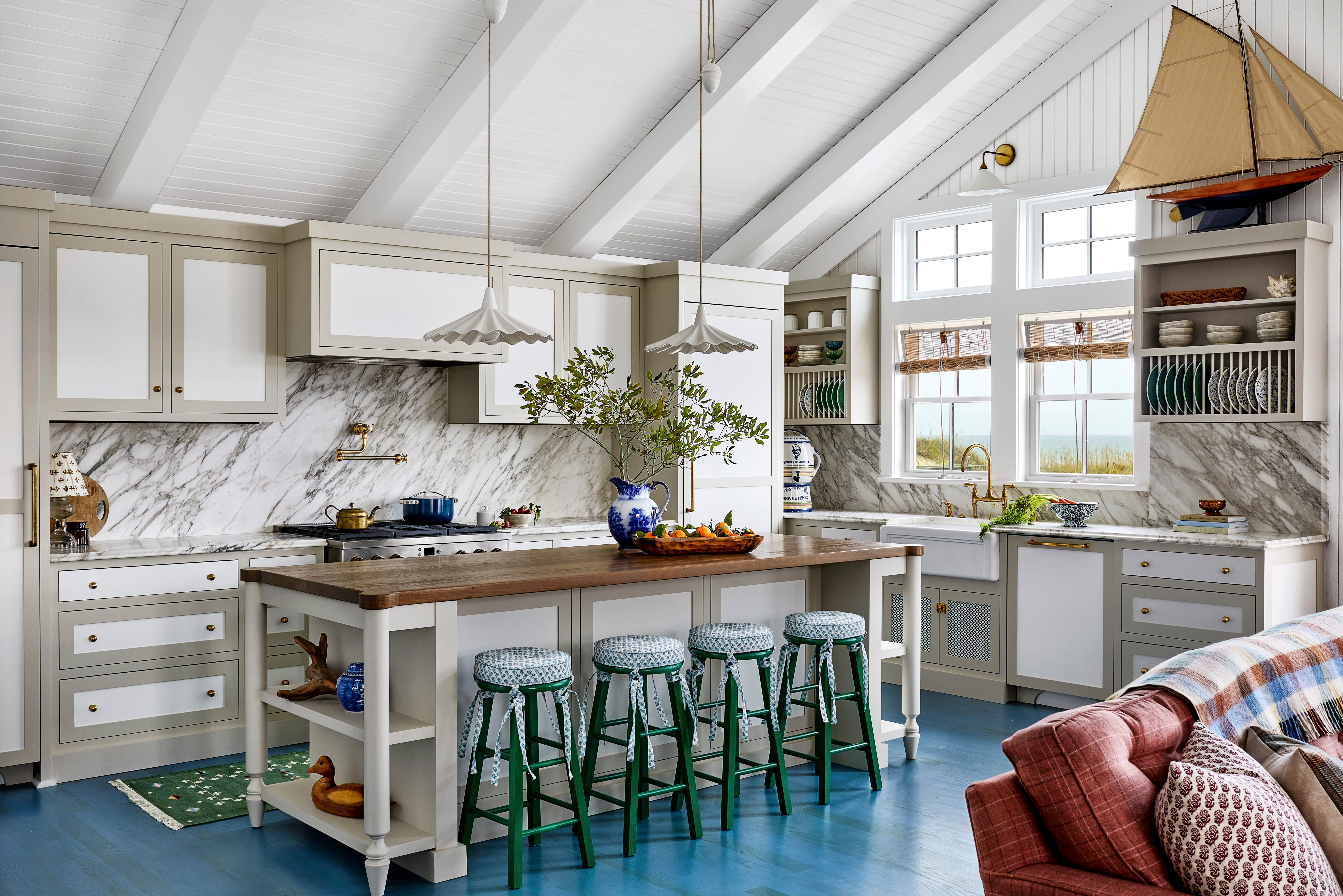
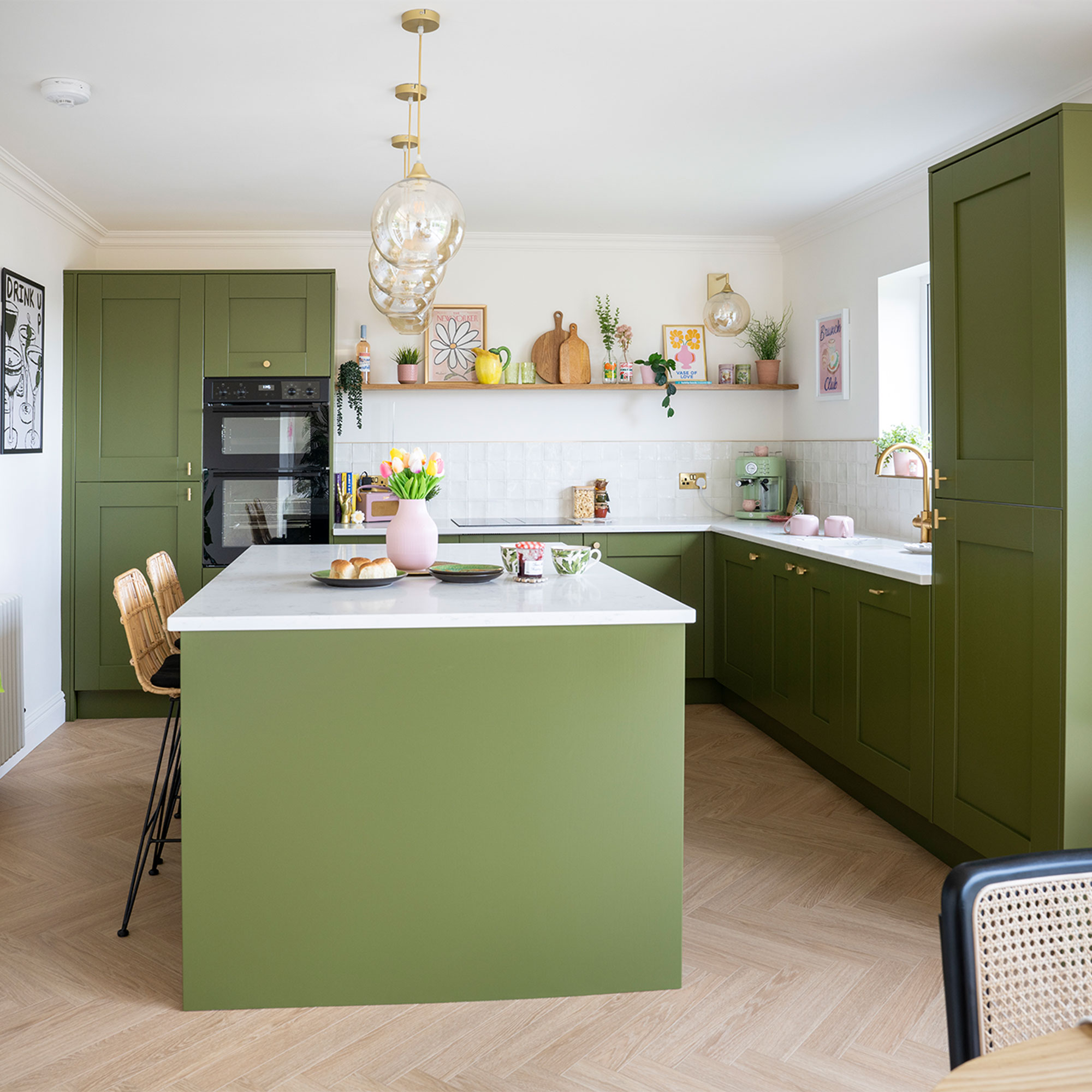
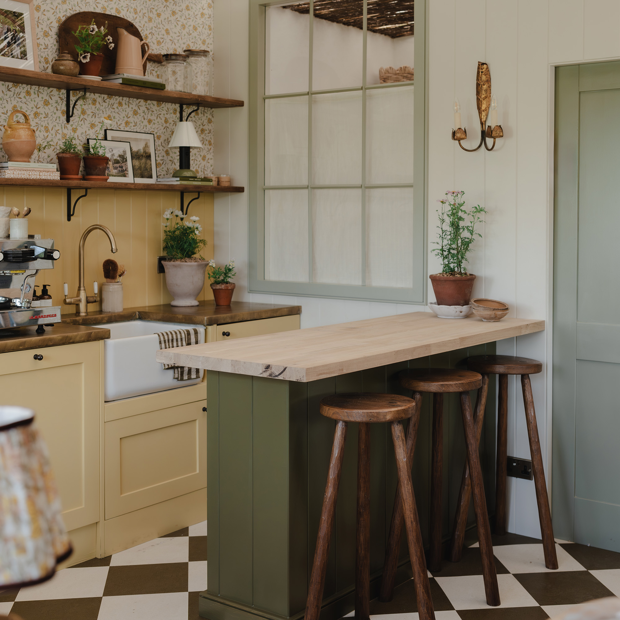
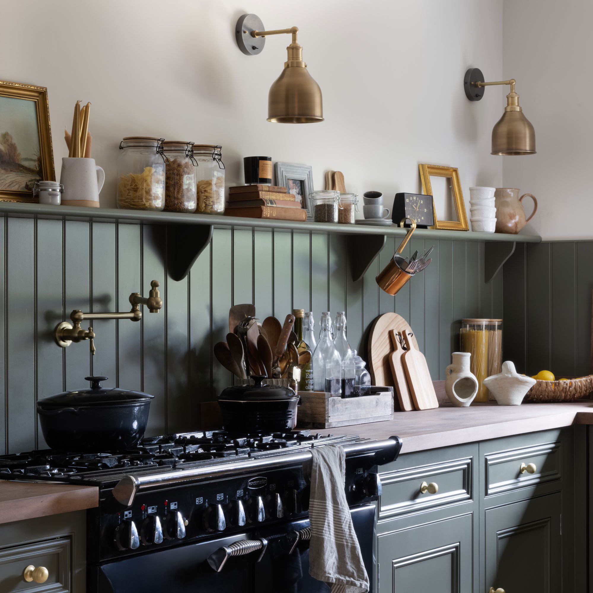
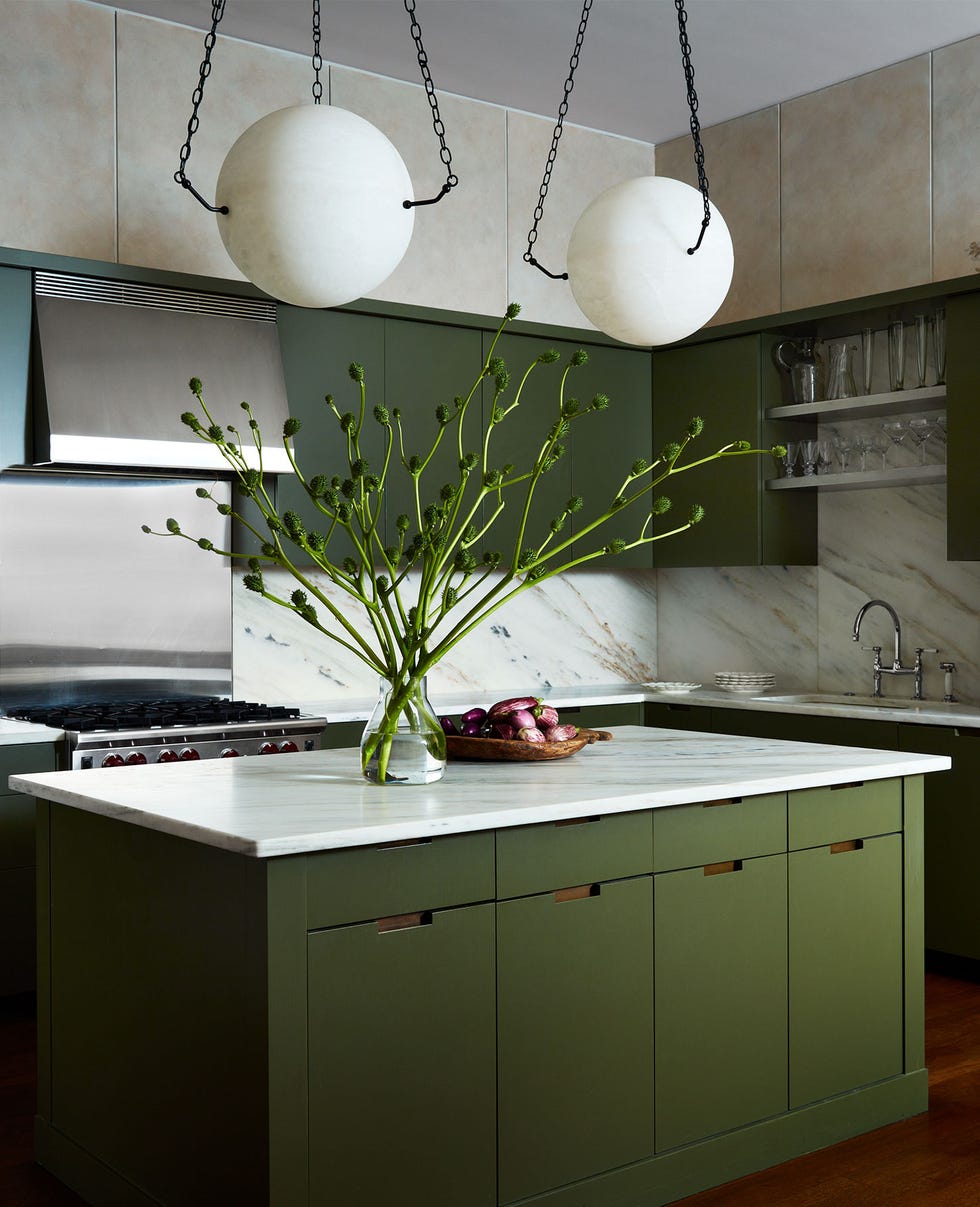
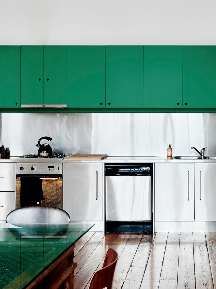
The article identifies 14 specific green paint colors that have been successfully integrated into various kitchen designs, chosen after an extensive review of popular green kitchens. These selections demonstrate the versatility of green, ranging from bold and vibrant to subtle and muted tones.
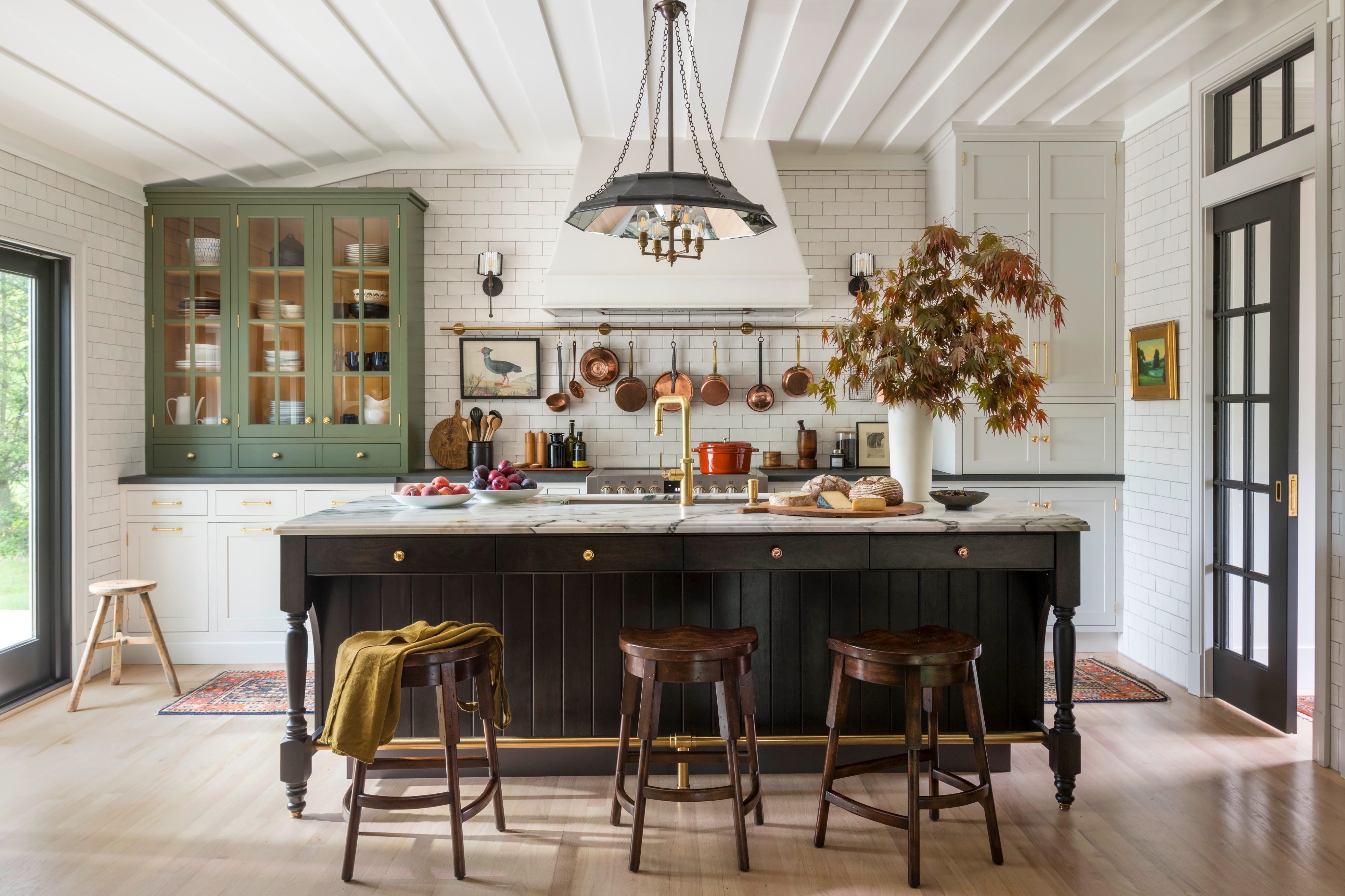
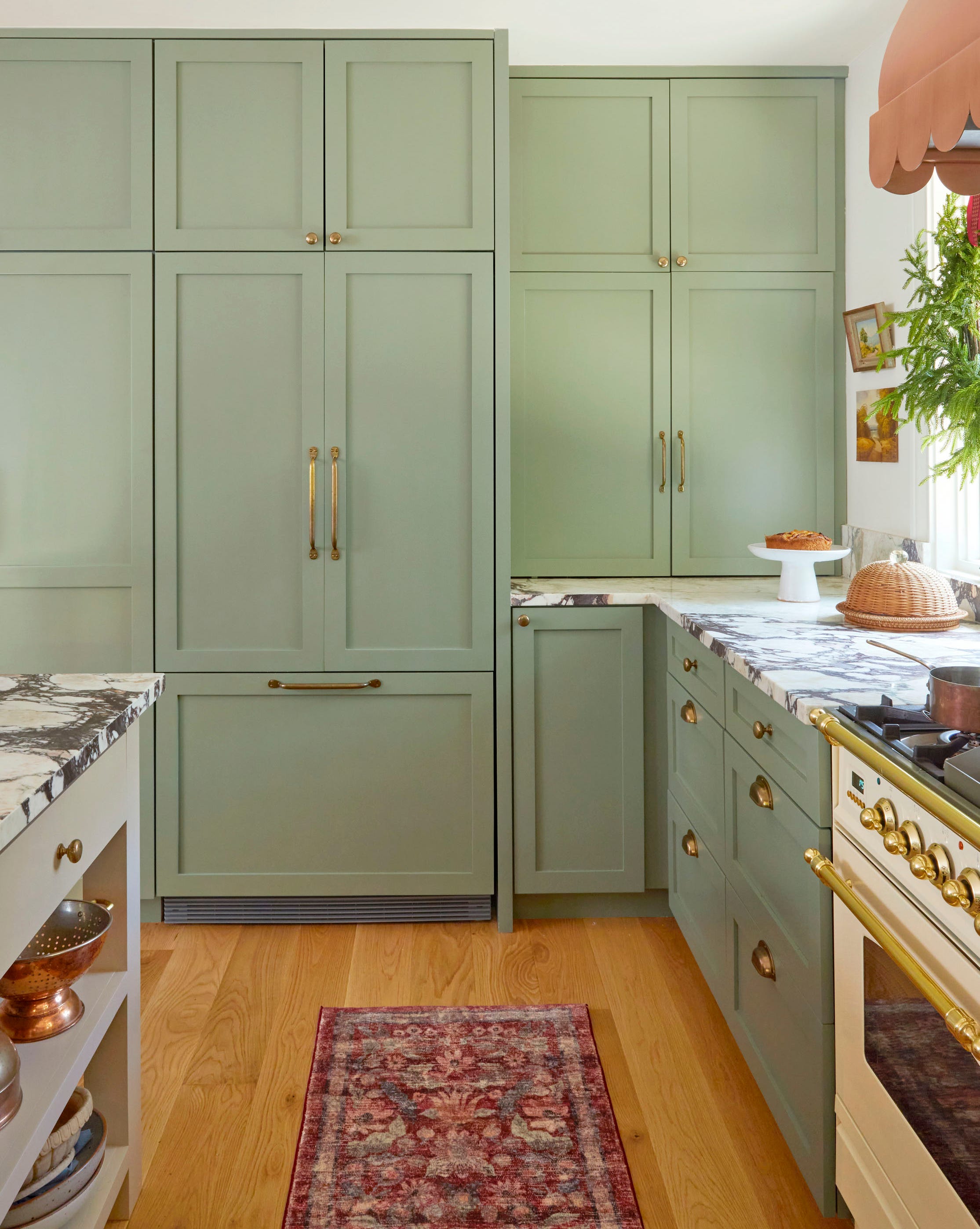
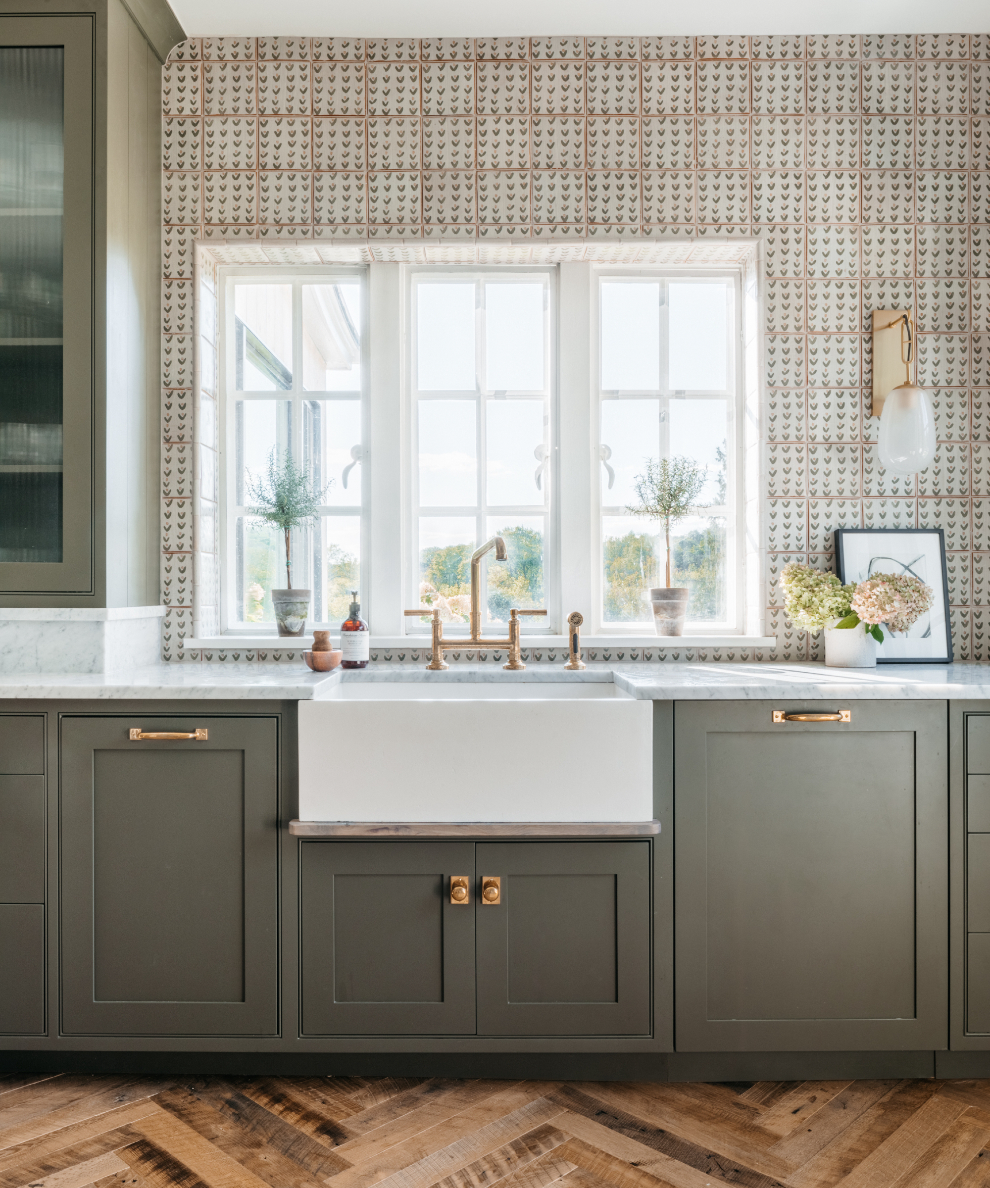
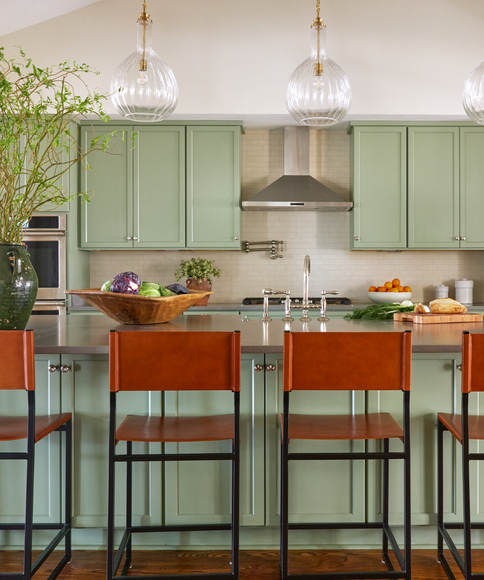
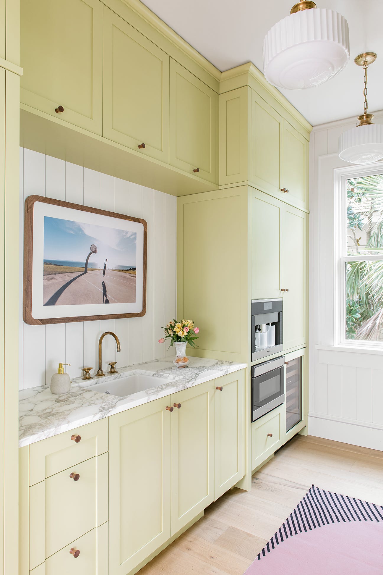
One featured color is 'Cactus Shadow by Valspar,' a hue inspired by the 1988 Seoul Olympics flag, used by blogger Christine Han for her kitchen cabinets. Another is 'Berkshire Beige by Benjamin Moore,' which, despite being categorized as brown, appears as a pale green-gray in naturally lit spaces, as seen in a Los Angeles home designed by Natalie Myers. 'Clary Sage by Sherwin-Williams' is highlighted for its pea-green tone, used in Jessica Mikesell's San Francisco Craftsman kitchen, where it pairs well with soapstone countertops, creating a cozy atmosphere.
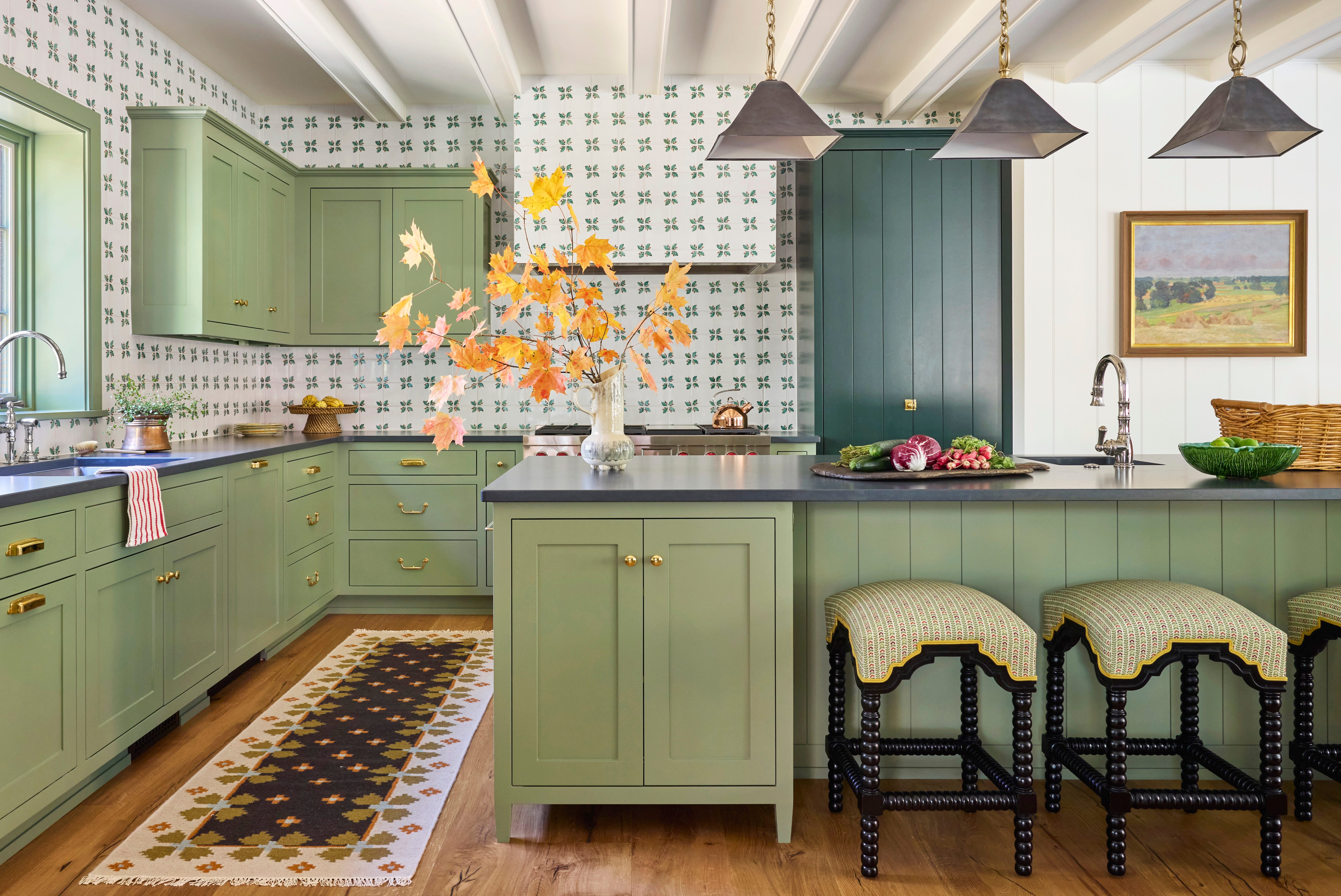
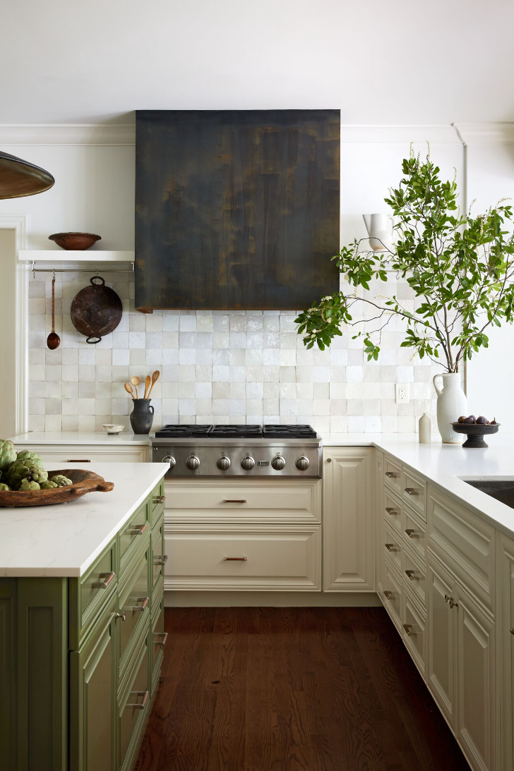
'Rosemary by Sherwin-Williams,' a subdued olive green, is a favorite of designer Stephanie Dyer, who incorporates it into both personal and client projects, often alongside pops of red, orange, and teal. 'Cooking Apple Green by Farrow & Ball' offers a bright, minty-sage hue, chosen by Teri Lyn Fisher of Spoon Fork Bacon, and is particularly striking when contrasted with white elements.
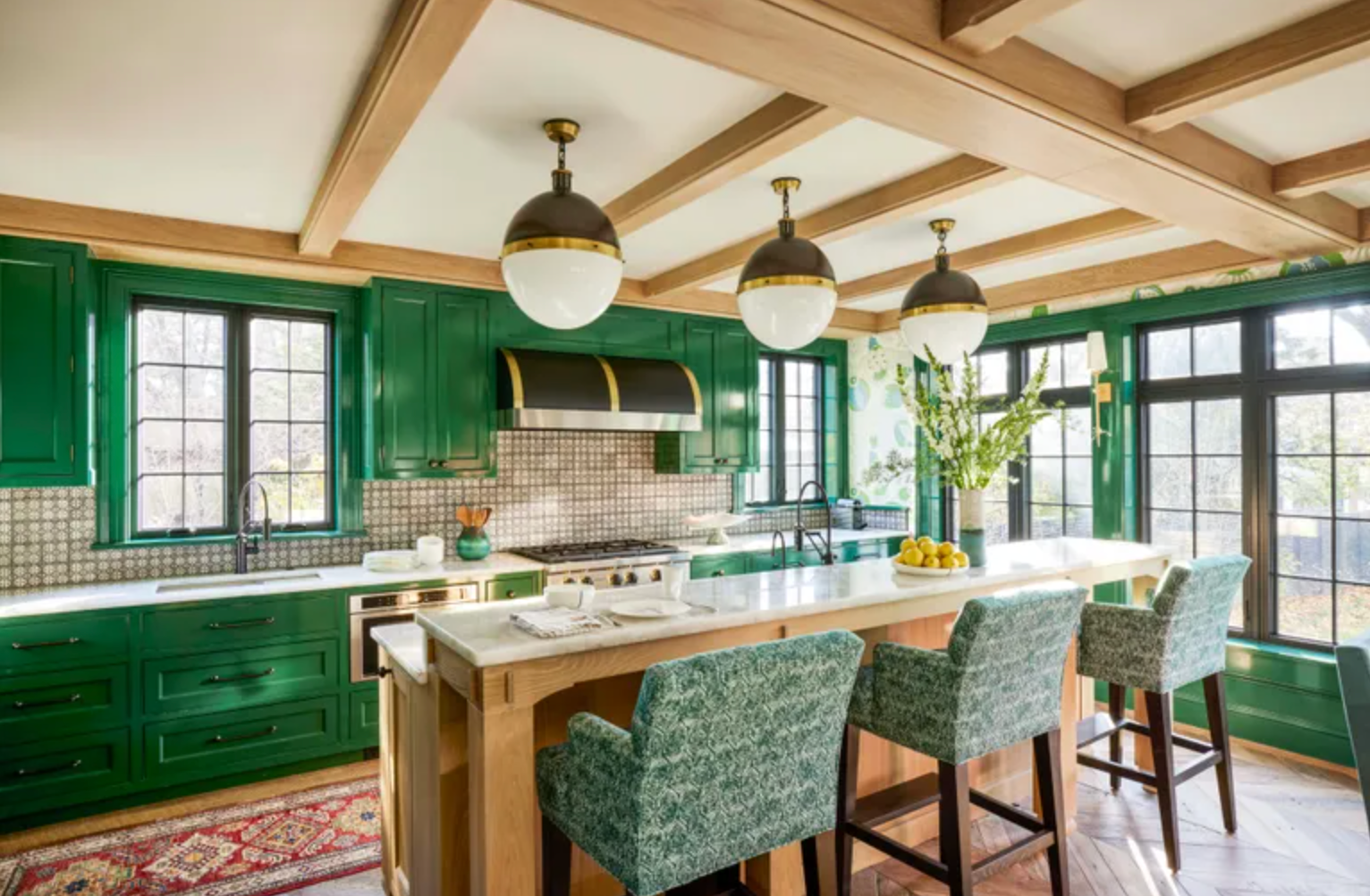
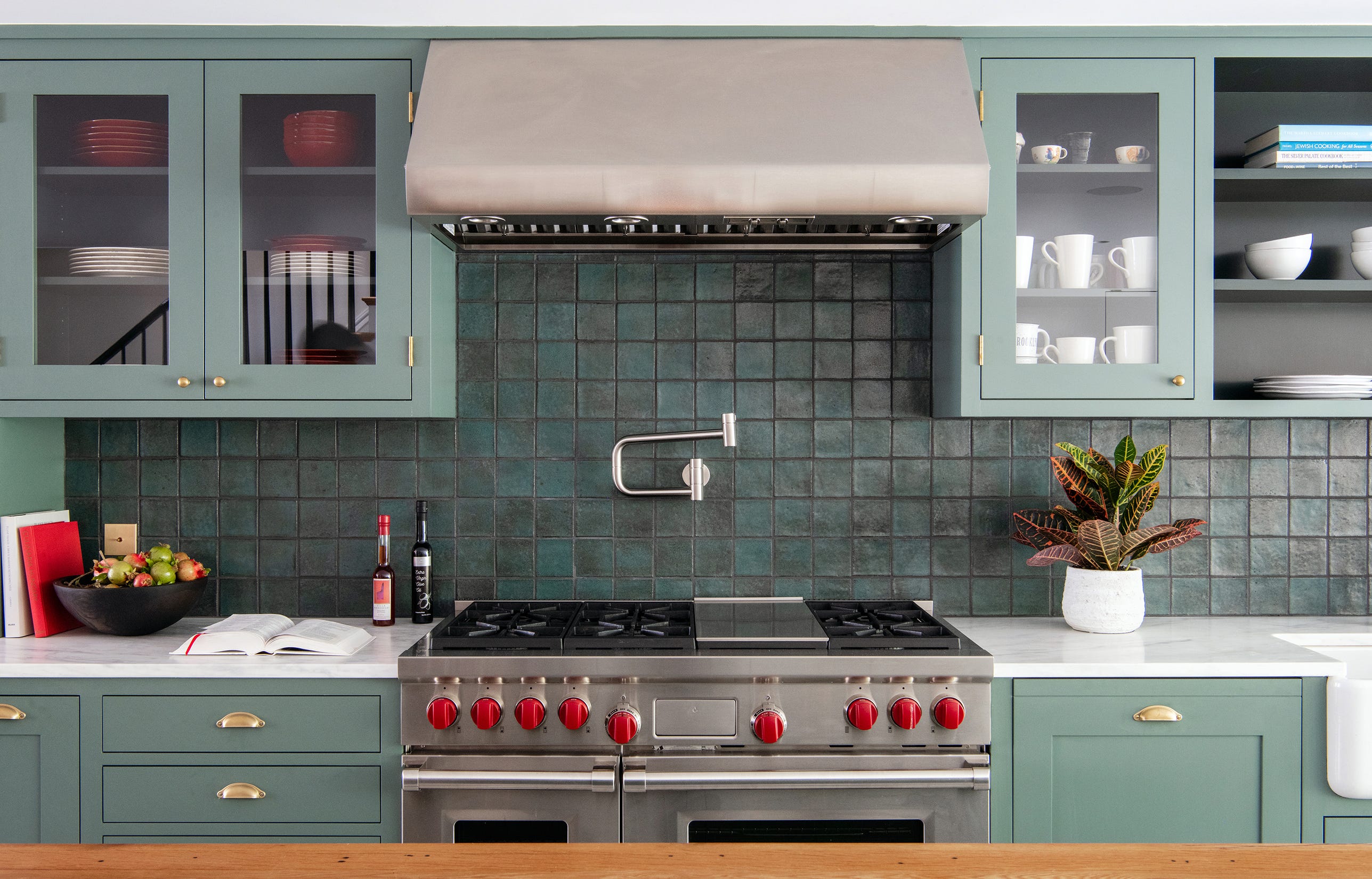
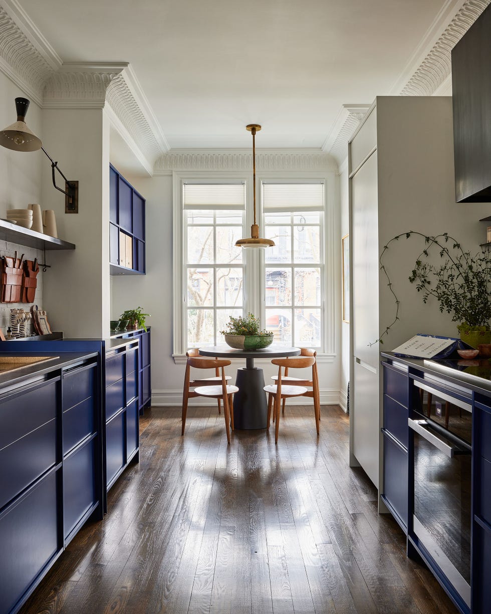
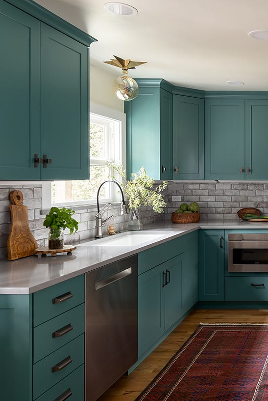
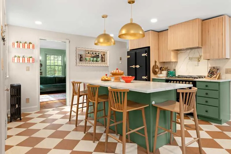
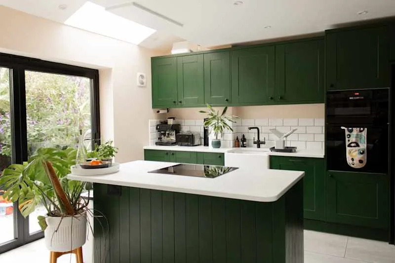
The '60s-inspired 'Fig Tree by Behr' provides a muddy green with brown undertones, complementing the vintage aesthetic of a Lancaster, Pennsylvania kitchen. 'Forest Green by Benjamin Moore' is presented as a chameleon color; its appearance shifts from green-blue in a matte finish with black hardware, as seen in a renovated row home, to a brighter emerald in a Denver Tudor kitchen by Shea McGee.
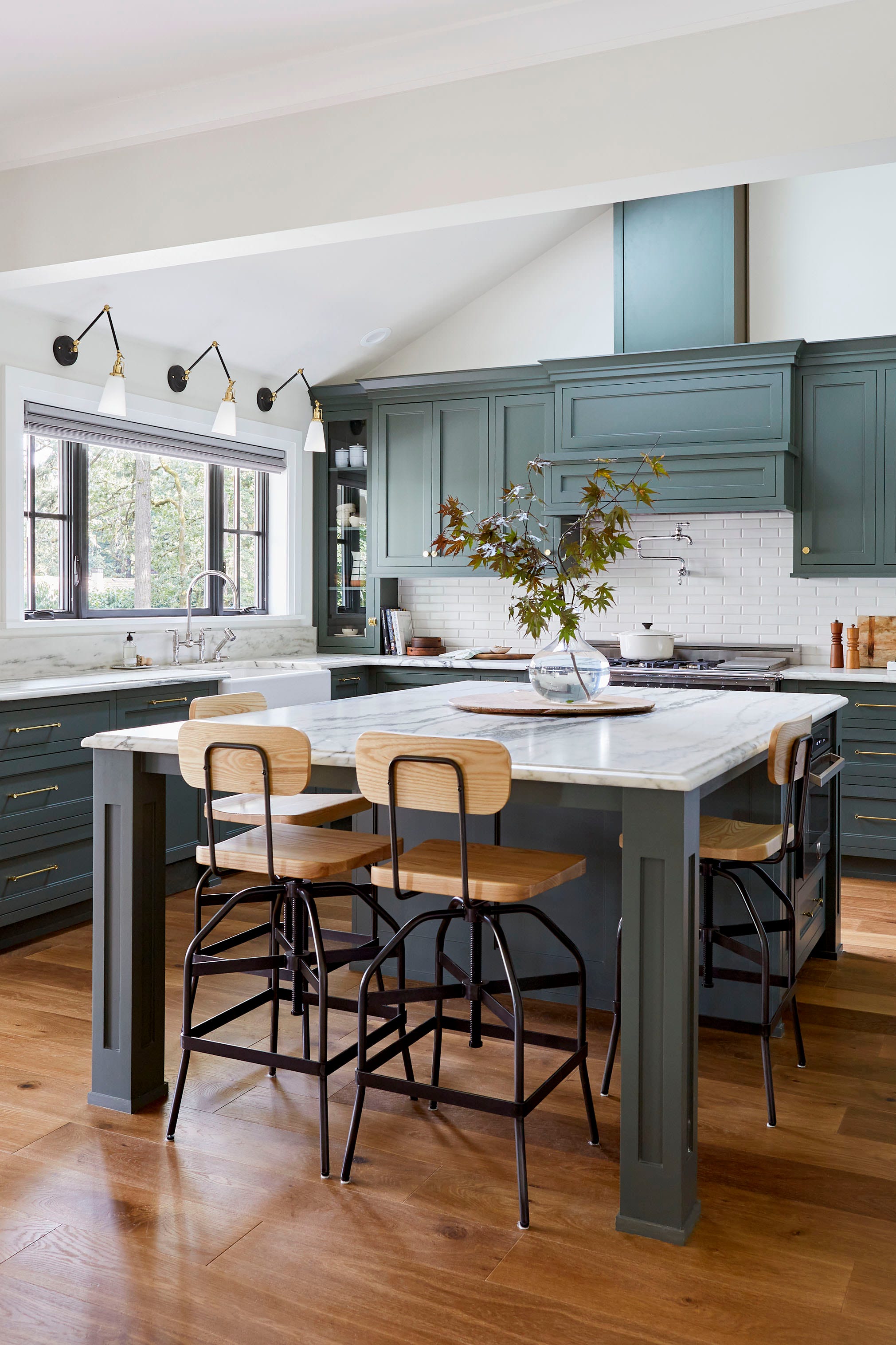
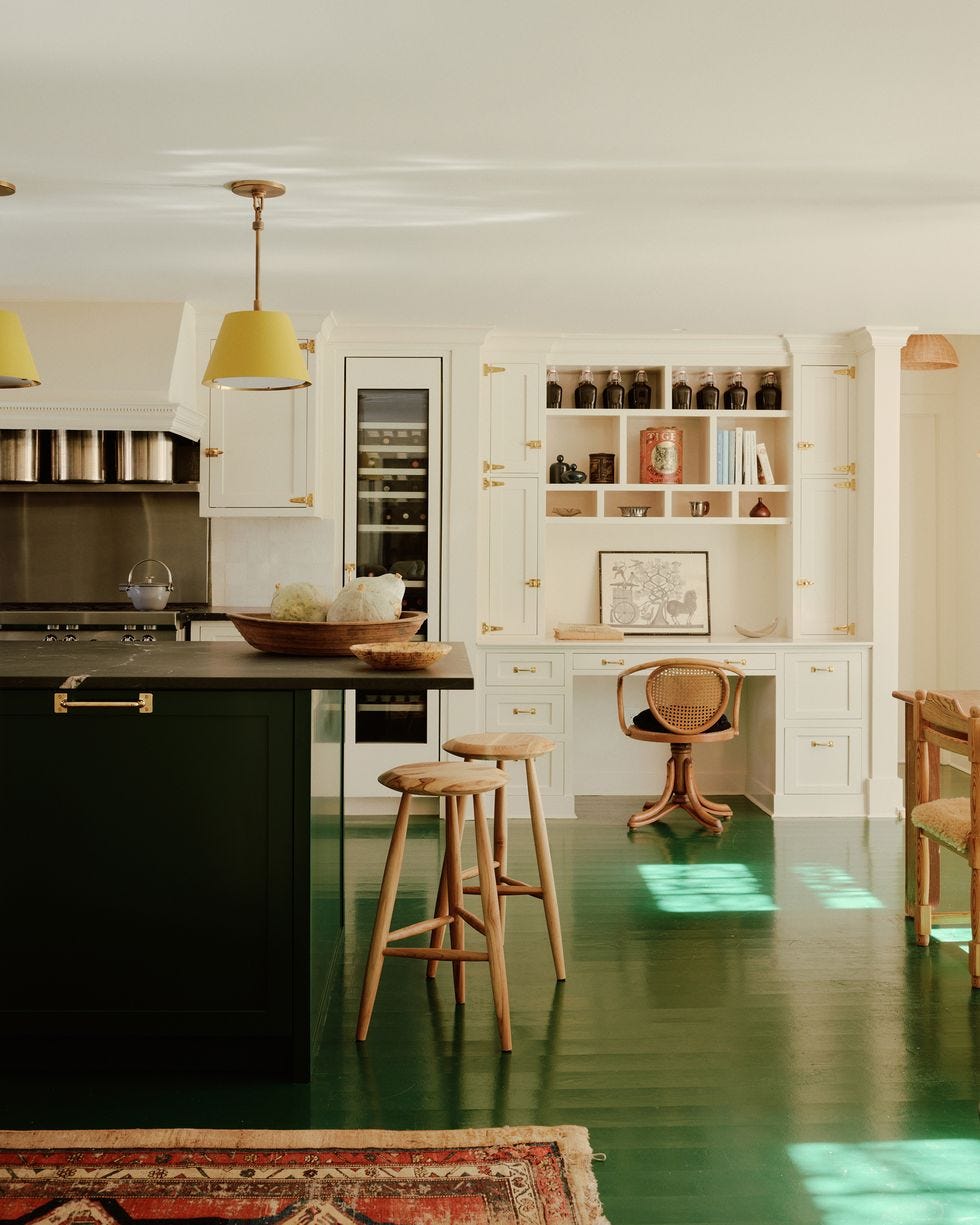
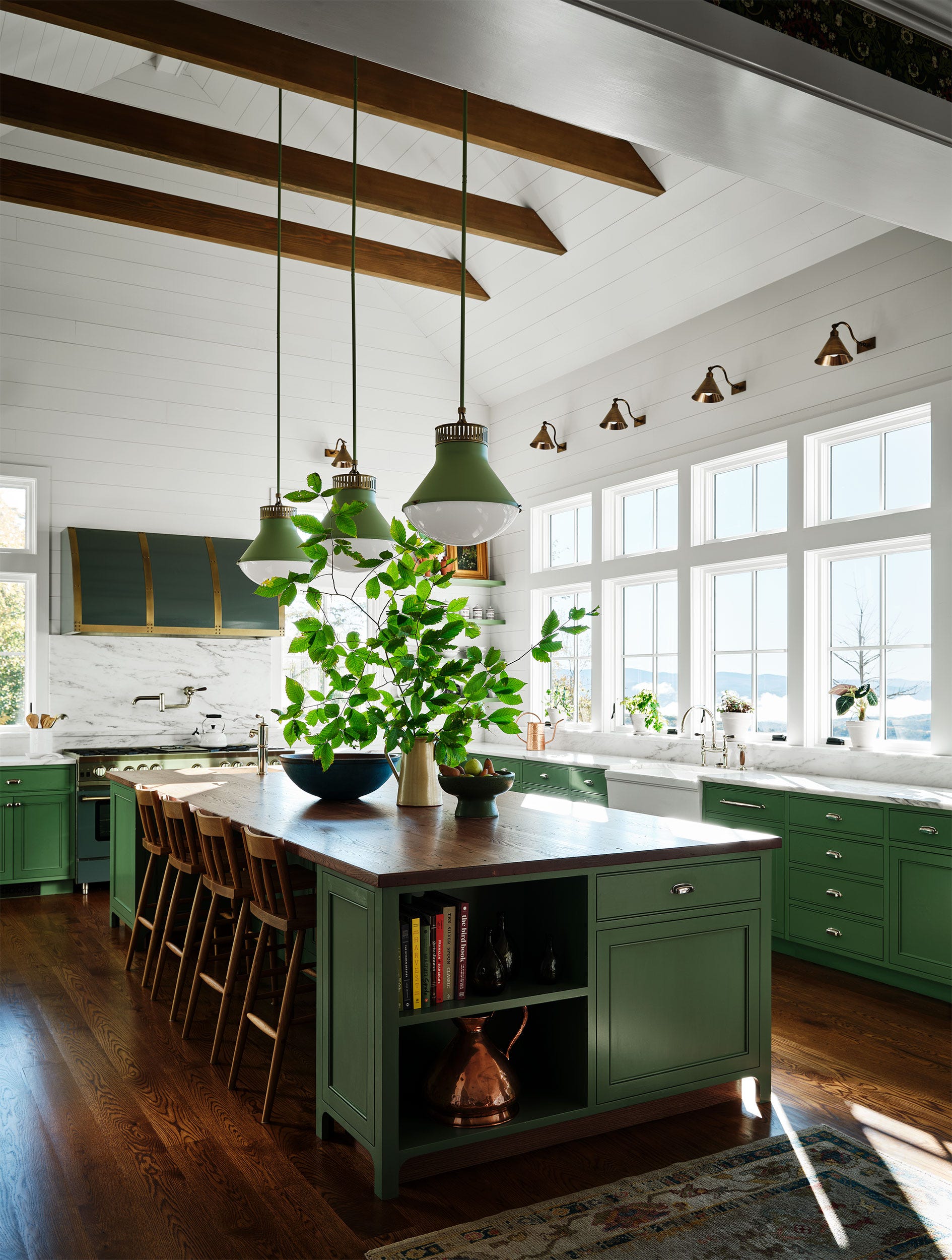
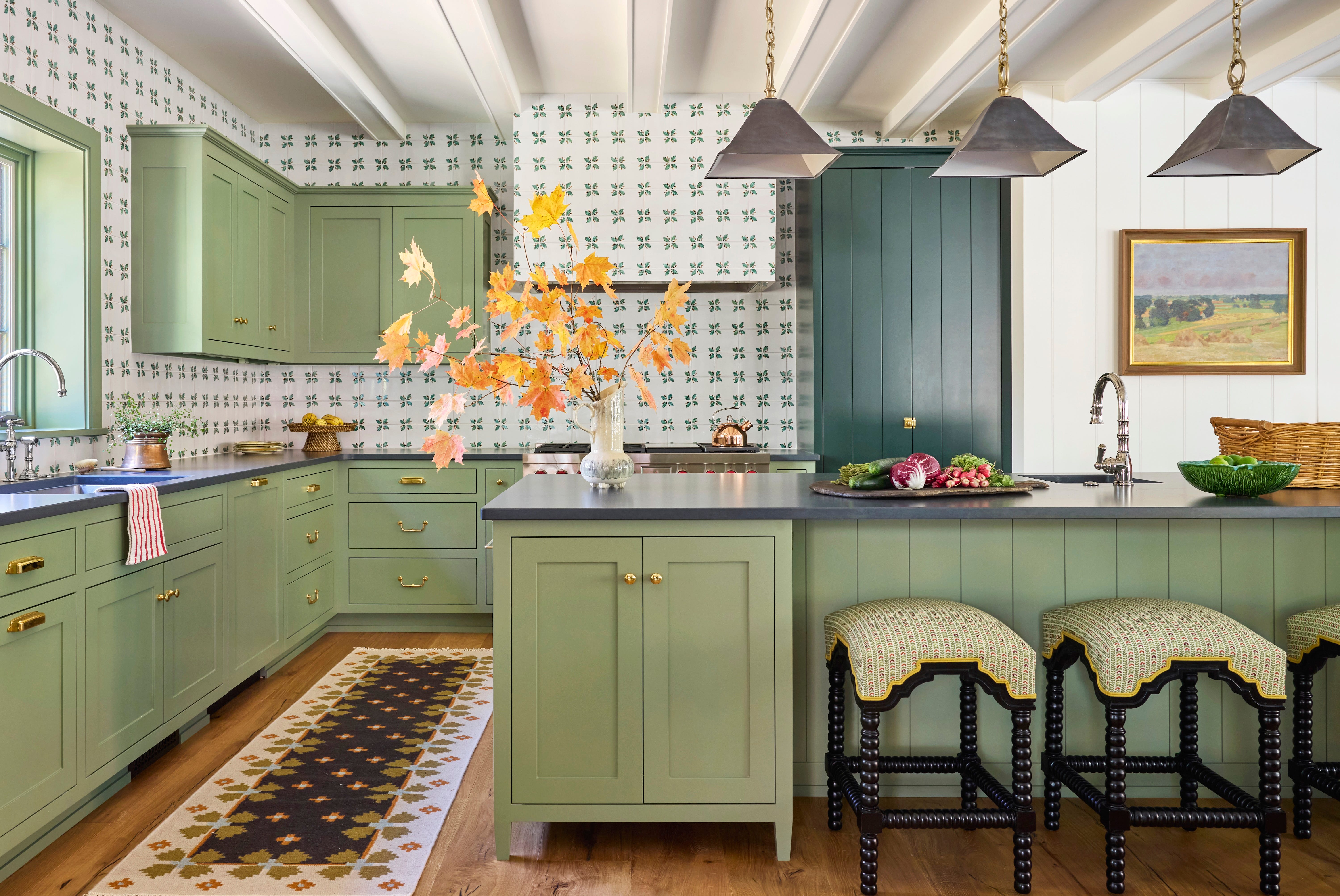
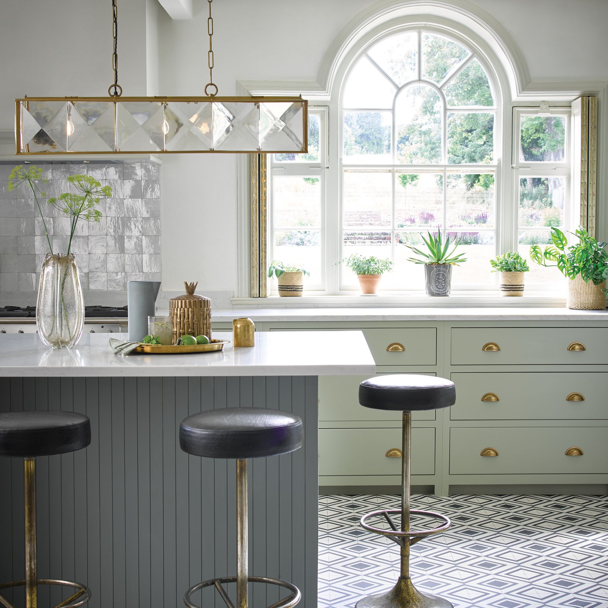
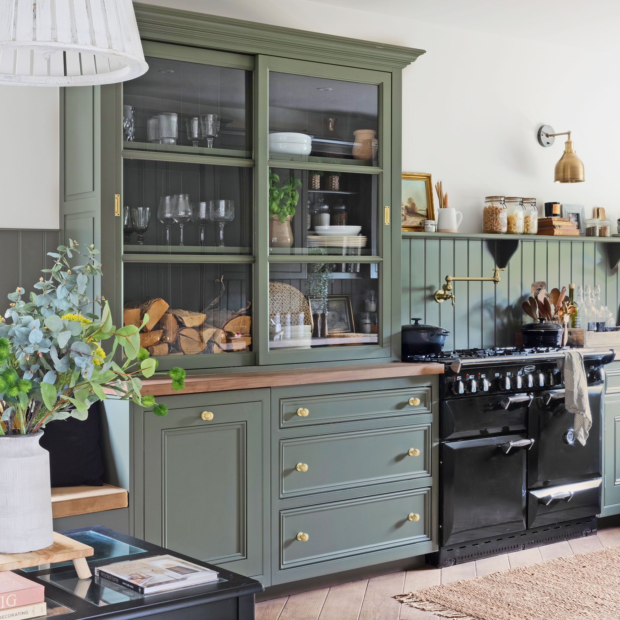
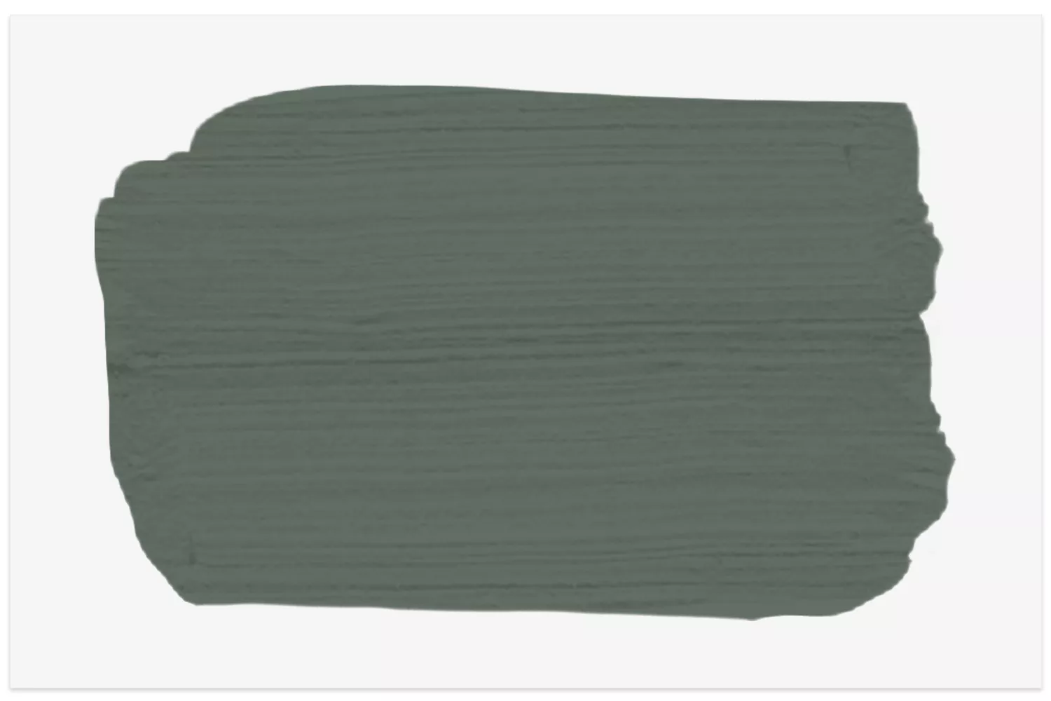
'Pewter Green by Sherwin-Williams' is a smoky, silvery green that pairs elegantly with marble countertops, as demonstrated by Emily Henderson's design. 'Hunter Dunn by Paint and Paper Library' offers a vibrant hunter green that feels fresh on hardware-less cabinetry, enhanced by elements like buttery yellow barstools and fluted glass. 'Caldwell Green by Benjamin Moore,' a sage-y olive, provides a cool contrast in a modern cabin kitchen designed by Shea McGee, complementing black hardware and white shiplap.
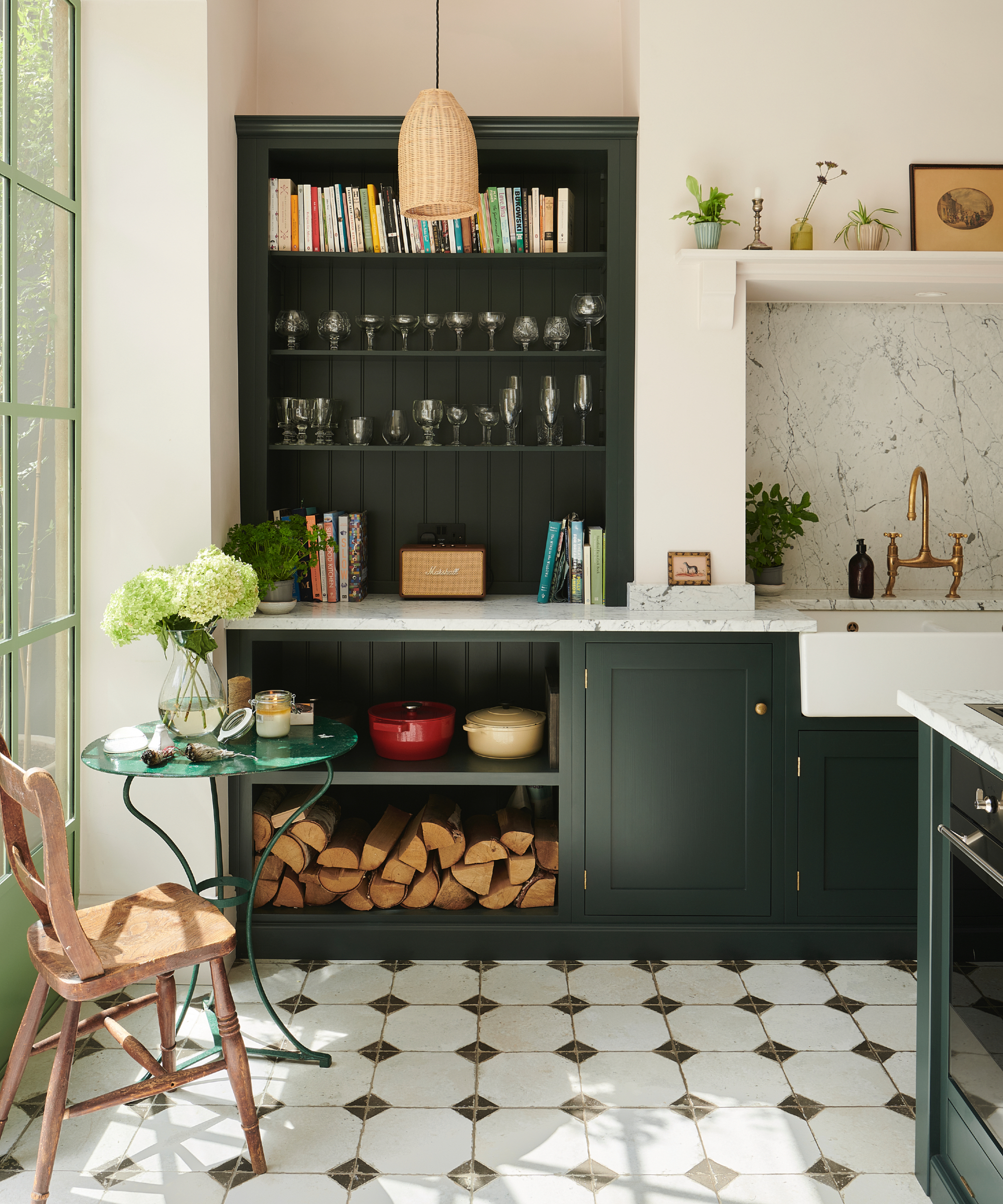
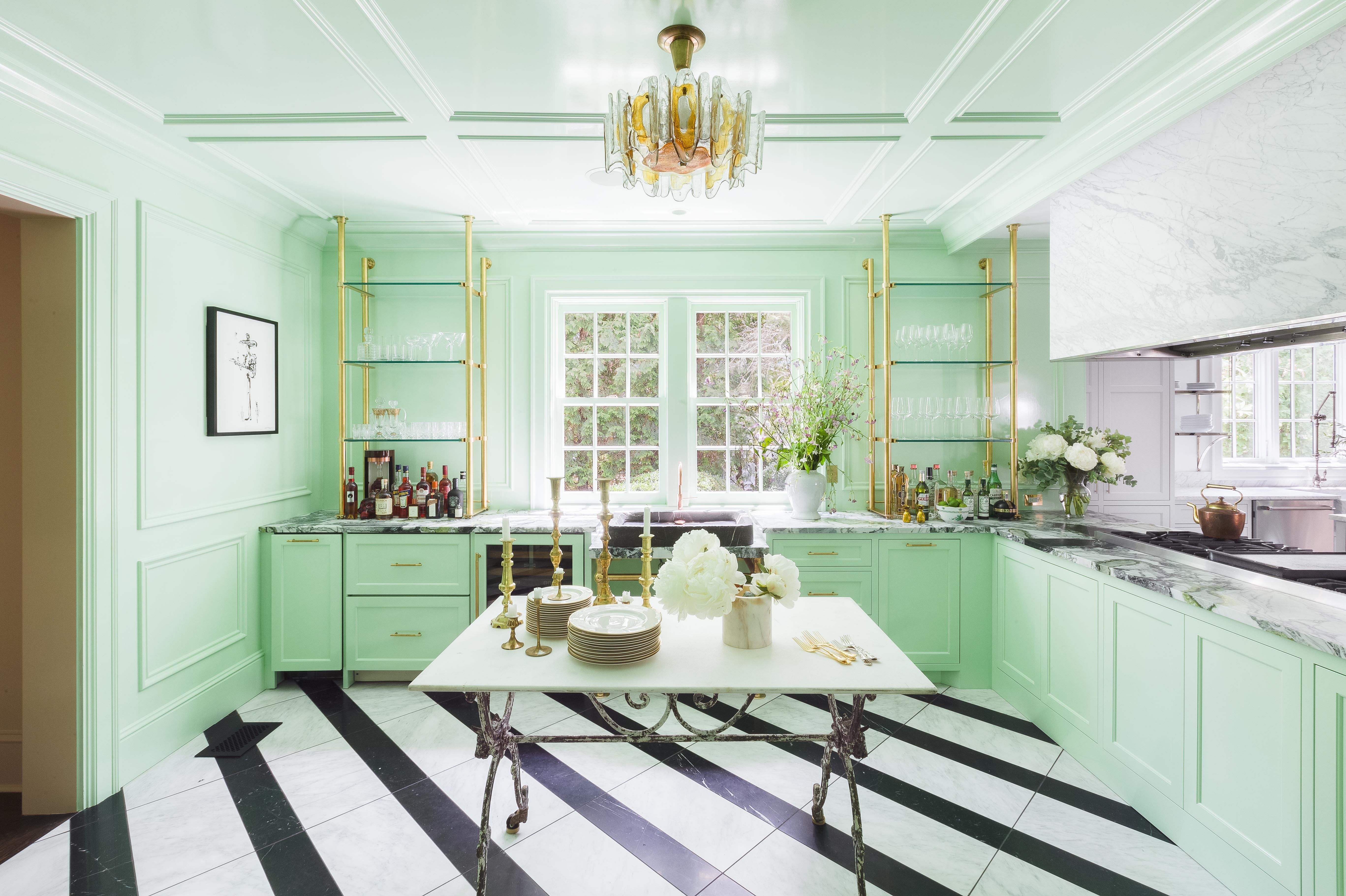
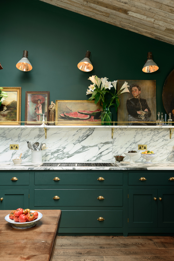
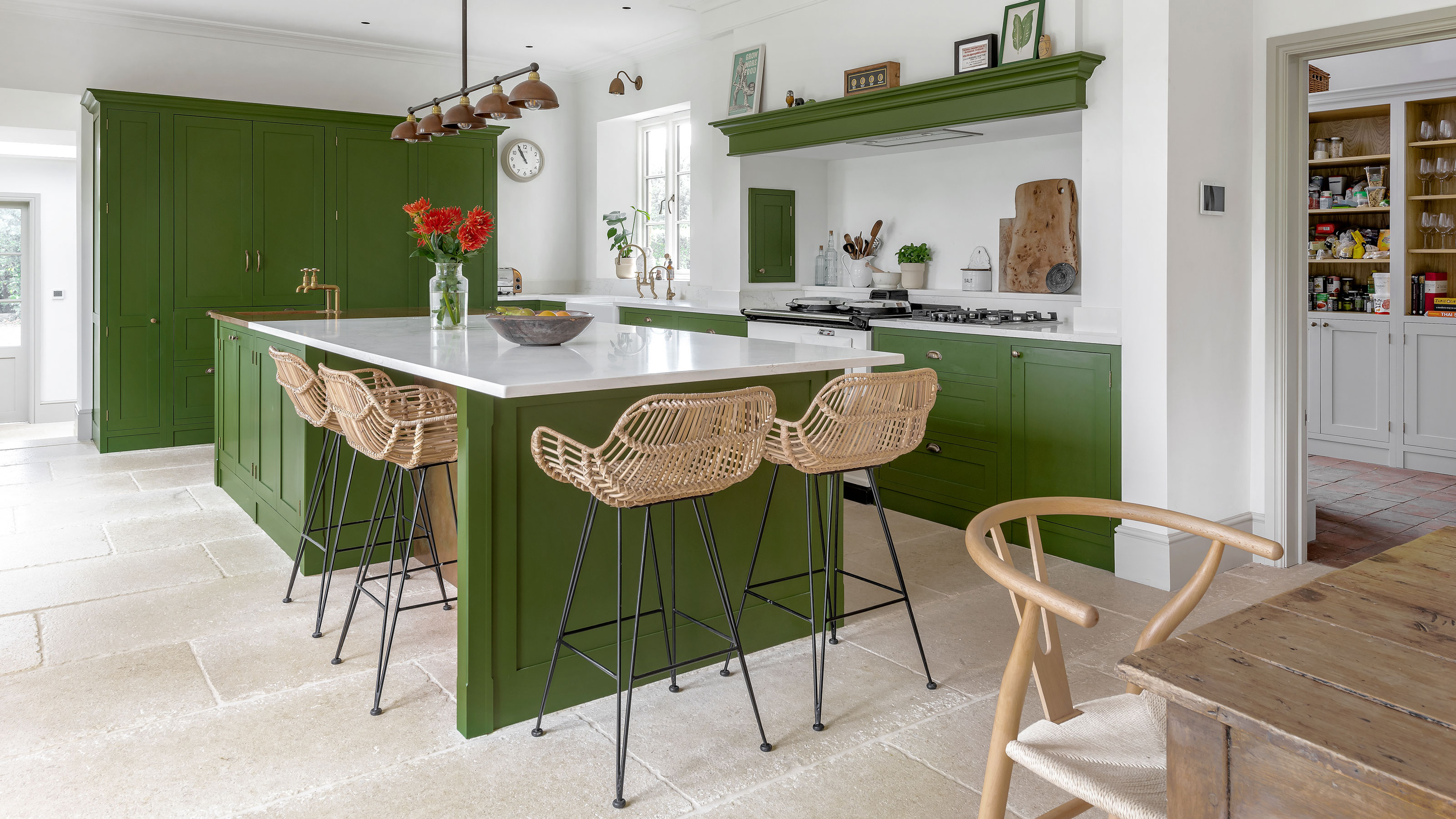
'Chimichurri by Benjamin Moore,' an herbaceous green with a satin finish, was chosen by Katie Hackworth for a small office kitchen. Lastly, 'Great Barrington Green by Benjamin Moore' is described as a moss green that emits a limelike glow in sunlight, used in Babba C. Rivera’s Brooklyn kitchen. The article also mentions a custom mix of 'Racing Green' and 'Emerald Green' by DeVol Kitchens, which elevates rustic wood details, and 'Moth’s Wing by Behr,' a whimsical pastel mint green used in Lourdes Hernández’s Los Angeles kitchen, further accentuated by a pale yellow refrigerator and colorful pendant lights. These examples illustrate the diverse applications and effects of green paint in kitchen design.
#KitchenDesign #GreenKitchens #PaintColors #HomeDecor #InteriorDesign #CabinetColors #DesignInspiration #ShadesOfGreen #KitchenRenovation #KitchenDesign #GreenKitchens #PaintColors #HomeDecor #InteriorDesign #CabinetColors #DesignInspiration #ShadesOfGreen #KitchenRenovation
合計0件のコメント
 まだコメントはありません
あなたも好きかもしれません
Designers Love Using THIS Color to Make a Kitchen Look More "Expensive"

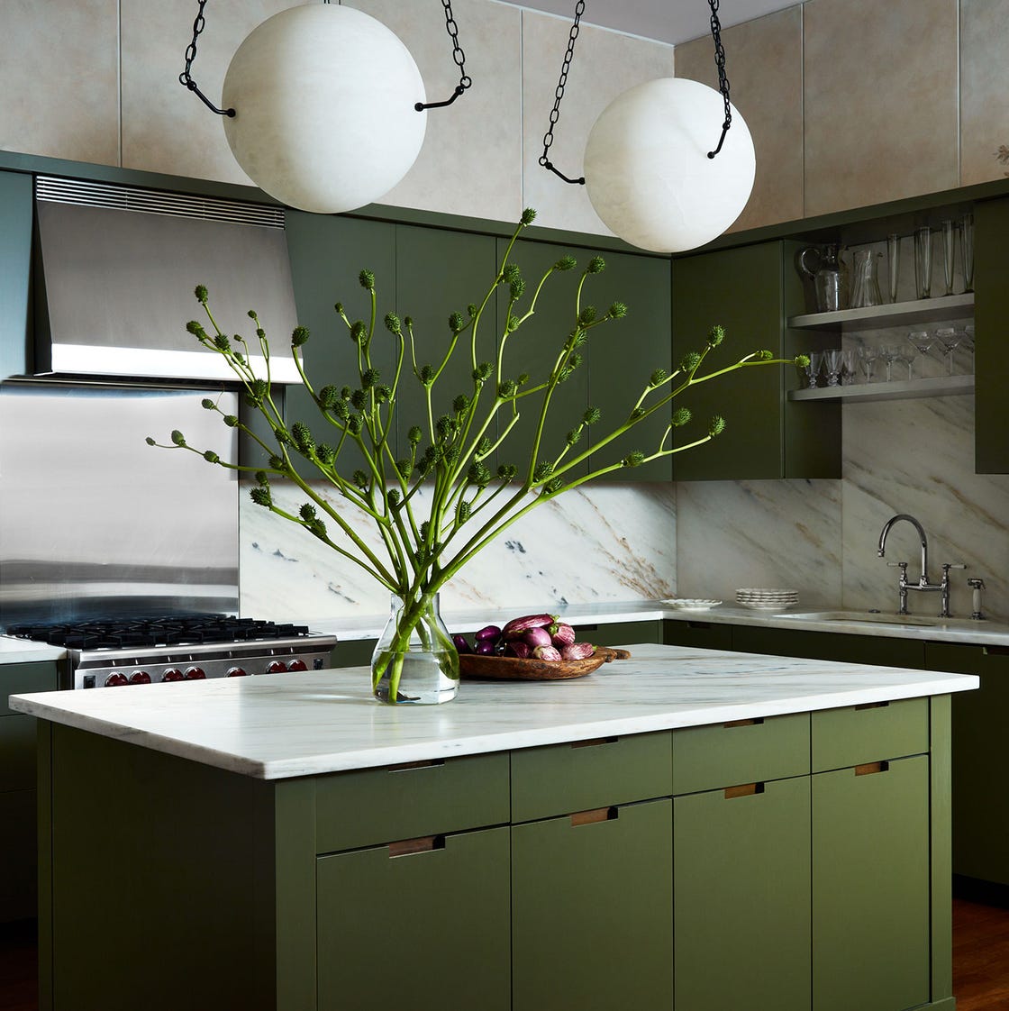
37 Green Kitchen Ideas for the Freshest Cooking Space Ever in 2025
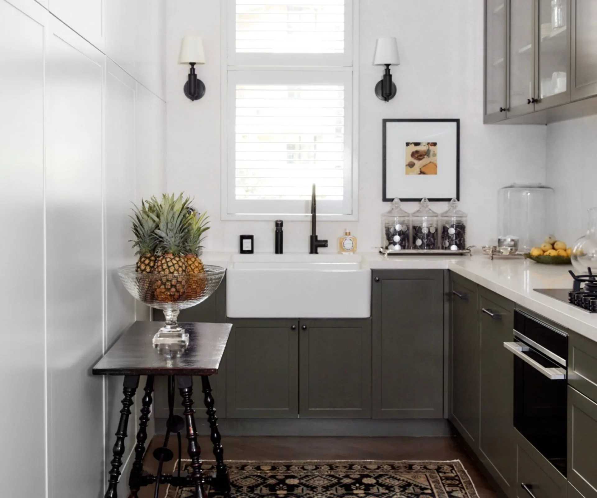
22 green kitchens that are guaranteed to induce envy

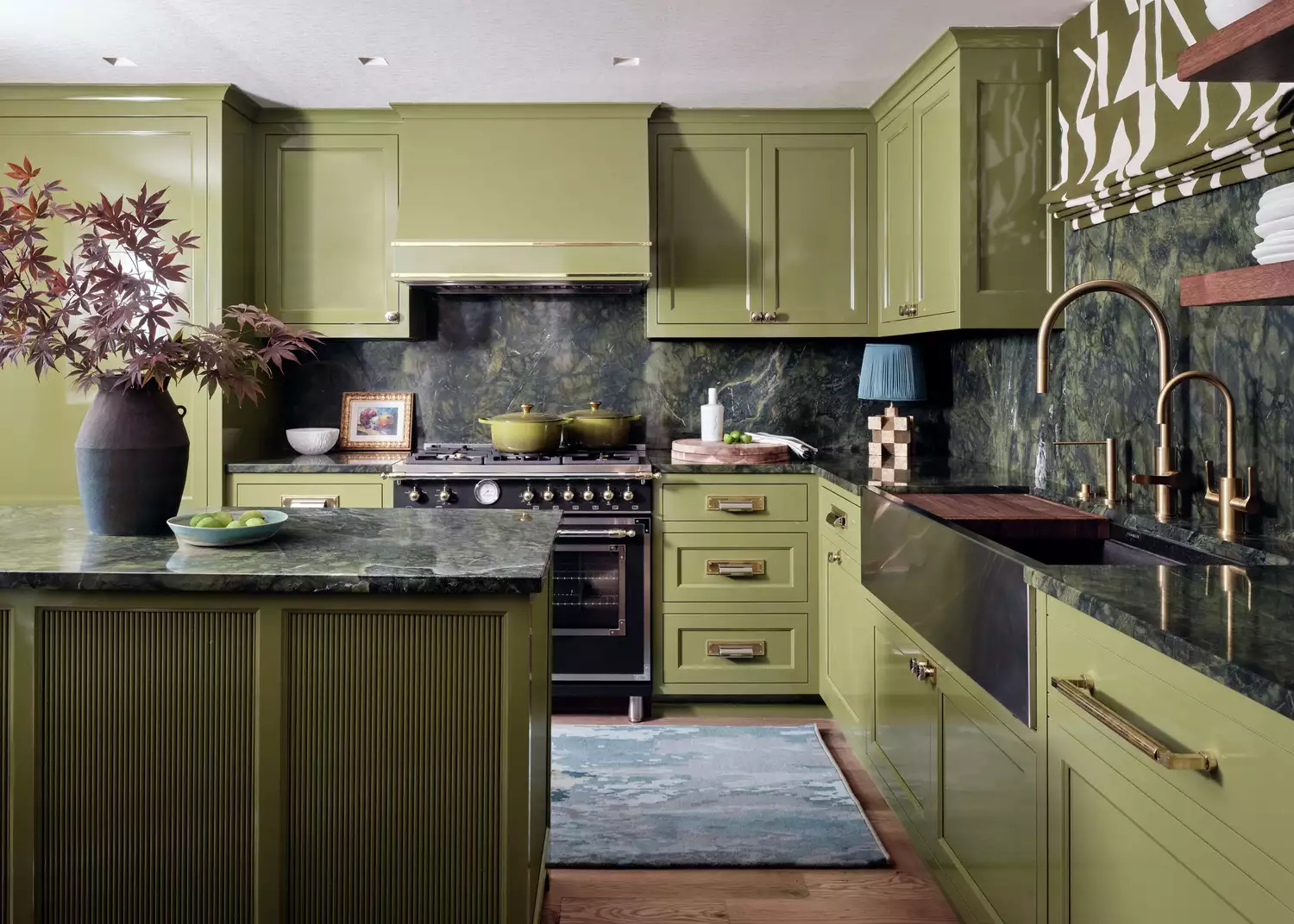
16 Green Kitchen Cabinet Ideas for a Timeless and Stylish Space
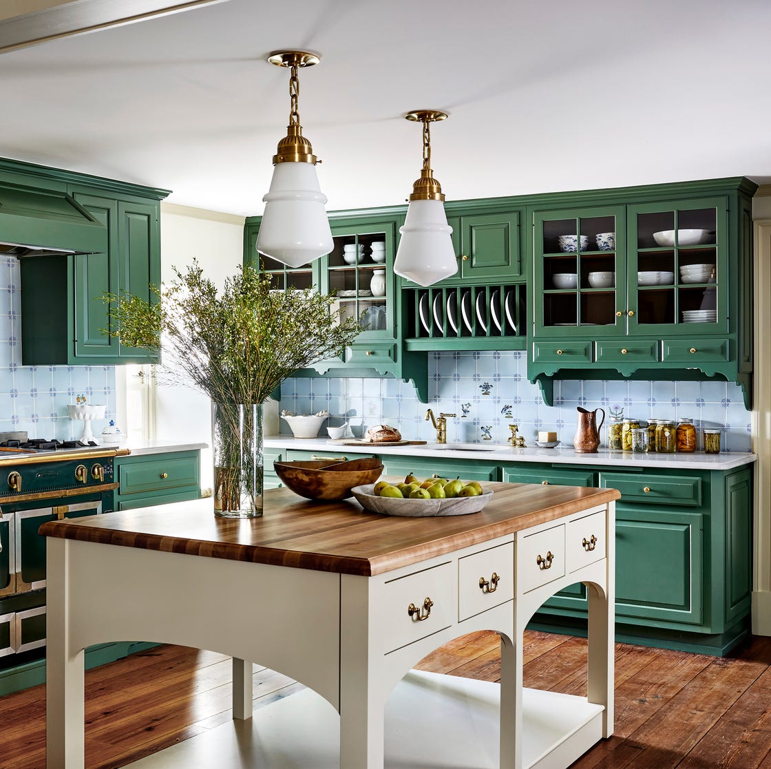
From Racing Green to Barbour Coat Green: The British-Inspired Kitchen Look You’ll See Everywhere
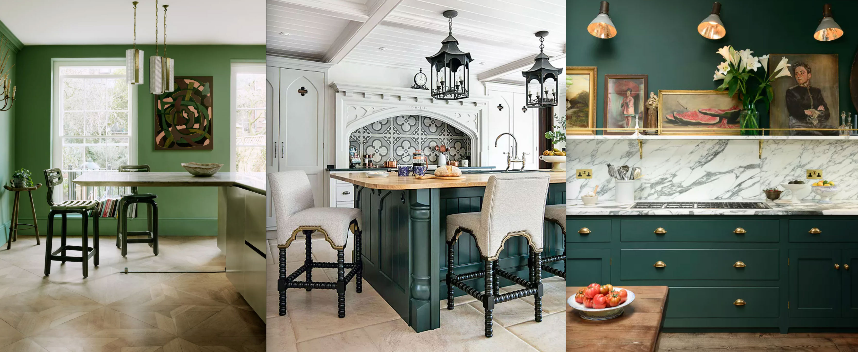
Green kitchen ideas: 16 ways to use olive, sage, apple and more

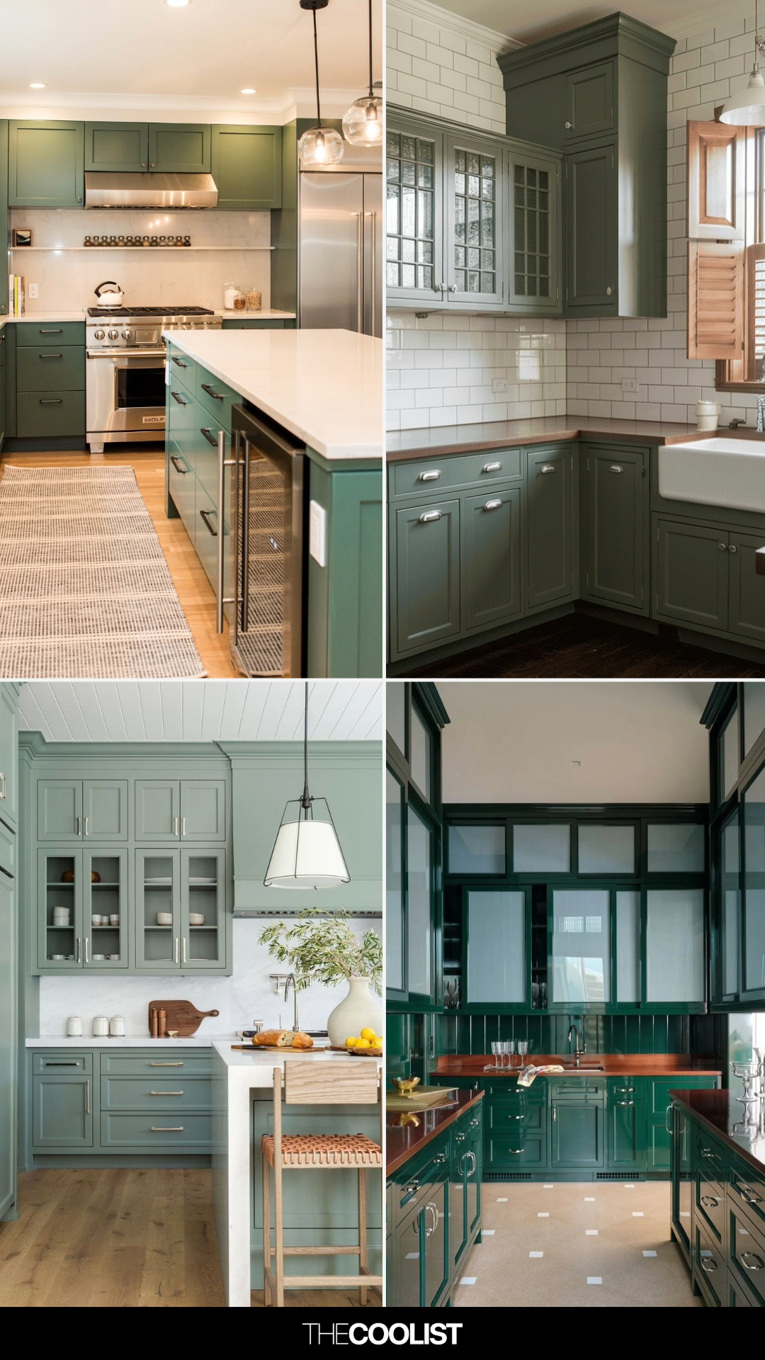
26 Green Kitchen Cabinet Ideas That Fix the “I Want Color But Not Too Much” Struggle
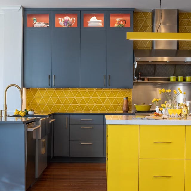
Ditch the White! Try One of These Designer-Approved Kitchen Colors

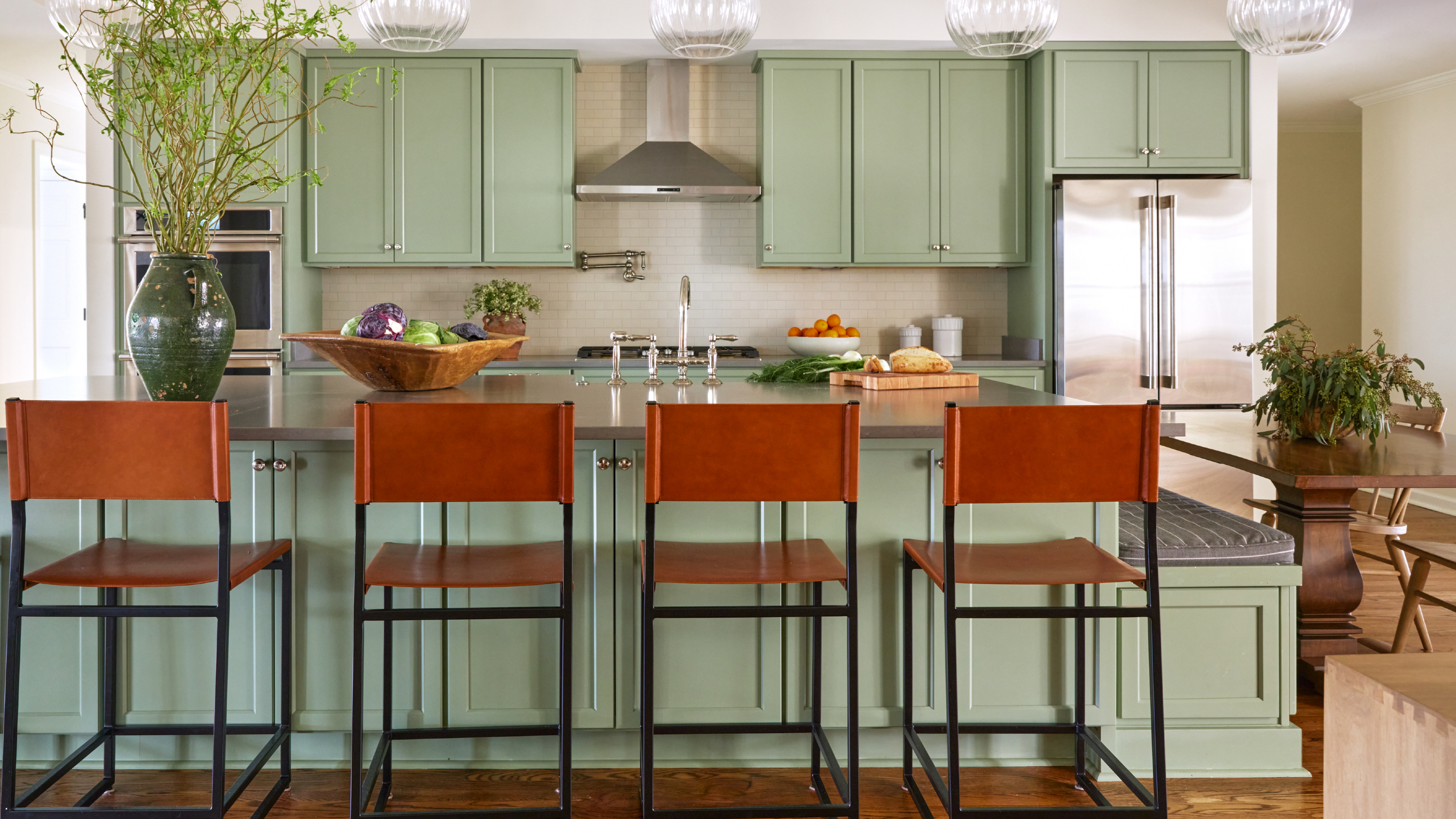
9 green kitchen cabinet ideas for a fresh look

14 Best Green Paint Colors

5 Kitchen Paint Color Trends to Watch in 2024
14 Kitchen Cabinet Colors You Can Easily Mix and Match

These Will Be the Most Popular Kitchen Paint Colors In 2025, According to Interior Designers

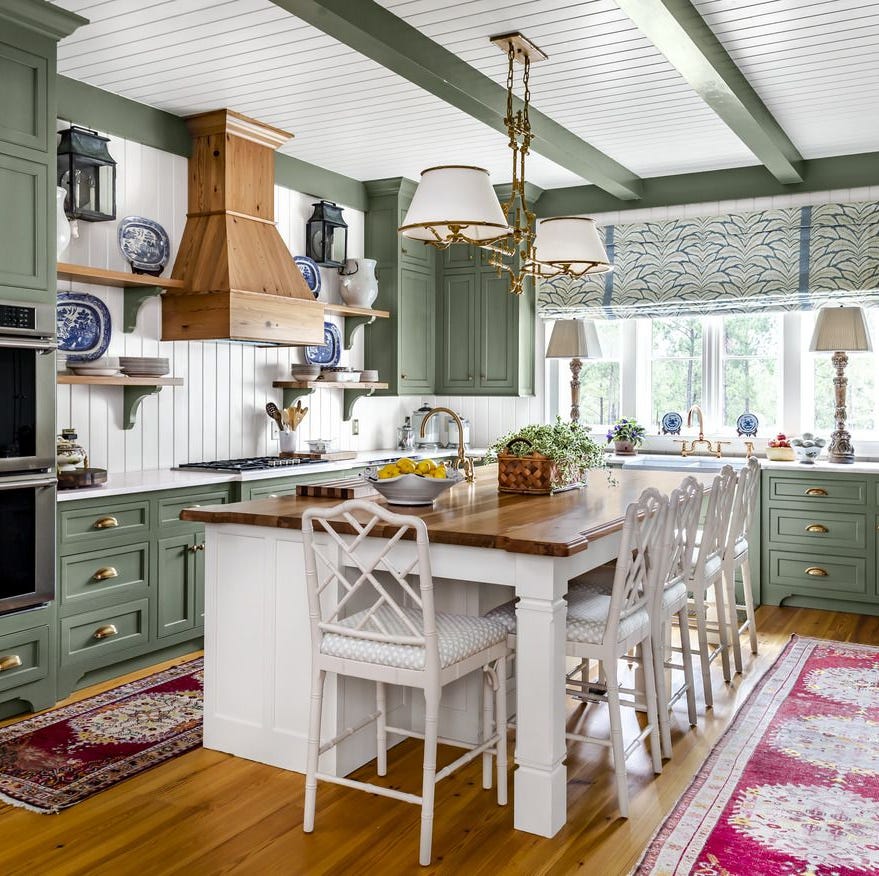
The Kitchen of Your Dreams Is Just a Paintbrush Away
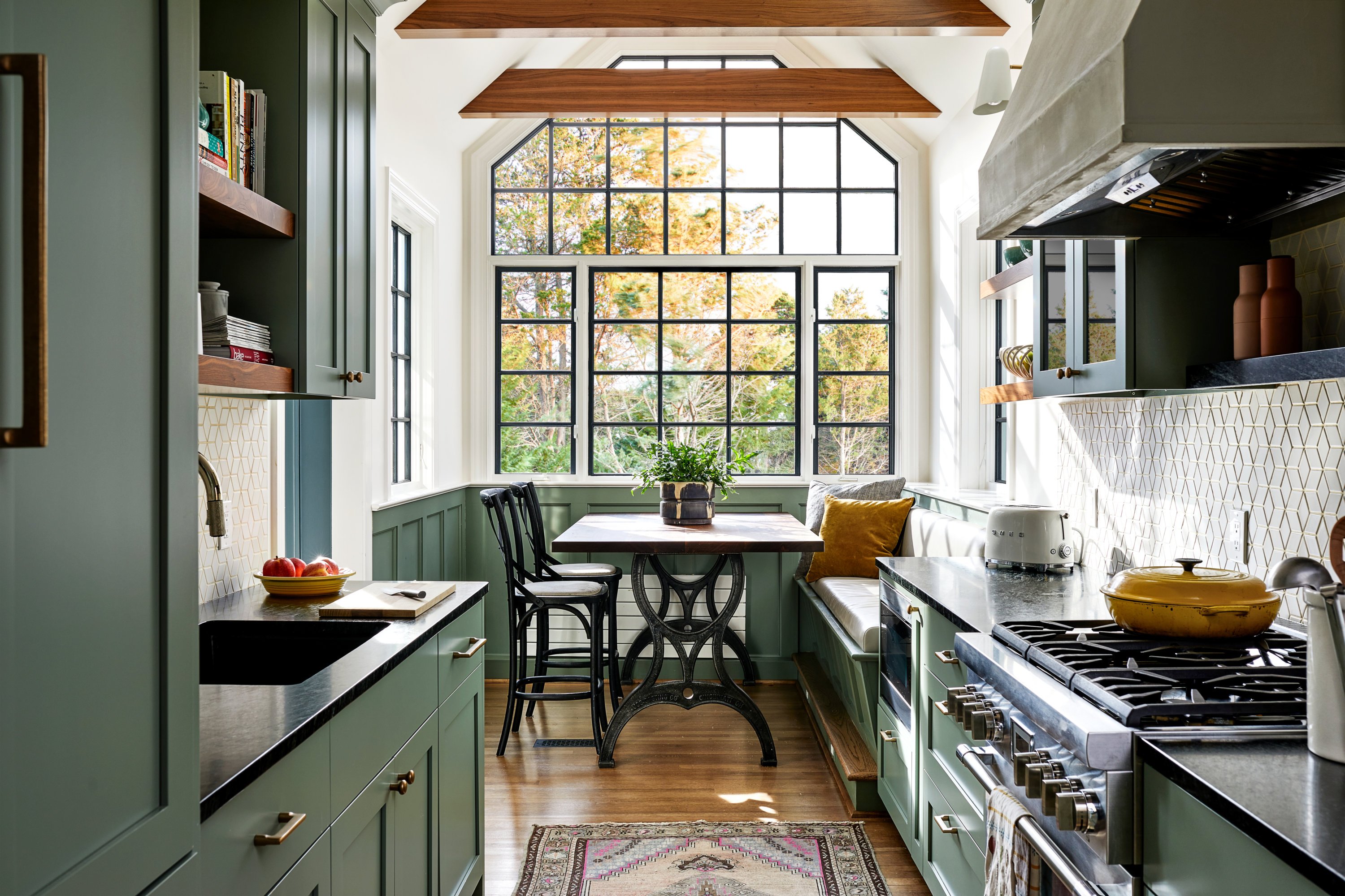
Are Green Kitchen Cabinets a Good Idea?
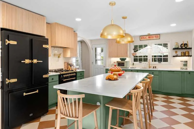
These 13 Green Paint Colors Are the Best We’ve Ever Seen

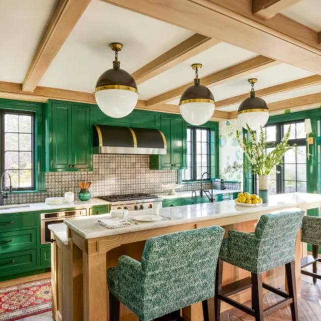
15 Green Kitchens You're About to Envy Hard
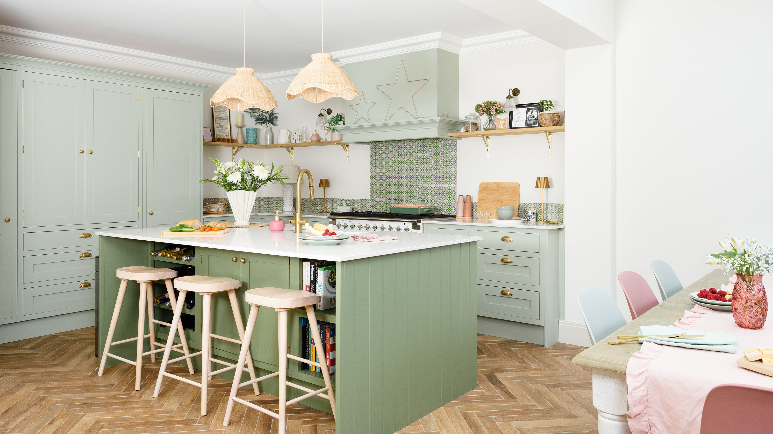
19 green kitchen ideas – verdant shades guaranteed to breathe life into your cooking space
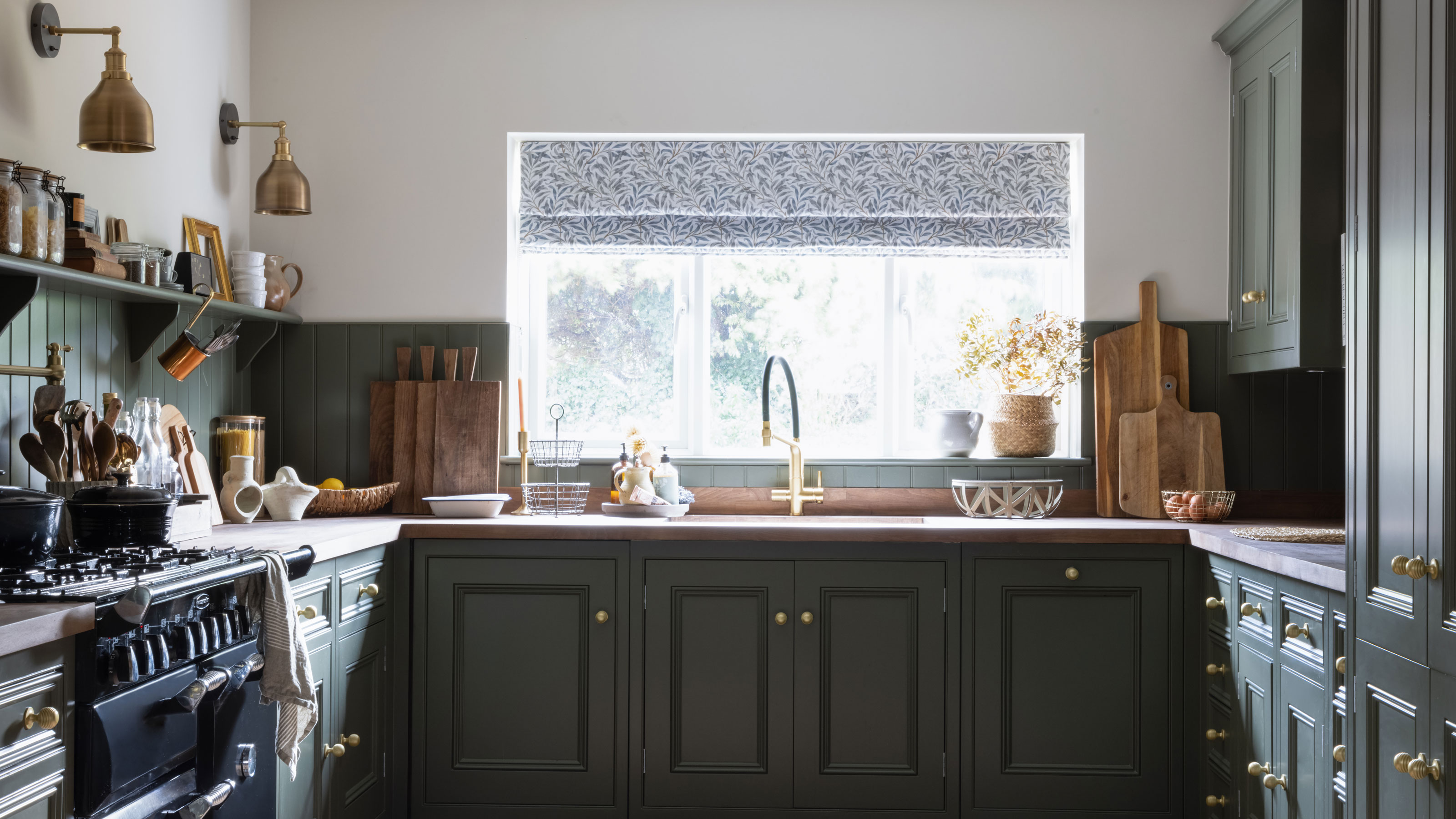
These are the 3 wall colours to avoid if you have a green kitchen - and the expert-approved shades to try instead
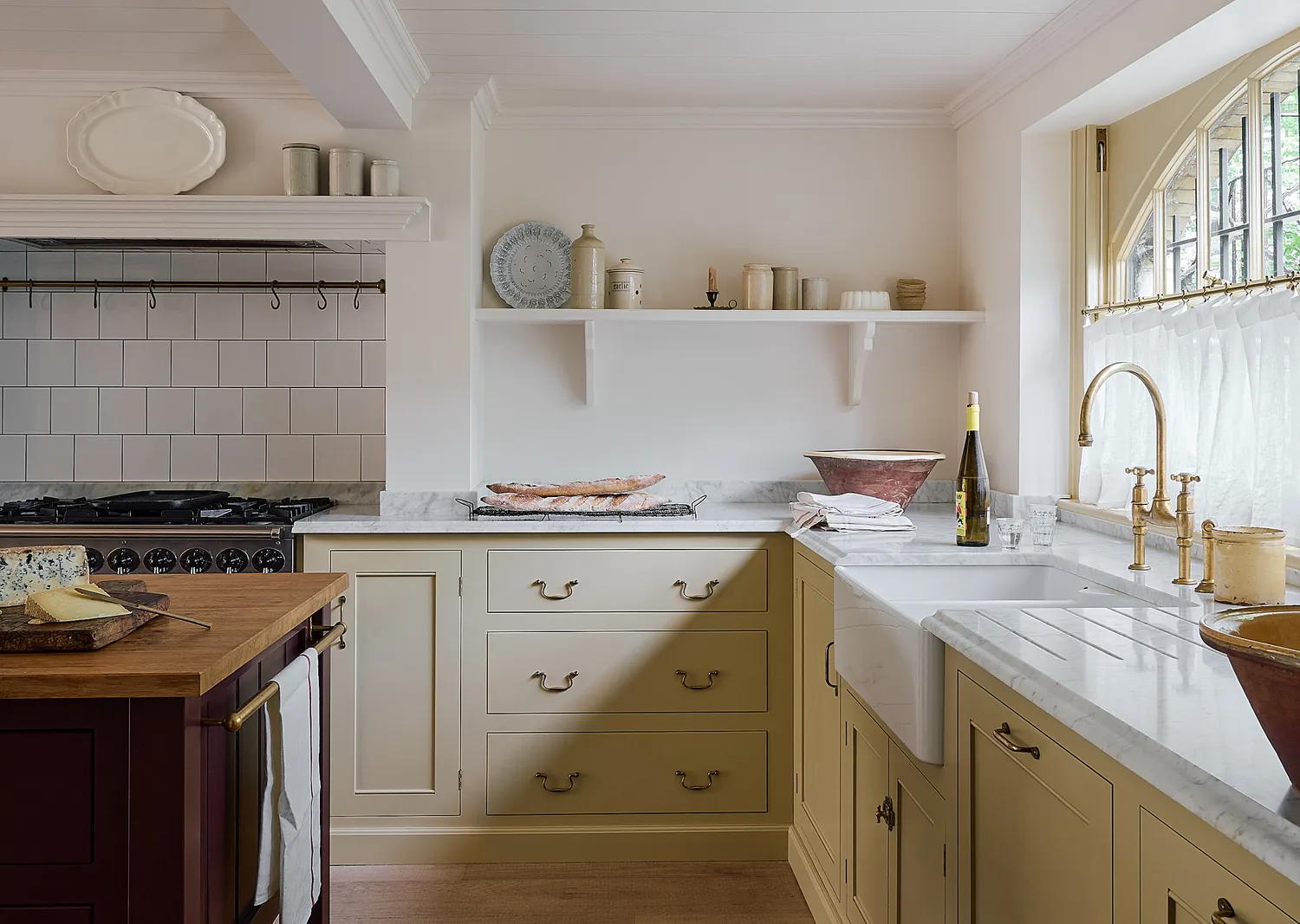
The 6 Most Popular Kitchen Cabinet Paint Colors for 2026, According to Designers