1/8
It’s Cozy Season, and Nothing Says 'Snug and Restful' More Than Johnny Galecki's Cabin-Style Kitchen – the Autumnal Color Palette Is a Game-Changer
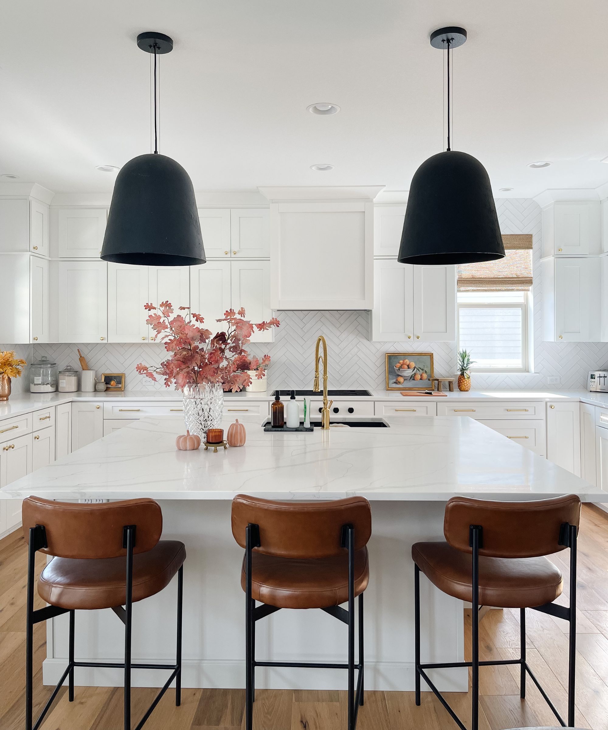
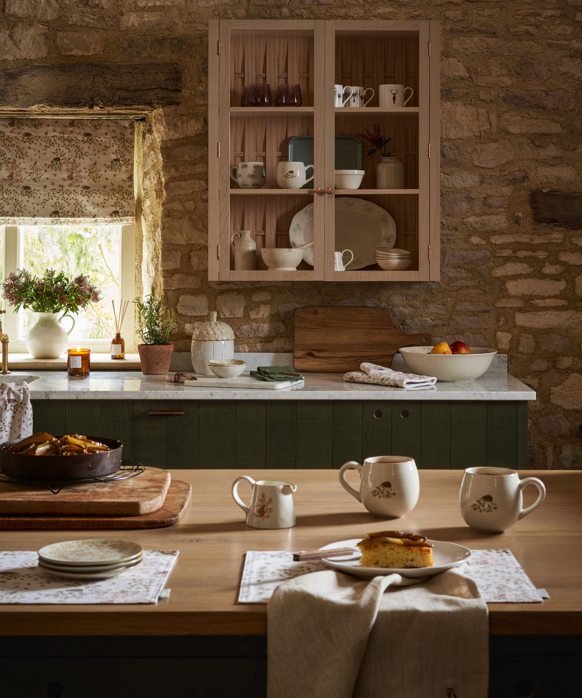
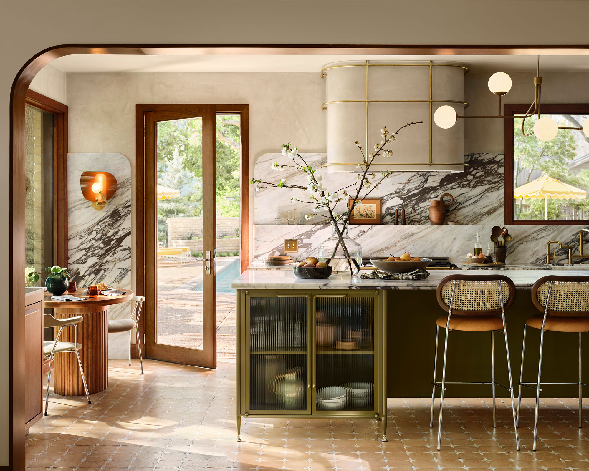
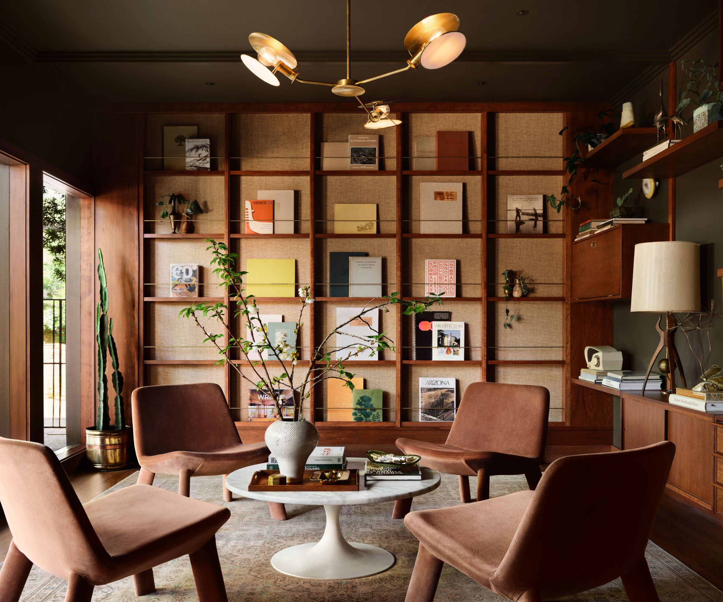
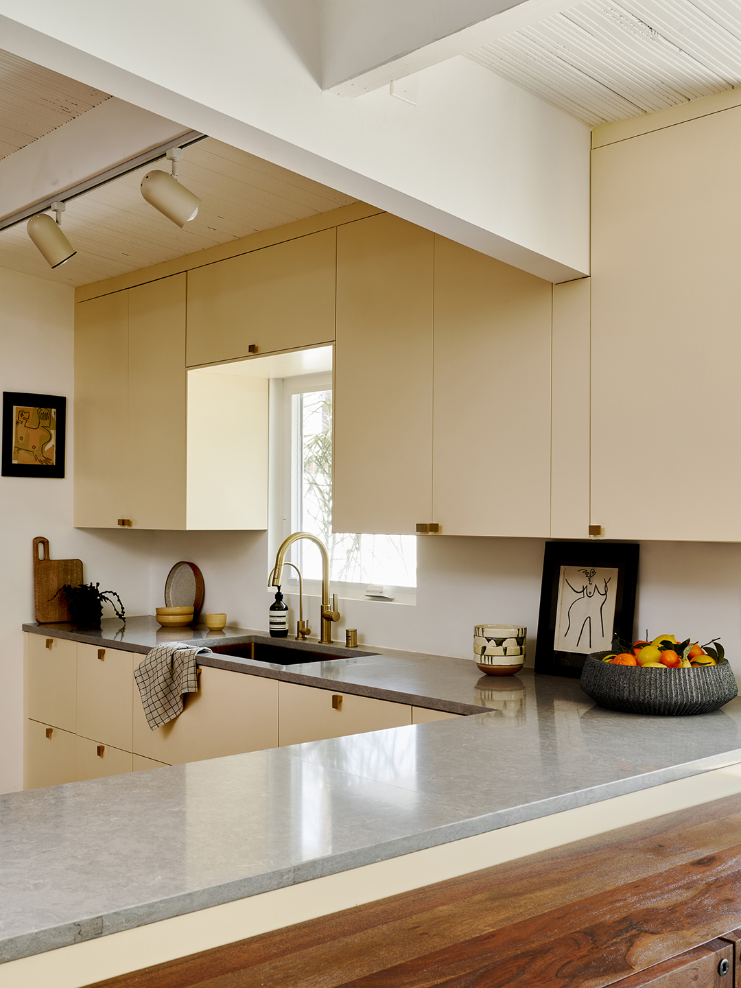
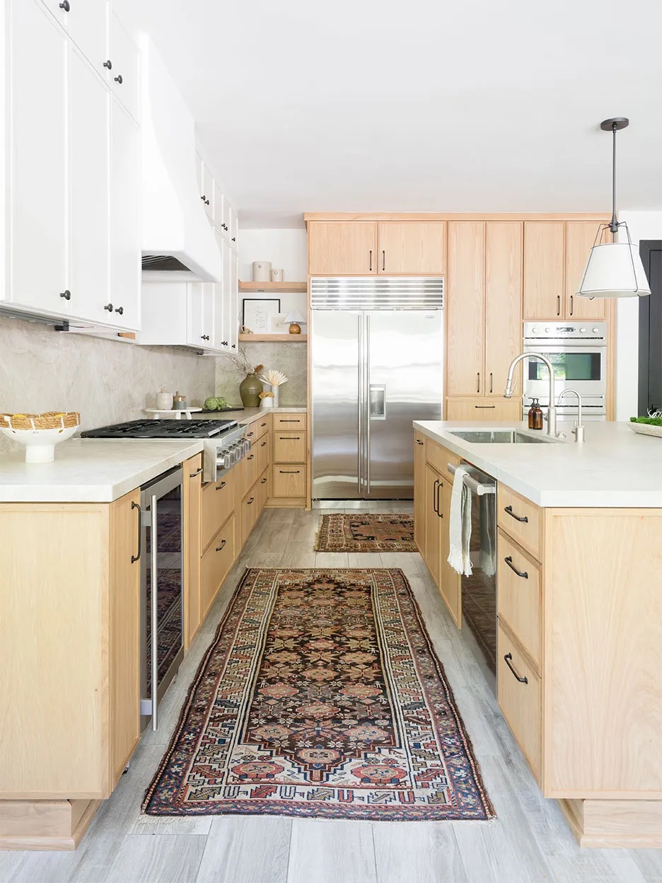
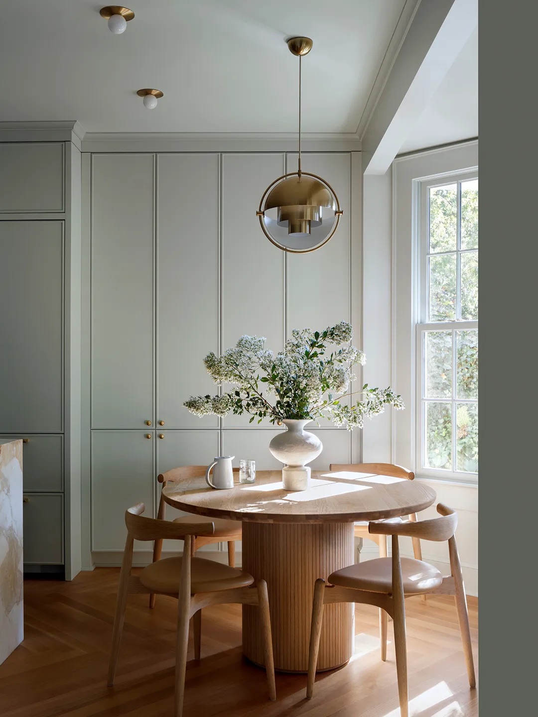
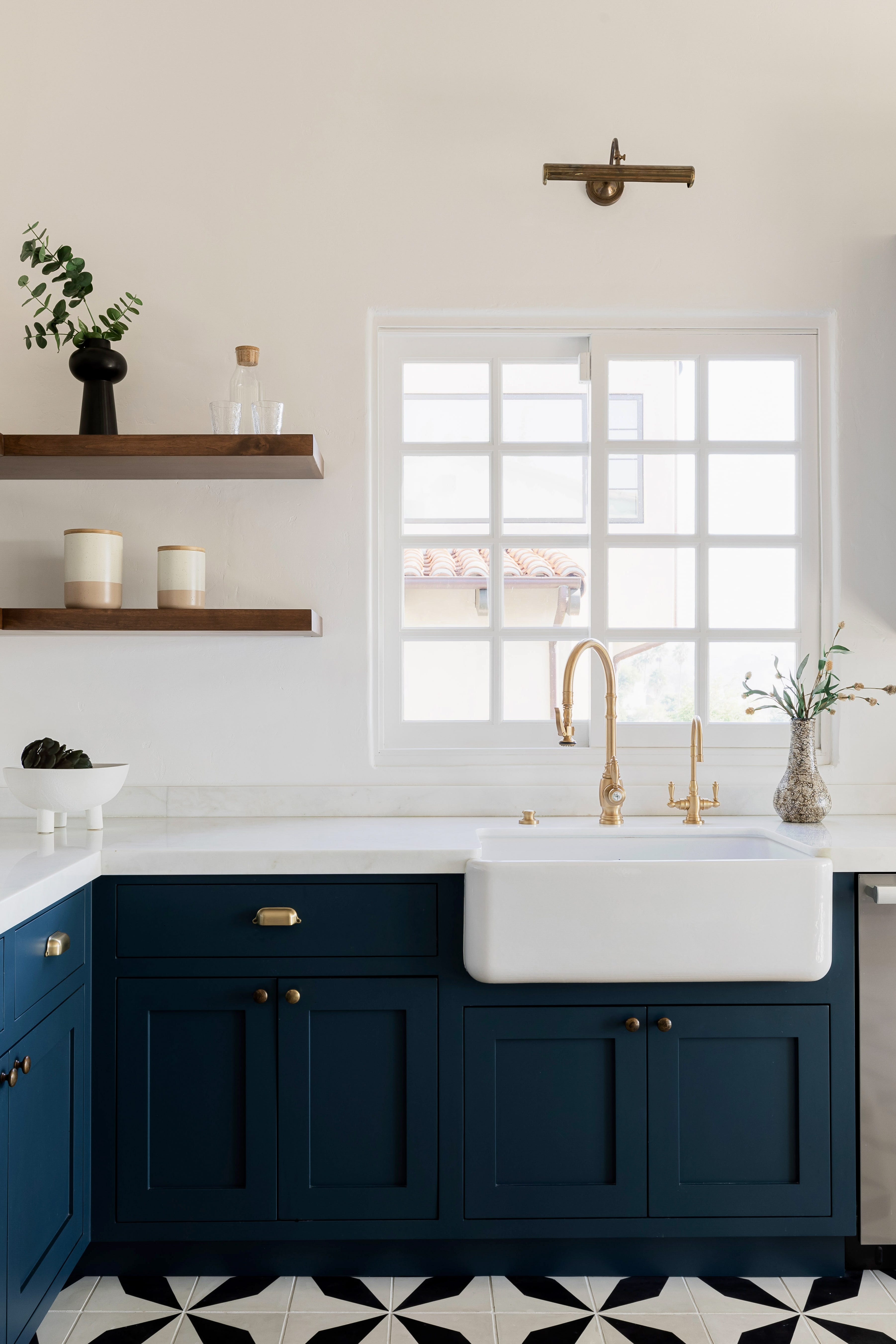
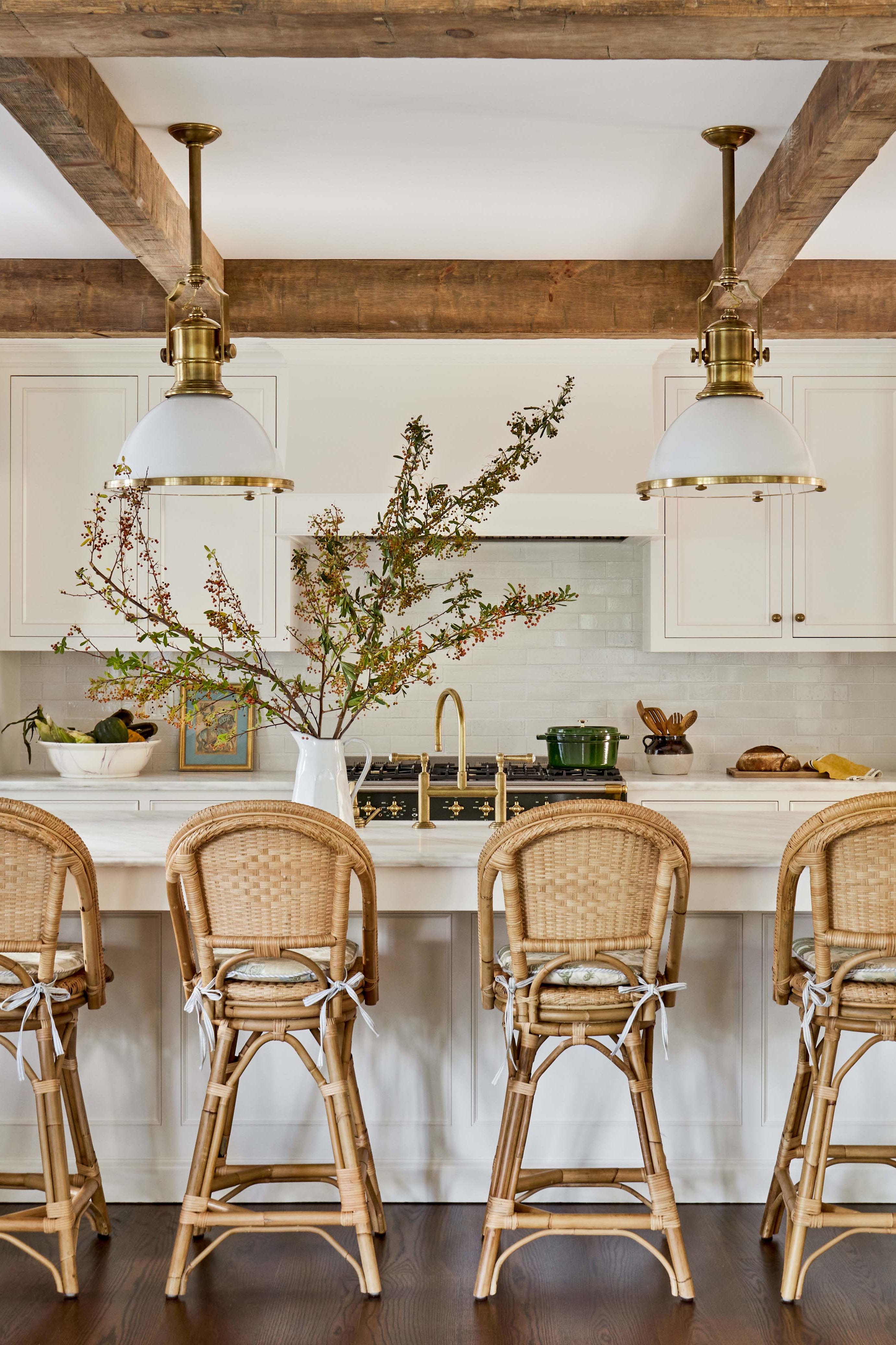
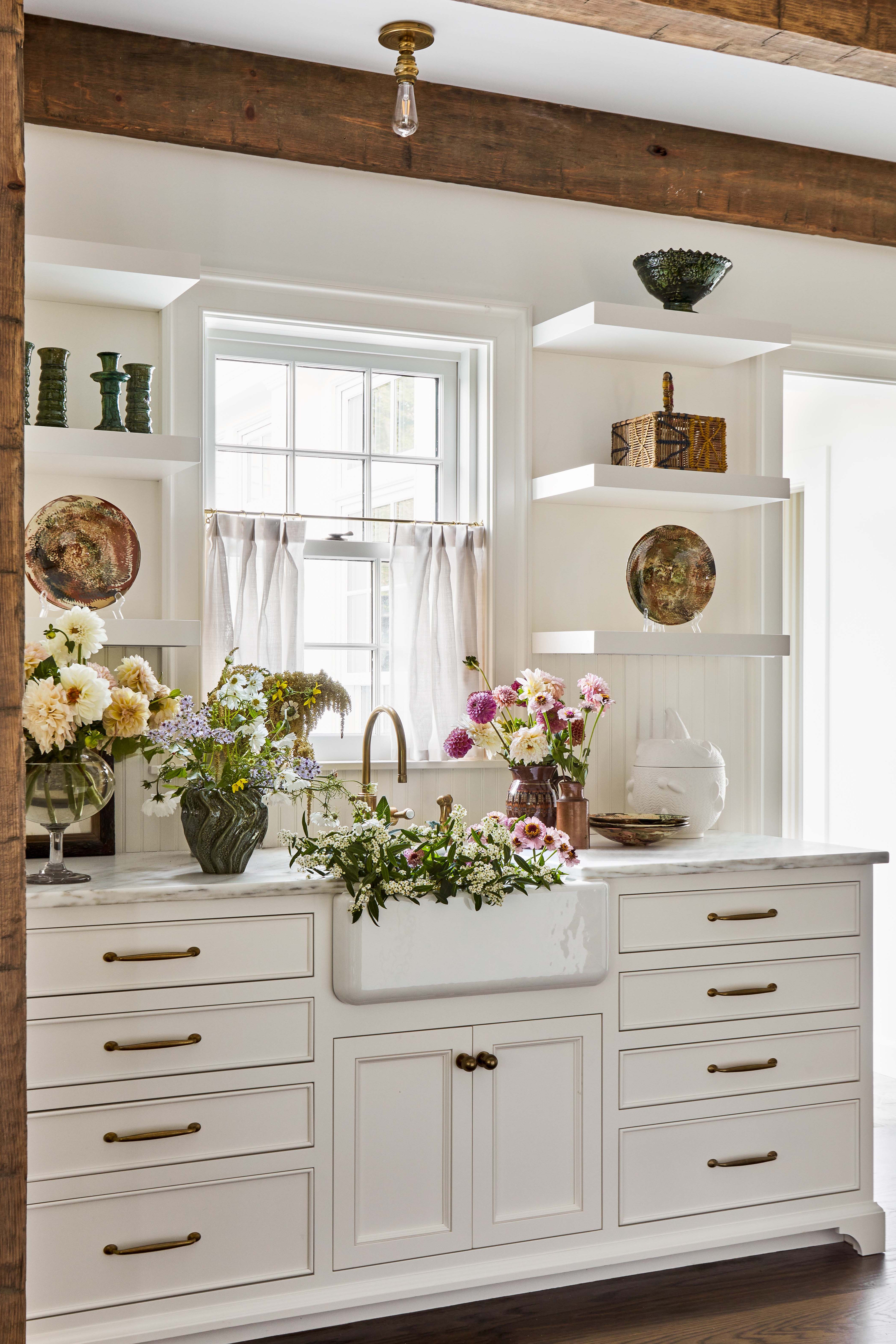
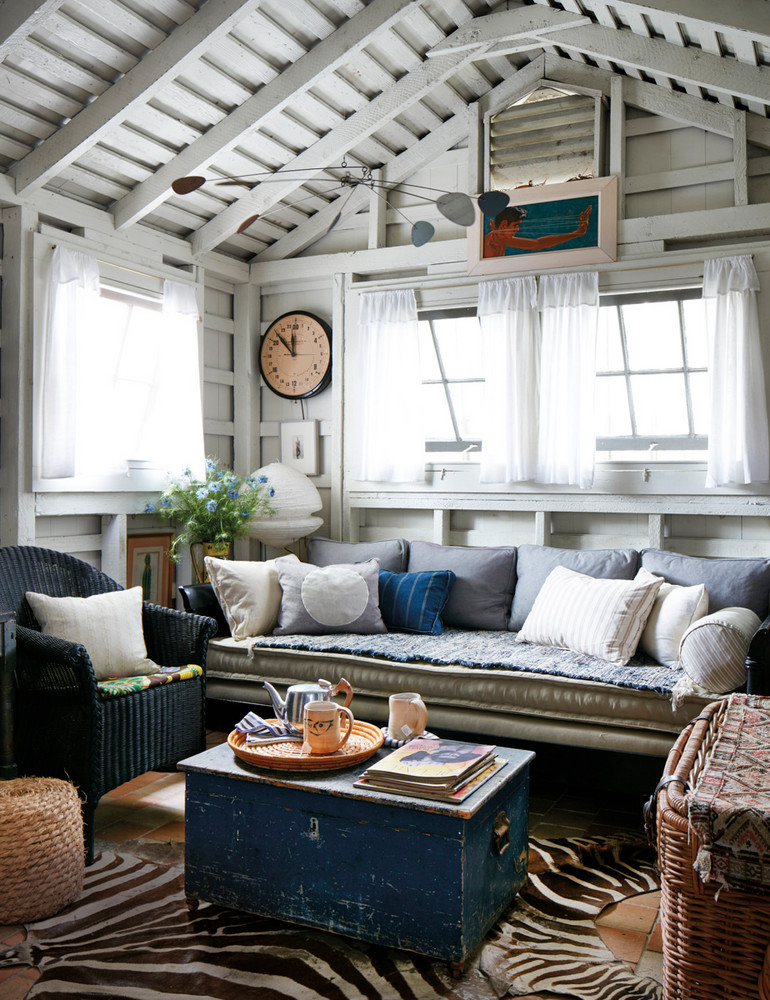
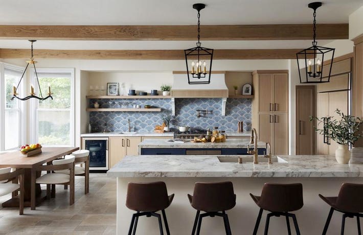
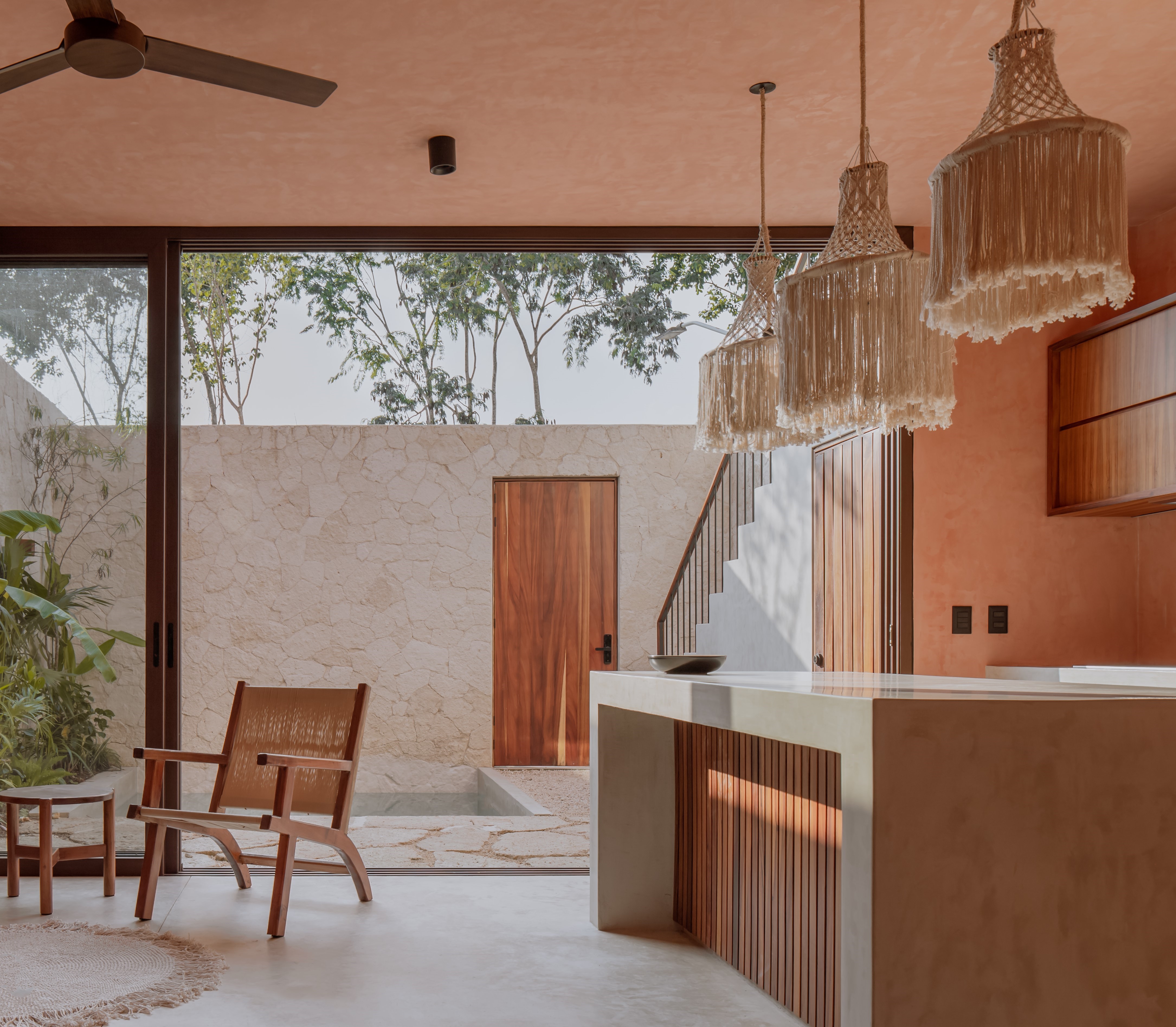
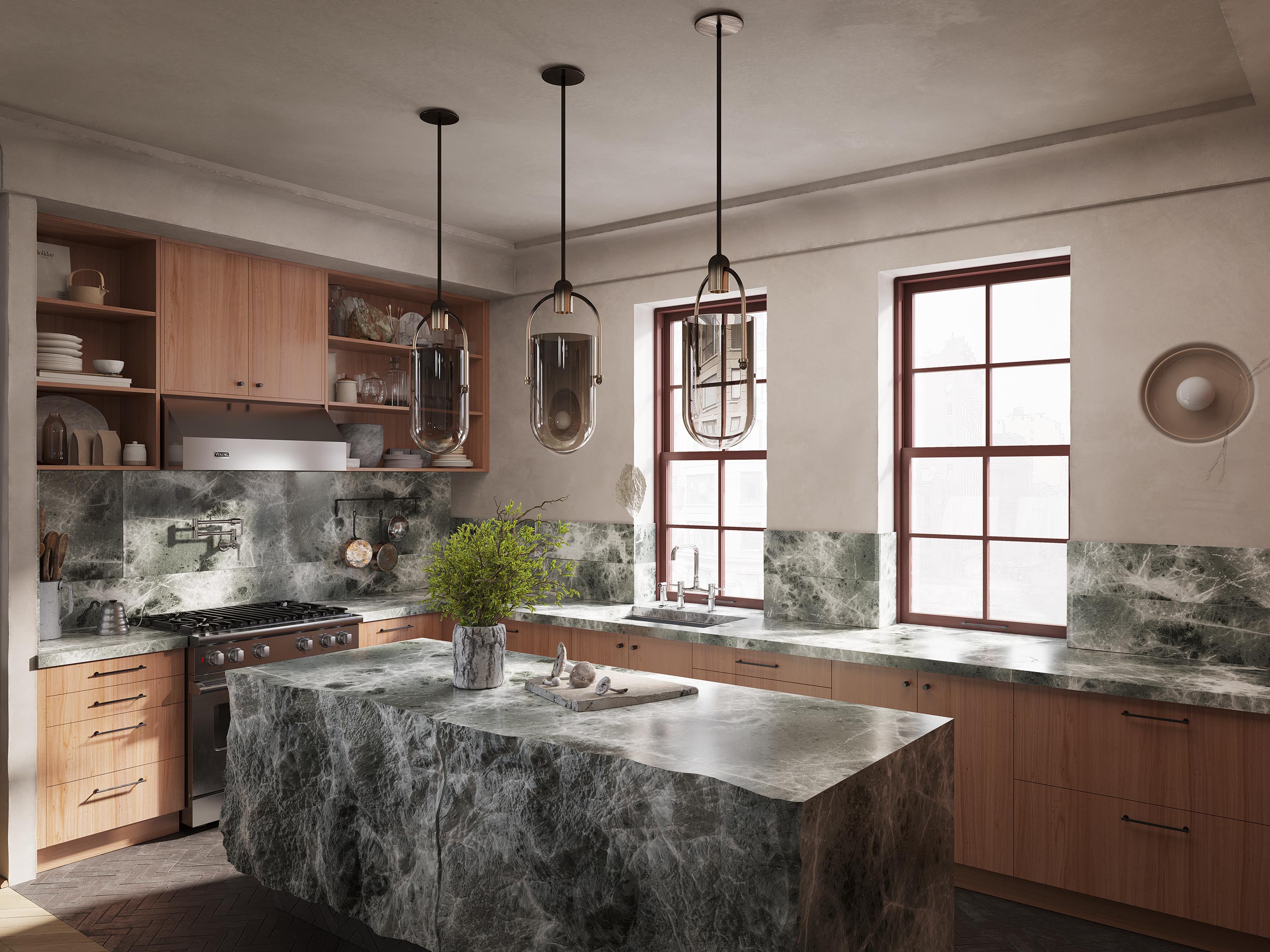
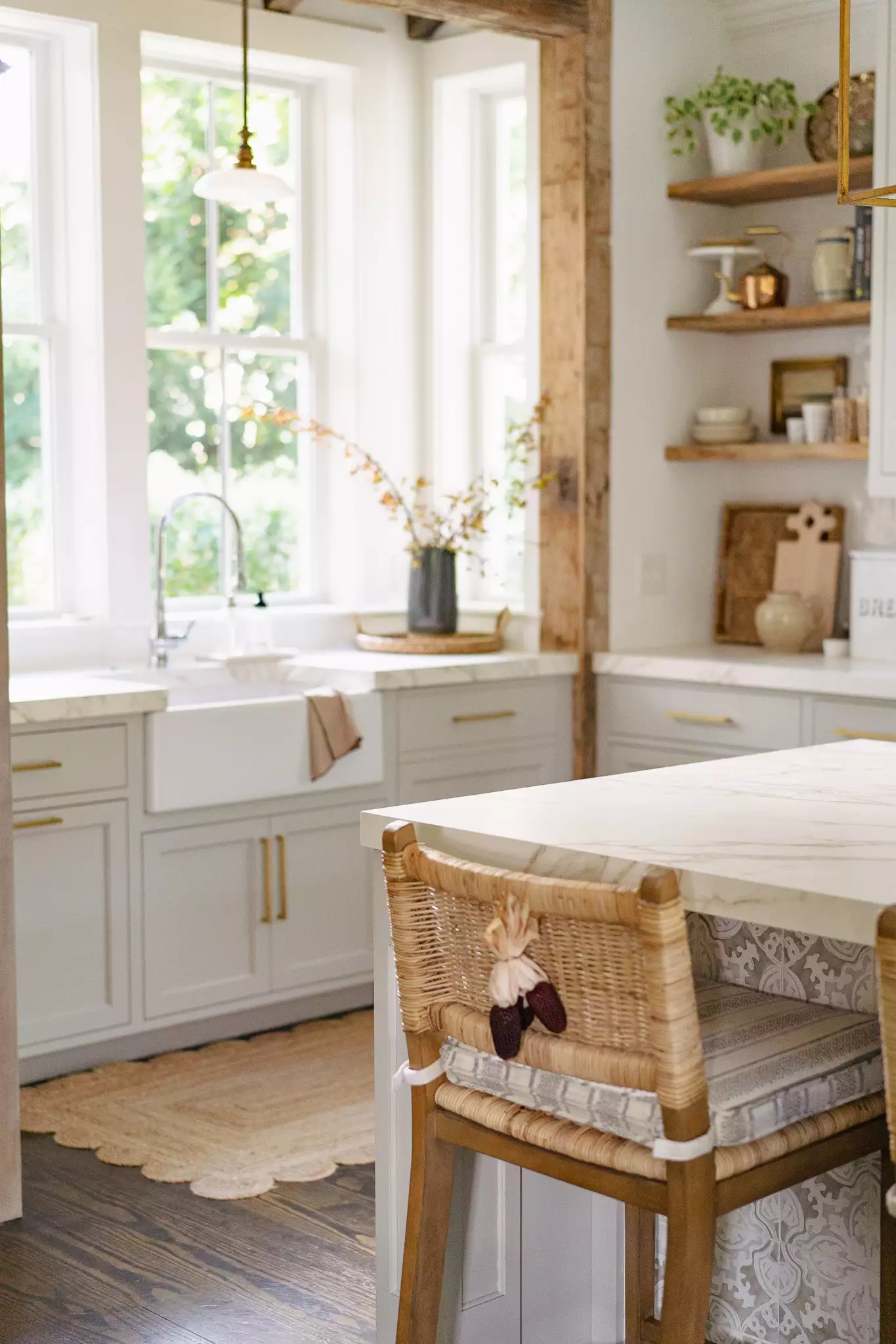
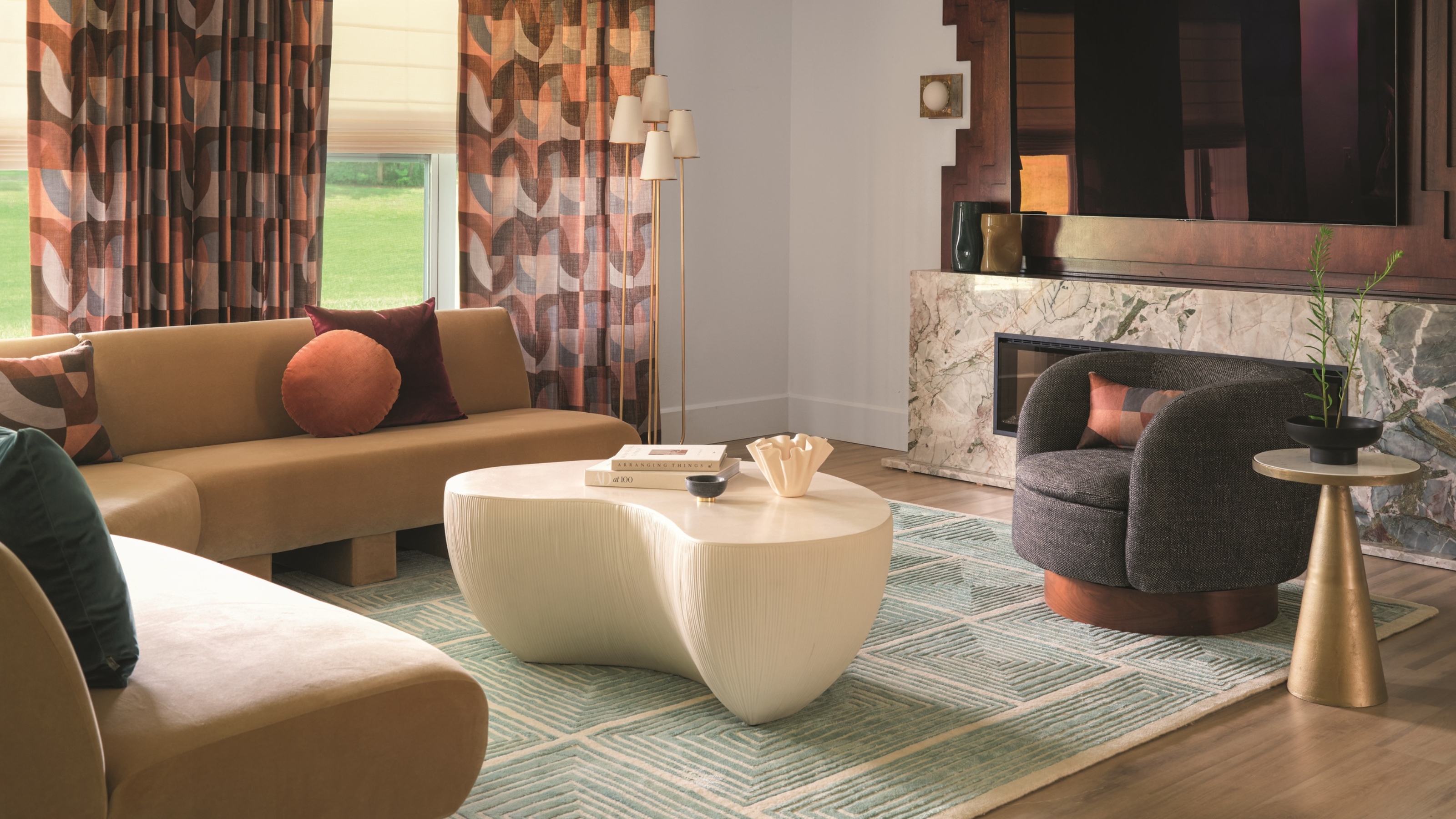
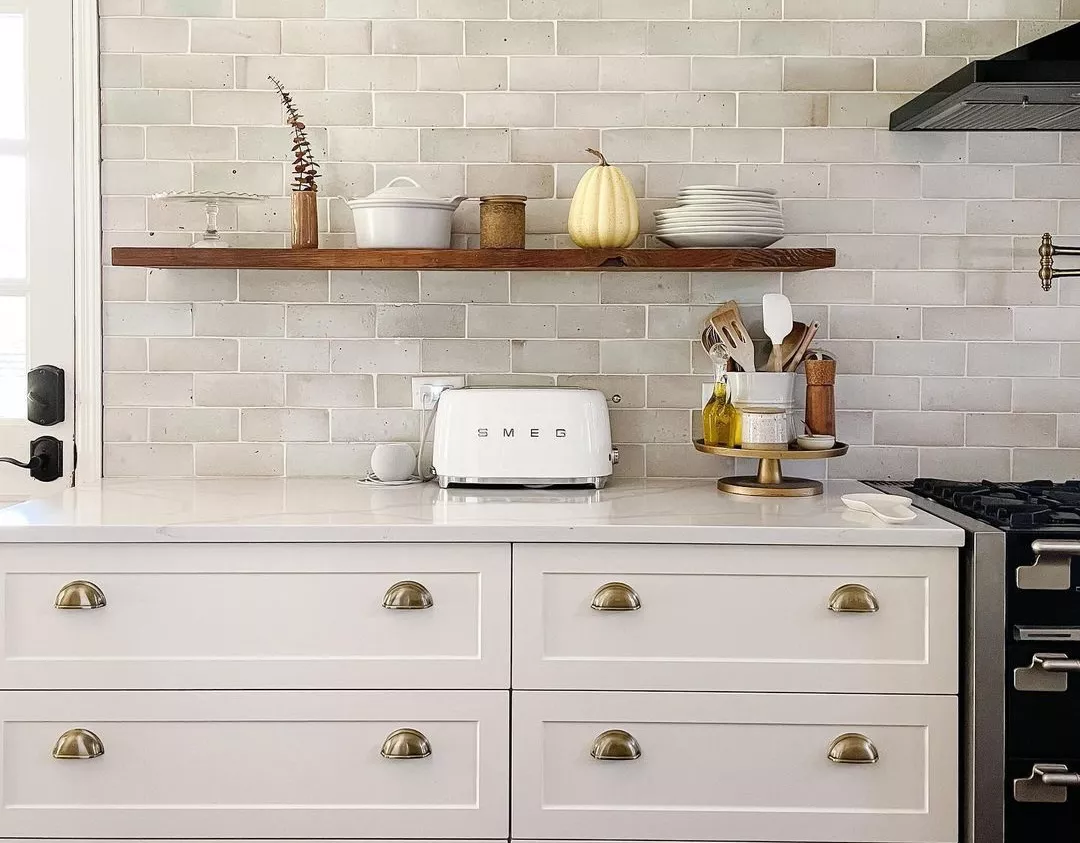
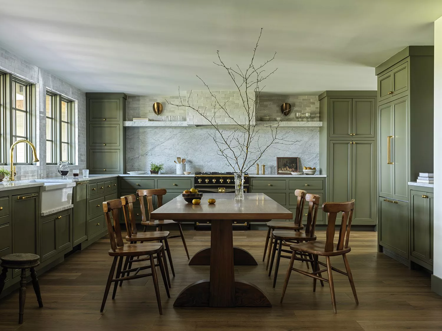
The article explores the captivating appeal of autumnal color palettes in interior design, particularly highlighting Johnny Galecki's log cabin-style kitchen as a prime example of this trend. Crafted by Pierce & Ward, the kitchen embodies the essence of fall, creating a snug and restful atmosphere through its use of warm, earthy tones. The natural beauty of autumn, characterized by fiery reds, burnt oranges, deep rusts, and golden yellows, provides rich inspiration for interior designers seeking to evoke comfort and serenity within living spaces. These colors, often found in woodland landscapes, are described as versatile and capable of transforming a home.
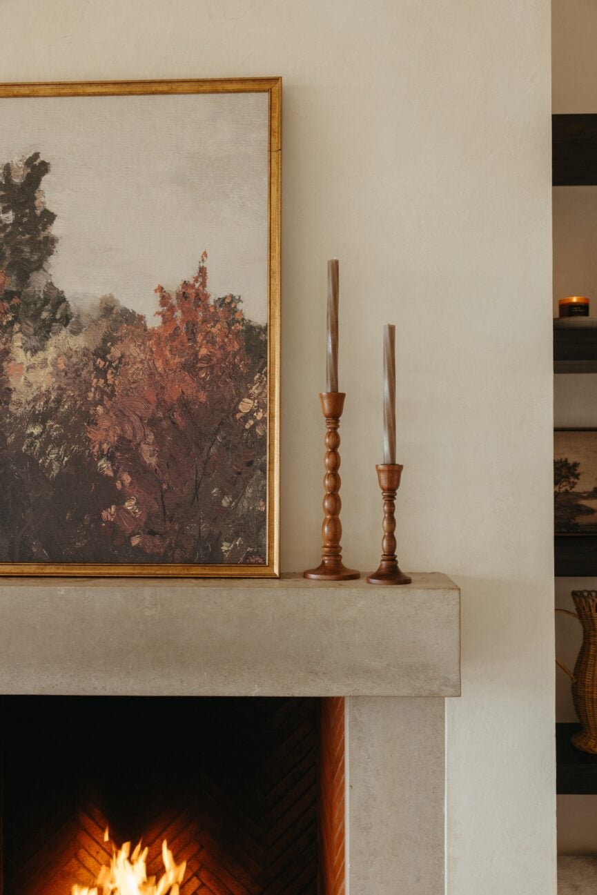
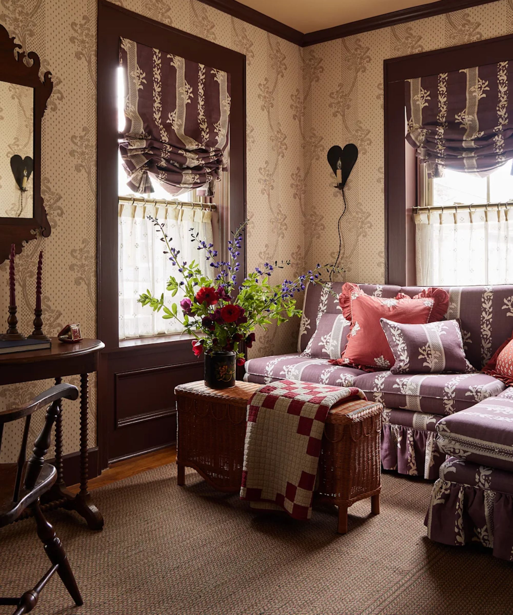
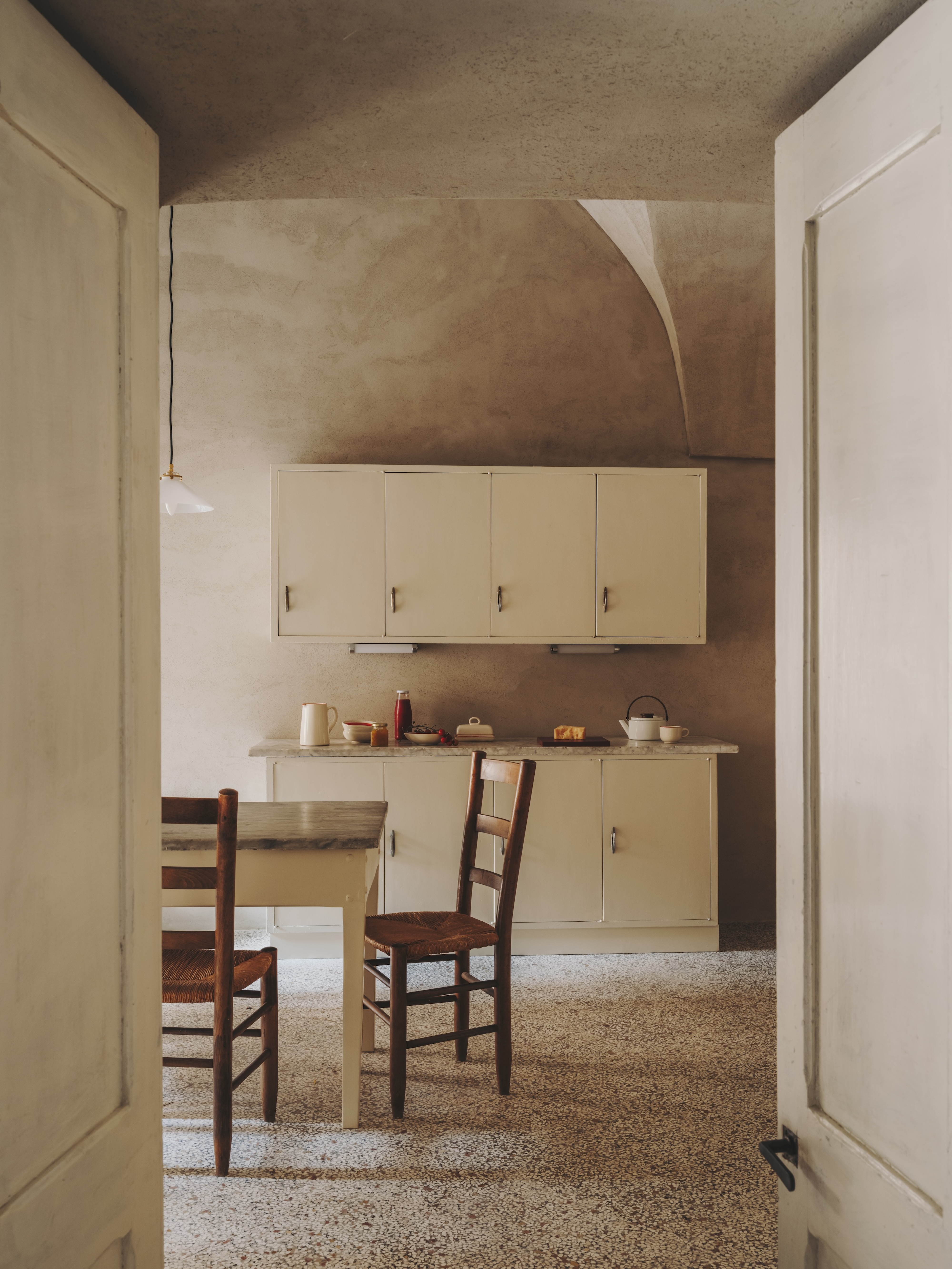
The discussion delves into the adaptability of the fall palette, where colors like ochre, terracotta, and dusty rose serve as calming backdrops that complement natural materials such as timber and stone, frequently found in period homes. This foundation allows more vibrant shades, including ruby red, plum, and deep orange, to function effectively as accent points. Fabric designer Vanessa Arbuthnott emphasizes that decorating with neutrals extends beyond traditional off-whites and soft browns to encompass these rich autumnal hues, which naturally harmonize with each other. Creative director Sue Jones of Oka reinforces this idea, noting the inspirational quality of woodland colors in imparting calmness and serenity to interiors, allowing them to blend seamlessly into a room without overpowering it. She also highlights the increasing popularity of these tones in kitchens, where comfort, warmth, and conviviality are essential.
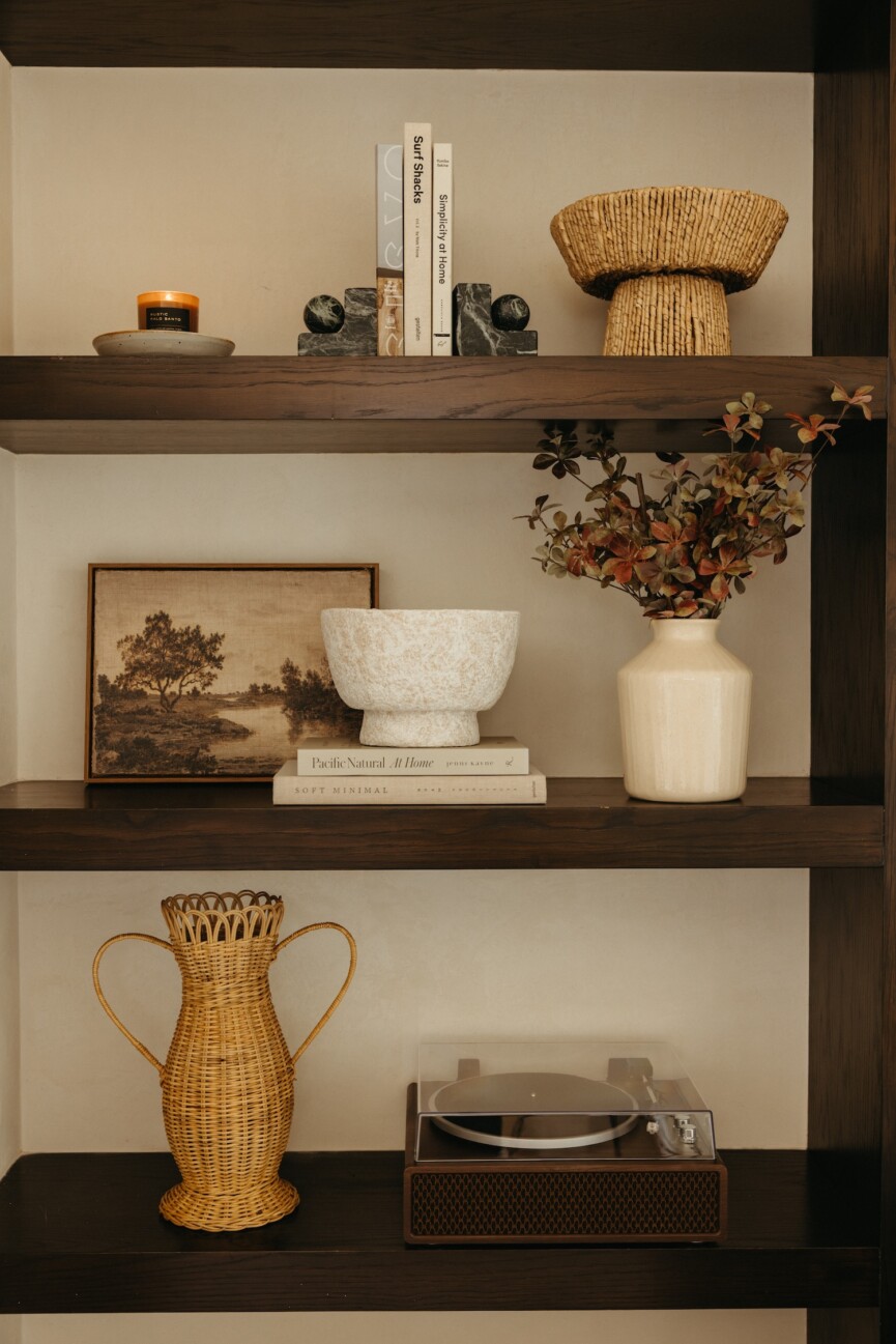
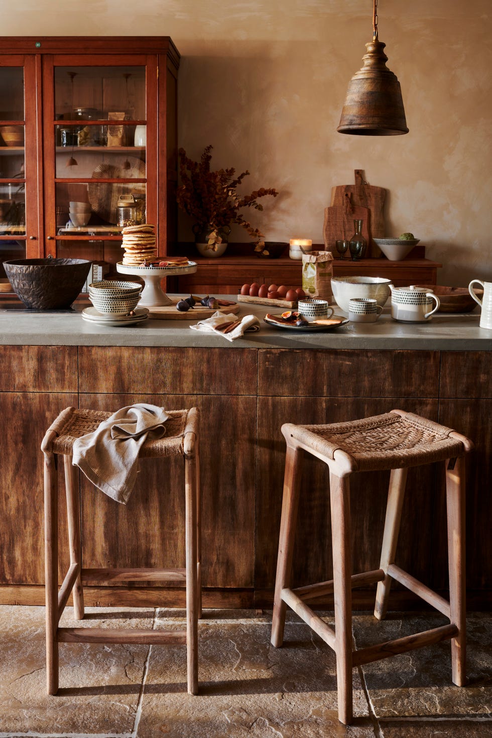
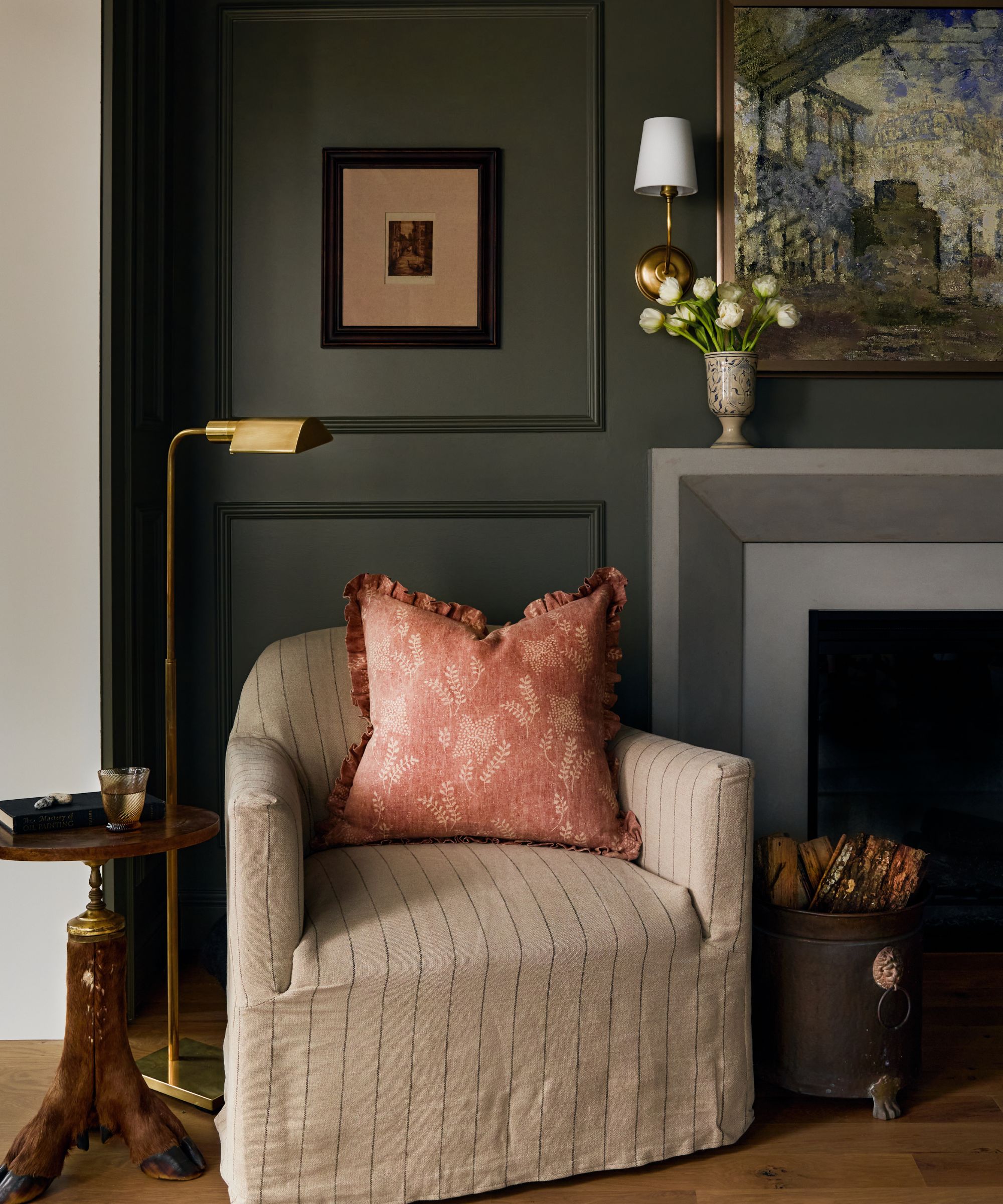
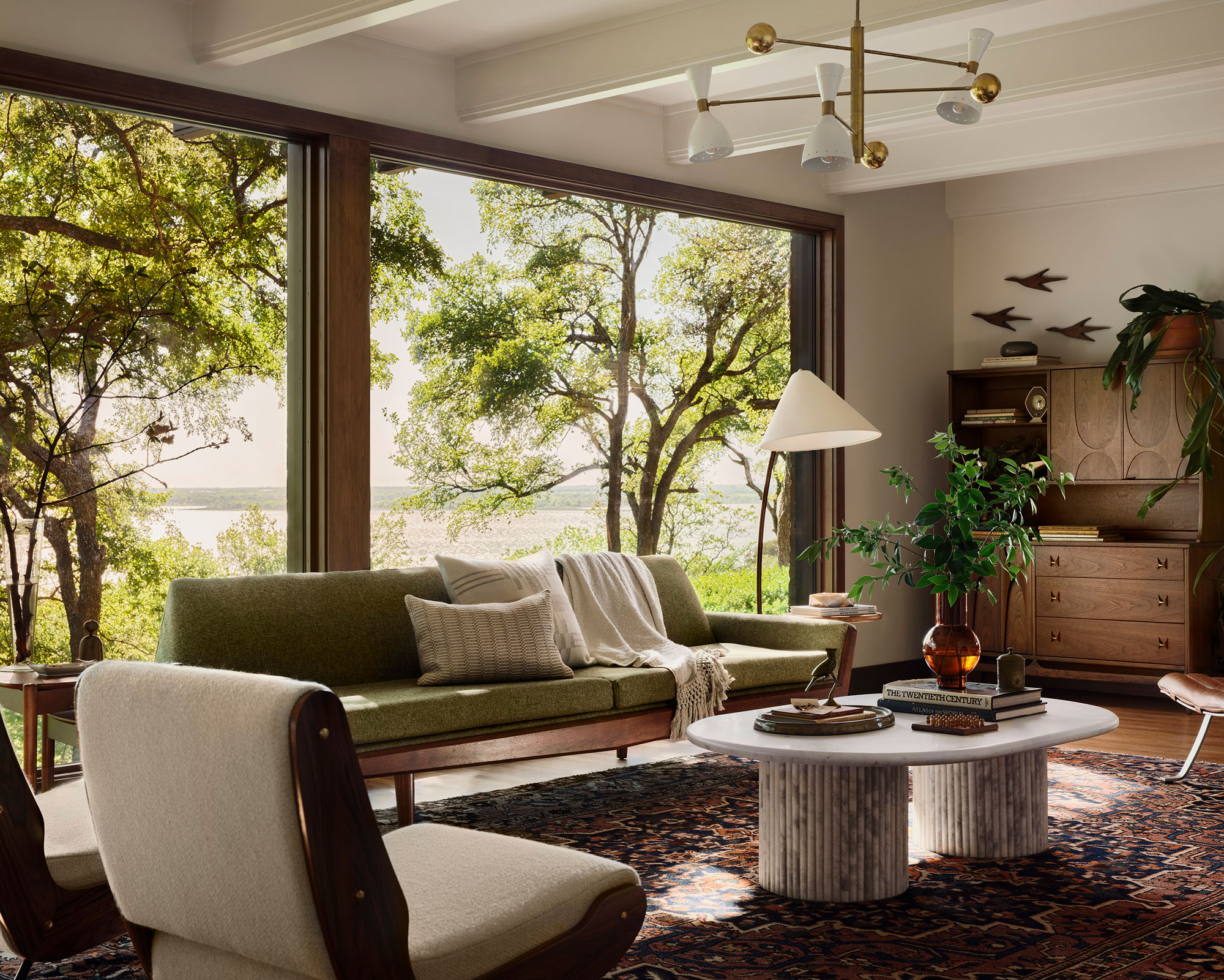
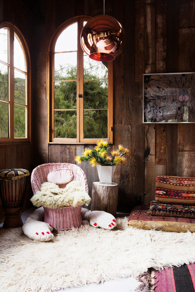
Ruth Mottershead, creative director at Little Greene, points out a growing trend toward using brown and other earthy hues in decor to promote well-being. She explains that there is a heightened desire among homeowners to surround themselves with comforting colors that are easy to incorporate into a scheme and contribute to a tranquil home environment. Shades of honey, caramel, and chocolate are regaining prominence in interiors, bringing warmth and comfort and creating enveloping, cozy spaces. This perspective underscores that these color choices are not merely aesthetic but also serve to nurture both the home and its occupants. The article suggests that layering is crucial for maximizing the impact of a fall palette. Sue Jones advises incorporating different types of lighting at various heights, mixing lamp bases with sculptural elements, and using shades with nature-inspired patterns, along with candlelight, to create depth. For soft furnishings, she recommends blending materials like jute, leather, and linen to add texture and richness.
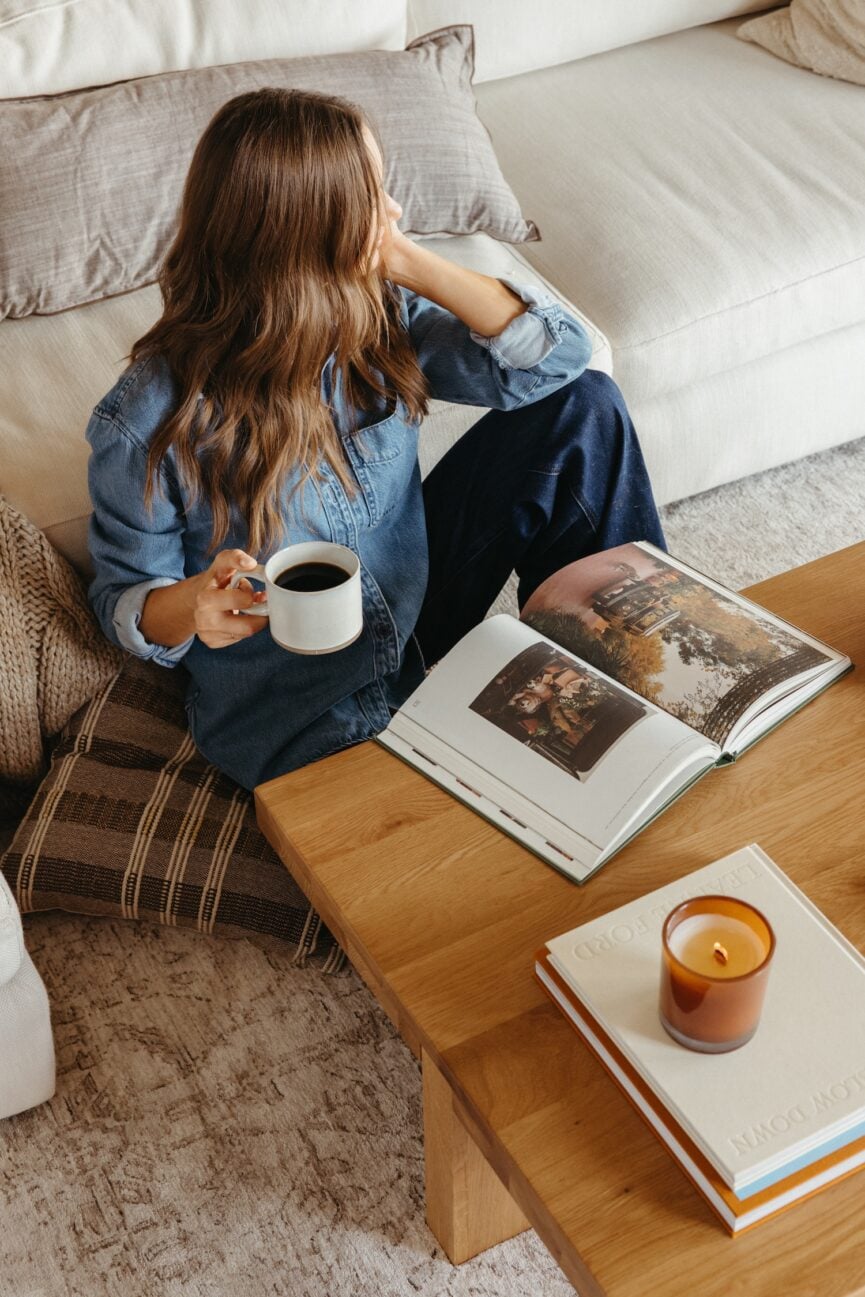
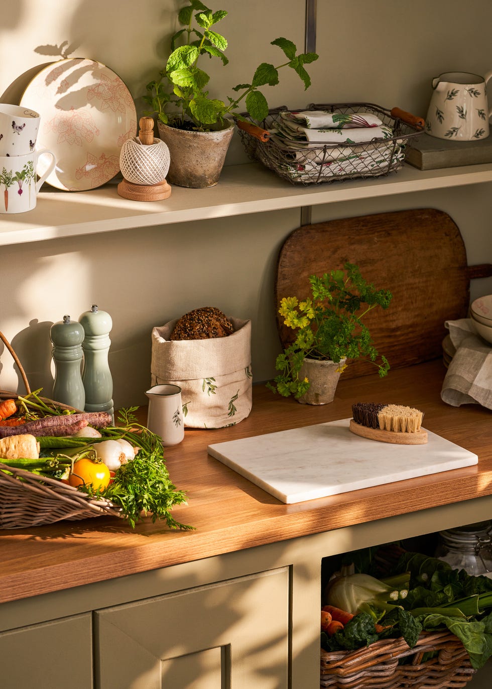
In Galecki’s kitchen, this layering technique results in an immediate sense of warmth and a tactile environment where every detail appears thoughtfully placed. The versatility of fall hues means they can be applied extensively, such as through deep burgundy cabinets, terracotta tiles, and copper accents paired with neutral walls and wooden countertops in contemporary kitchens, to achieve a sophisticated, layered effect. Alternatively, these colors can be introduced more subtly through textiles, cushions, rugs, or decorative objects. The overall aim is to create an effortless and inviting space where the rich, warm palette, natural materials, and layered textures transform the area into a sanctuary for daily activities, encouraging readers to draw inspiration from nature's autumn colors to make their homes feel snug, restorative, and prepared for the season.
#CozySeason #AutumnalDecor #CabinStyleKitchen #ColorPalette #InteriorDesign #FallHues #EarthyTones #LayeringTechniques #HomeDecor #CelebrityHomes #CozySeason #AutumnalDecor #CabinStyleKitchen #ColorPalette #InteriorDesign #FallHues #EarthyTones #LayeringTechniques #HomeDecor #CelebrityHomes
合計0件のコメント
 まだコメントはありません
あなたも好きかもしれません
The Seasonal Reset: 38 Easy Fall Updates for Max Coziness

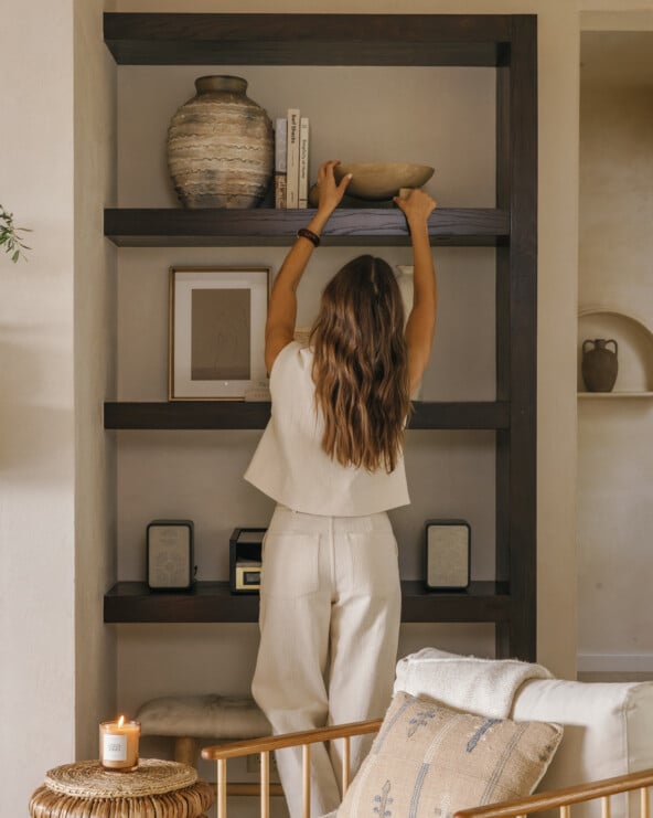
8 Simple Styling Swaps to Take Your Home from Summer to Fall
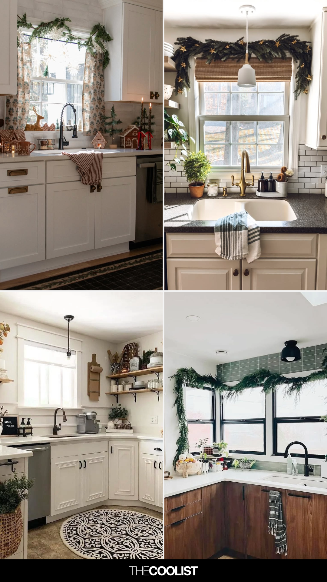
17 Above Kitchen Cabinet Decor Ideas That Add Style and Charm to Your Space
Fall Home & Decor: Tips for embracing that warm seasonal vibe
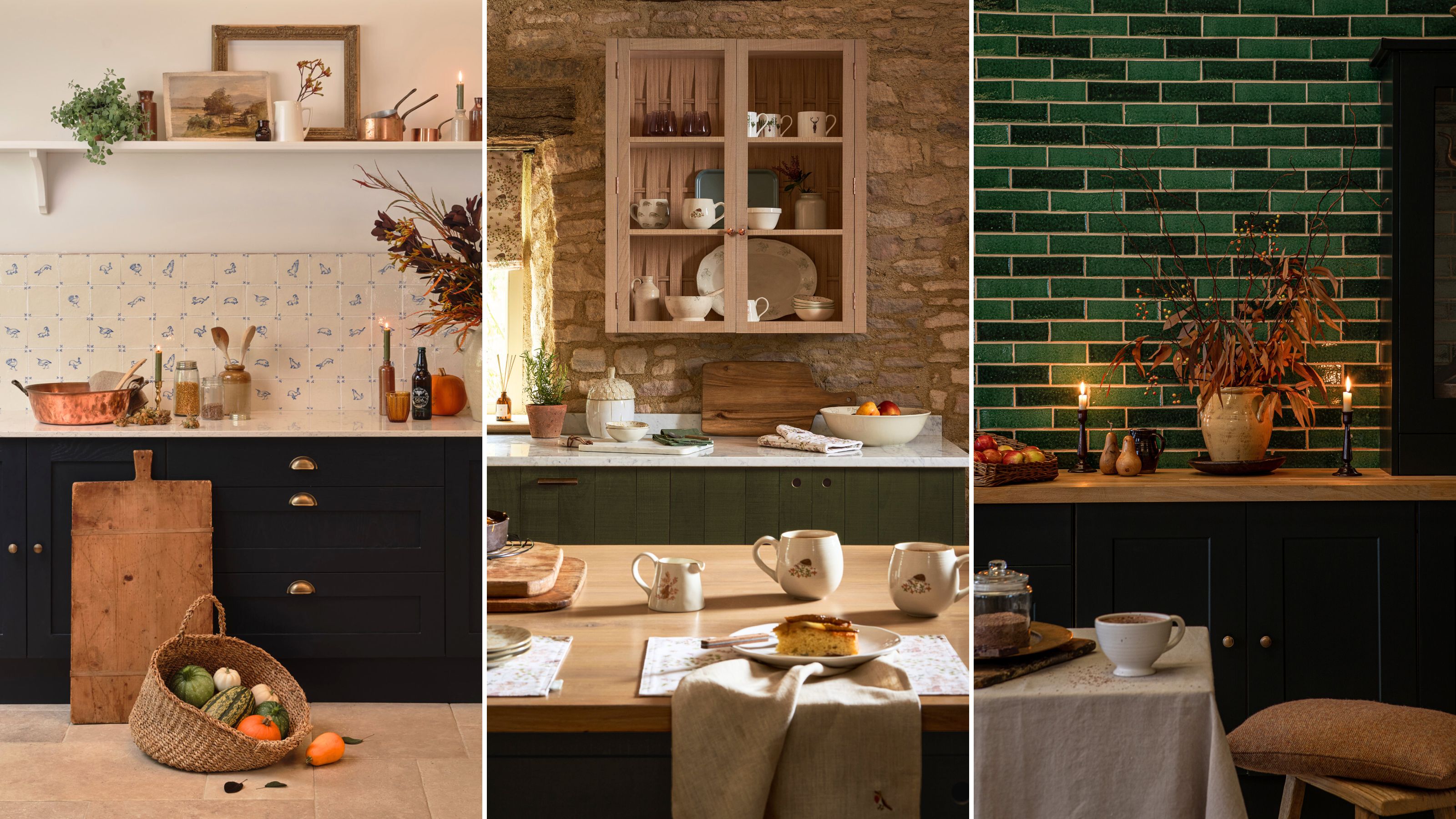
5 fall kitchen decor ideas that are perfect for adding coziness to your cooking space

I'm Not Big on Buying 'Autumn Decor', but This One Simple Switch Makes My Home Feel Styled for the Season

24 Minimalist Fall Kitchen Ideas for Just the Right Touch of Autumn Cheer

Meet Domino Editors—And Steal Our Fall Styling Secrets—At Joss & Main’s First Store Opening

5 Cosy Autumn 2025 Kitchen Ideas For A Seasonal Refresh

The Cozy Color That Instantly Makes A Kitchen Feel More Luxurious

18 Amazon fall decor finds I'd recommend to picky friends
5 Fall Interior Design Trends You Can Incorporate This Autumn


See Johnny Galecki's quiet luxury kitchen: the color will surprise you
I tried Joanna Gaines’ 3 go-to colors – and this quiet luxe palette is all I want for fall and winter 2025
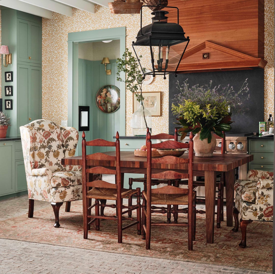
For a Homey and Charming Kitchen Vibe, Designers Say to Choose This Aesthetic

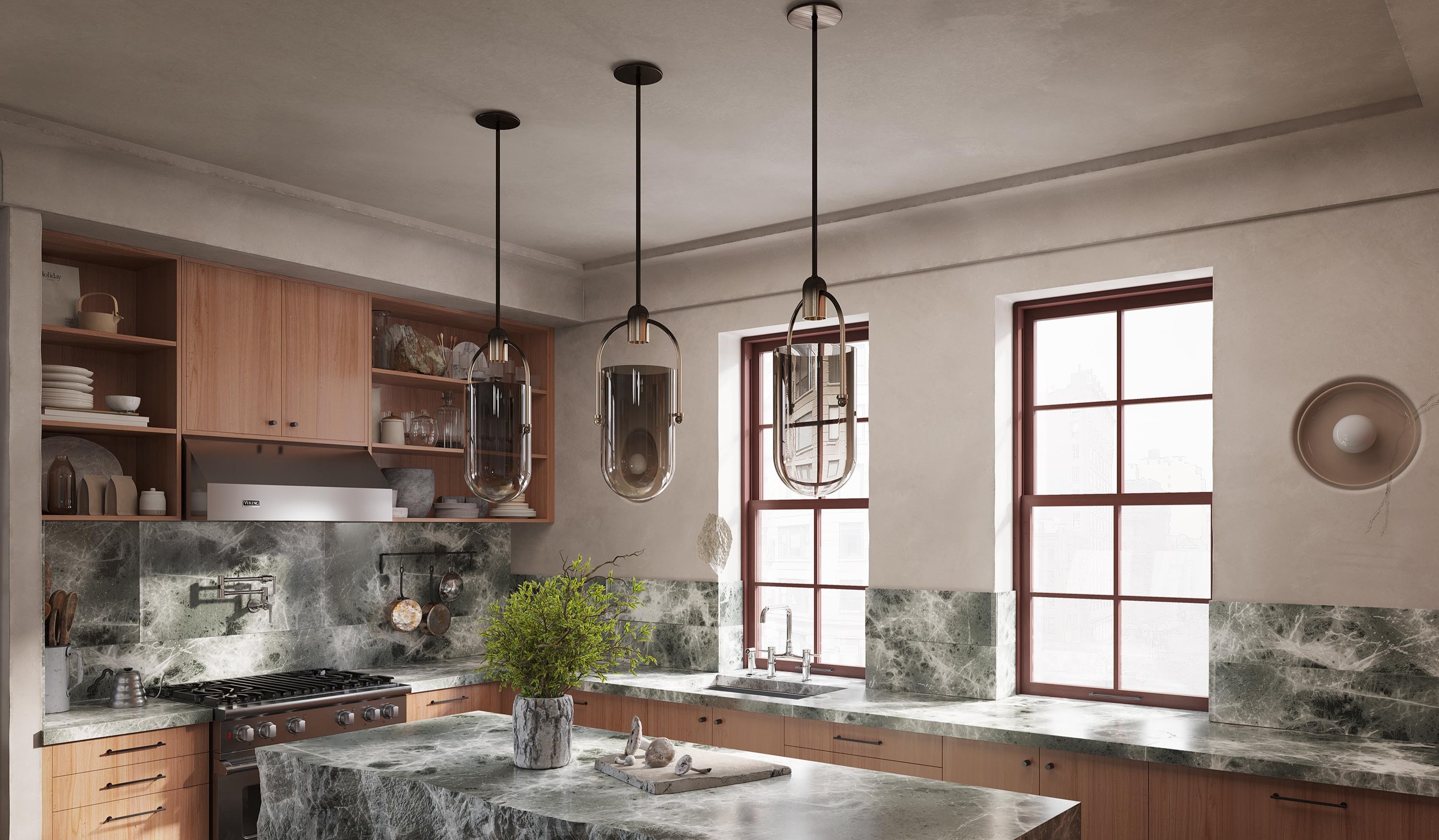
This Kitchen Trend Can Make Your Space Look Like a Charming, Tuscan Retreat — "It's Instantly Warming"
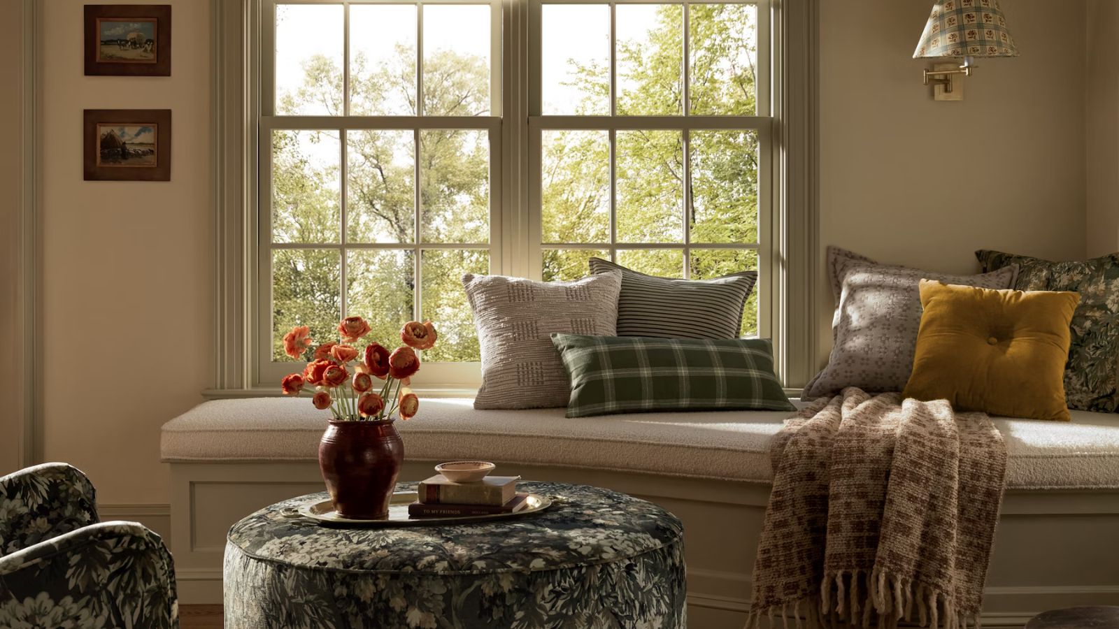
I'm a lazy seasonal decorator, but these are the 6 things I always do to make my home feel a little more cozy come fall
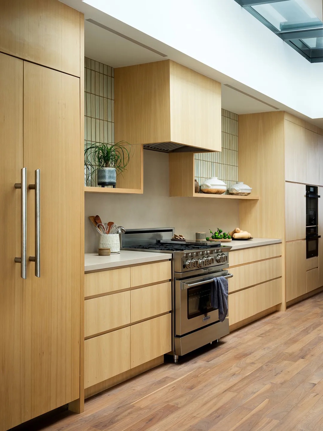
Kitchens Are Becoming the Ultimate Chill Zone This Fall
Easy Decor Swaps to Prep Your Living Room for Fall

21 Festive Fall Kitchen Ideas You Need to Try If You Can't Wait for Cooler Weather