1/4
Bold Color Palettes for Your Midcentury Space 🎨
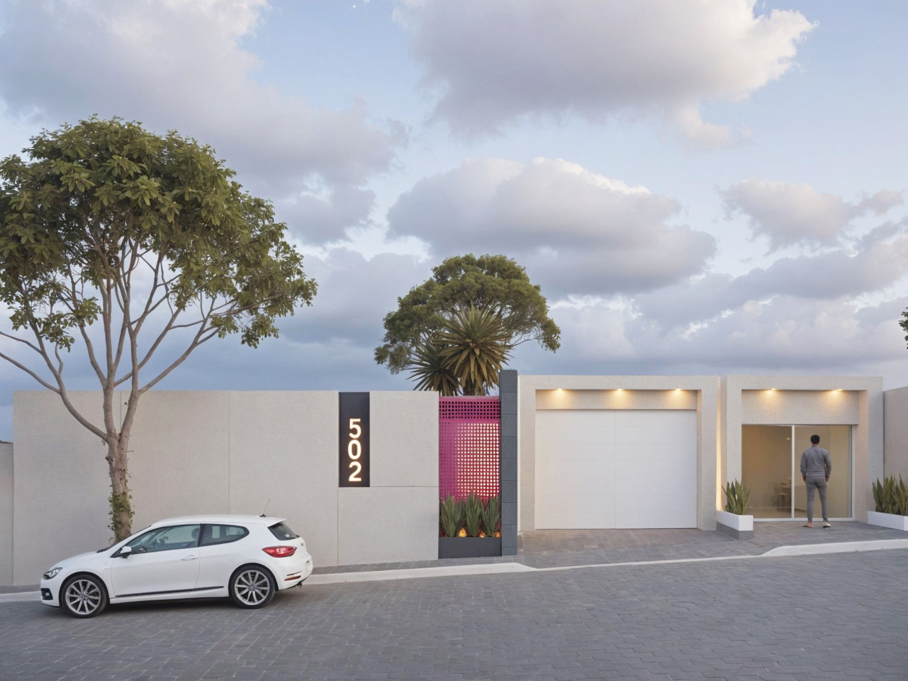
Midcentury Modern isn't just about neutrals! Embrace the era's love for vibrant, bold color combinations to make your home pop. 💥
Think avocado green, mustard yellow, turquoise, and burnt orange. These colors are perfect for accent walls, upholstery, or even smaller decor pieces.
Pair these bold hues with teak wood or crisp white for a balanced yet dynamic look. It's all about creating a lively and inviting atmosphere!
Which color combo is your favorite? #midcenturymodern #colordesign #boldcolors #interiordecor #livingroomideas #midcenturycolors #colorpaletteideas #retrodecor #vintagestyle #designinspo
17 ott 2025
Copia Stile
0 commenti in totale
Nessun commento ancoraPotresti anche gradire
The Art of Mid-Century Color Palettes 🎨
Mid-Century Modern is renowned for its distinctive and timeless color palettes. Learn how to use color to define your MCM space! 🌈
Embrace these signature hues:
• **Earthy Neutrals:** Warm whites, beiges, greys, and subtle creams form the perfect backdrop.
• **Bold & Saturated:** Pops of mustard yellow, avocado green, teal, and burnt orange add personality.
• **Natural Wood Tones:** Walnut, teak, and mahogany provide rich, grounding warmth.
• **Retro Accents:** Dusty rose, turquoise, and muted blues evoke a nostalgic feel.
Combine these strategically for a balanced and sophisticated look. ✨ #MidCenturyColorIdeas #MCMpalette #ColorInspiration #InteriorColor #DesignTrends #HomeDecorTips #RetroColor #TimelessDecor #ColorTheory #DecoratingIdeas
Mastering MCM Color: Neutrals with a Punch! 💥
Midcentury Modern isn't afraid of color, but it also mastered the art of sophisticated neutrals. Think creamy whites, warm beiges, and earthy greys! ⚪⚫
These neutral bases allow iconic furniture shapes and textures to shine. Use them for walls and larger upholstered pieces, then layer in pops of bolder colors through accessories.
This approach creates a chic, timeless backdrop that feels both modern and inviting. It’s the perfect way to balance vibrancy with calm.
Save this for your MCM color palette inspo! #midcenturymodern #colorpalette #neutraldecor #interiordesign #homedecor #midcenturycolors #designinspiration #minimalistdesign #classicstyle #mcmdecor
Cores Que Contam Histórias: A Paleta de Cores Mid-Century Icônica 🌈
As cores são fundamentais no design mid-century. Elas trazem personalidade e um toque nostálgico vibrante. 💛 Explore a paleta icônica que mistura tons terrosos com acentos de cores ousadas para criar um lar único. Pense em mostarda, verde musgo, azul petróleo e tons de coral. Use-os em sofás, almofadas, tapetes ou em uma parede de destaque. ✨ Essa combinação cria um equilíbrio perfeito entre o acolhedor e o moderno. Salve para inspiração e ouse na sua próxima decoração! #MidCenturyModernIdeas #ColorPaletteIdeas #MidCenturyColorsIdeas #InteriorColorIdeas #AccentWallIdeas #MidCenturyVibes #RetroColor #HomeDesignTips #VibrantInteriors #TimelessStyle
🔥 5 Iconic Mid-Century Colors to Instantly Elevate Your Home!
Craving that timeless mid-century modern vibe? Color is your secret weapon! 🎨 These hues are back and bolder than ever. Think warm terracottas, sophisticated teals, and the ever-reliable atomic orange. They're perfect for accent walls, furniture, or even smaller decor pieces to inject personality. Don't shy away from mixing them for a truly unique look.
Which is your favorite mid-century inspired shade? Let me know below! 👇
#MidCenturyModern #ColorPalette #HomeDecorIdeas #RetroStyle #InteriorDesignInspo #MidCenturyModernIdeas #InteriorDesignIdeas #HomeDecorIdeas #RetroDecorIdeas #ColorInspoIdeas #MidCenturyStyle #VintageDecor #DesignTrends #HomeInspiration #DesignSecrets
Color Palette Perfection: MCM Hues for Your Home 🎨🌈
Mid-Century Modern design is known for its distinctive color palettes that are both timeless and inviting. Let's explore the iconic hues that define MCM style! ✨
Embrace these MCM color combinations:
* **Earthy Neutrals:** Think warm creams, deep browns, and subtle greys.
* **Bold Accents:** Mustard yellow, teal, avocado green, and burnt orange bring vibrancy.
* **Pops of Color:** Use these vibrant shades strategically in cushions, art, or accent furniture.
* **Wood Tones:** Always anchor your palette with rich walnut and teak.
* **Subtle Pastels:** Mint green or pale blue can also add a touch of vintage charm.
Add a splash of MCM color to your space. Save this for your next paint project! 💖 #midcenturymodern #mcmdecor #colorpalette #mcmcolorideas #interiordesign #homedecor #paintcolors #designinspiration #walnutfurniture #vintagecolors
The MCM Living Room: Harmonizing Wood & Color 🪵🌈
The magic of Mid-Century Modern living rooms lies in the harmonious blend of warm wood tones and curated pops of color. Let's create a balanced and inviting space! ✨
Achieve MCM harmony:
* **Wood Foundation:** Use walnut or teak for your main furniture pieces.
* **Neutral Base:** Paint walls in soft whites, greys, or muted earthy tones.
* **Accent Colors:** Introduce pops of mustard yellow, teal, avocado green, or burnt orange through cushions, rugs, or art.
* **Texture Play:** Mix wood grain with fabrics like tweed, linen, and wool.
* **Balanced Design:** Ensure color and wood tones are distributed evenly throughout the room.
Create your perfectly balanced MCM living room. Save this for inspo! 💫 #midcenturymodern #mcmdecor #livingroomideas #mcmcolorideas #mcmwoodideas #interiordesign #homedecor #balanceddesign #decorinspo #colorpalette
Jewel Tone Dreams: Opulent Color Palettes for Your Walls! 💎💜
Dreaming of interiors that feel rich, dramatic, and utterly luxurious? Jewel tones are your answer! Think sapphire blue, ruby red, amethyst purple, and deep emerald. 👑
These intense hues add instant depth and sophistication to any room. They work beautifully on walls, accent pieces, or even as the star of your upholstery.
Pair jewel tones with metallics like gold or brass for an extra touch of glamour, or contrast them with creamy neutrals for a balanced, elegant feel.
#jeweltone #colorinspiration #luxurioushomes #interiordesign #homedecor #colorideas #jeweltoneinteriors #boldwalls #luxurydecor #opulenthome #sophisticatedstyle #designpalette #vividcolors
Beyond Black & White: Gilded Age Color Palettes for a Dramatic Home 🌈
The Gilded Age was a period of unapologetic color and grandeur! If you're aiming for opulence, don't shy away from bold hues. Deep jewel tones are your best friends: think emerald green, sapphire blue, ruby red, and amethyst purple. 👑
These colors look spectacular in luxurious fabrics like velvet, silk, and damask. Pair them with rich metallics – brushed gold, antique brass, and even hints of bronze – for an extra layer of sophistication. Wood tones should be deep and lustrous, like mahogany or walnut.
Save this for your dramatic home color palette inspiration! #GildedAgeColorIdeas #JewelToneDecorIdeas #OpulentColorIdeas #DramaticHomeIdeas #InteriorColorSchemes #HomeDecor #LuxuryInteriors #VelvetColor #GoldAccents #RichHues
1
Bold & Beautiful: Midcentury Entryway Accent Walls! 🎨
Make a statement from the moment guests step inside with a bold midcentury accent wall in your entryway. This could be through wallpaper with iconic geometric or abstract patterns, wood paneling in a rich walnut or teak, or even a pop of vibrant, unexpected color. The accent wall draws the eye, adds personality, and sets the tone for the rest of your home. Paired with minimalist furniture and strategically placed decor, it creates an unforgettable first impression that screams midcentury sophistication. Save this for your entryway glow-up! ✨ #MidcenturyAccentWall #EntrywayIdeas #WallpaperInspo #WoodPaneling #InteriorDesignTrends #HomeDecorInspo #BoldDecor #StylishEntryway #MidcenturyStyle #DecorIdeas
Mastering Neo-Classical Color Palettes for Serene Homes 🎨
Create an atmosphere of enduring elegance by mastering neo-classical color palettes. Reimagining classical proportions for modern living means using color to evoke tranquility and sophistication.
Key palettes to embrace:
1. **Soft Neutrals:** Think serene creams, gentle ivories, and muted greys as a sophisticated base.
2. **Muted Pastels:** Incorporate delicate shades like blush pink, pale blue, or soft sage for a touch of subtle color.
3. **Rich Jewel Tones:** Deep blues, emerald greens, or regal purples can be used sparingly for dramatic accents, adding depth and luxury.
4. **Metallic Accents:** Introduce subtle glints of brass or gold to highlight architectural details and add warmth.
Save this for your next elegant color scheme! 🏛️ #NeoClassicalColorPaletteIdeas #ColorPaletteIdeas #InteriorDesignIdeas #ElegantHomeIdeas #TimelessDecorIdeas #SophisticatedSpacesIdeas #SereneInteriors #HomeStyling #RefinedLiving #ChicColorSchemes
The Art of the Accent Wall: Bold Color Choices 🎨
Accent walls are a fantastic way to introduce a bold splash of color and personality into your space without overwhelming the room! Let's explore some impactful choices.
💙 **Deep Teal:** Sophisticated and moody, deep teal creates a dramatic focal point and pairs beautifully with neutrals.
❤️ **Burnt Orange:** Warm and inviting, a burnt orange accent wall adds energy and a cozy, earthy vibe.
💜 **Muted Lavender:** A soft yet striking choice, muted lavender adds a touch of romance and tranquility.
💚 **Emerald Green:** For a touch of opulence and natural beauty, an emerald green wall is both bold and elegant.
Save these accent wall ideas for a room refresh! ✨ #accentwall #colorinspiration #boldcolors #interiordesign #homedecorideas #livingroomideas #bedroomdecor #designstatement #colorpalette #walls
Color Your World: Mastering Bold Hues in Eclectic Home Design 🎨
Bored of bland? Let's talk about bringing bold colors into your eclectic design! It’s not about overwhelming, but about strategic pops that ignite personality. Think a vibrant emerald accent wall against a more neutral backdrop, or jewel-toned furniture pieces. 💎 Mix and match contrasting colors for an energizing vibe. Your home should be a reflection of your spirit! ✨ What's your favorite bold color to use? Save this for your colorful design journey! 🌈 #BoldColorDecorIdeas #EclecticColorIdeas #MaximalistColorIdeas #VibrantHomeIdeas #AccentWallIdeas #InteriorDesign #HomeDecor #ColorInspiration #DecoratingWithColor #BohemianPalette
Jewel Tones: The Rich Palette of Gothic Interiors 💎🦇
Gothic design isn't confined to black and grey. The true magic lies in its embrace of rich, deep jewel tones. Think of saturated shades like sapphire blue, emerald green, amethyst purple, ruby red, and deep garnet. These colors are often used for upholstery, curtains, accent walls, and decorative objects, adding a layer of regal sophistication and depth. Paired with dark woods and metallic accents, these hues create a luxurious and inviting atmosphere that feels both powerful and intimate. Embrace the drama of color. ✨ Save this for your color palette inspo! #GothicColorPalette #JewelTones #RichColors #InteriorColor #GothicDecor #DeepColors #LuxuryColors #ColorInspiration #GothicInteriors #ElegantColor
Mid-Century Modern Magic: Iconic Silhouettes & Warm Woods for Your Living Room 🛋️🌳
Travel back to the mid-20th century with the enduring appeal of Mid-Century Modern design. This style is celebrated for its organic shapes, streamlined silhouettes, and the warm embrace of natural wood tones. It’s about creating spaces that are both stylish and incredibly livable.
Imagine iconic furniture pieces like the Eames lounge chair, a tapered-leg credenza, and accent chairs with elegantly curved backs. Pair these with textured rugs, geometric patterns, and pops of color inspired by nature.
Bring timeless cool and comfort into your home. Save this for your Mid-Century Modern living room inspo! ✨ #MidCenturyModern #MCMdesign #IconicFurniture #WarmWoodTones #RetroDesign #MCMIdeas #LivingRoomIdeas #HomeDecorInspirationIdeas #TaperedLegsIdeas #EamesInspiredIdeas
Bold Color Palettes: Injecting Personality into Your Home Office! 🌈💼
Who says your home office has to be boring? Embrace bold color palettes to boost creativity and productivity! Art and vibrant accents can make all the difference.
Think about a dynamic abstract piece with energetic colors, or even a brightly painted mural on an accent wall. Don't shy away from color in your furniture or accessories either! It's about creating a space that inspires.
• **Color Psychology:** Use colors that boost focus or calm.
• **Accents:** Start small with pillows or a rug.
• **Balance:** Mix bold with neutrals.
Make your workspace a masterpiece! Save these bold color ideas for your office redesign. #homeoffice #workspaceinspo #colorinspiration #bolddecor #officeideas #interiorstyling #artworkforhome #creativeworkspace #paintinspiration #decorideas
Art Deco's Signature Color Palette: Bold & Beautiful 🎨
The Art Deco era wasn't shy with color! Its iconic palette is as daring and glamorous as the style itself. Mixing rich hues with metallics creates unparalleled opulence. ✨
Embrace these signature color combinations:
* **Deep Jewel Tones:** Emerald green, sapphire blue, ruby red, amethyst purple.
* **Classic Neutrals:** Black, cream, ivory, and deep charcoal grey.
* **Glistening Metallics:** Generous use of gold, brass, chrome, and silver.
* **Rich Earth Tones:** Deep browns, ochres, and burnished oranges for warmth.
* **Bold Contrasts:** High-contrast pairings for maximum impact.
Use these colors to make a dramatic statement in your home. Save this for your next color inspiration! 💫 #ArtDecoColors #ColorPalette #InteriorDesignColors #LuxuryDecor #VintageStyle #HomeDecorIdeas #ColorInspiration #DecoDecor #GlamourHome #InteriorStyling
Unleash Your Inner Maximalist: Bold Color Palettes for a Joyful Home! 🌈✨
Tired of beige? It's time to embrace COLOR! 🎉 As Spectrum Style, I believe your home should be a vibrant reflection of YOU. Forget boring neutrals; let's dive into daring hues and playful patterns to create spaces that spark joy and express personality.
This trend is all about intentionality:
* **Unexpected Pairings:** Think teal with coral, or deep magenta with mustard yellow.
* **Pattern Play:** Mix florals, geometrics, and abstract designs fearlessly.
* **Balance is Key:** Use pops of bold color against a grounding neutral backdrop or use saturated tones in smaller doses like accent walls or vibrant decor.
Ready to transform your space into a dynamic masterpiece? Save this for your next colorful home refresh! 💖 #ColorPaletteIdeas #MaximalistDecorIdeas #BoldColorsHomeIdeas #InteriorDesignIdeas #SpectrumStyleHome #JoyfulLivingSpaces #PatternMixing #EclecticHome #VibrantInteriors #HomeDecorInspo
Jewel-Toned Dreams: Bold Color Palettes for Daring Decor! 💎
Embrace the richness! 💜 My love for jewel tones in home decor comes from their inherent luxury and depth. Think emerald green, sapphire blue, ruby red, and amethyst purple. These colors instantly elevate a space, creating a sense of opulence and drama. Don't shy away from combining them – the more vibrant, the better! Pair them with metallics like gold or brass for an extra touch of glamour. What's your favorite jewel tone? Tell me below! 👇 Save this for your next daring color adventure! 🌟 #jeweltones #boldcolors #maximalistdesign #luxuryinteriors #colorpaletteideas #glamorousdecor #vibrantinteriors #designinspo #homestyling #interiorcolor
The Magic of Wood Tones in Mid-Century Design! 🪵✨
Wood is the heart of Mid-Century Modern design! The warm, natural tones bring an organic, inviting feel that's hard to beat.
Focus on these sought-after woods:
⭐ Teak: Rich, reddish-brown, incredibly durable and elegant.
⭐ Walnut: Deep, dark, with beautiful grain patterns, very sophisticated.
⭐ Oak: Lighter and versatile, often seen in furniture and flooring.
Mixing and matching these woods can add depth and character, creating a harmonious and timeless aesthetic. Save this for your wood tone inspo! 🏡💡 #WoodToneIdeas #MidCenturyWoodIdeas #MCMfurniture #InteriorDesign #HomeDecor #NaturalMaterials #WoodFurniture #DesignElements #TimelessStyle #WarmSpaces


