1/5
Umm, Why Orange and Teal? The Hidden Color Meaning You Might Have Missed Behind Taylor Swift’s Next Album
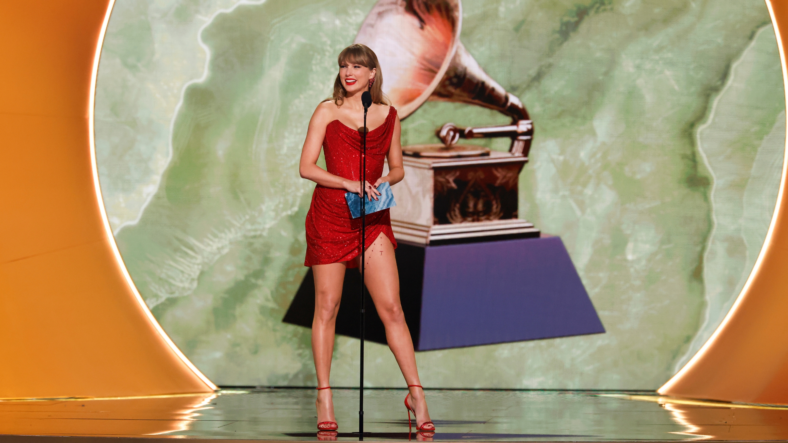
Taylor Swift's upcoming album, titled '_The Life of a Showgirl_', signals a significant shift in the artist's aesthetic, moving from the previously melancholic black and white tones to a vibrant orange and teal color palette. This change was subtly hinted at during the final performance of her Eras Tour, where she exited through an orange door, and later confirmed with the reveal of the vinyl cover featuring her partially submerged in mint-colored water with orange glitter lettering. Given Swift's reputation for meticulously planned details, this color choice is unlikely to be accidental and holds deeper meaning.
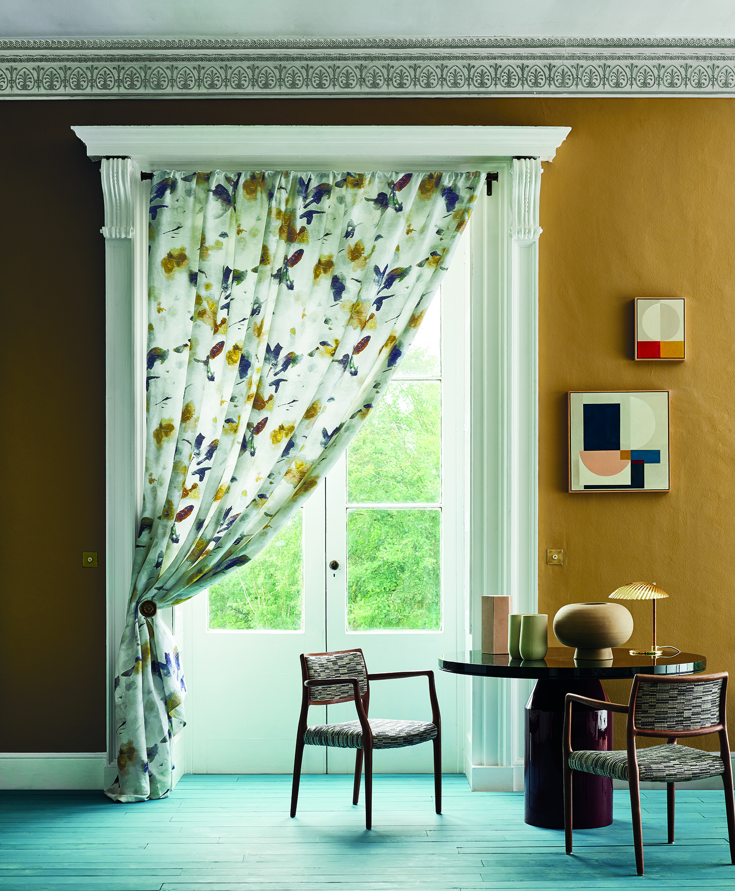
The juxtaposition of orange and teal, which are complementary colors on the color wheel, symbolically represents the duality between the dazzling public life of a performer and the complexities of her private existence. According to _Livingetc_'s color expert, Amy Moorea Wong, this pairing creates a dynamic contrast: orange's brilliance amplifies teal's calming depths, while teal tempers orange's exuberance. This creates a "lively push-and-pull" effect, forming a vibrant and compelling foundation for both the album's themes and potential interior design applications.
The choice of orange for _The Life of a Showgirl_ is particularly notable. It is speculated that orange was originally intended for Swift's scrapped album '_Karma_', which was shelved due to intense media scrutiny after '_1989_'. This fiery, rich hue is associated with heat, energy, warmth, and intensity, demanding attention and bringing drama—qualities that resonate with the extravagance and fanfare of show business. Teal, conversely, combines the tranquility of blue with the invigorating freshness of green, often symbolizing balance, emotional well-being, and harmony in color theory.
The combination of orange and teal thus forms a symbolic yin and yang, mirroring the personal balance Swift has likely cultivated through years of navigating the demands of touring, performing, and living under public scrutiny. This color scheme suggests themes of confidence, vivacity, and a sophisticated approach to her career, moving beyond past challenges. The album is expected to explore the realities of being a 'showgirl,' constantly performing both on and off stage, with upbeat melodies and an ABBA-like synth track.
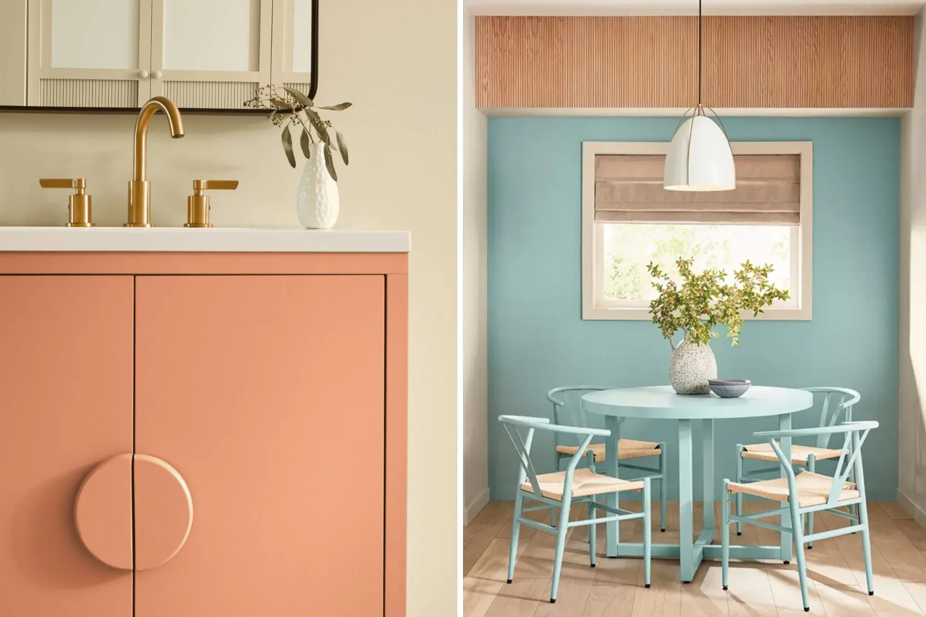
For interior design, the article highlights how these colors can be effectively integrated. Teal can be both grounding and enlivening, suitable for spaces that aim to be composed yet expressive, like bedrooms or bathrooms where it can bring a calm sophistication. Orange, with its inherent exuberance and luxurious feel, is well-suited for energizing social spaces such as living or dining rooms. Combining them, for example, a teal lamp on an orange sideboard or an orange cushion on a teal sofa, creates a curated tension that is visually striking and theatrical. The article also suggests that if this color pairing receives Taylor Swift's endorsement, it is likely to influence color trends for 2026, possibly becoming a popular prediction for Color of the Year.
#TaylorSwift #ColorTheory #InteriorDesign #TheLifeOfAShowgirl #OrangeAndTeal #ColorTrends2026 #AlbumArt #CelebrityInfluence #HomeDecor #TaylorSwift #ColorTheory #InteriorDesign #TheLifeOfAShowgirl #OrangeAndTeal #ColorTrends2026 #AlbumArt #CelebrityInfluence #HomeDecor
 Nessun commento ancora
Do You Know What Every Room in Taylor Swift's Lover House Really Means?

The Paint Color We’d Pick for Taylor Swift’s New Album (and Every Other Era)

Everyone's Talking About Taylor & Travis, But All I Can See Is Her Manicure
Miley Cyrus found the critical balance of color and pattern