




1/5
'It Doesn't Have to be One or the Other!' 5 Wallpaper and Paint Combination Ideas Inspiring us Right Now
The article explores five inspiring ideas for combining wallpaper and paint, moving beyond the conventional approach of matching colors or using white as a safe option. Jill Steinberg, co-founder of Fine & Dandy Co., highlights that choosing the right paint color is crucial for making wallcoverings, especially murals, inhabit a room effectively. While white is a common choice, many designers are embracing bold statements by pairing wallpaper with darker, moodier paint colors. This method frames the wallcovering, making it the focal point, and creates an immersive and enveloping space with a dramatic and ambient mood.
Steinberg also suggests that wallpaper and paint do not always need to match perfectly. Unexpected paint color choices that complement a mural or pattern, even if not directly found within the wallcovering, can add an element of surprise and create impactful spaces. The article then delves into five specific combination ideas. The first idea is to pair dark wallpaper with bright paint. An example is a hallway featuring House of Hackney's Papavera in Noir wallpaper with its Art Nouveau poppies and gothic twist, paired with Apple paint, a fresh green shade with yellow undertones. This combination brings out the warmth in the print and prevents the space from appearing dreary.
The second idea involves using contrasting blues. A dining room designed by Jewel Marlowe for Fine & Dandy Co. demonstrates the refreshing energy achieved by combining different shades from the same color family, along with lavenders and greens. The blue paint color subtly picks up the purple/blue tones in the Paradis Atelier wallcovering, making the wallpaper the star of the room. Painting the ceiling, trims, cabinetry, and walls in the same color, like Kelly-Moore's Navy Damask, contributes to a cohesive look.
The third idea focuses on matching colors with a corresponding room. Barbra Bright of Barbra Bright Interiors created a sense of fluidity between a kitchen and hallway by matching the hallway's Enfume in Acid mural by Flavor Paper with the kitchen's lilac and green scheme. Starting with a beloved element, such as lilac marble in the kitchen, and building around it, she selected black and white cabinets, green tile with a snakeskin pattern, and custom-matched Ben Moore's Waterbury Green for the cabinets.
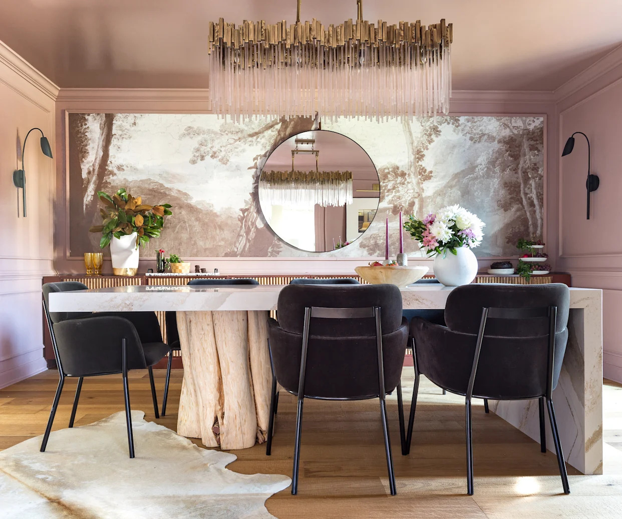
The fourth idea highlights combining rich jewel hues. In a bathroom designed by Jewel Marlowe, decorating with jewel tones transformed a small powder room into a luxurious space. The large-scale pattern of the wallcovering, combined with rich emerald paint on the walls and trim, made the room feel larger and more spectacular than its actual size. The final idea discussed is monochromatic wallpaper and paint. Choosing wallpaper and paint in the same color creates an enveloping, color-drenching effect. An example is the Imaginarium-Sepia Mural paired with Farrow & Ball's Setting Plaster, a pink-y earthy color used throughout the space, including the ceiling. This pairing, along with natural wood, marble, and brass elements, creates a beautiful and harmonious monochromatic feel.
#Wallpaper #PaintColors #InteriorDesign #HomeDecor #DesignInspiration #ColorCombinations #HomeStyling #RoomDecor #Wallpaper #PaintColors #InteriorDesign #HomeDecor #DesignInspiration #ColorCombinations #HomeStyling #RoomDecor
 Nessun commento ancora