




1/17
How a Designer Worked With, Not Against, a Wall of 34 Windows
This article details the renovation of a Toronto home, focusing on how designer Jaime Zimmerman of JPZ Interiors successfully integrated a distinctive wall of 34 orange-tinted, 1980s-era windows into a modern, functional living space. The homeowners, drawn to the unique character and backyard view offered by these windows, wished to retain them despite their dated appearance and the contractor's suggestion to paint them. Zimmerman emphasized that these windows contribute to the home's natural feel and character, making them a special feature she aimed to preserve.
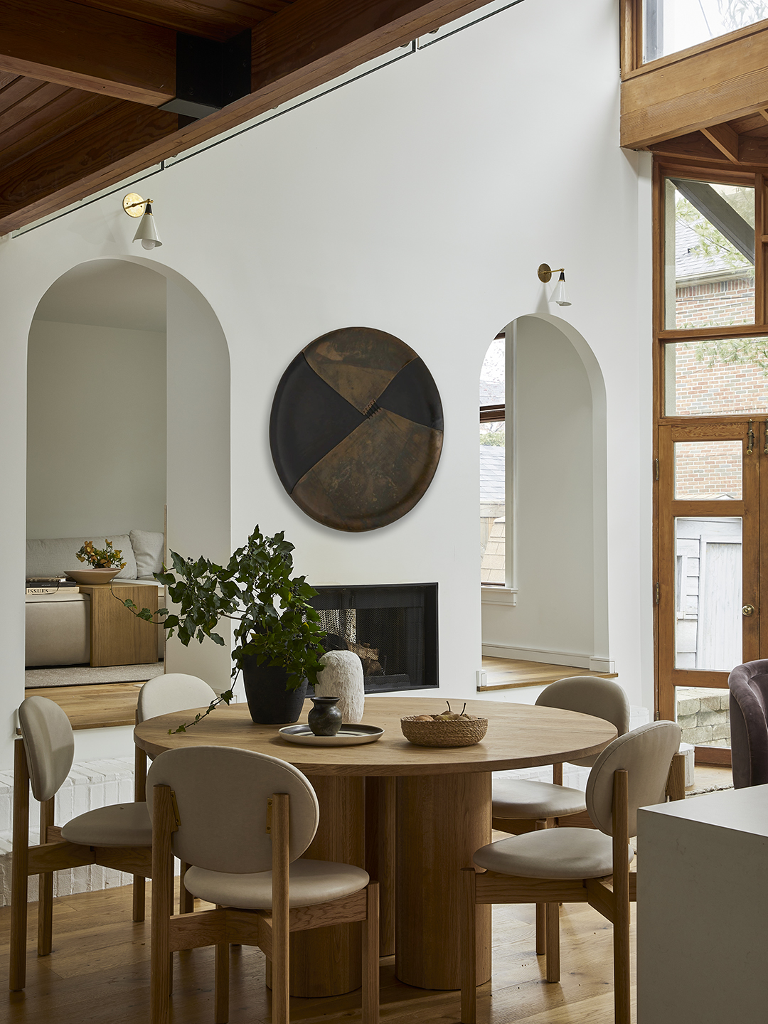
The renovation tackled several challenges, including a "wonky" layout where different areas of the great room, kitchen, mudroom, family room, and dining area were on varying levels, creating tripping hazards. Zimmerman’s primary goal was to create a cohesive and safer environment. One significant improvement involved extending the steps to the left of the fireplace thresholds and constructing them from white-painted brick, matching existing elements in the room, to address a safety concern for the homeowners' children.
The kitchen, originally separated by a peninsula, was opened up further to seamlessly connect with the great room. The designer maintained the integrity of the windows by not adding upper cabinets in their vicinity, instead maximizing storage with custom organizers for pots and pans integrated into drawers near the range. The vent hood, strategically placed in front of the windows, was painted the same color as the new flat-slab cabinets to make it blend in and appear less obtrusive.
Material selection, particularly wood tones, was crucial. Zimmerman replaced the terracotta tiles with engineered hardwood flooring, opting for a honey-hued finish that harmonized with the existing orange tones of the window frames and ceiling panels. In the new front entryway, a checkerboard tile was introduced, along with an oak coat closet. For new wood furniture and built-ins, lighter stains and species were chosen to avoid a heavy aesthetic. This new entryway, now functioning as a mudroom, had its floor raised to be level with the kitchen, and the double door was replaced with a single opening and sidelight windows for improved accessibility.
Lighting also received careful consideration. Given Toronto's dark winters, a functional yet subtle lighting plan was implemented. Zimmerman avoided grand chandeliers, instead incorporating simple track lights over the dining table and mono-point flush mounts above the peninsula. Sconces were used to mark the new arched thresholds and steps leading to the family room. The formal dining room, a long and narrow space, was an exception, featuring a series of three long-hanging fixtures with textured white shells that complement the room’s linear design and blend into the background.
#homeRenovation #interiorDesign #beforeAndAfter #windowDesign #kitchenRenovation #floorLeveling #woodTones #lightingDesign #mudroomDesign #TorontoHome #homeRenovation #interiorDesign #beforeAndAfter #windowDesign #kitchenRenovation #floorLeveling #woodTones #lightingDesign #mudroomDesign #TorontoHome
 Nessun commento ancora