
1/4
Kelly Wearstler Shares How to Create a Color Palette for Your Home
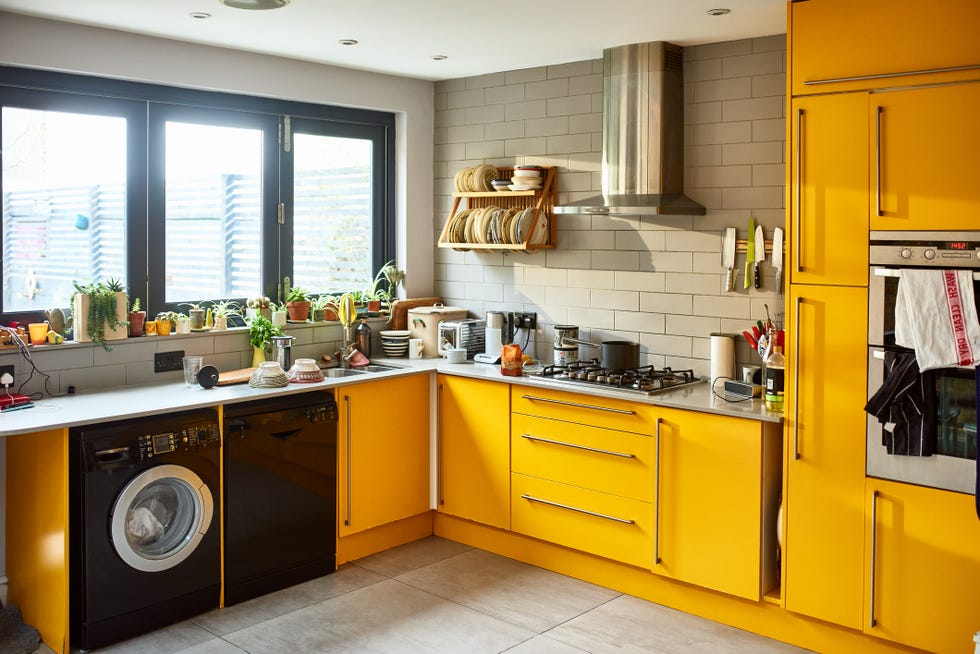
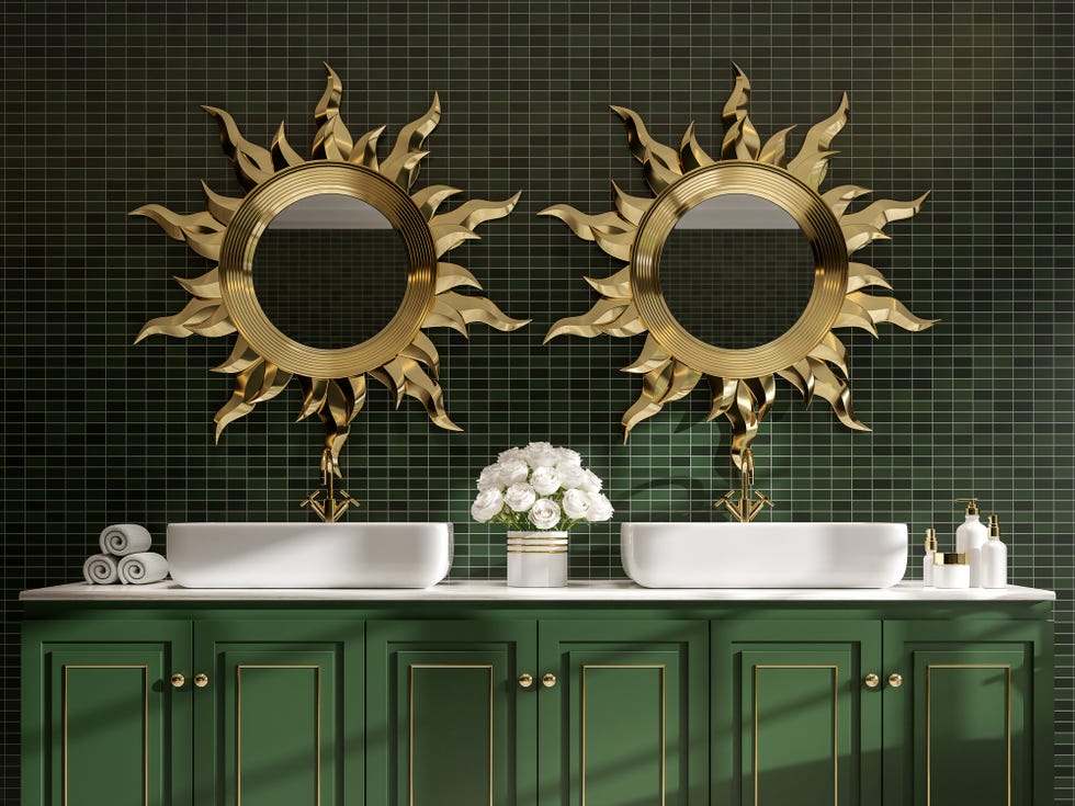
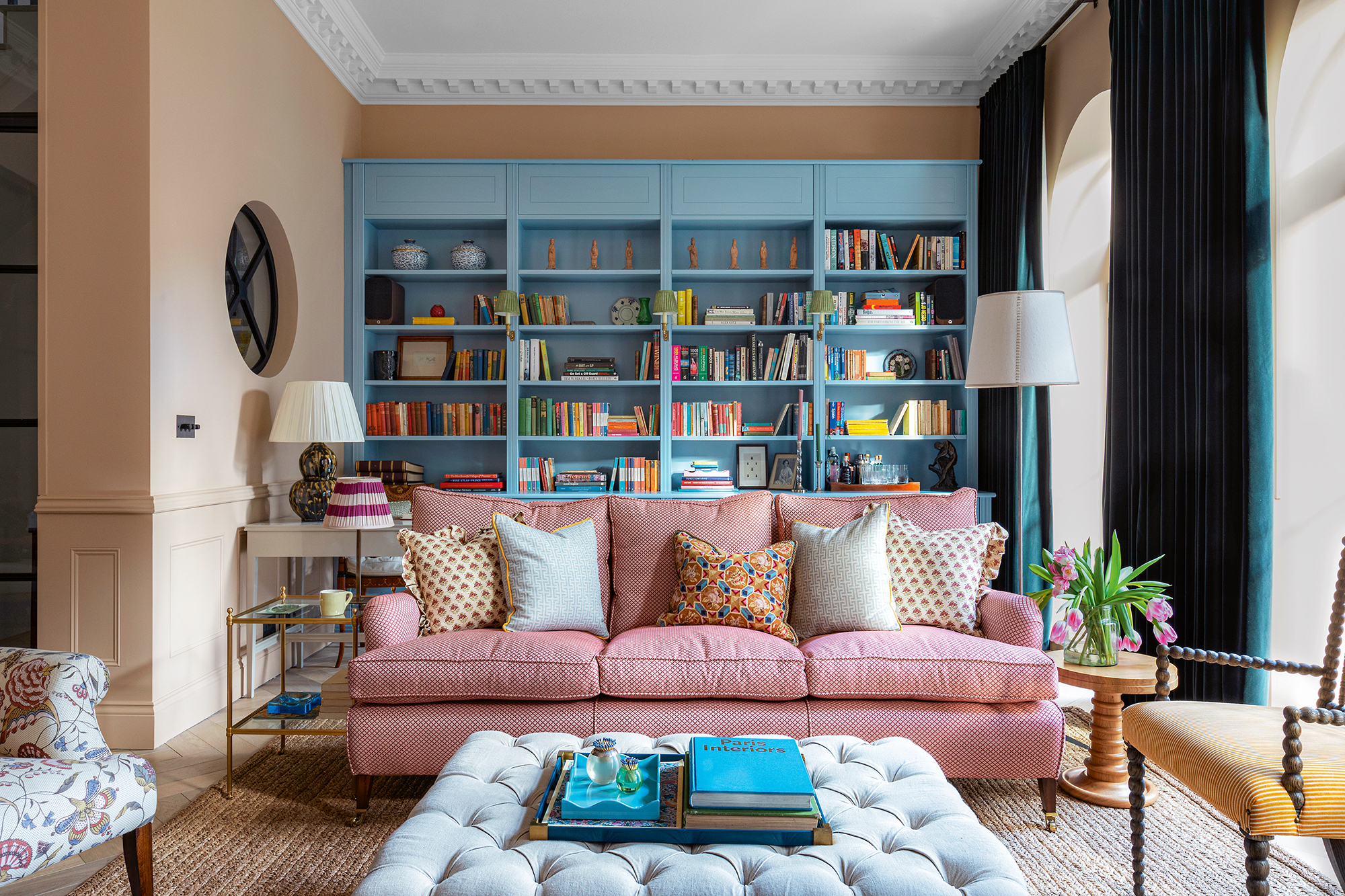
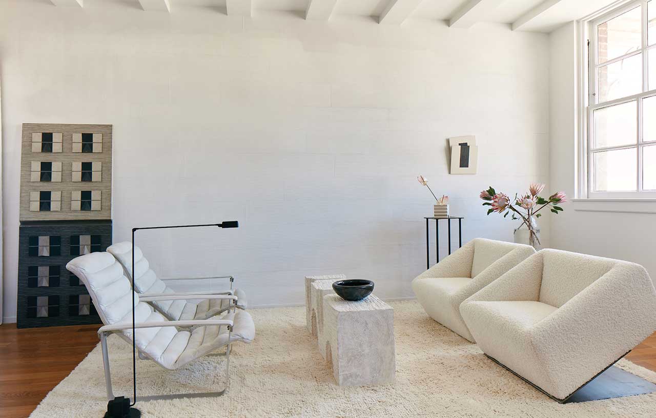
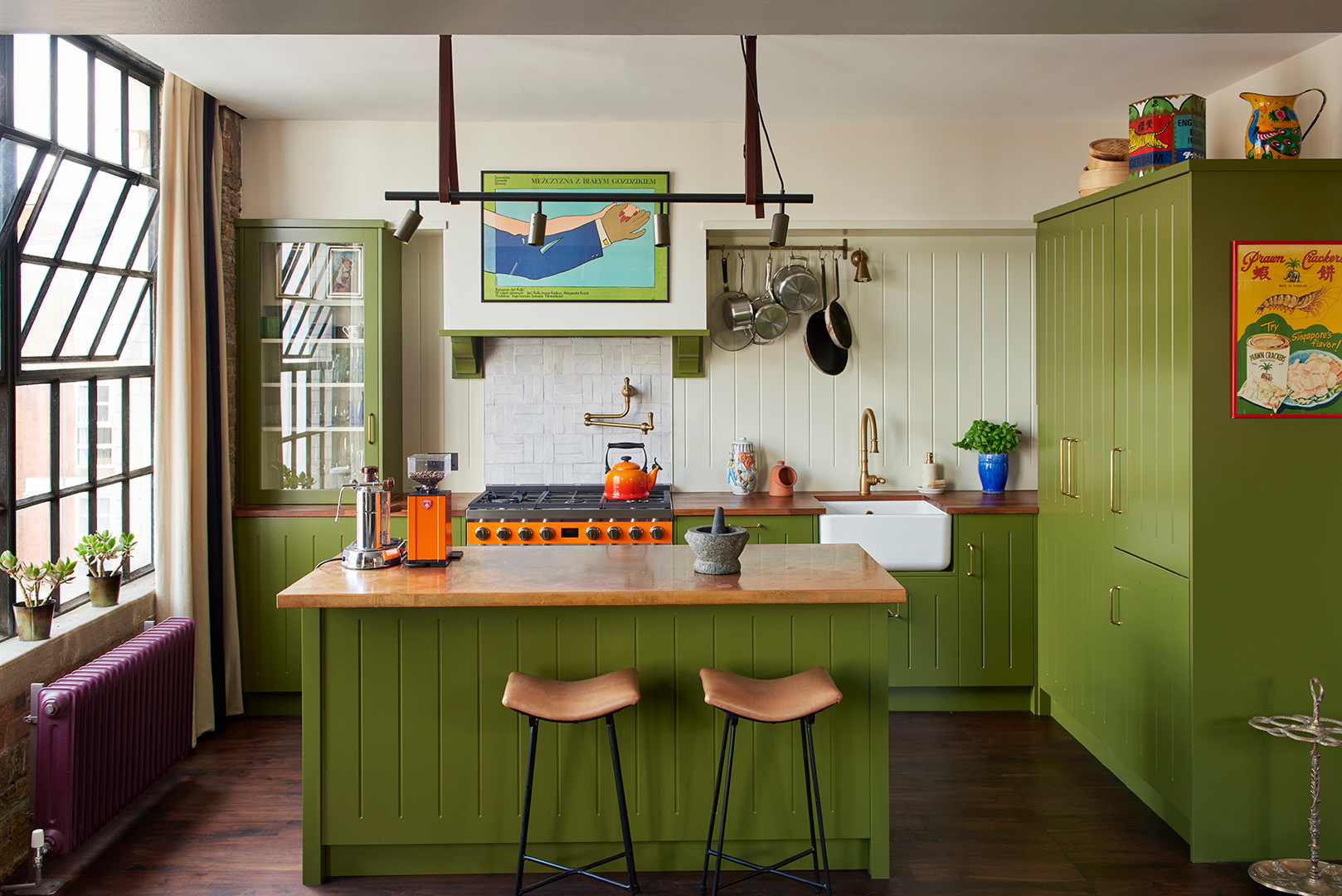
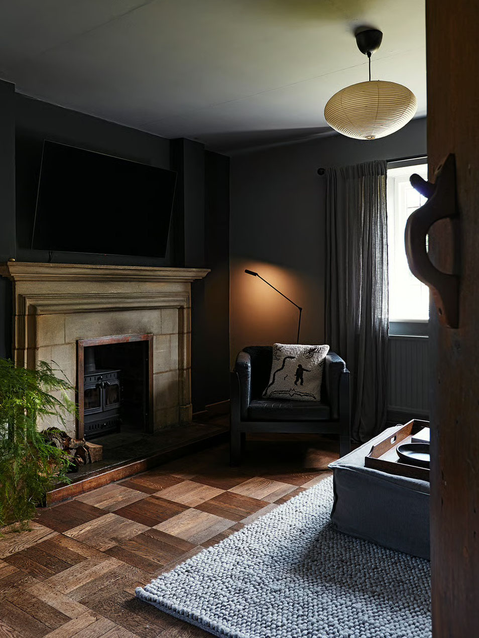
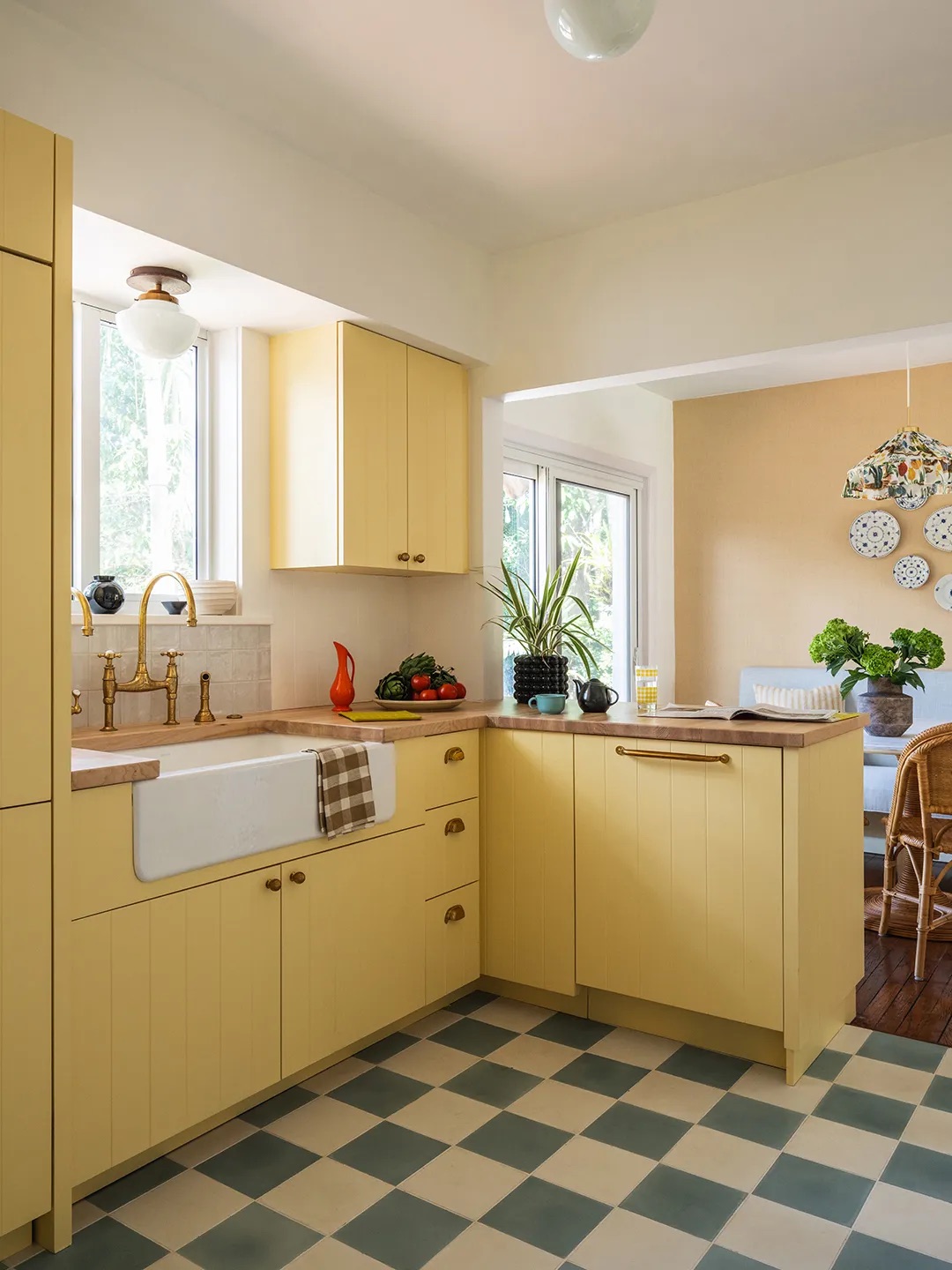
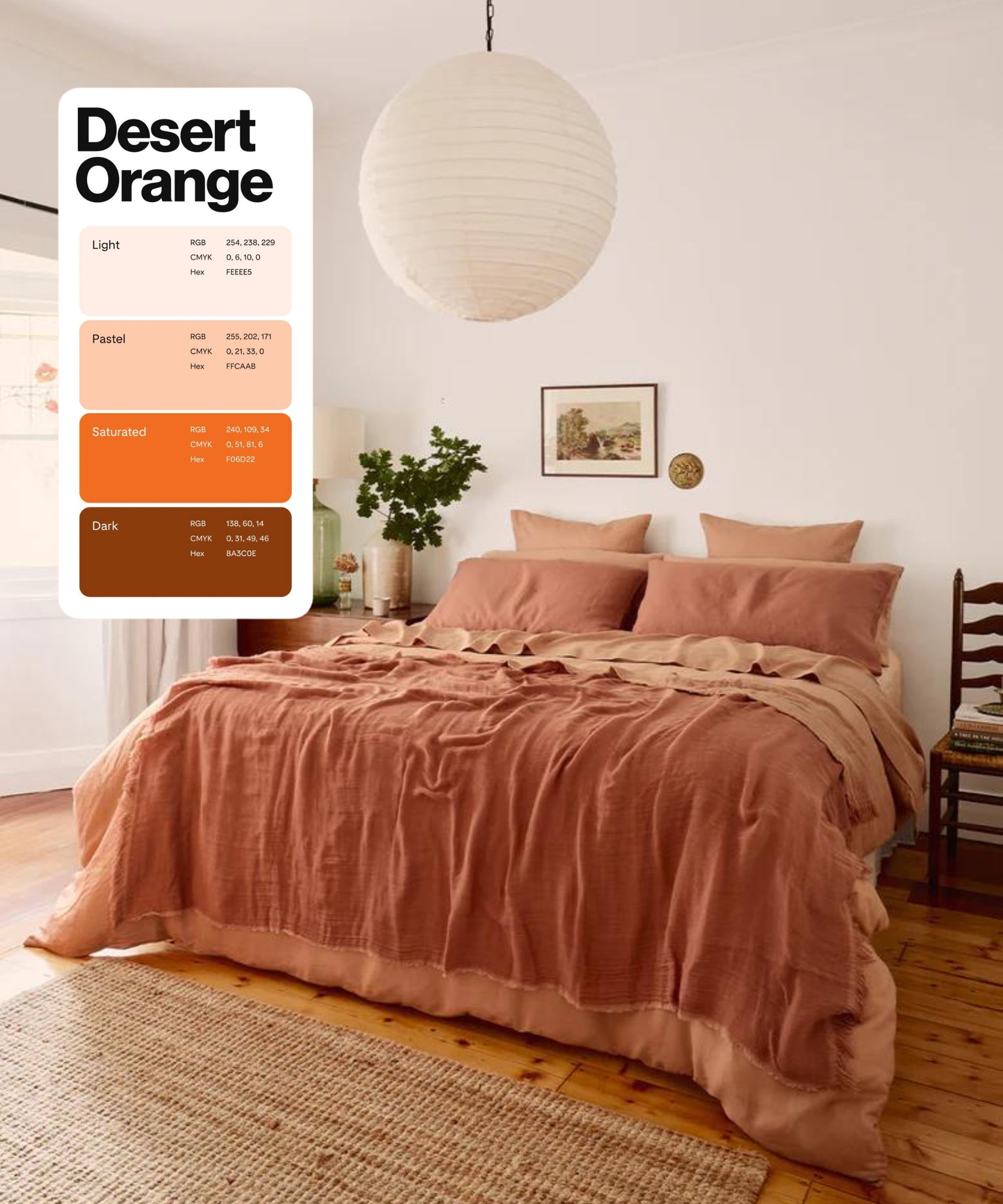
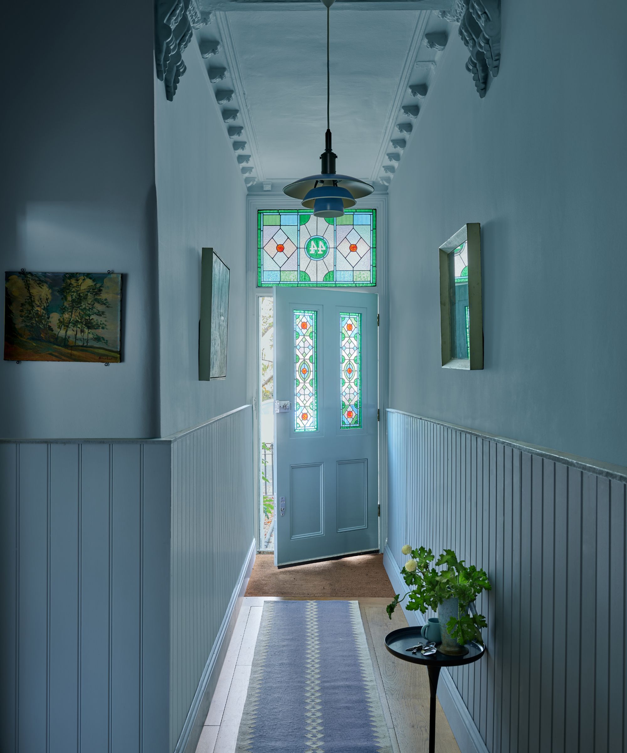
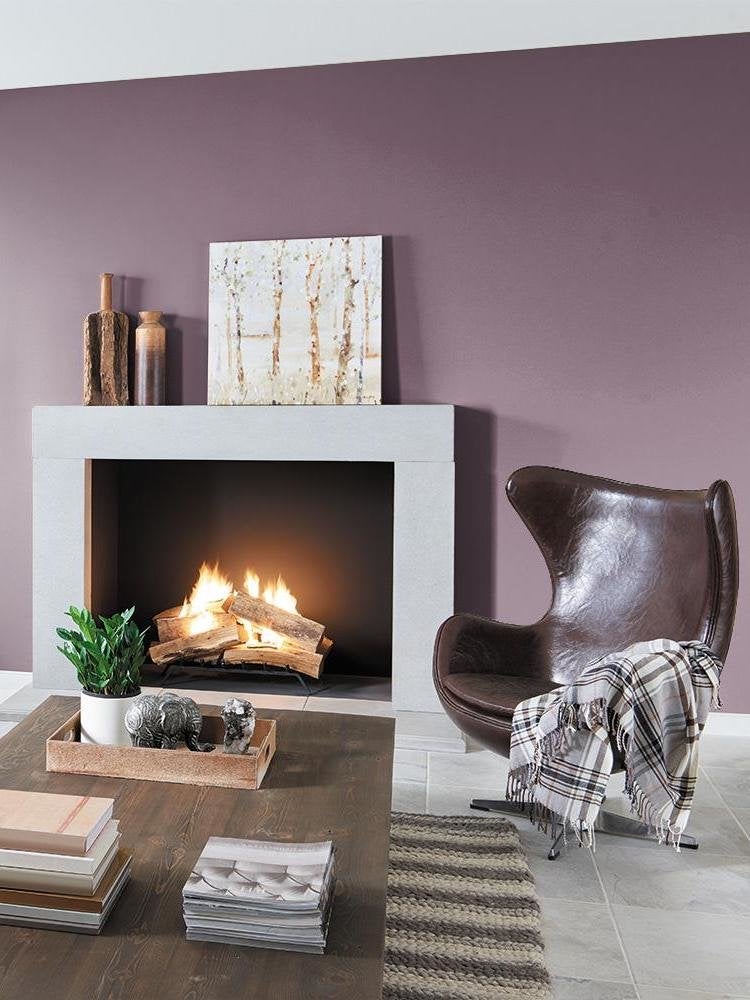
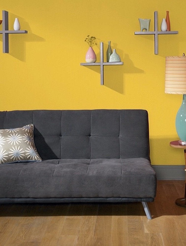
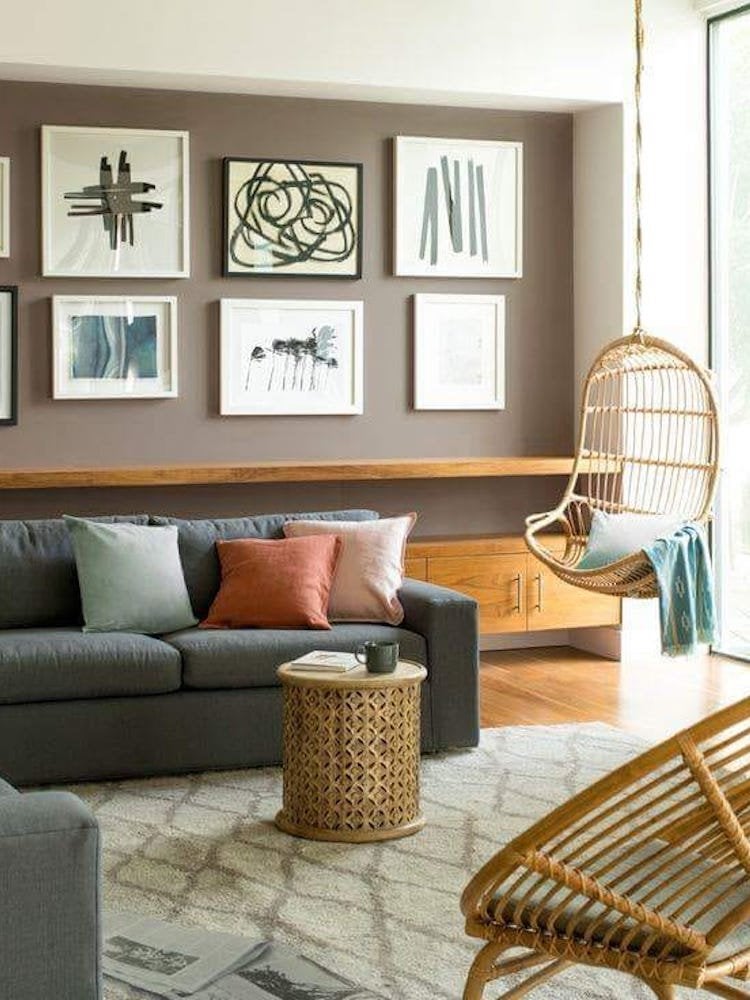
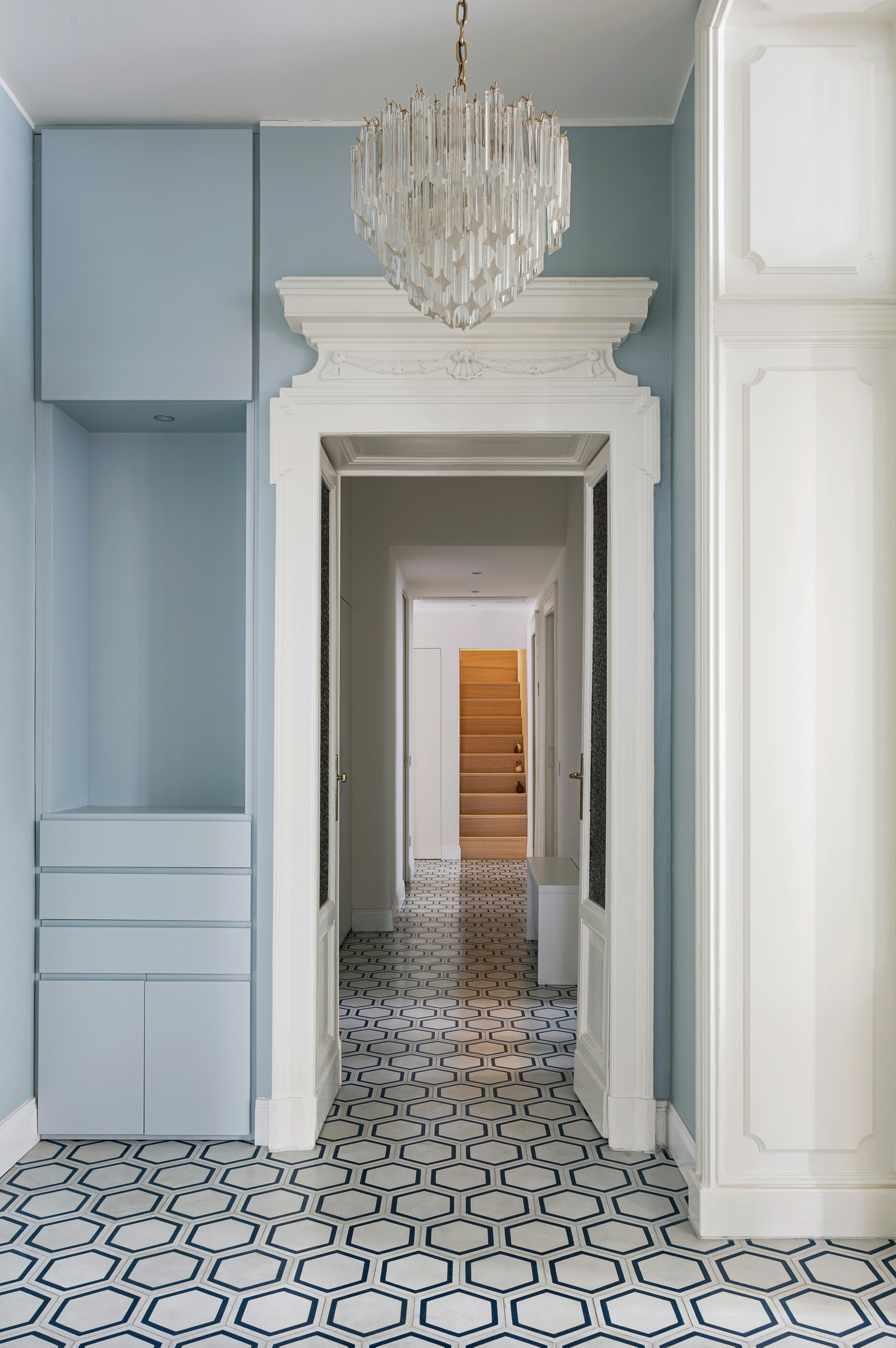
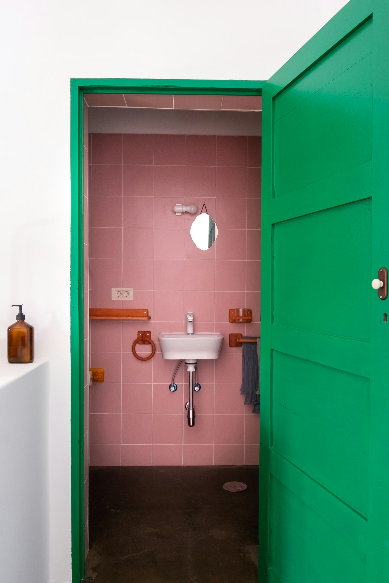
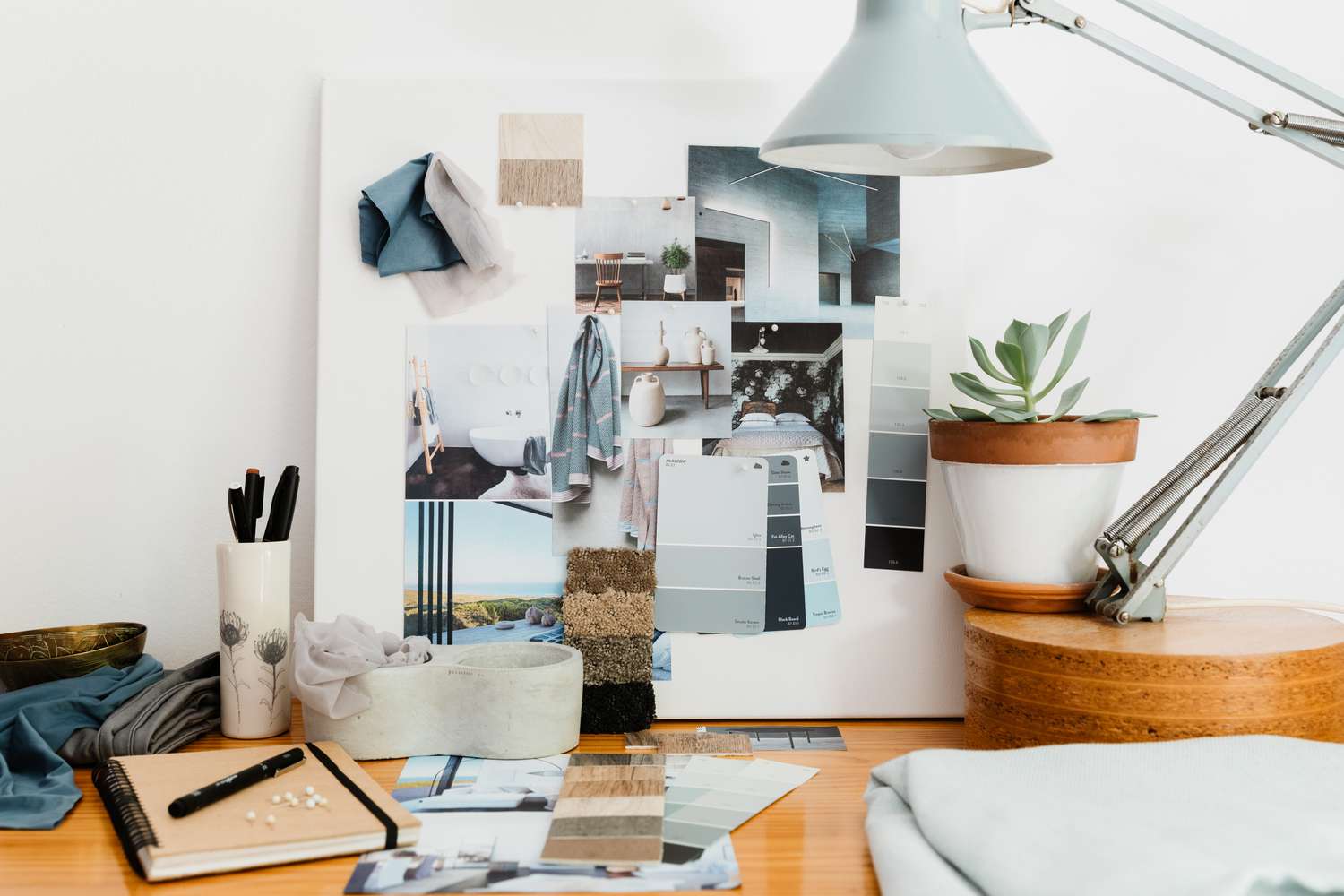
Choosing paint colors for a home can be an overwhelming task due to the vast array of options and the commitment involved in painting an entire room. Many individuals resort to safe neutral colors like white, gray, or beige to avoid decision paralysis. British paint company Farrow & Ball addresses this challenge by offering a curated selection of 132 paint colors, updated annually. For their 75th anniversary, Farrow & Ball collaborated for the first time with an outside designer, renowned Californian interior designer Kelly Wearstler, to create eight new colors for 2021. This collaboration is significant, considering the company typically introduces only a few new colors every couple of years.
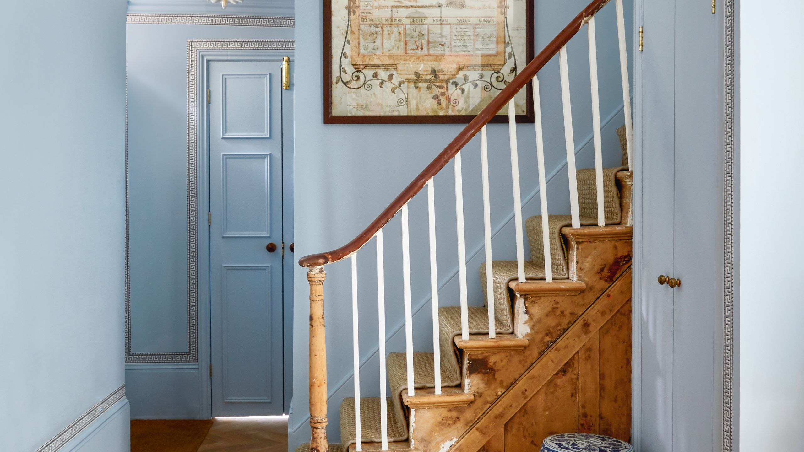
Farrow & Ball's paints are known for their distinctive, whimsically named colors, such as Dead Salmon and Hague Blue. The unique quality of these paints stems from a proprietary blend of 13 pigments, which includes a substantial amount of black. Charlotte Cosby, head of creative at Farrow & Ball, explains that the added black gives the colors a familiar, comforting feel, akin to a well-worn pair of jeans.
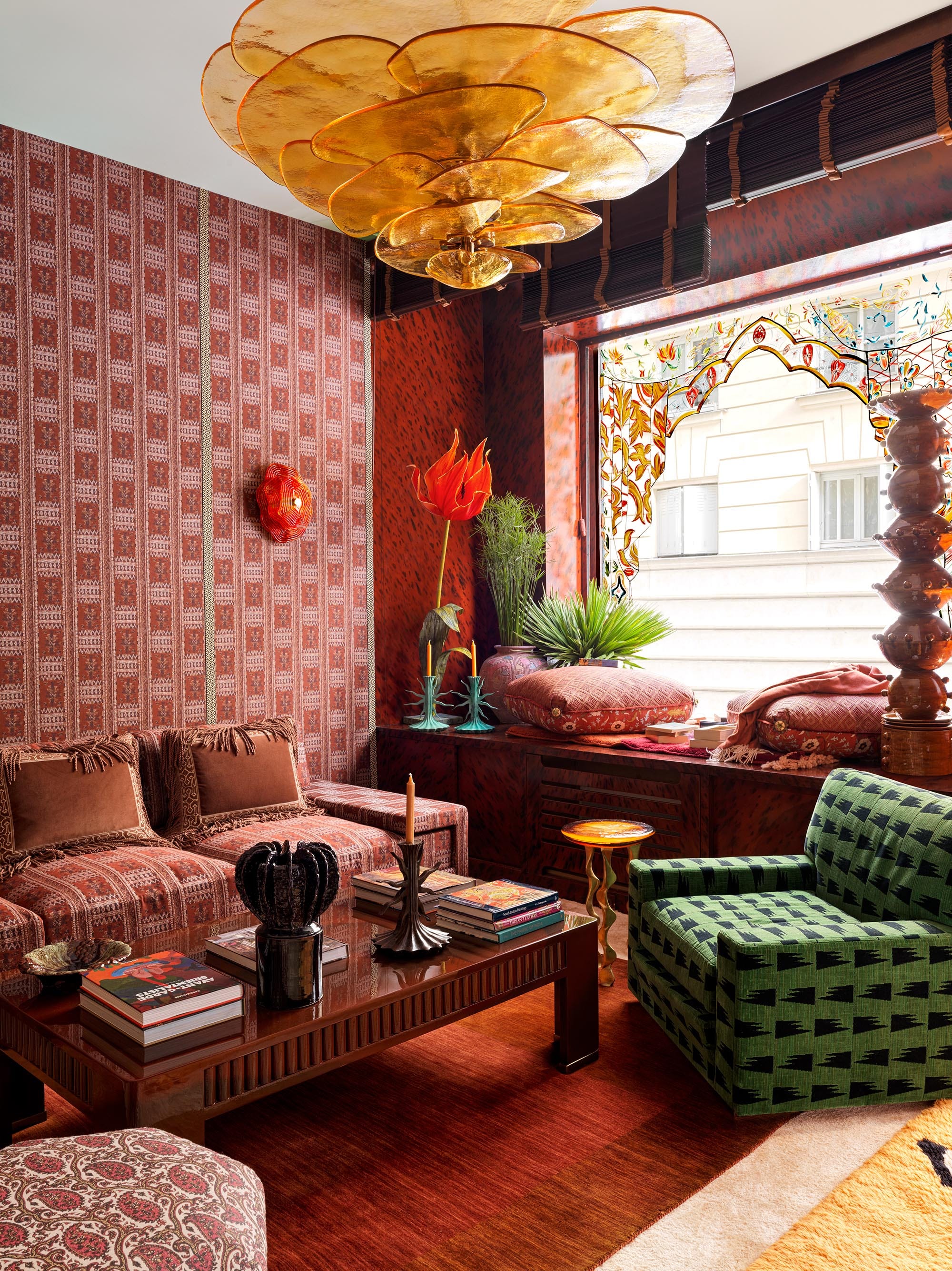
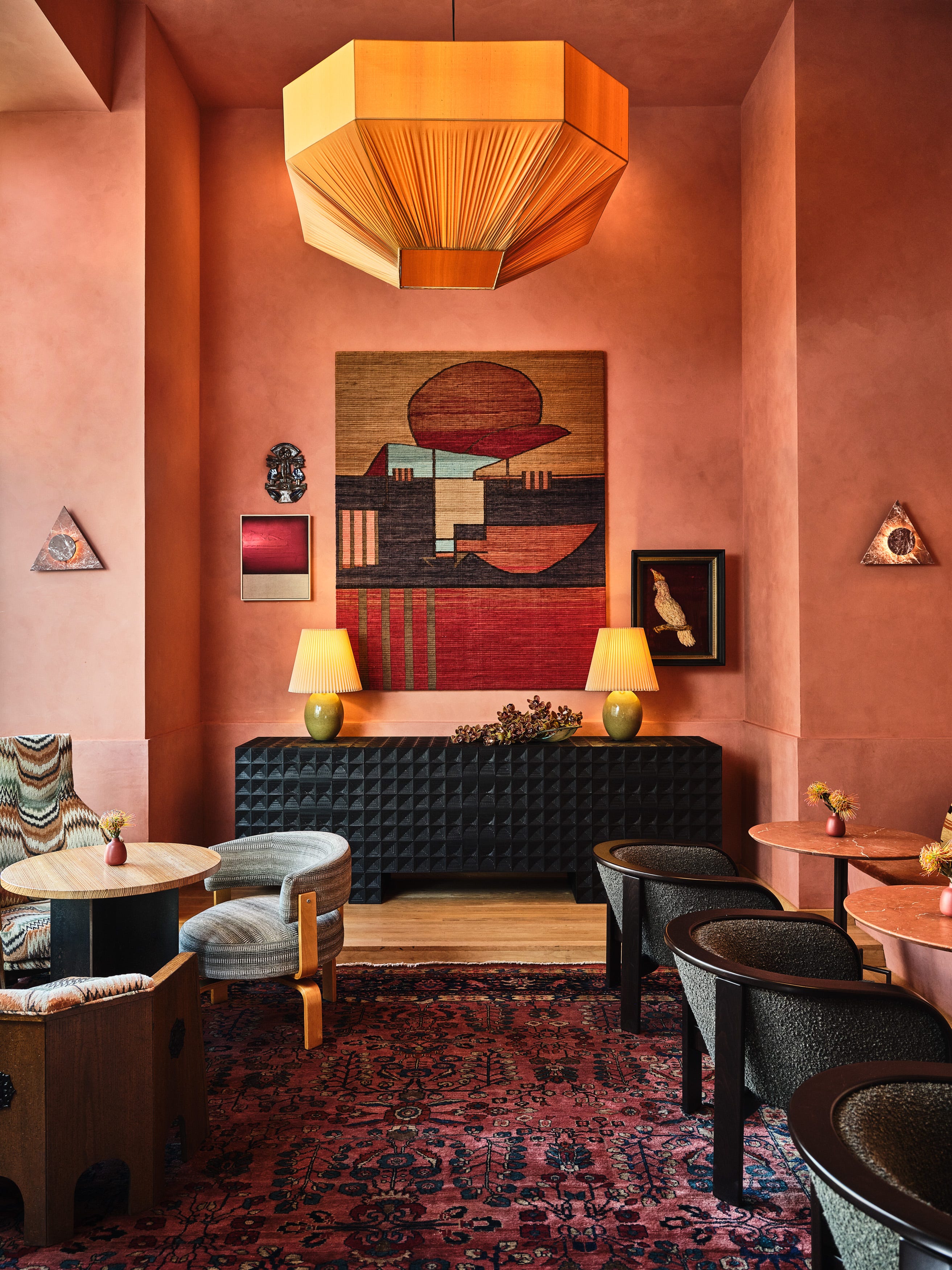
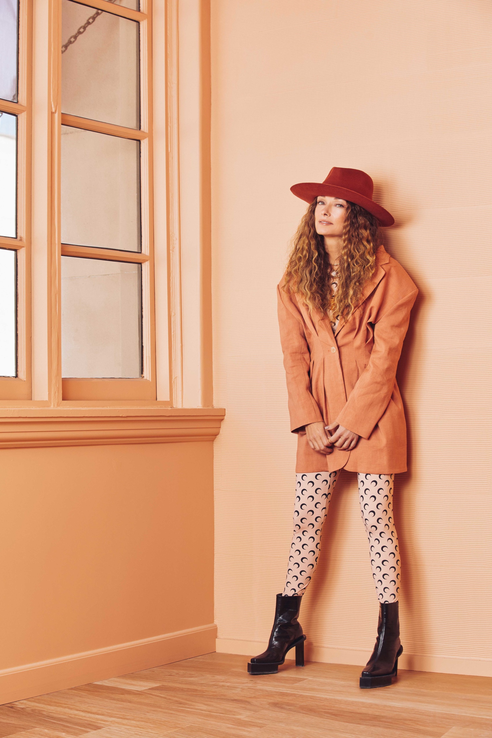
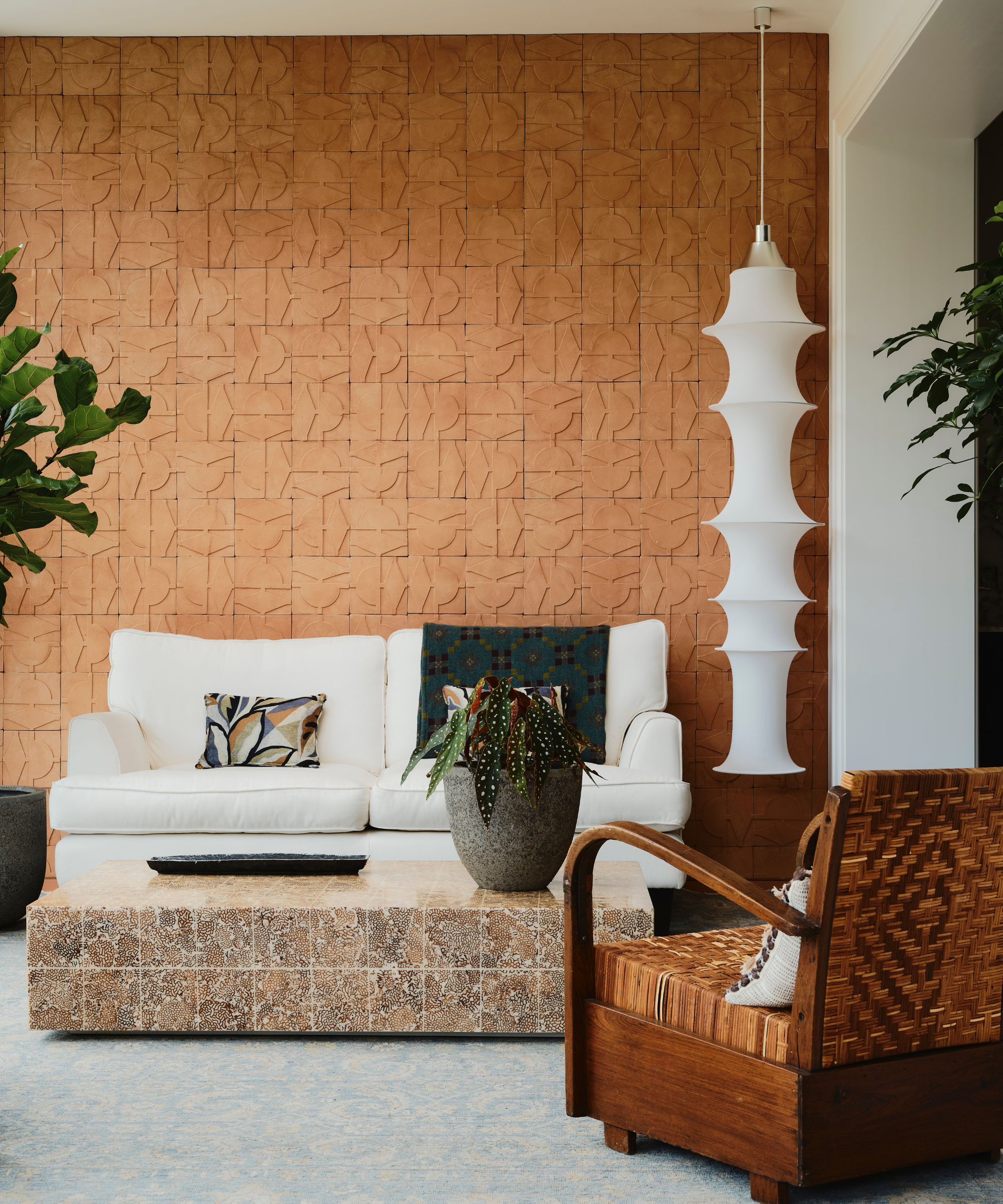
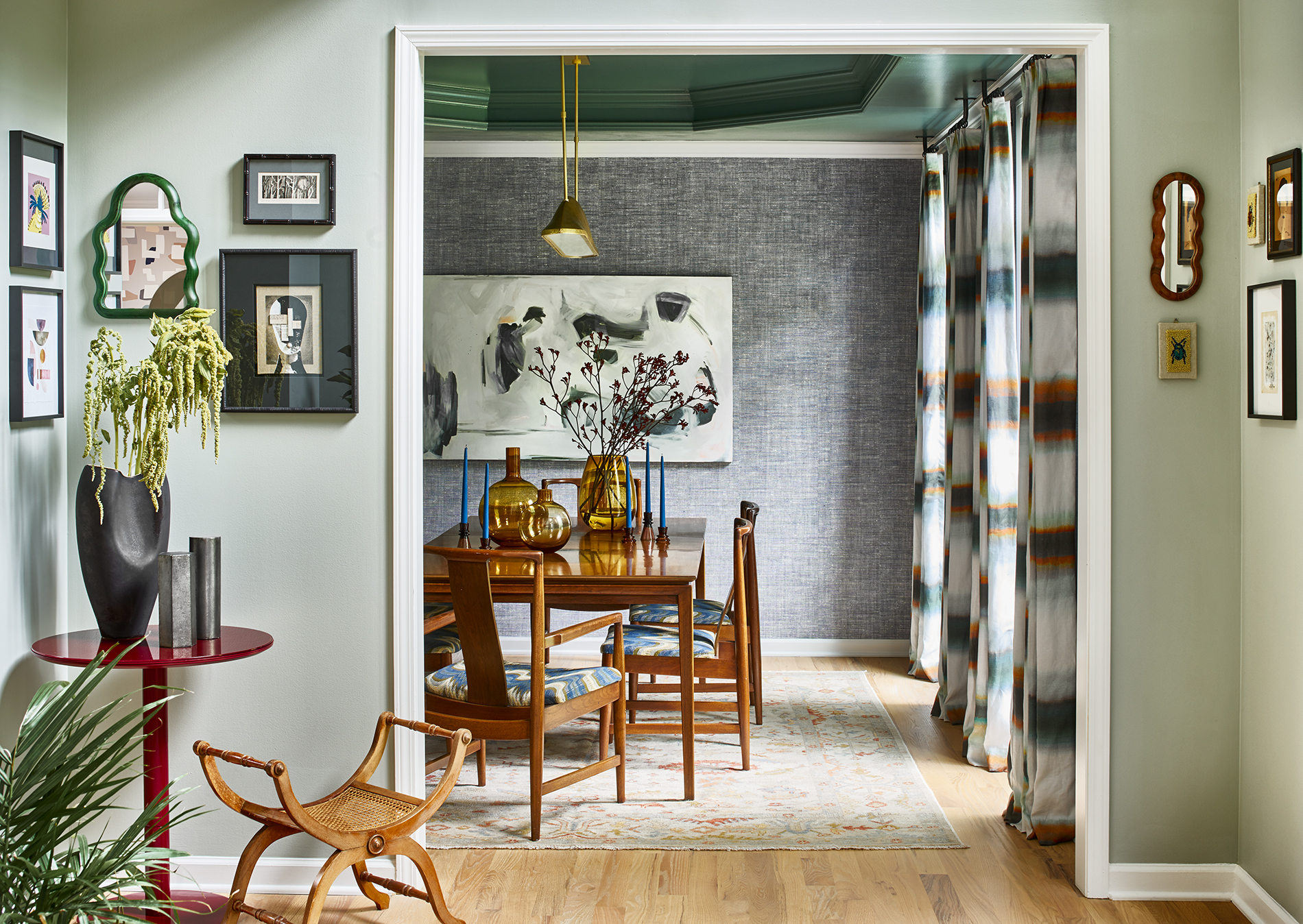
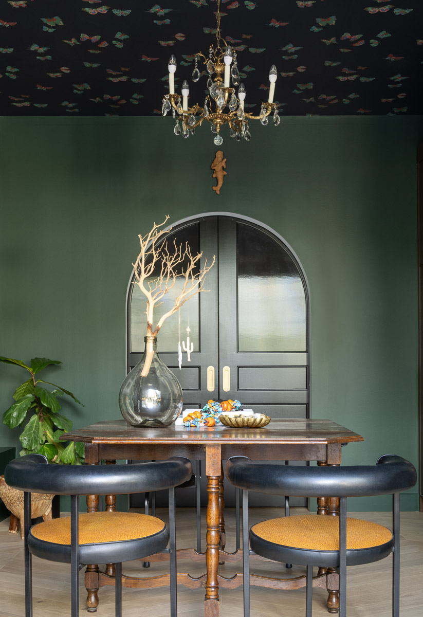
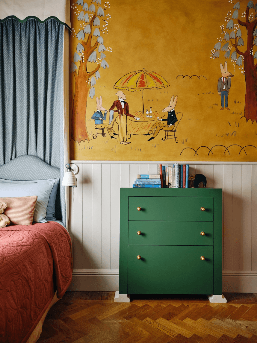
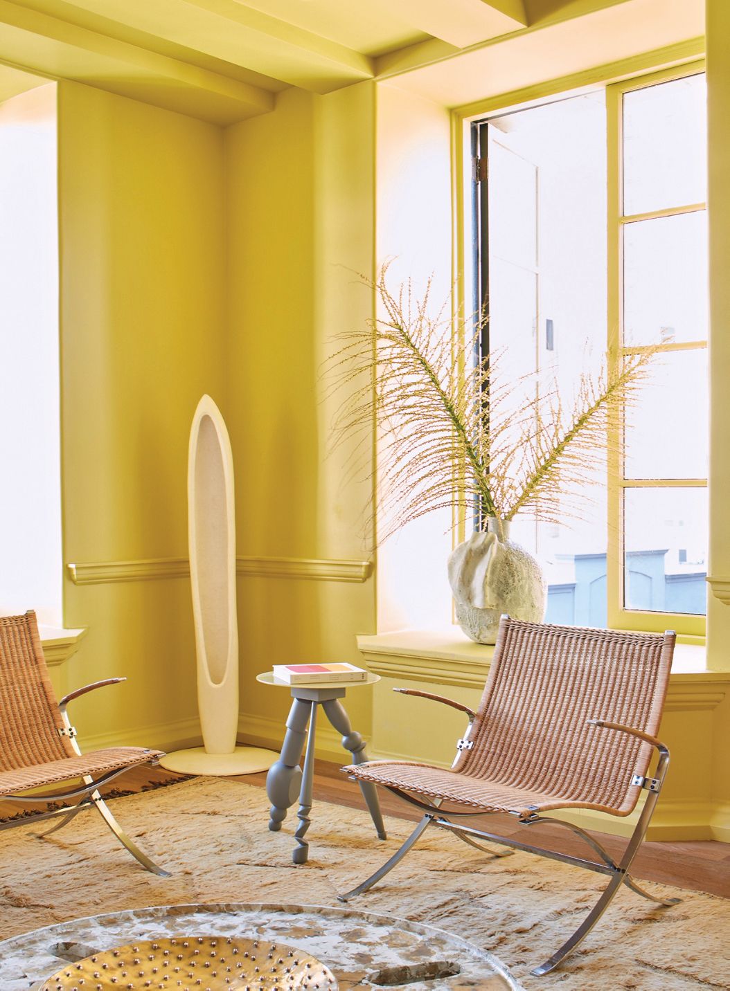
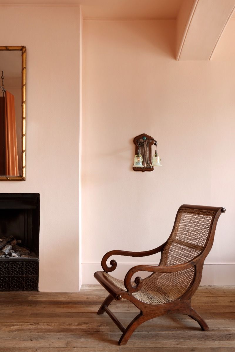
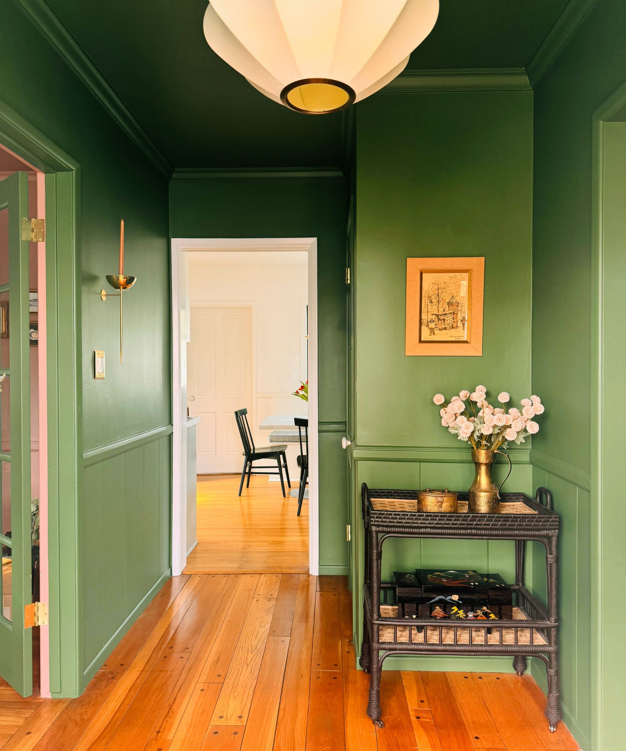
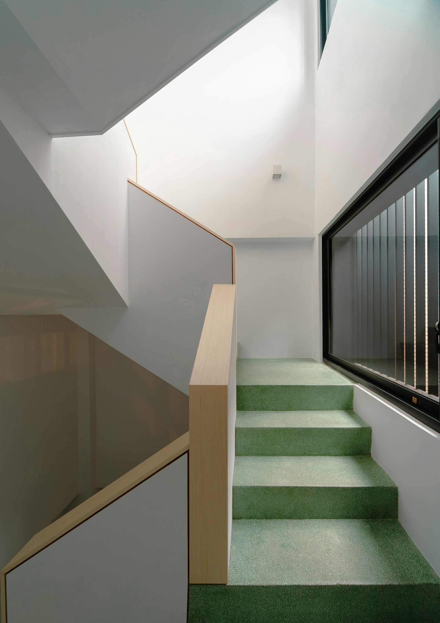
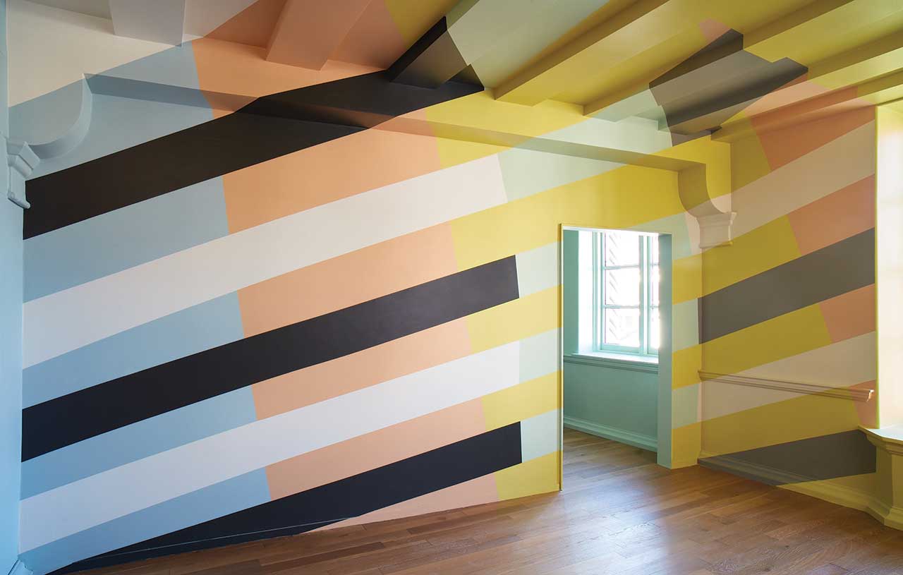
Kelly Wearstler, who has integrated Farrow & Ball colors into her projects for decades, working with clients ranging from Hollywood celebrities to luxury hotels, found the opportunity to develop her own color palette particularly exciting. She emphasizes that color is a crucial reflection of personal identity and well-being. Wearstler aimed for an optimistic and happy palette, especially as the world emerged from the pandemic. Each of the eight colors in her collection is inspired by a specific memory or element from Los Angeles. For instance, Faded Terracotta is reminiscent of vintage tiles found in Silverlake, and one muted gray-green hue reflects the Southern California landscape.
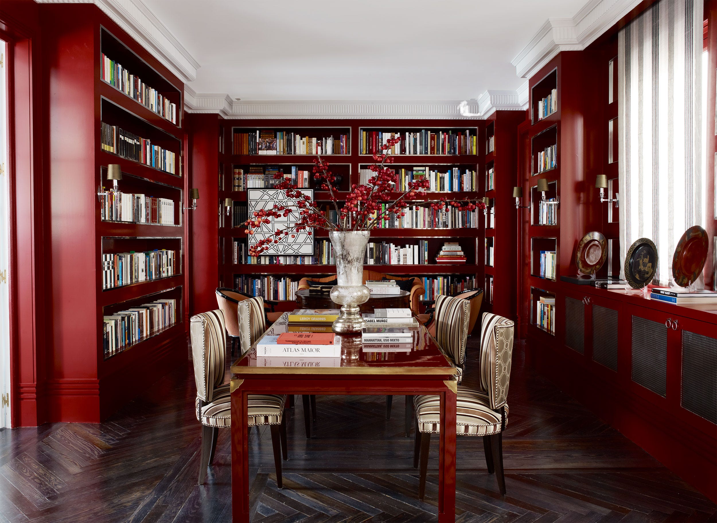
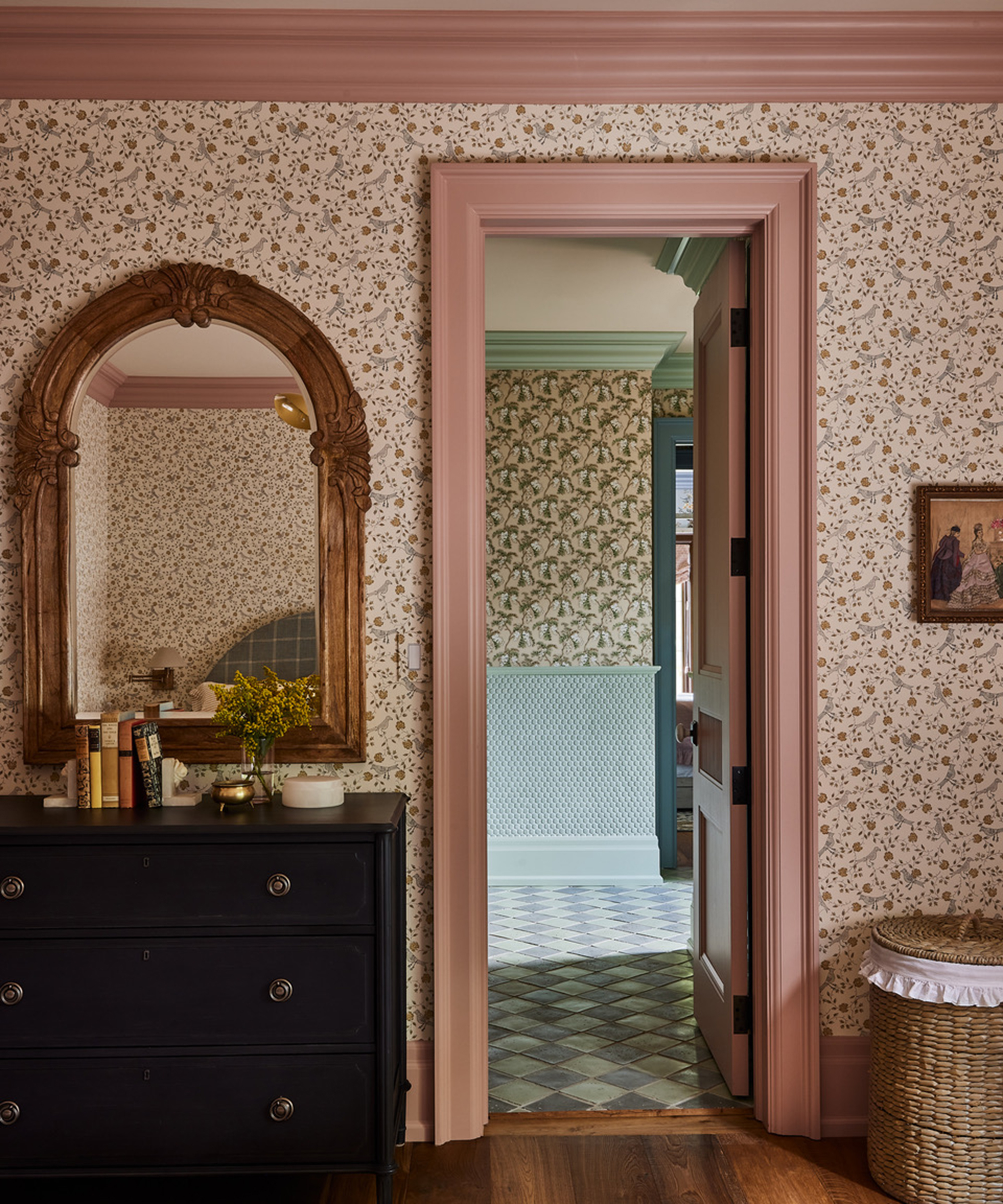
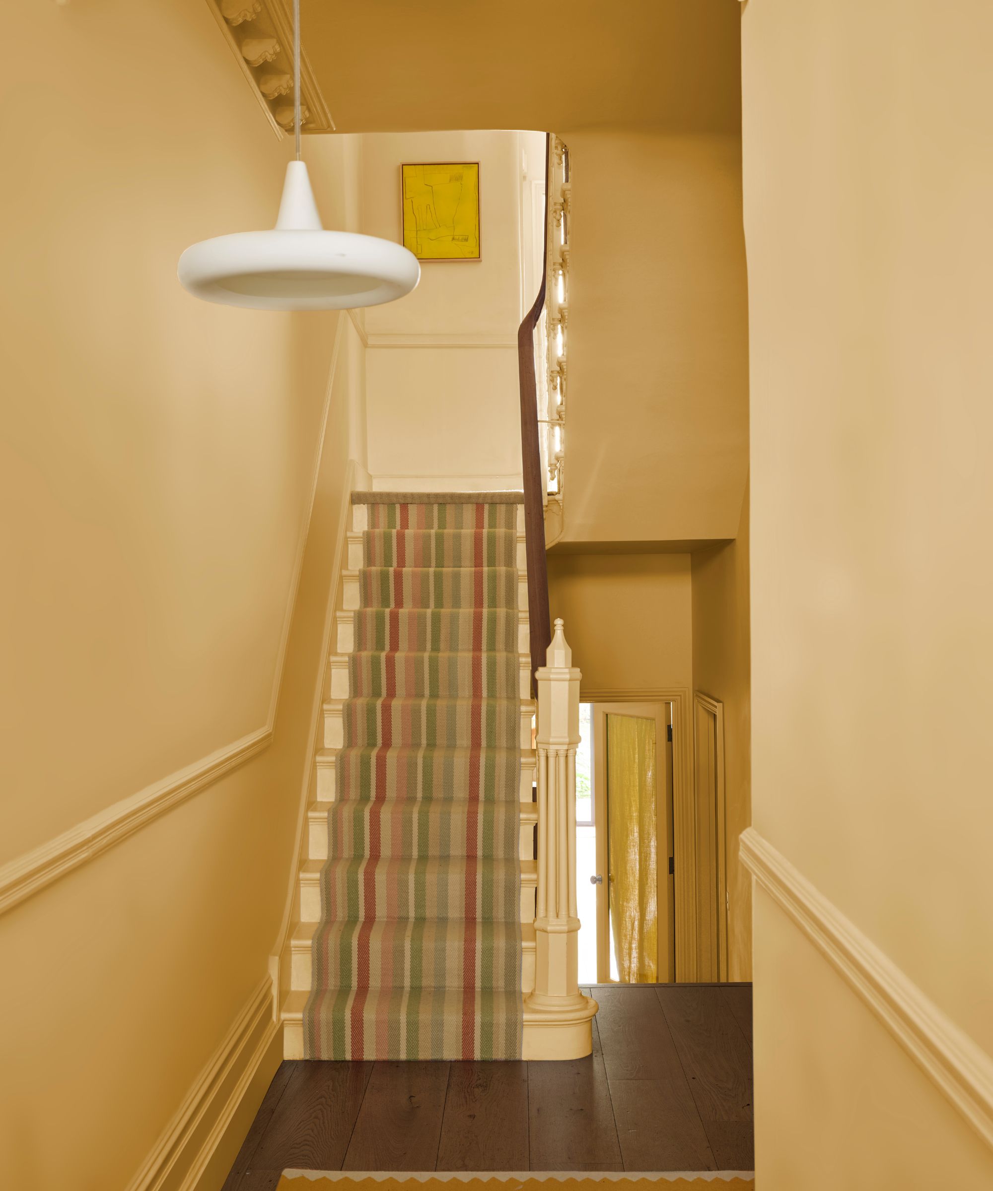
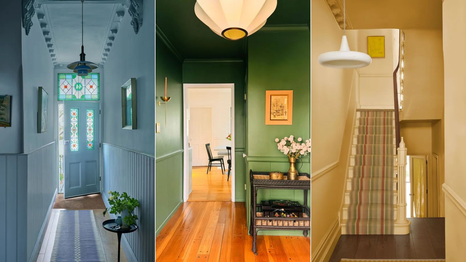
Wearstler advocates for a personalized approach to color selection, suggesting that individuals look to their own wardrobes and favorite art pieces for inspiration. She advises identifying recurring themes in colors and objects that one is naturally drawn to. Furthermore, she stresses the importance of testing paint colors in real-life settings. This includes considering where the color will be applied—walls, ceiling, millwork, or window frames—and the desired texture, to ensure all elements harmonize.
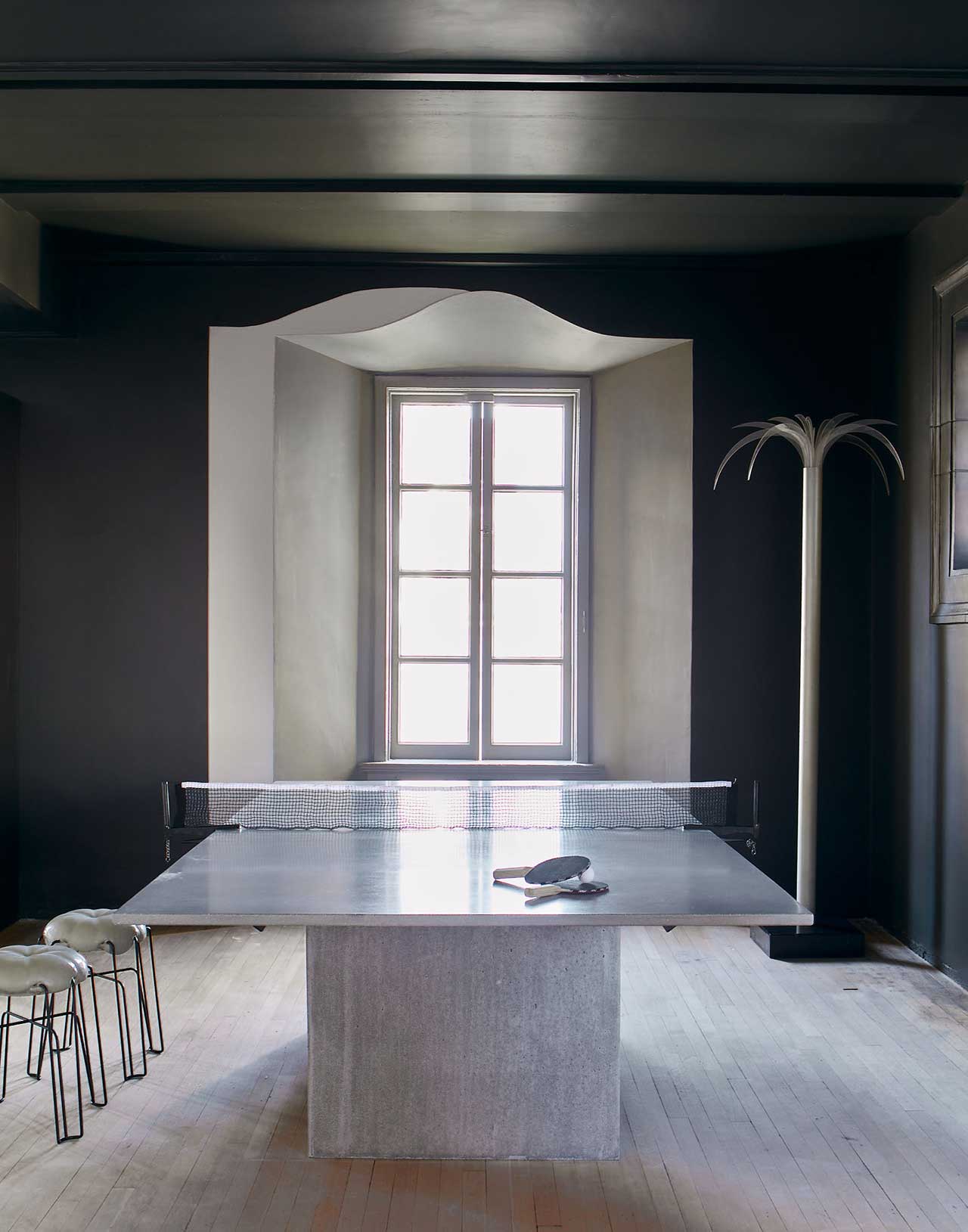
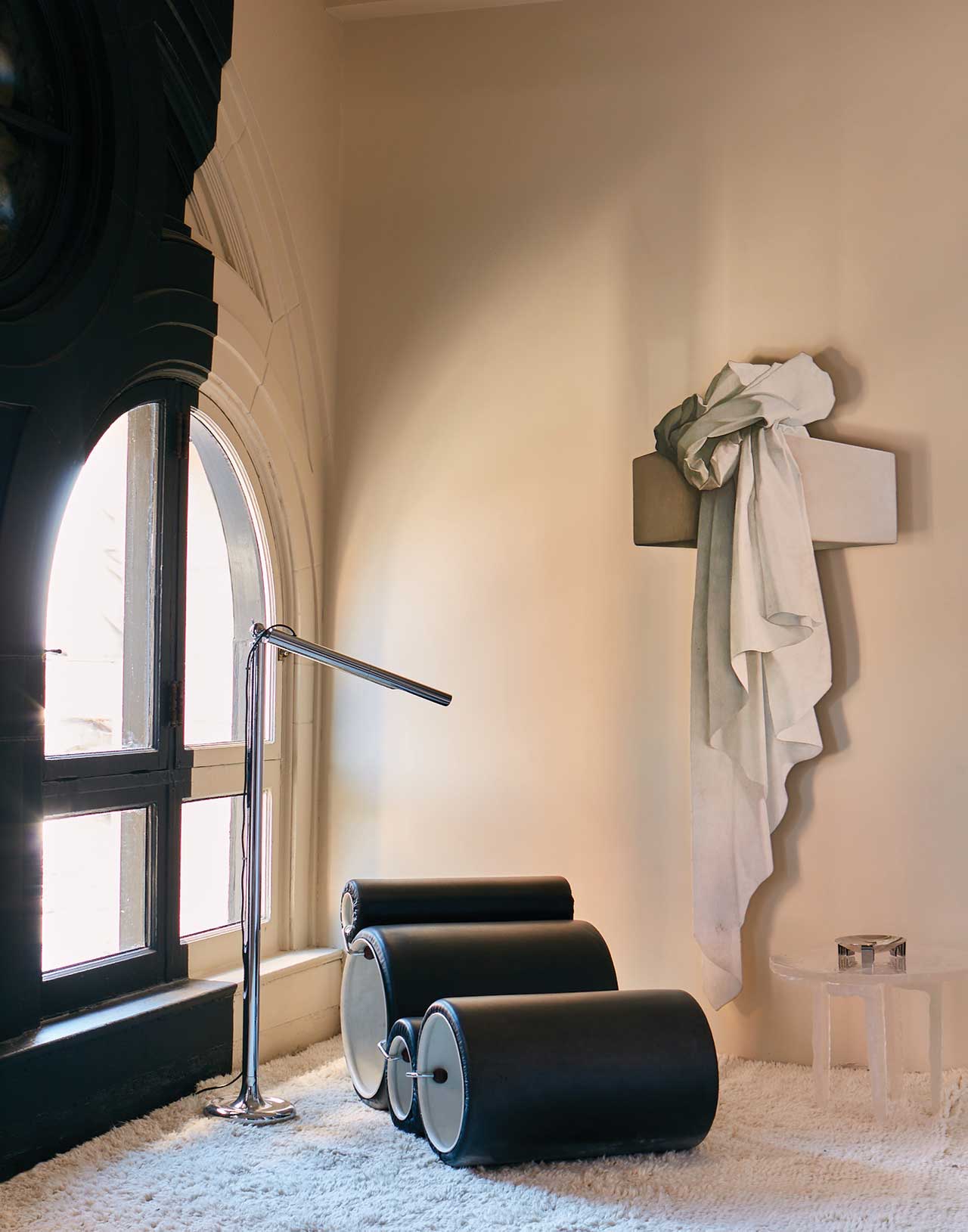
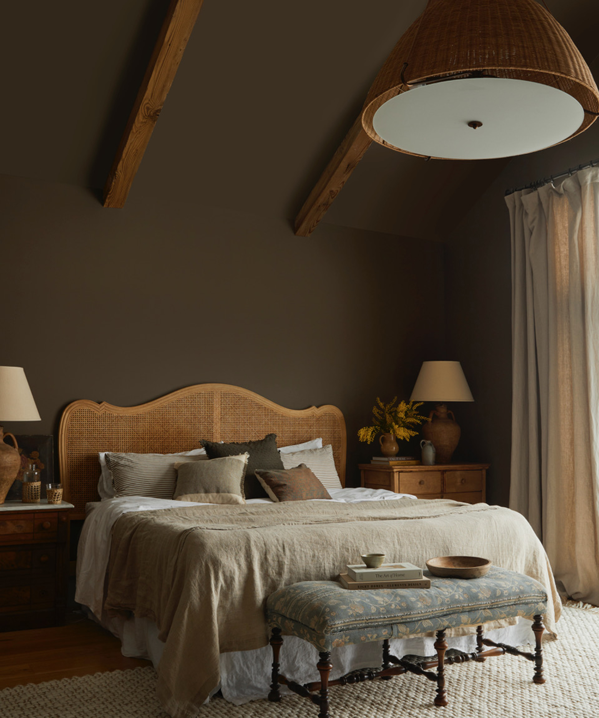
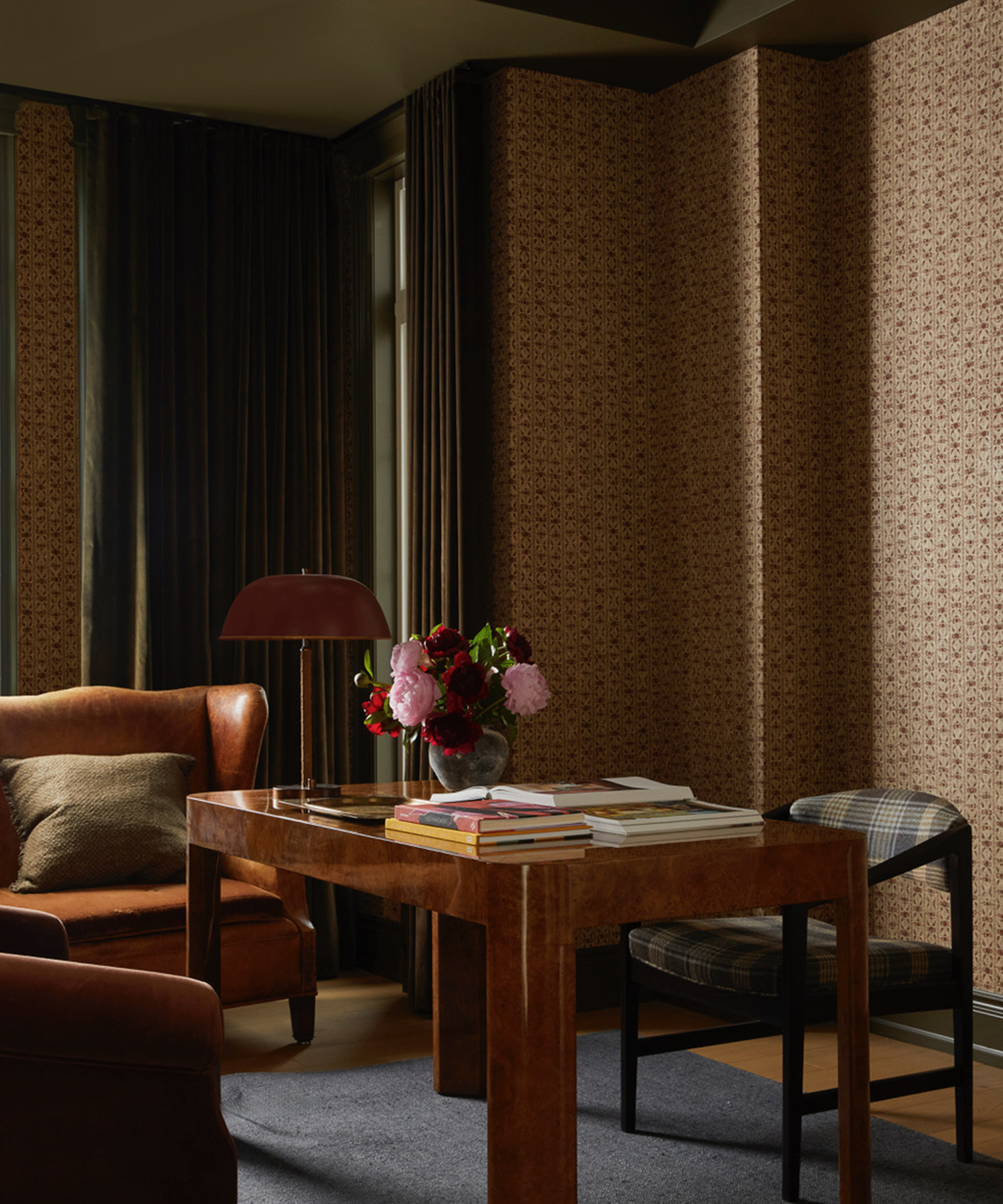
During the development of her collection, Wearstler immersed herself in the new palette, using it in various rooms of her Downtown LA Proper hotel project. The results were so compelling that these new Farrow & Ball colors will be incorporated into the hotel's decor upon its opening. To ensure the palette's versatility, Wearstler and Cosby meticulously evaluated each color under different lighting conditions, including the distinct light of “gray England,” “bright California,” and even the greenish light of New York. The resulting collection is designed to be foolproof, allowing for any combination of colors without the risk of an unfavorable outcome, much like a well-curated capsule wardrobe.
#KellyWearstler #FarrowAndBall #ColorPalette #HomeDecor #InteriorDesign #PaintColors #DesignCollaboration #ColorSelection #LuxuryDesign #KellyWearstler #FarrowAndBall #ColorPalette #HomeDecor #InteriorDesign #PaintColors #DesignCollaboration #ColorSelection #LuxuryDesign
0 commenti in totale
 Nessun commento ancora
Potresti anche gradire
8 Surprising Colors That Will Decrease Your Home's Value, According to Experts


An A-List Designer’s Secrets To Picking Perfect Paint Colors

As a designer, I can tell you: this one simple change can transform any home’s decor
Discover Your Perfect Interior Color Scheme With These Online Tools

These 20 Rooms Use a Red Color Palette in All the Right Ways
6 'Energetic Colors' for Vitality and "Sophisticated Interiors", According To Psychologists And Design Experts

Why This Hue Is Suddenly Dominating Every Designer's Wishlist—Plus, How to Style It

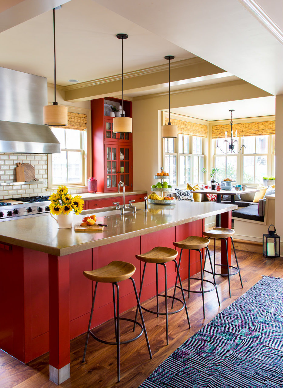
Four Gorgeous Front Range Rooms That Embrace Color

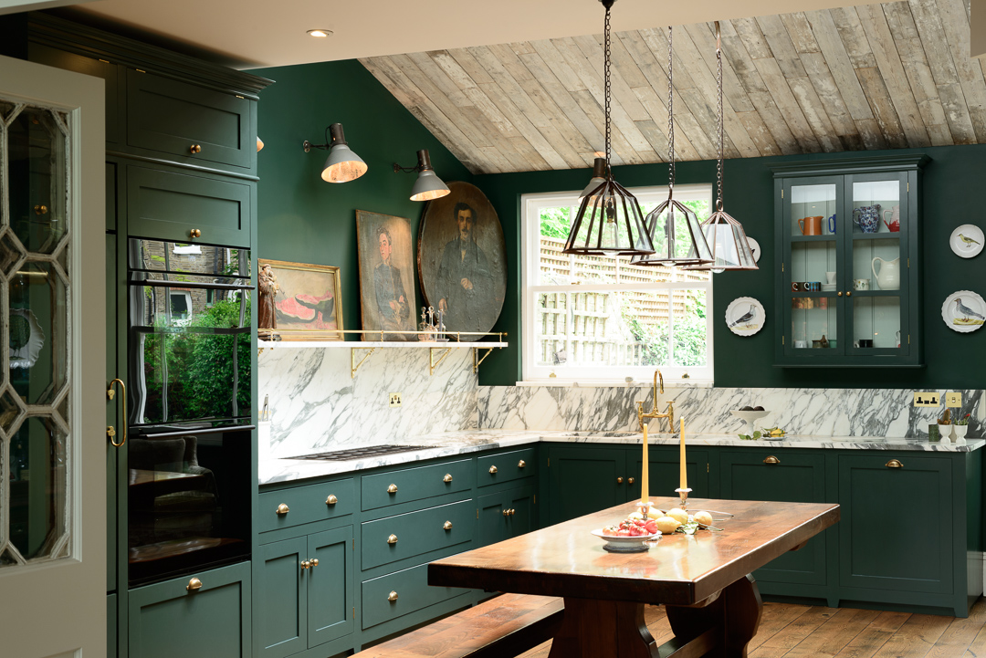
Real estate agents reveal which room colors sell a house the fastest – for the highest price


This Kitchen Paint Color Never Goes Out Of Style, According To Hilary Farr
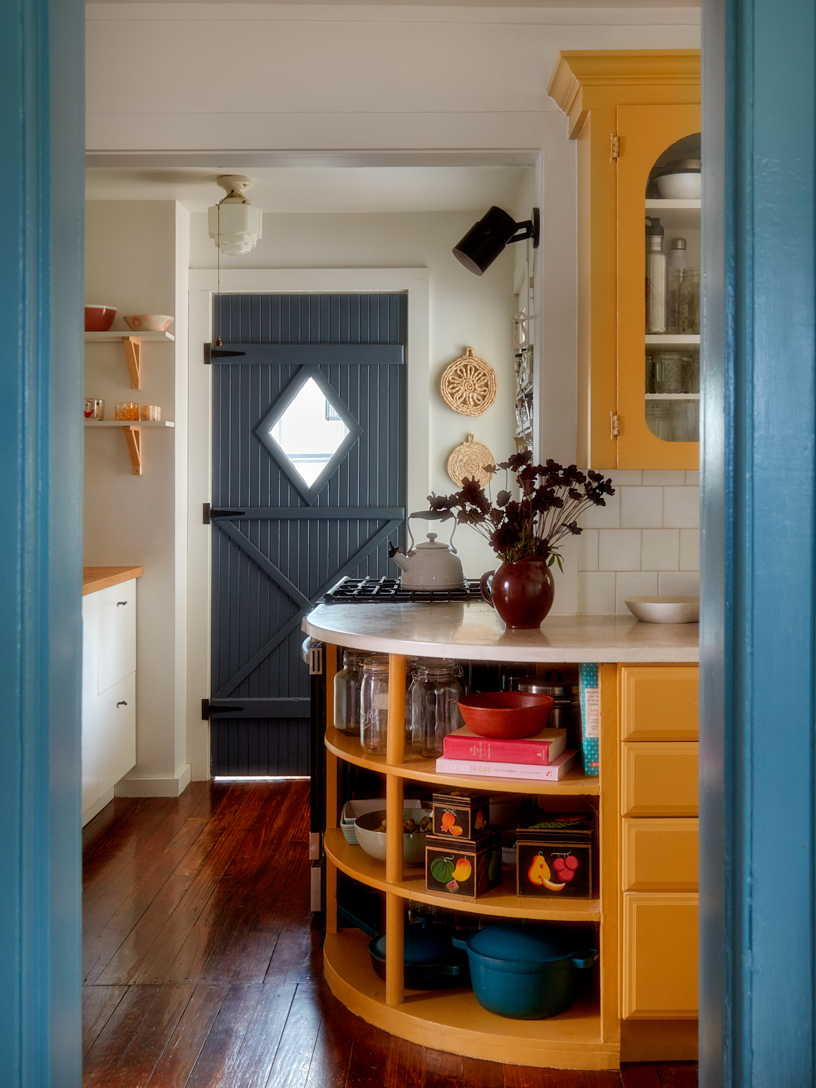
This Cheery Kitchen Color Could Hurt Your Home Value

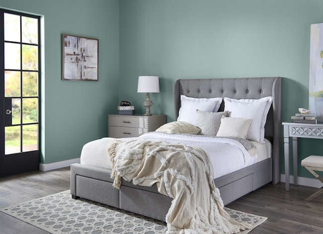
14 Paint Colors That Can Make a Room Feel Instantly Cozy

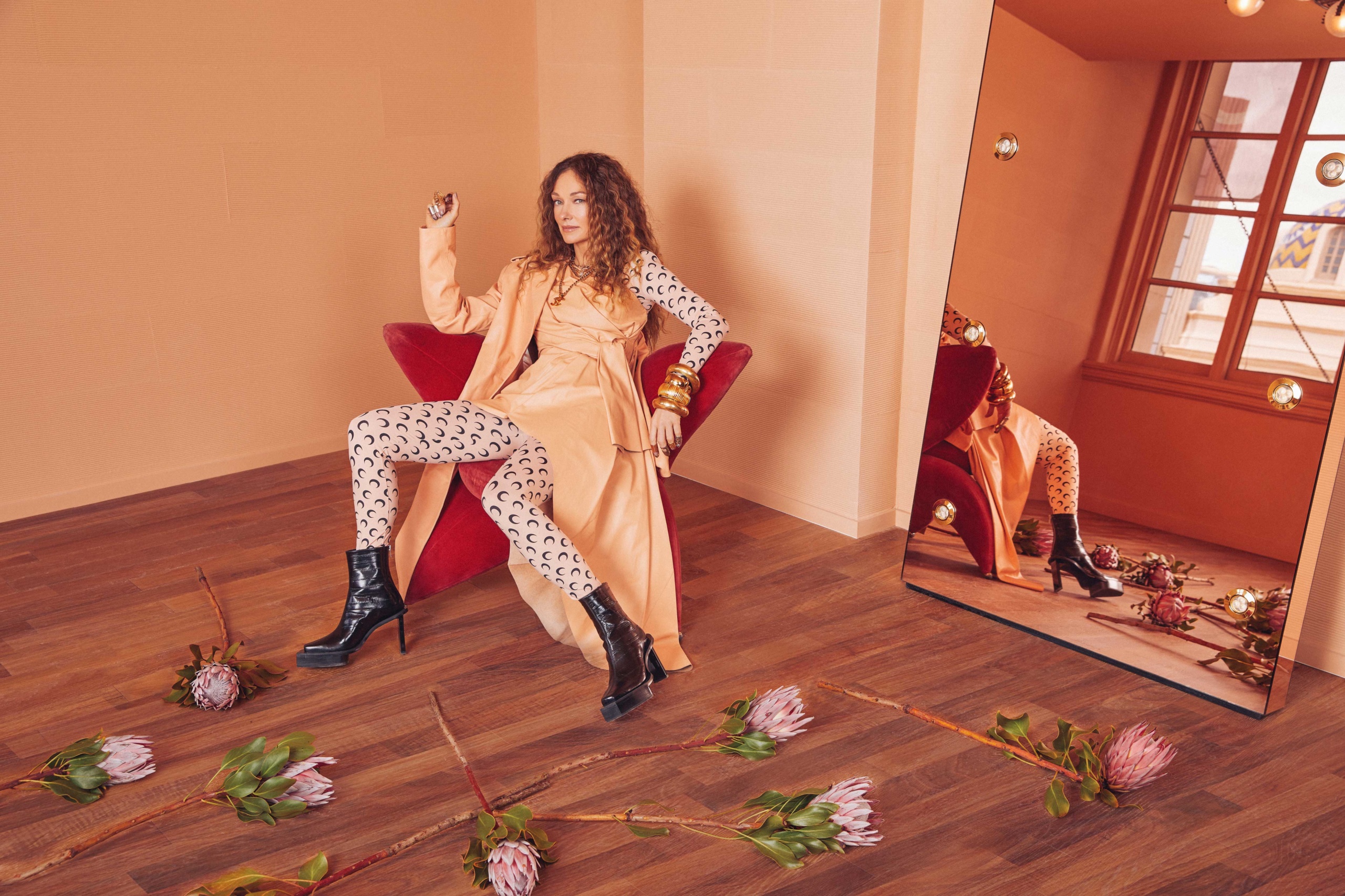
Kelly Wearstler Reveals a Farrow & Ball Paint Palette Inspired by the Golden State

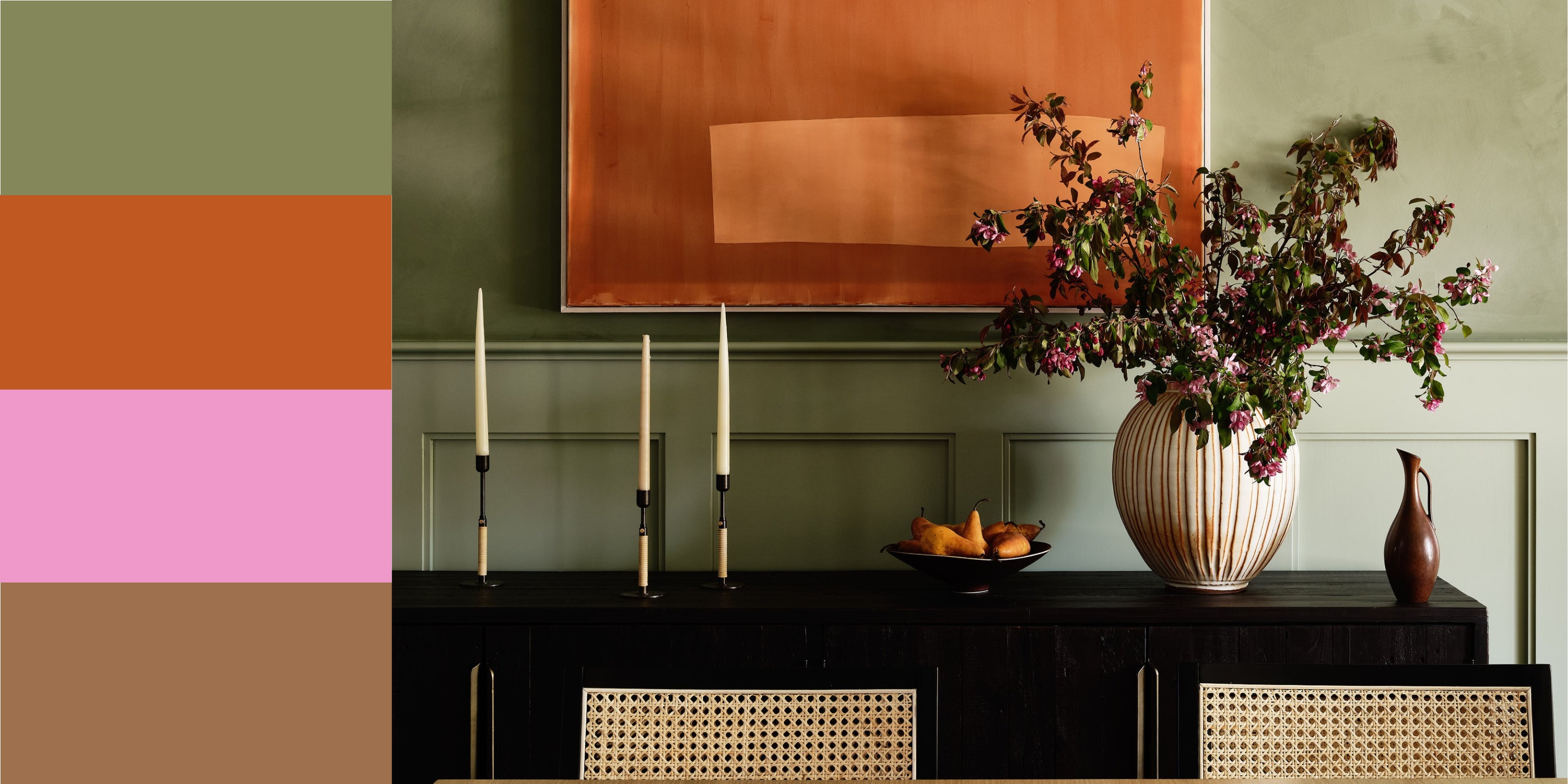
12 Colors That Go With Green I'm Seeing Interior Designers Use All the Time Right Now
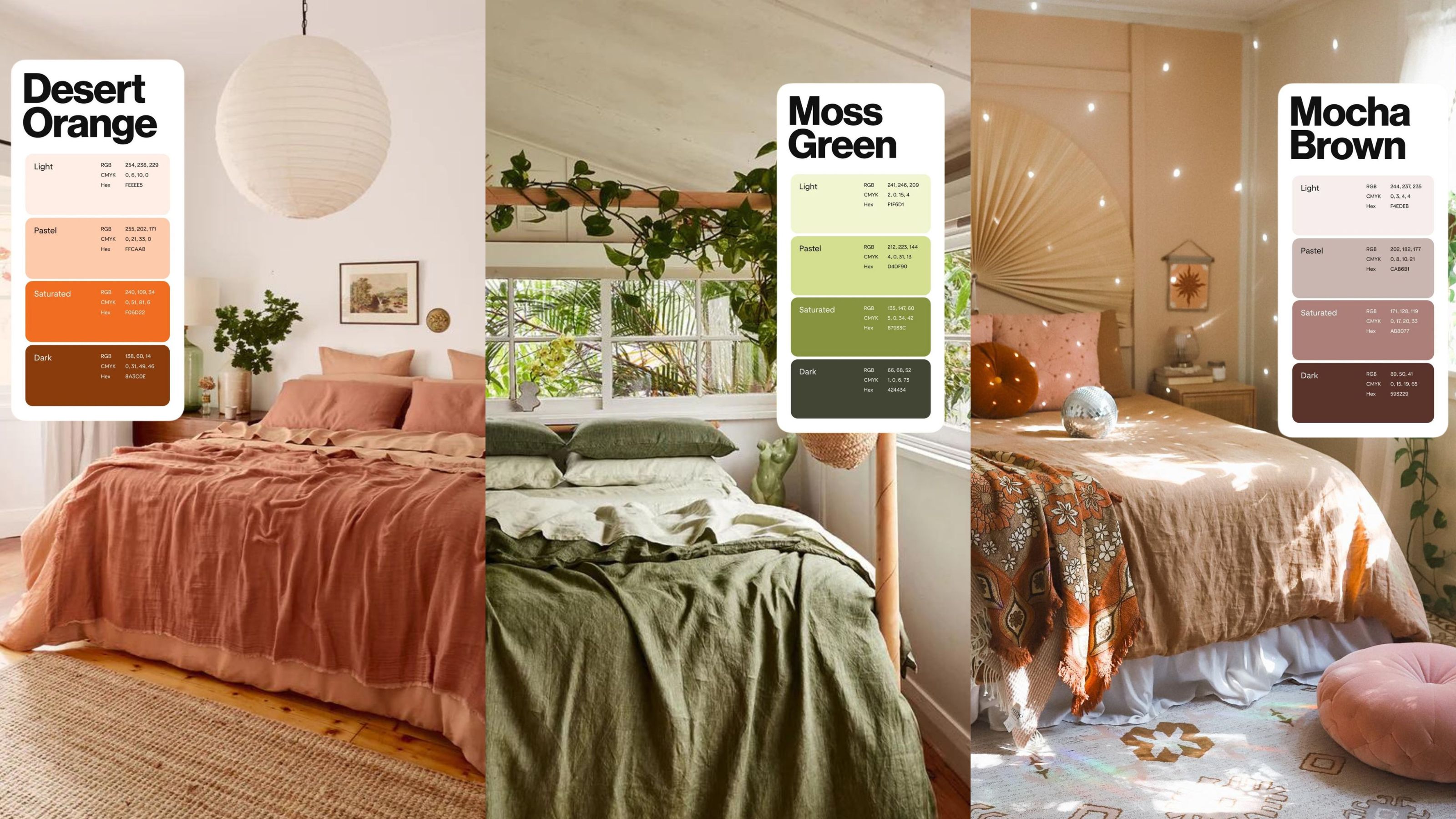
The 2024 Pinterest color palette is what bedroom decor dreams are made of

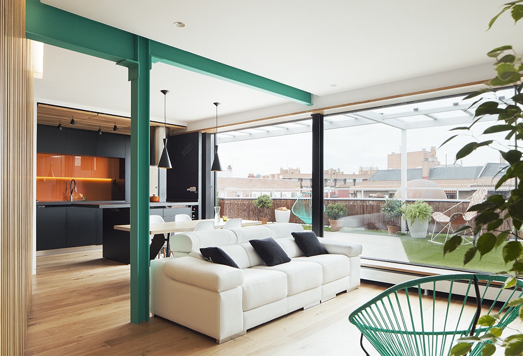
Dress Up Your Space With Contrasting Colors

Kelly Wearstler Creates a California-Inspired Paint Palette for Farrow & Ball
All the interior designers with paint collaborations (and our favourite shades)
If you color drench any room make it this one
Love the Color Green? 22 Colors That Pair With It Perfectly in Any Room of the House