1/9
What Colors Go With Cream? 10 Crème de la Crème Pairings That Go Perfectly With the Warm Neutral
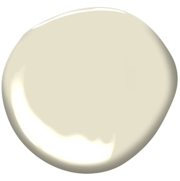
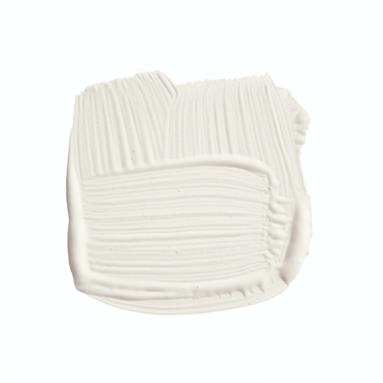
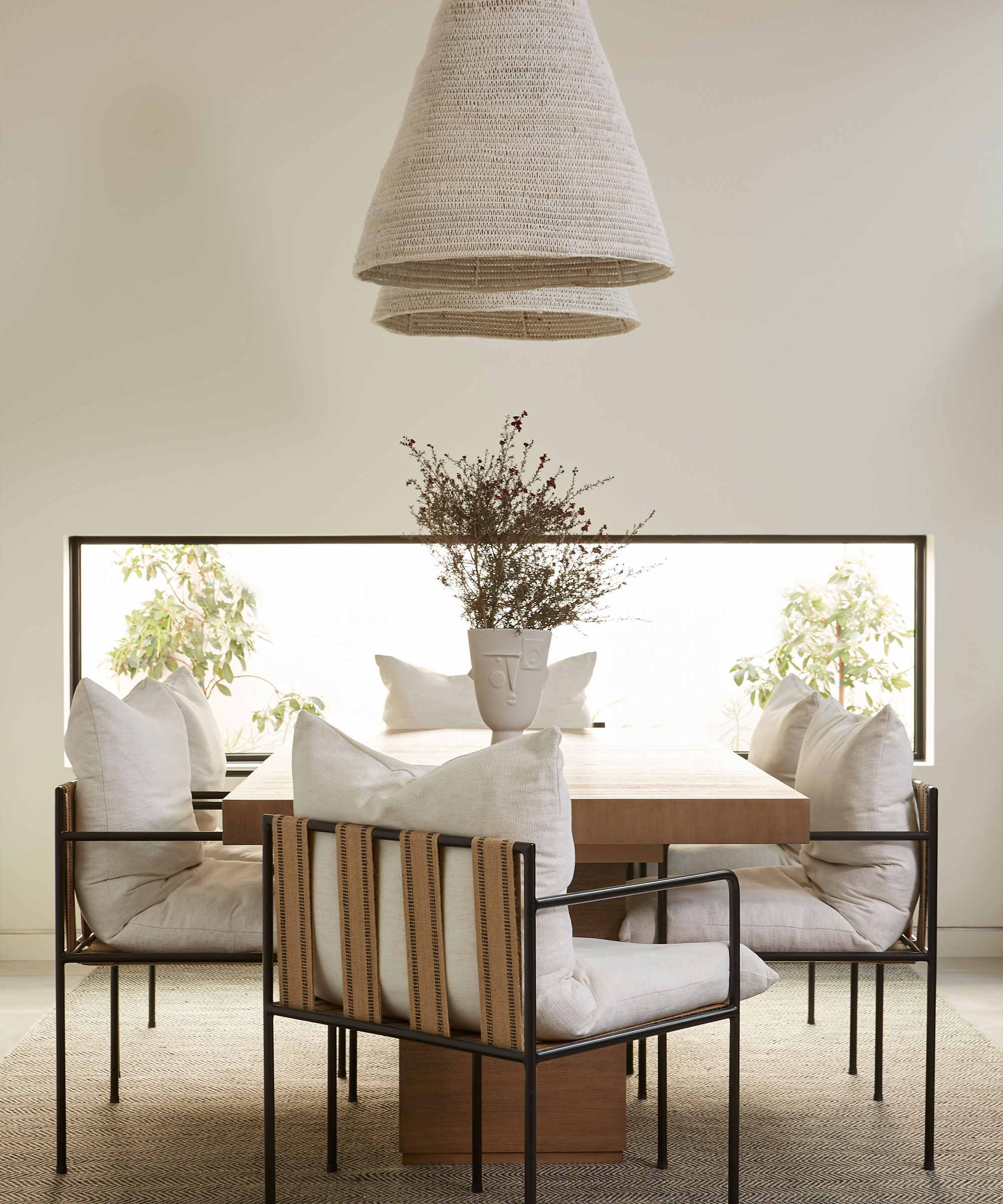
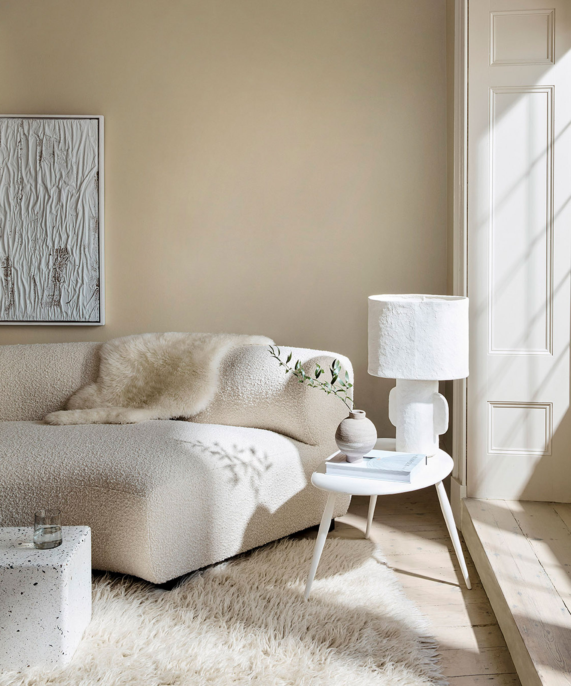
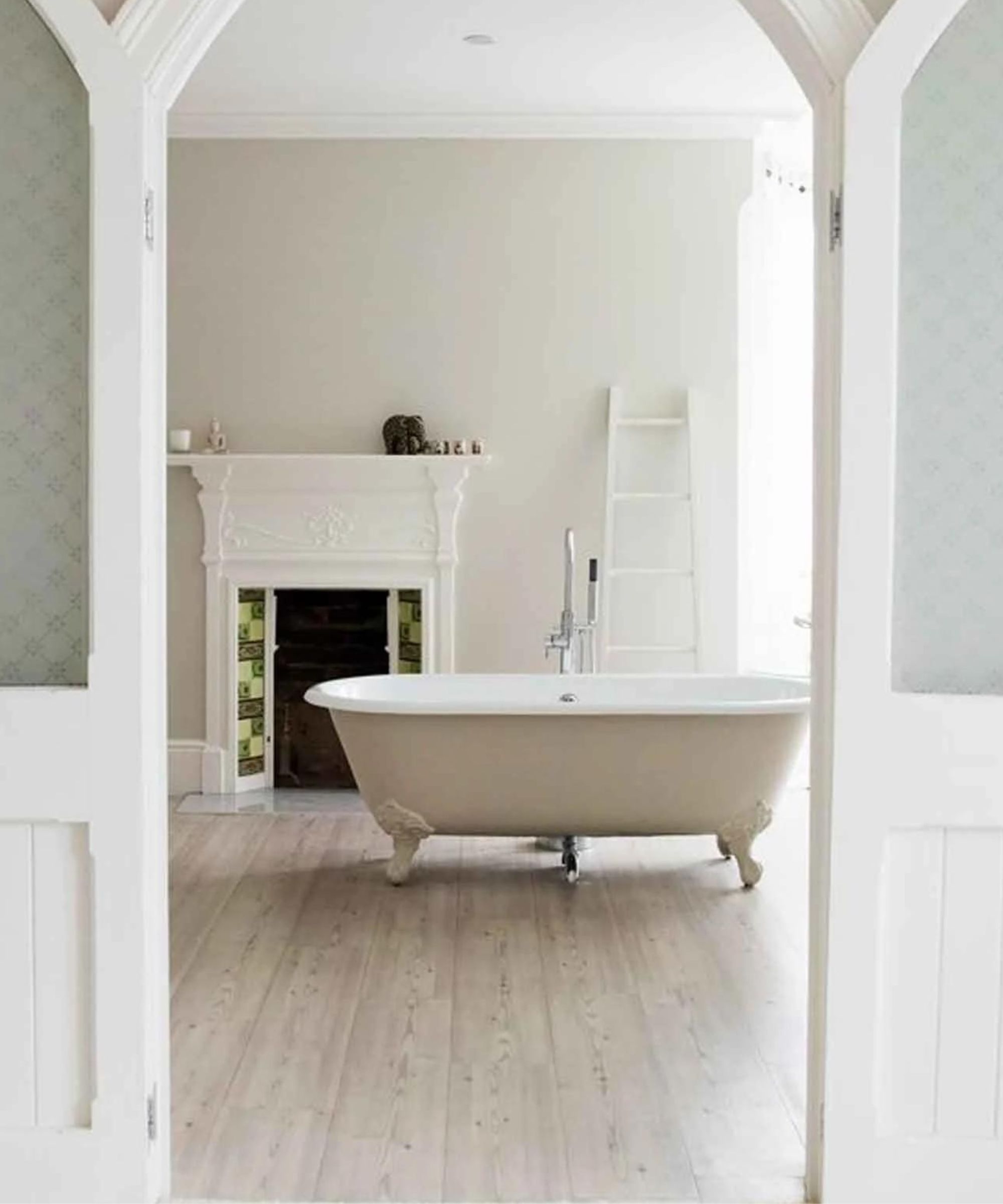
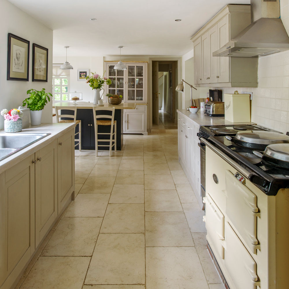
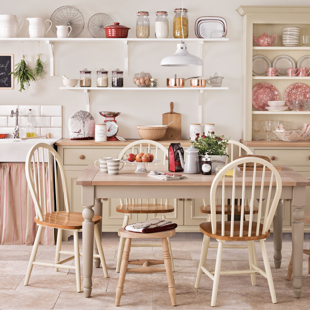
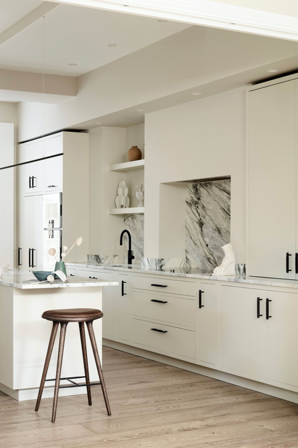
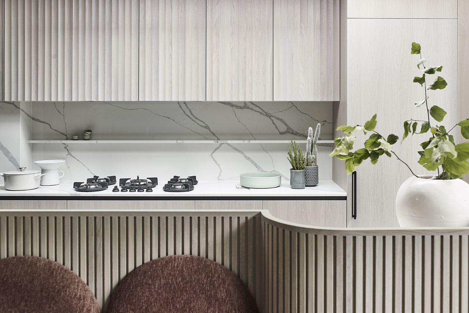
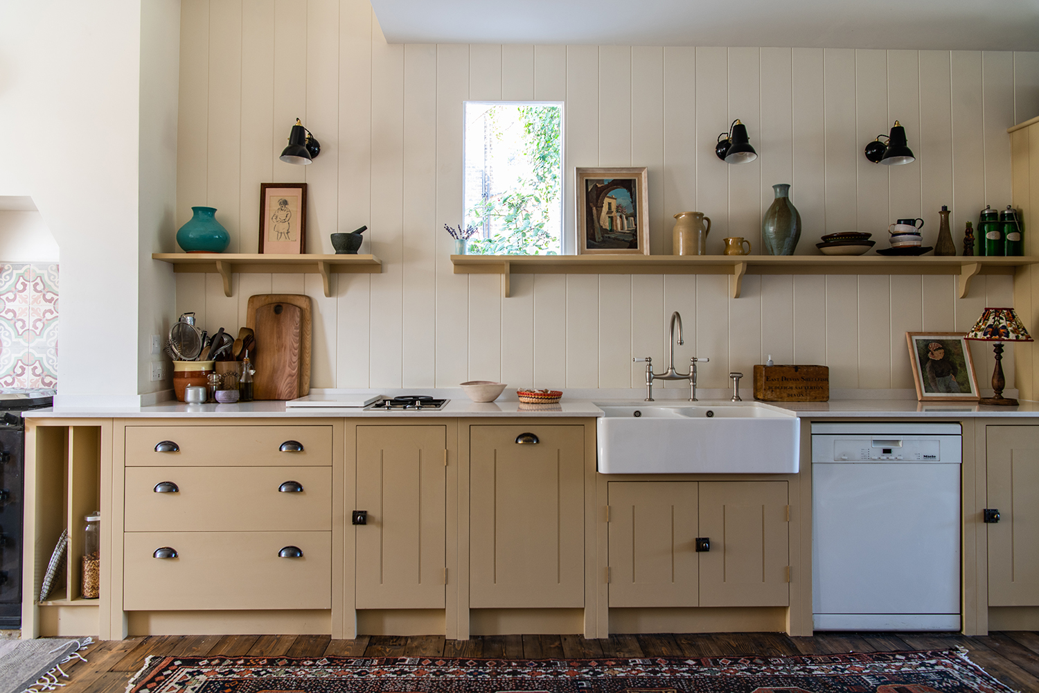
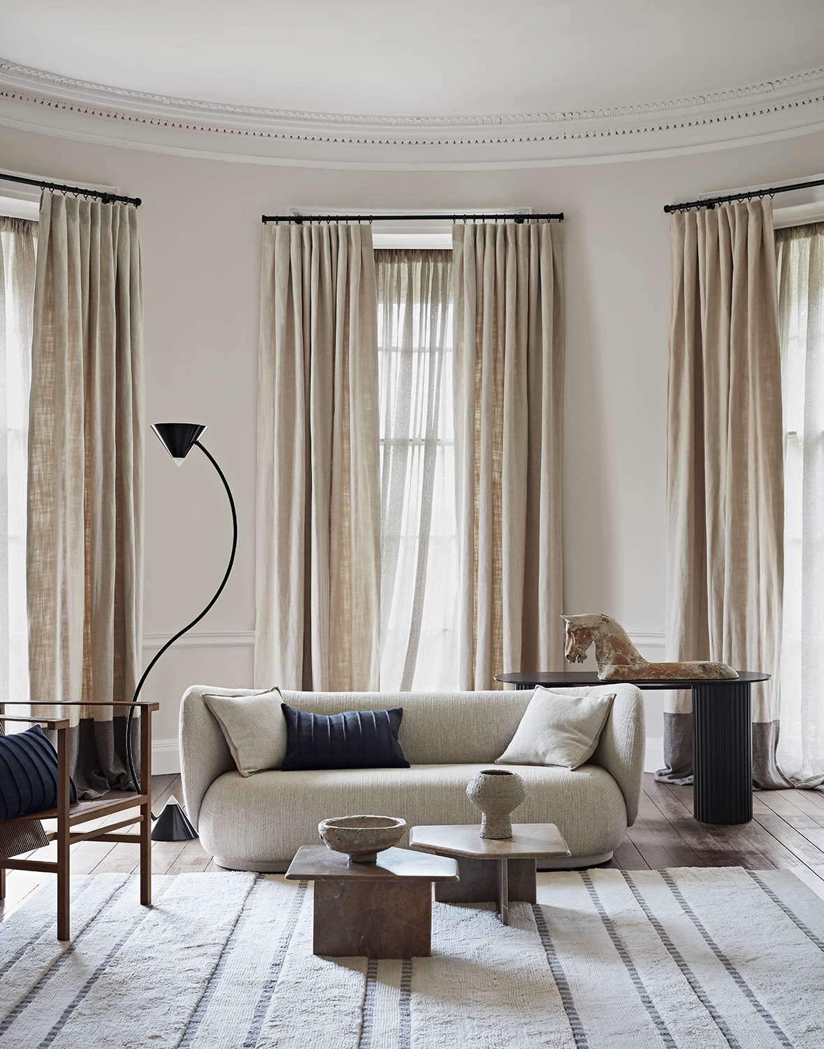
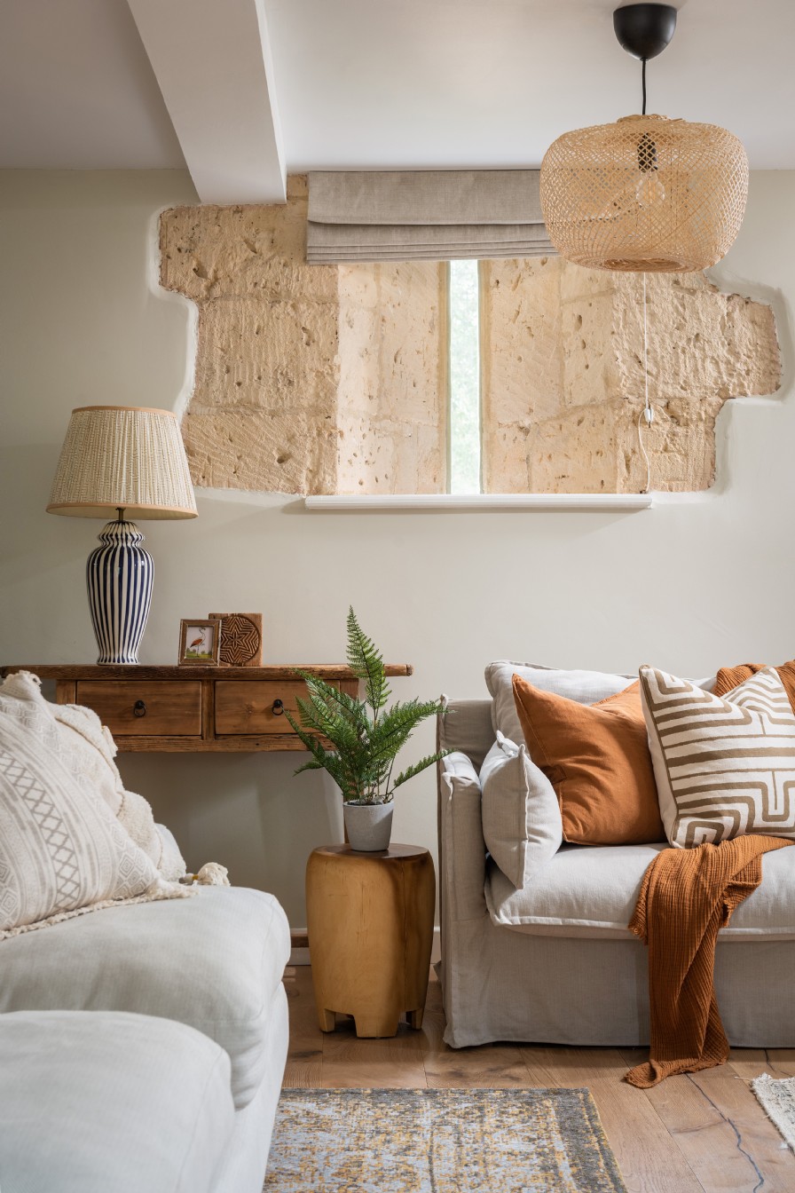
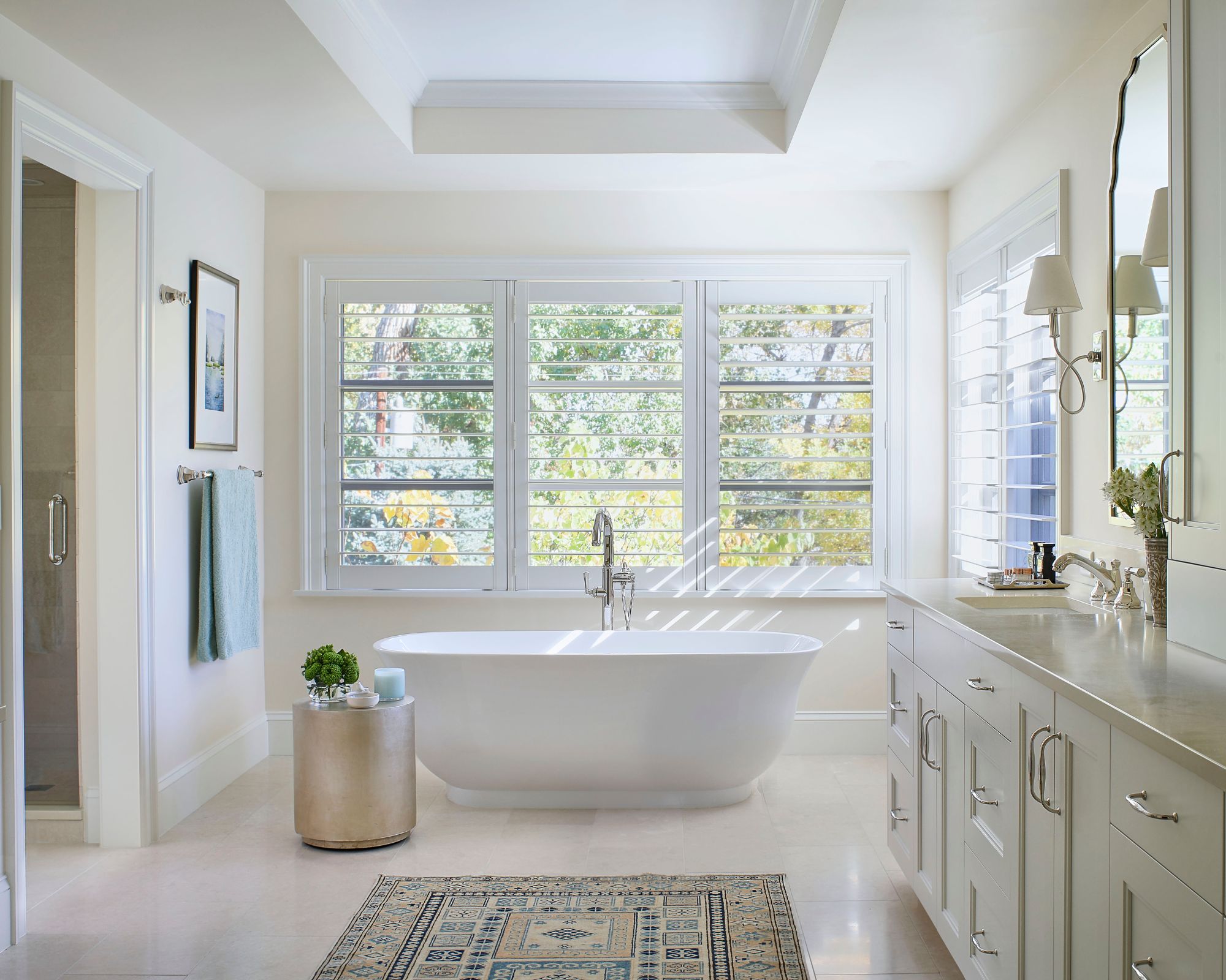
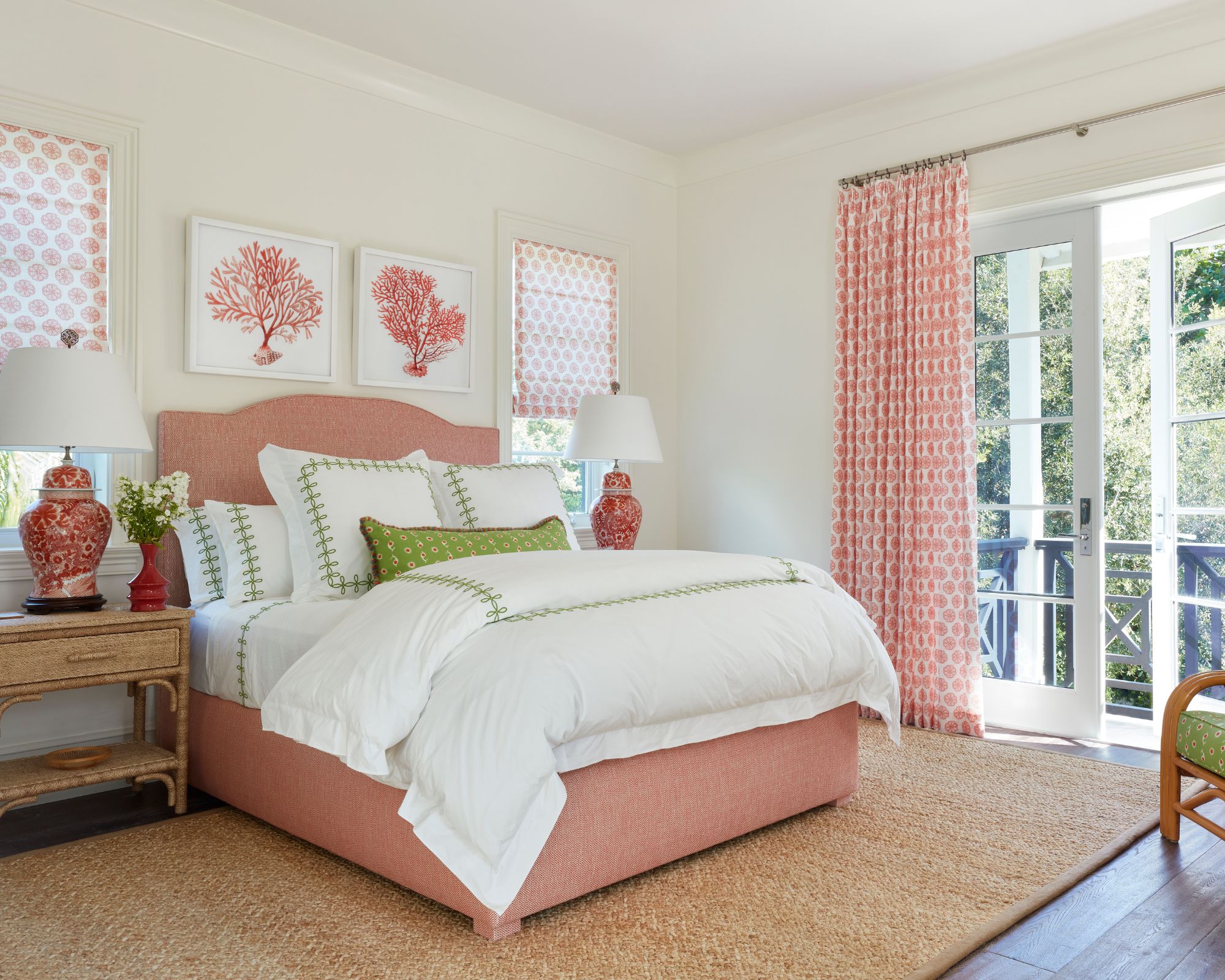
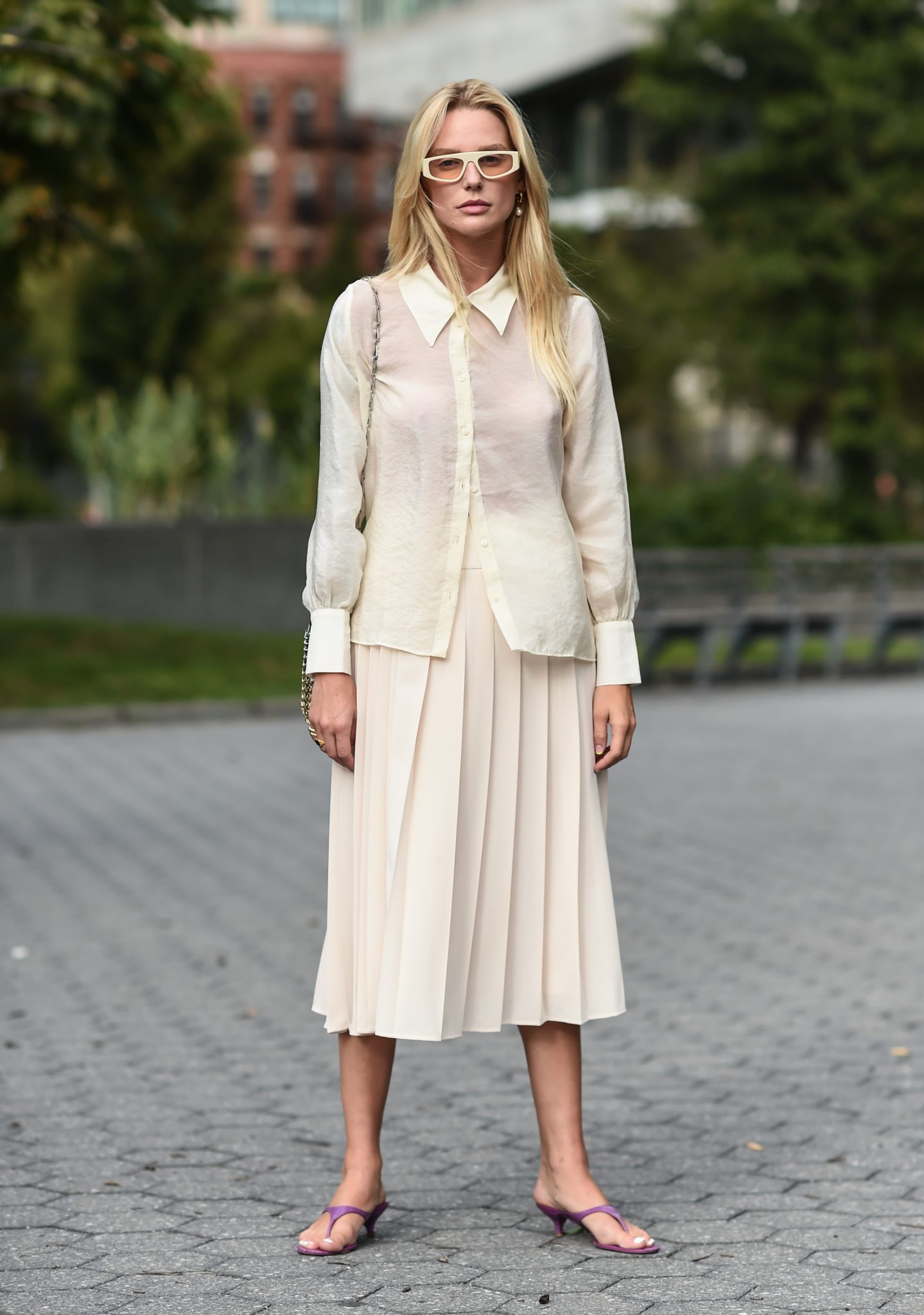
Cream is a versatile and elegant neutral color that strikes a perfect balance between stark white and overly subdued tones. It is widely appreciated for its warm and calming appeal, often featuring undertones of yellow, beige, or even peach. This article explores ten color pairings that complement cream, offering expert advice and visual examples to inspire interior design schemes.
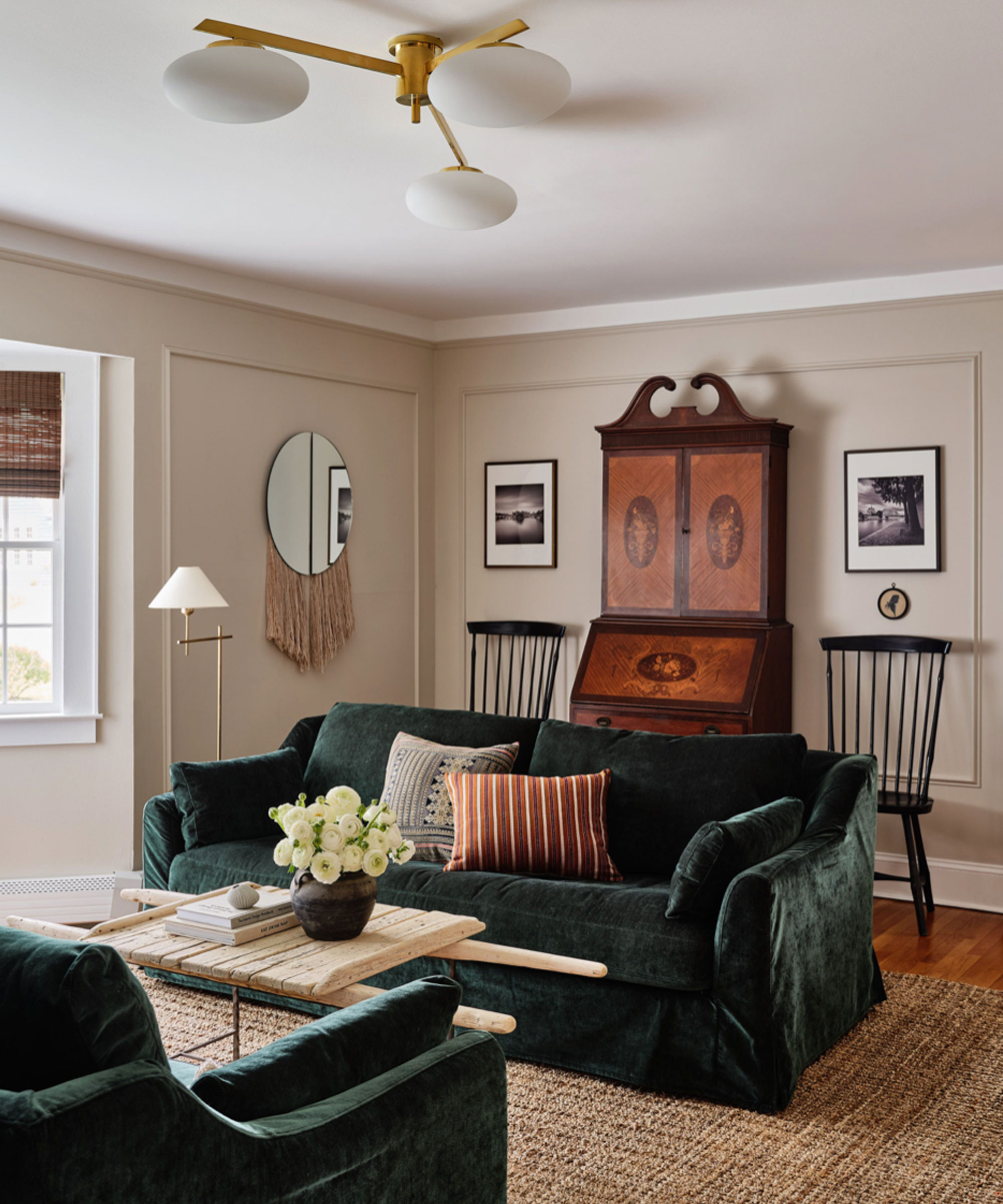
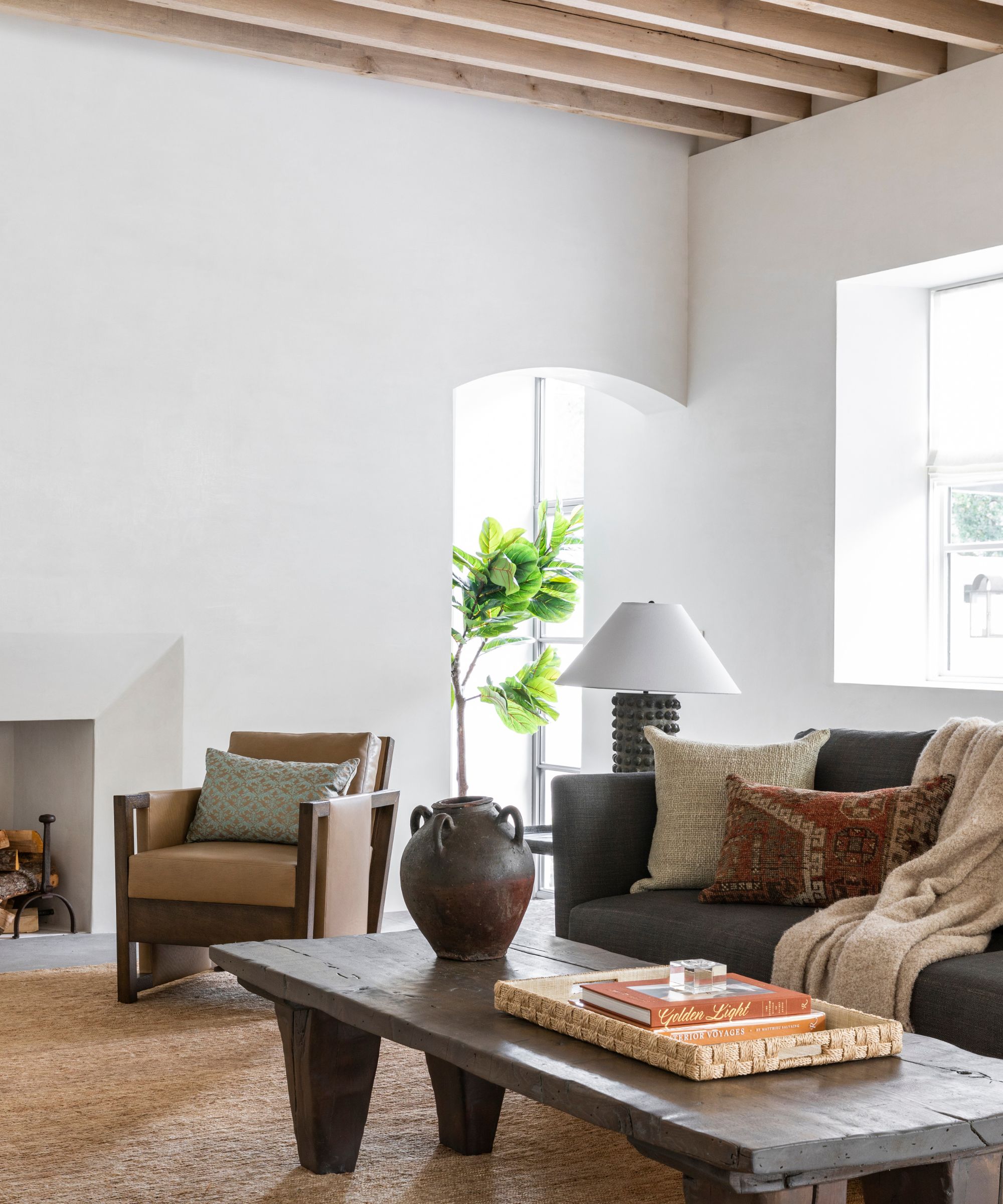
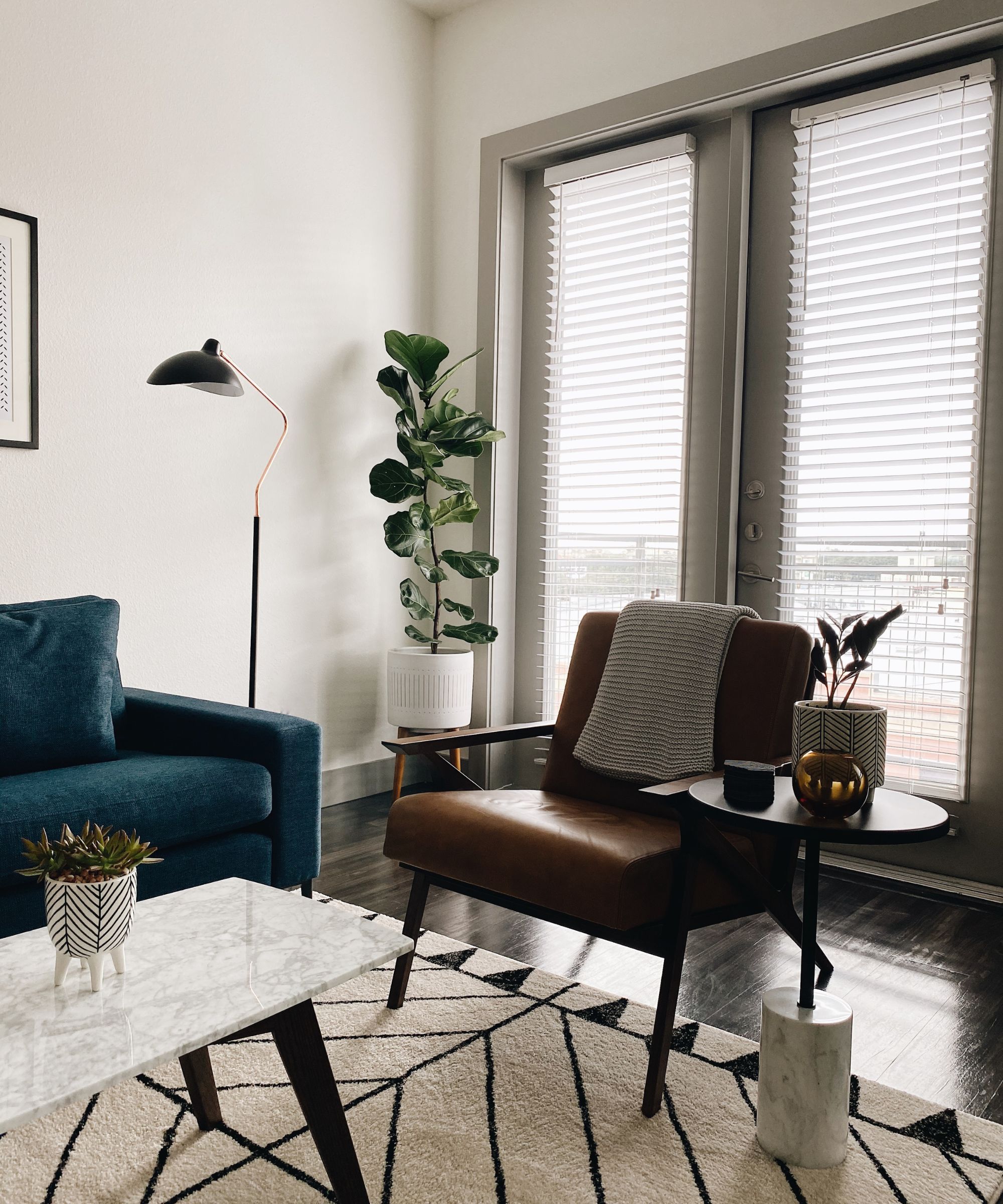
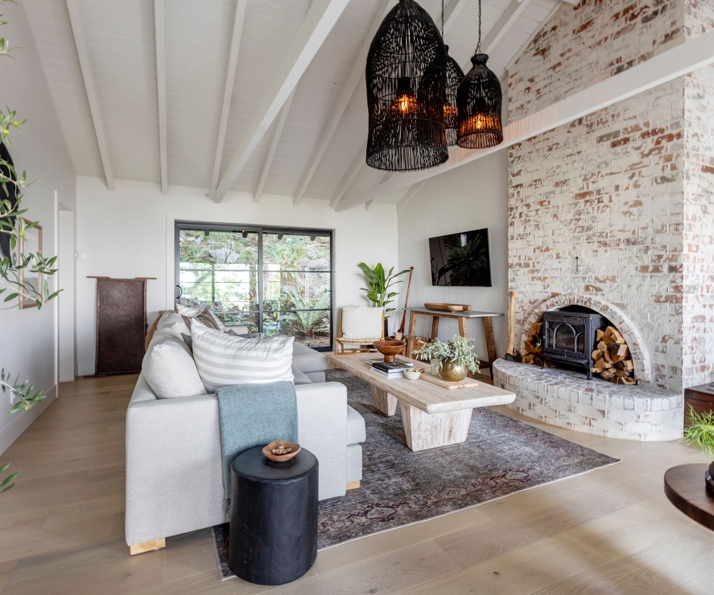
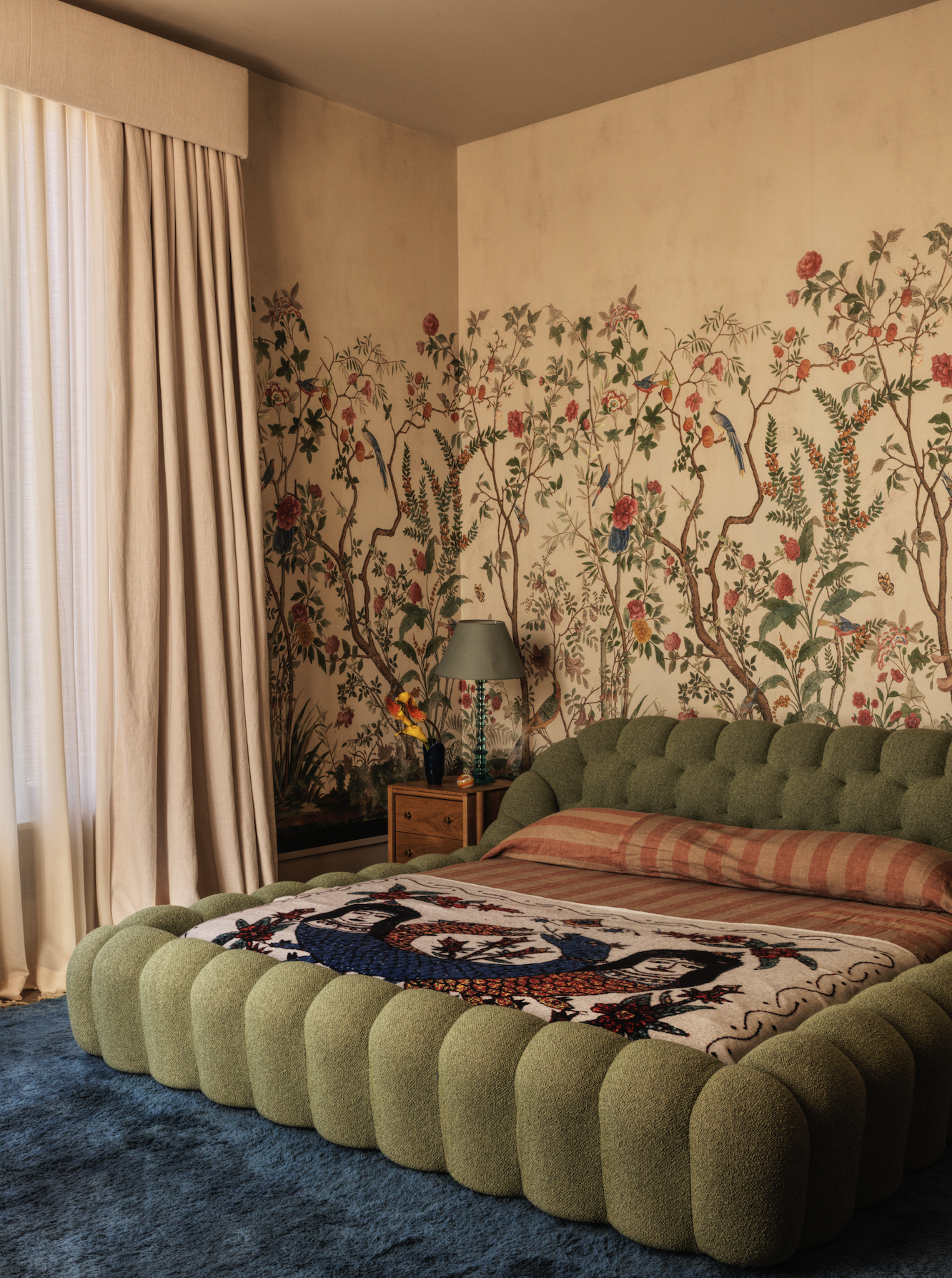
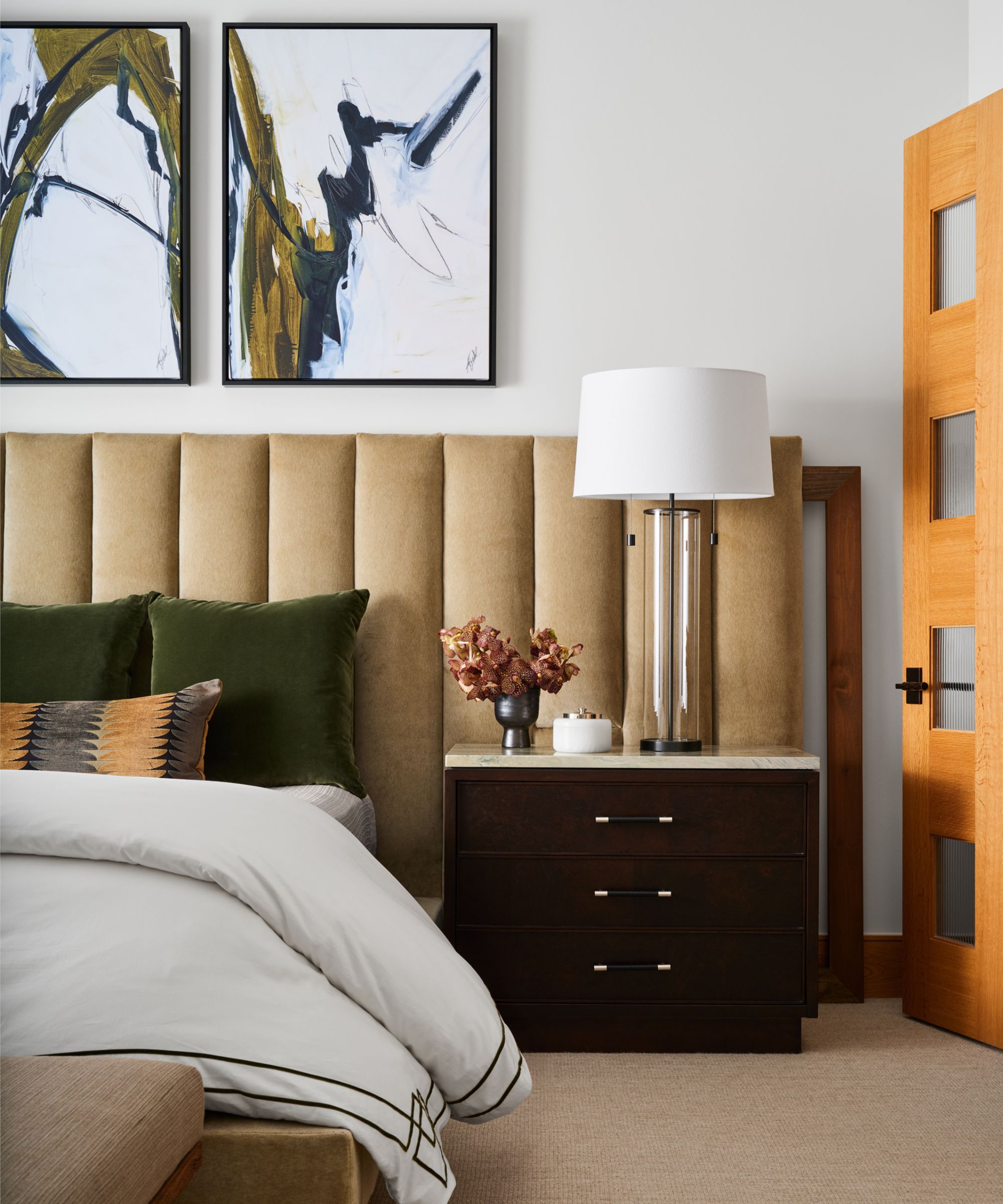
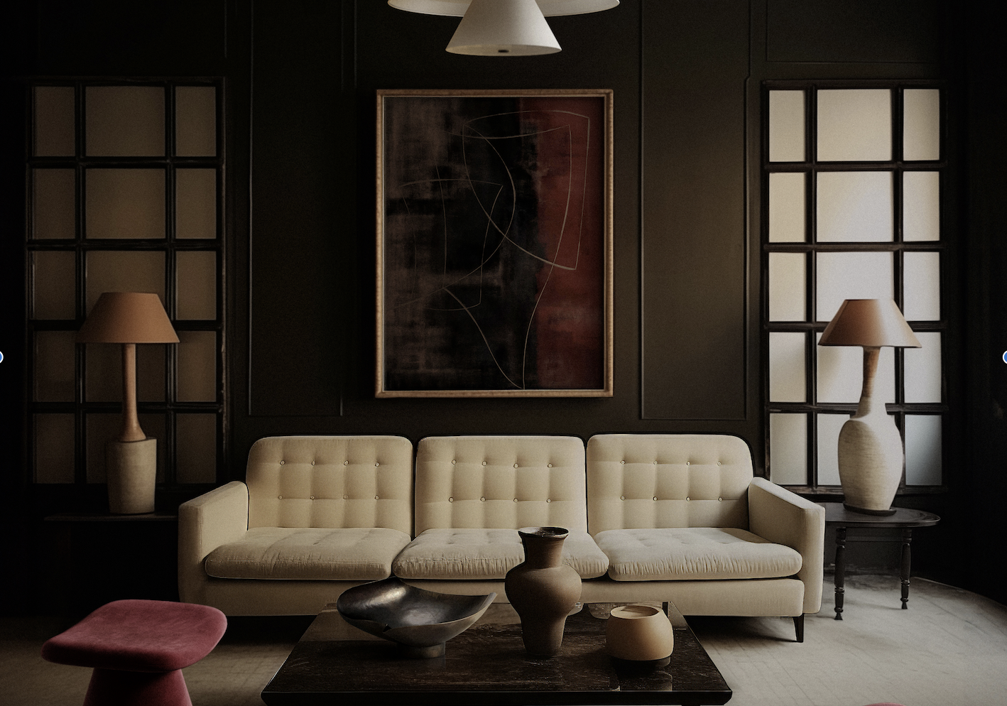
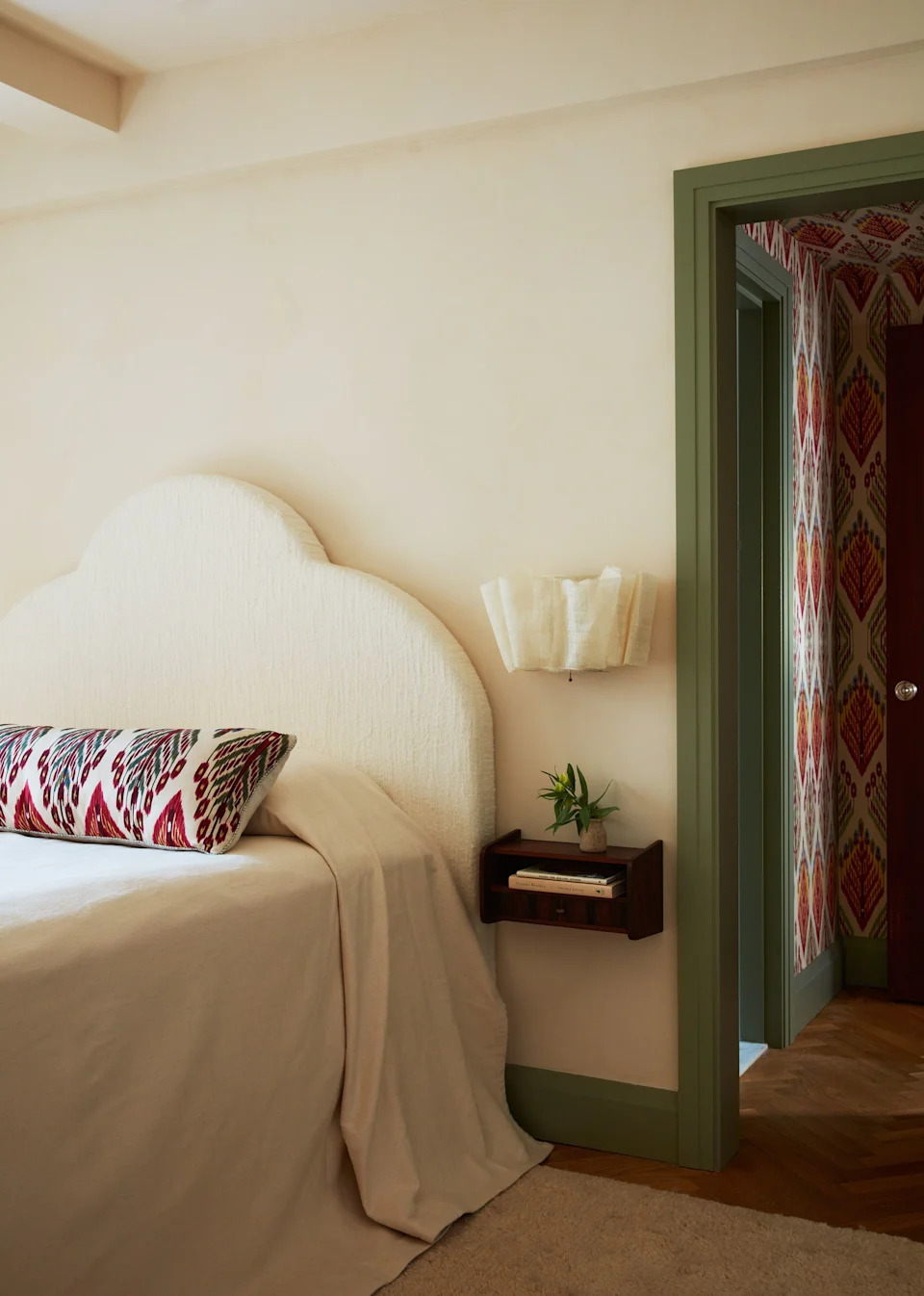
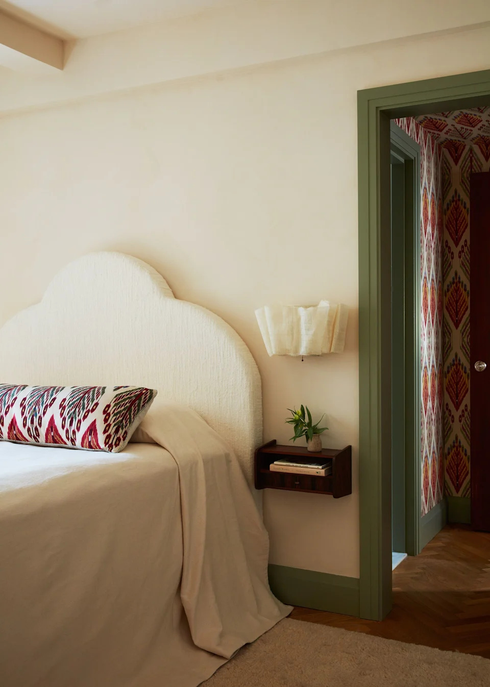
The first pairing discussed is dark green. Cream and dark green create an earthy and calming atmosphere. The article suggests complementing this combination with additional earthy tones like brown or beige to enrich the palette. Sarah Brady, founder and principal designer at Salt Design Company, emphasizes that the interplay of cream and off-white with earthy greens and rich textures fosters an inviting warmth. Natural materials such as woven window shades, leather ottomans, and wood accent chairs enhance the tactile and visual coziness of such spaces, creating a serene and grounded environment.
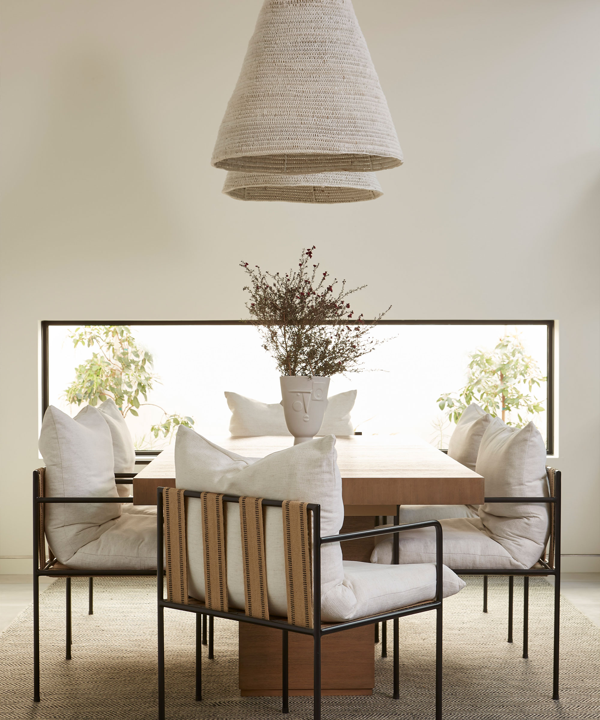
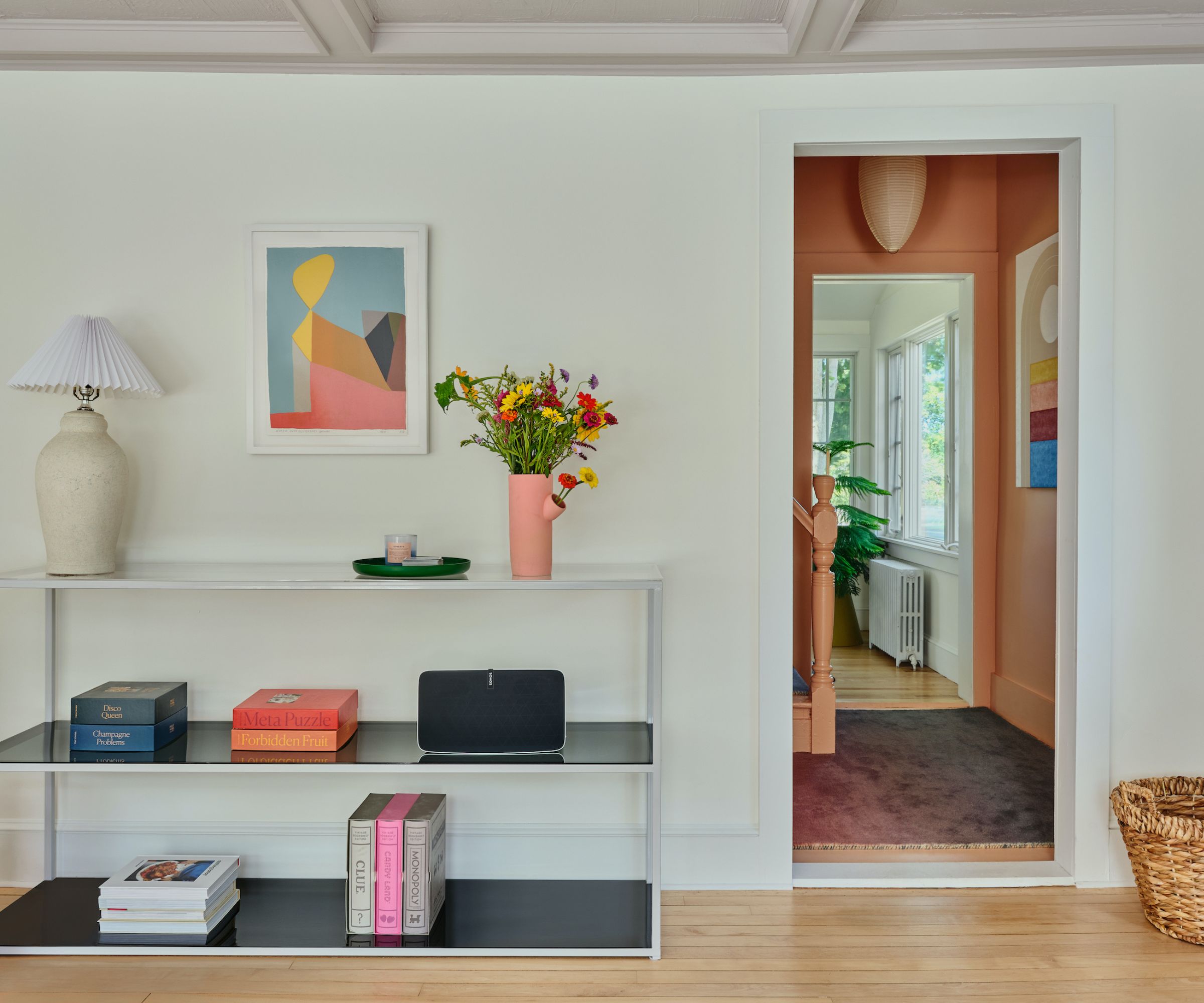
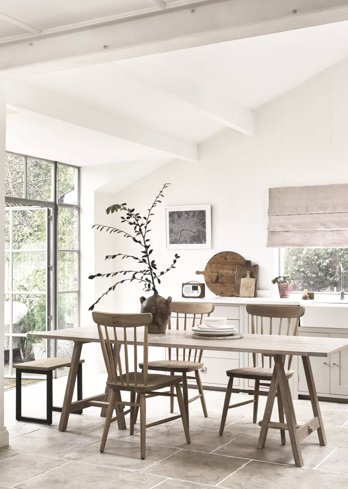
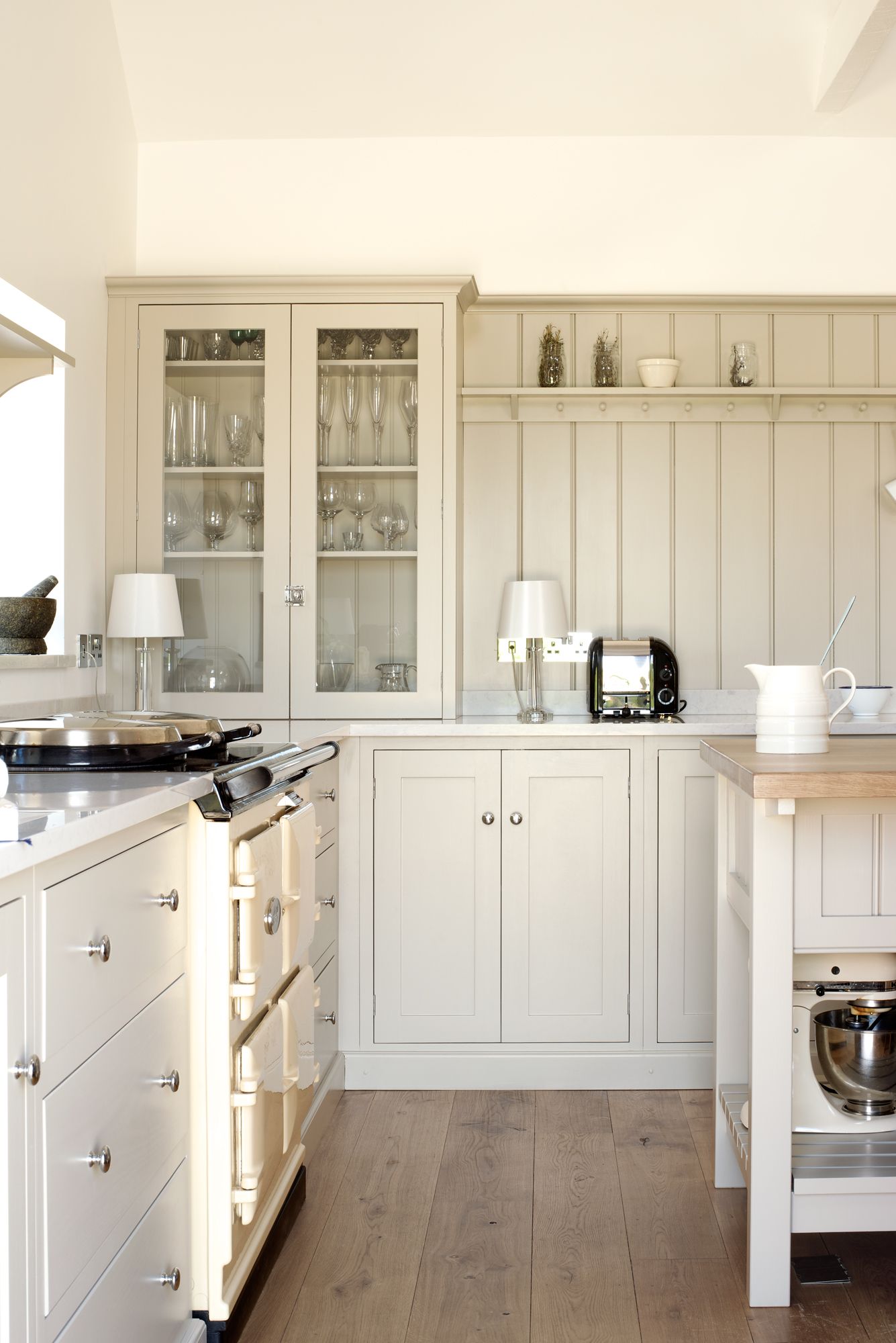
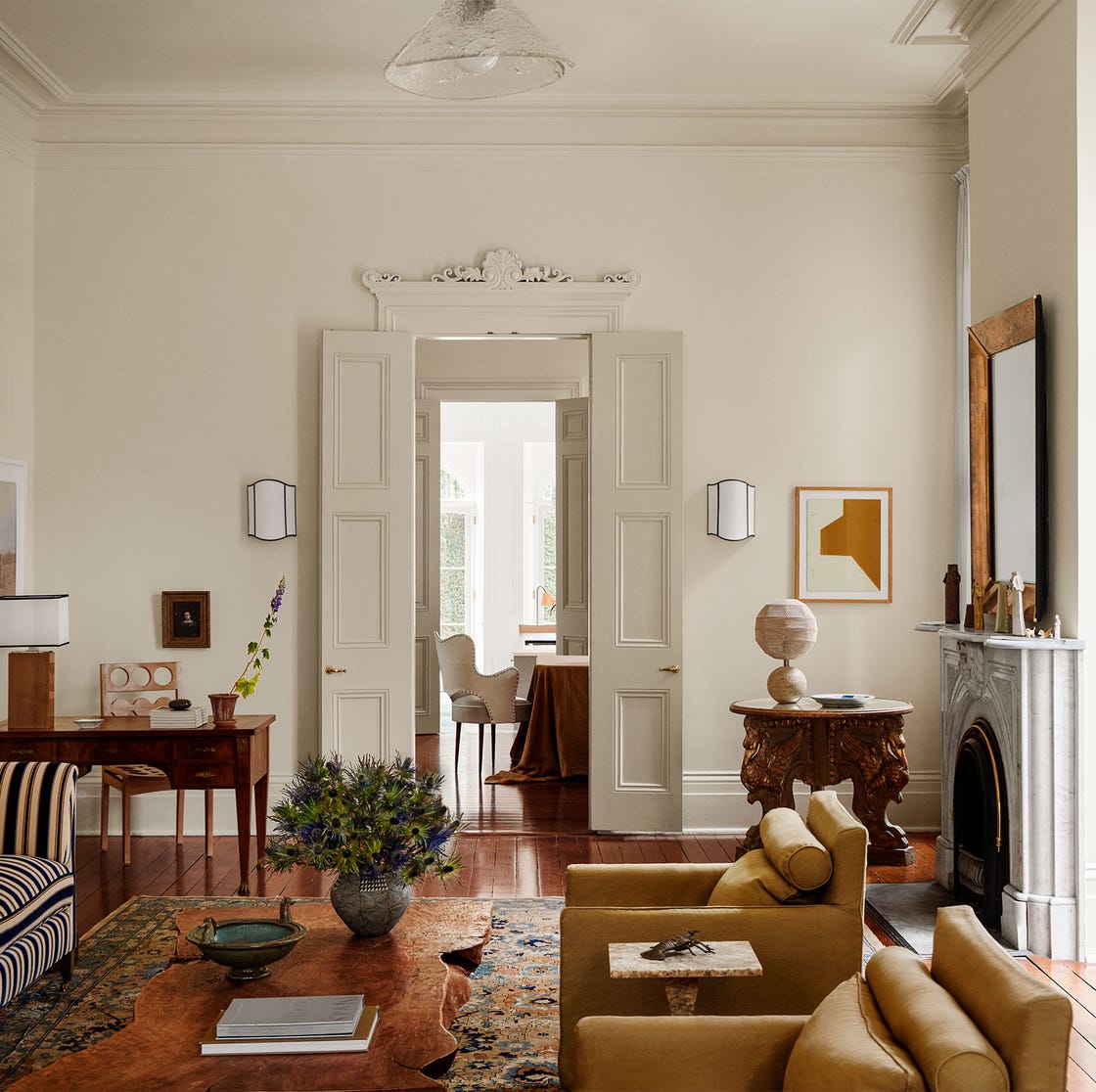
Next, the article highlights brown. When cream takes on a rosy hue, it harmonizes beautifully with brown, especially in spaces with warm, yellow light. The combination of blush and cream walls with brown accents can create a charming and modern interior. Burcu Garnier of Color Atelier suggests that for a grounded and serene look, dusty blues, warm grays, or taupe can perfectly complement cream, adding depth and sophistication. For a natural and earthy palette, colors like terracotta and sand are recommended to evoke a sense of calm and warmth.
Emerald green is presented as another excellent match for cream. This pairing can result in a modern, crisp, and elegant living space. The article showcases an example where light cream walls and wooden furniture are accented by an emerald chaise, adding a vibrant pop of color without overwhelming the room. Architect and interior designer Hugo Toro notes that strong stylistic statements, enhanced by thoughtfully designed and sourced furniture pieces made of materials like leather, wood, and brass, contribute to a balanced and sophisticated outcome.
Plum is also identified as a complementary color, with cream effortlessly pairing with a range of luscious tones from lilac to claret. This allows for the creation of a purple living room that feels rich without being overpowering, as the warmer cream neutral offers a softer alternative to stark white. Burcu Garnier reiterates that cream's versatility allows for soothing or striking combinations, suggesting colors with clear contrast or harmonious undertones to enhance cream's elegant nature.
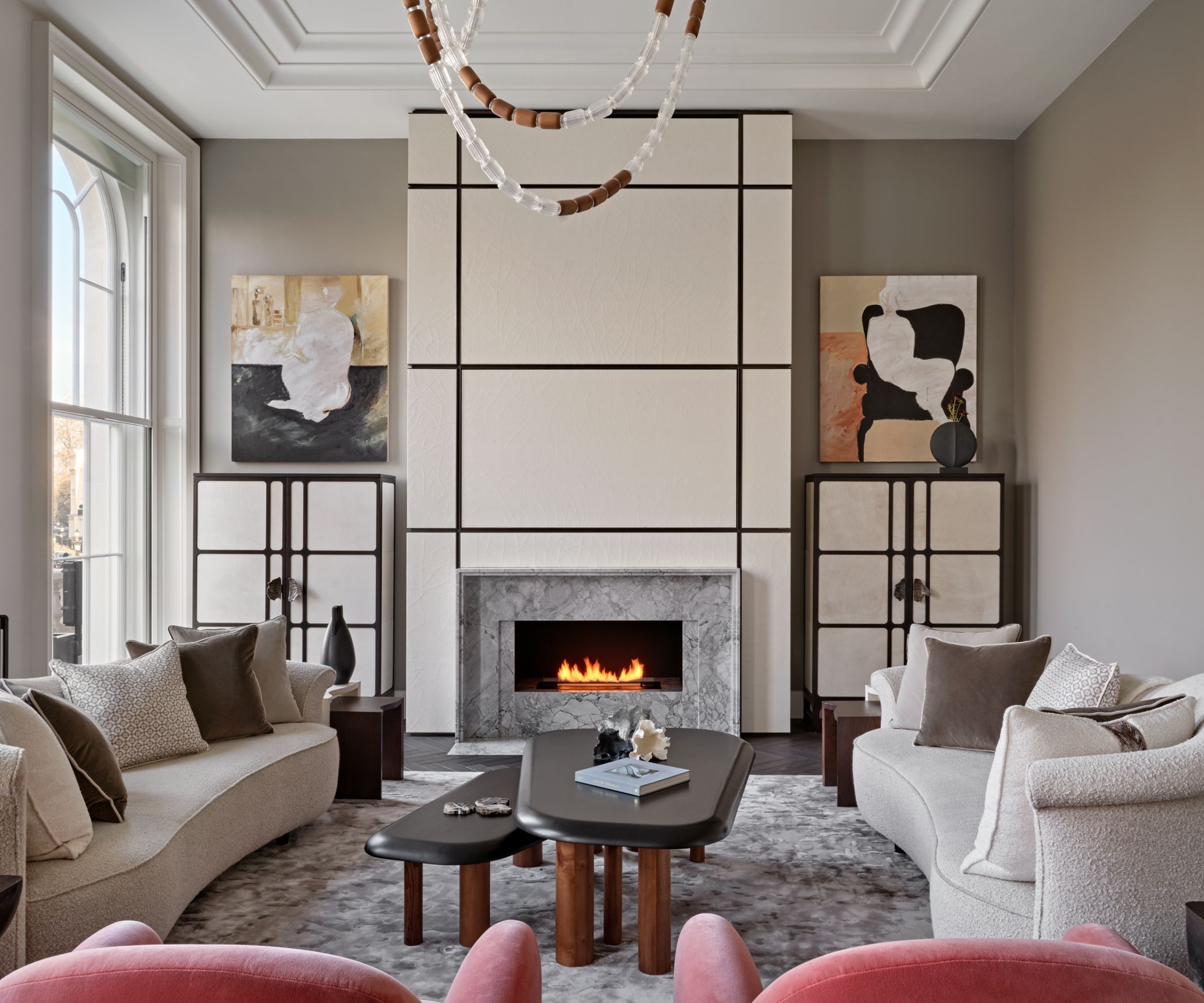
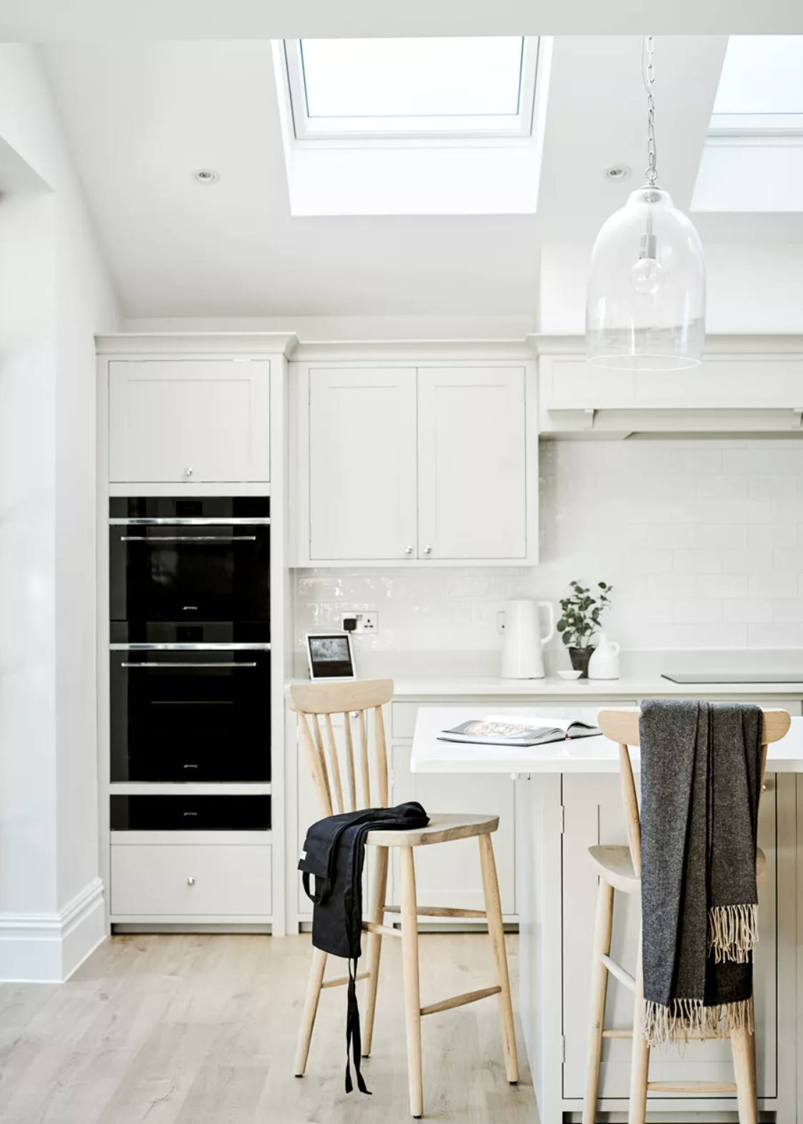
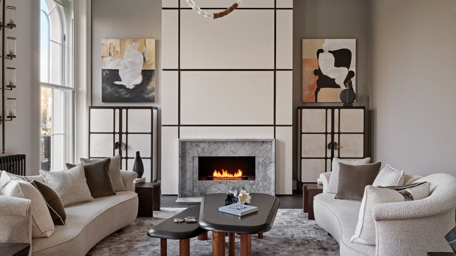
For a yin and yang effect, charcoal gray and cream are suggested. Both shades are described as soft neutrals, contributing to serene palettes. Paula Taylor of Graham & Brown advises using darker colors like charcoal gray on ceilings for a unique touch, balancing them with neutral colors such as cream and off-whites to create harmony. Neutral soft furnishings, including blinds, curtains, and pillows, can further refine the room's palette.
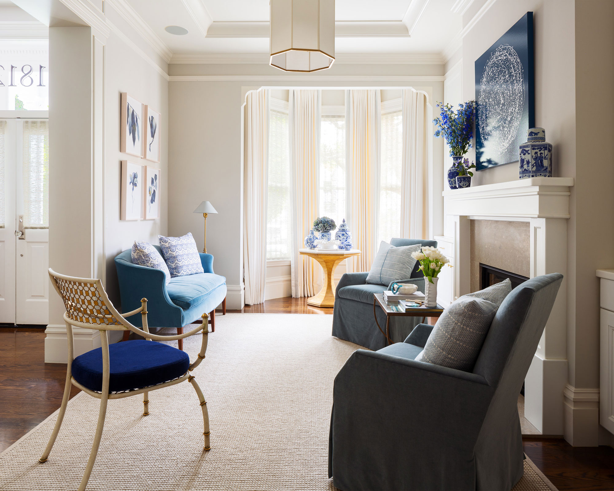
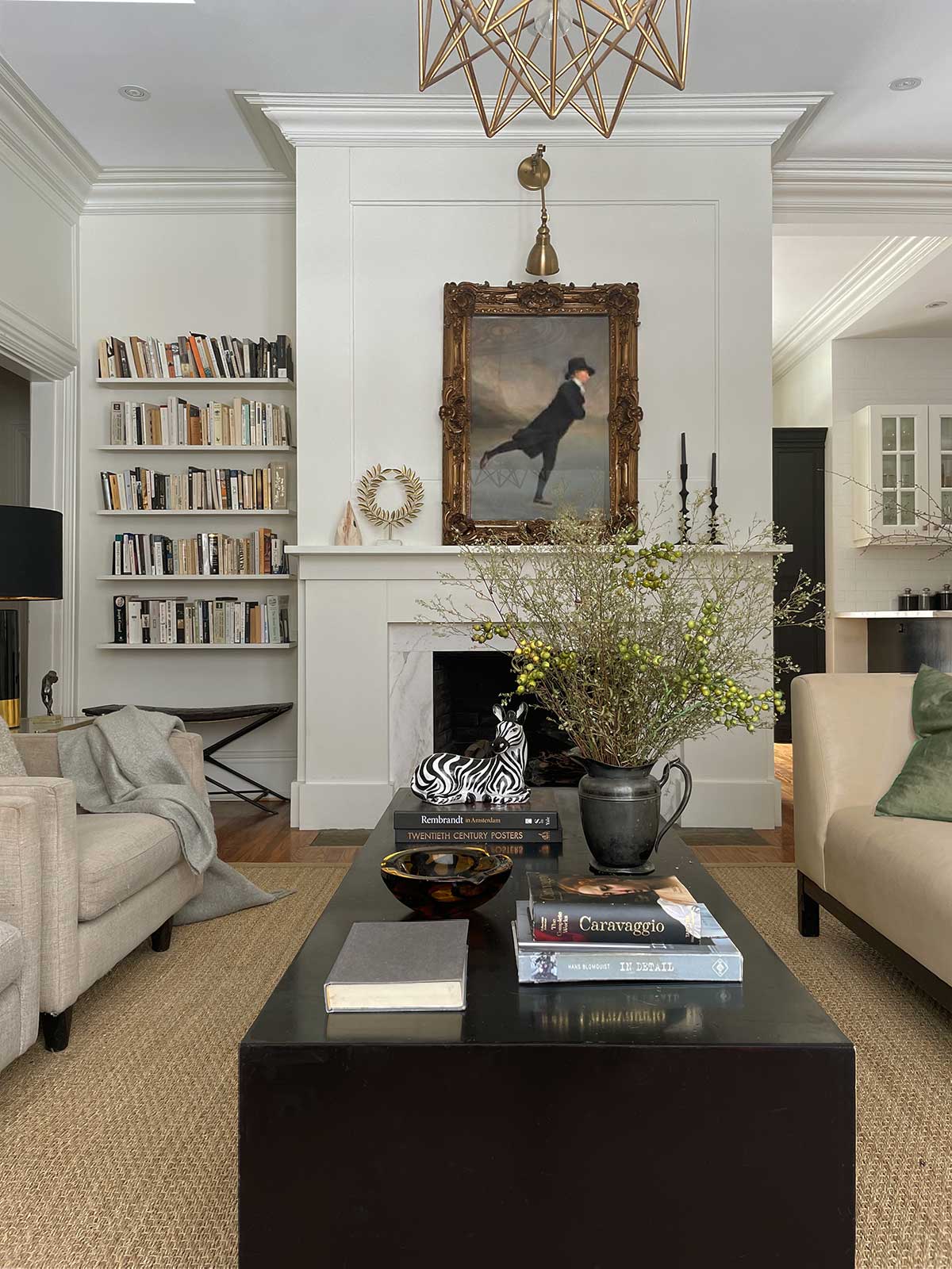
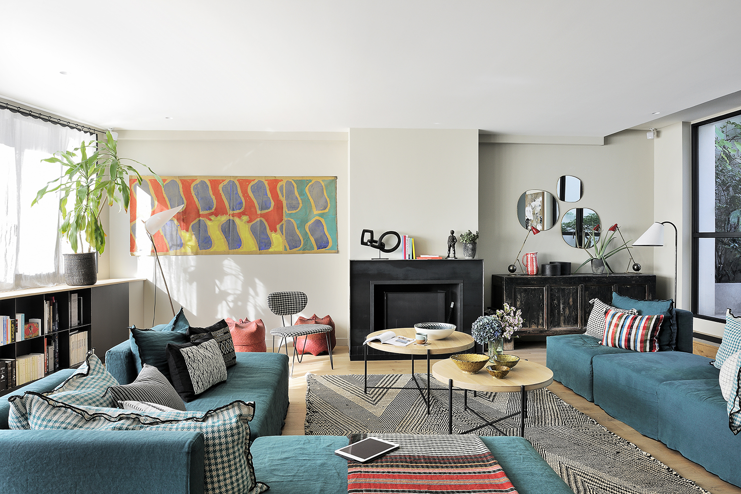
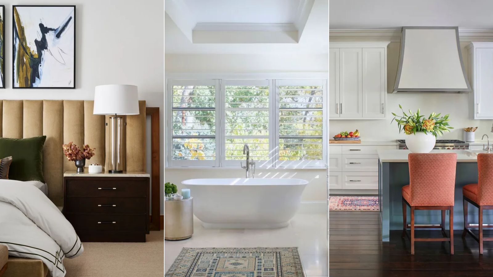
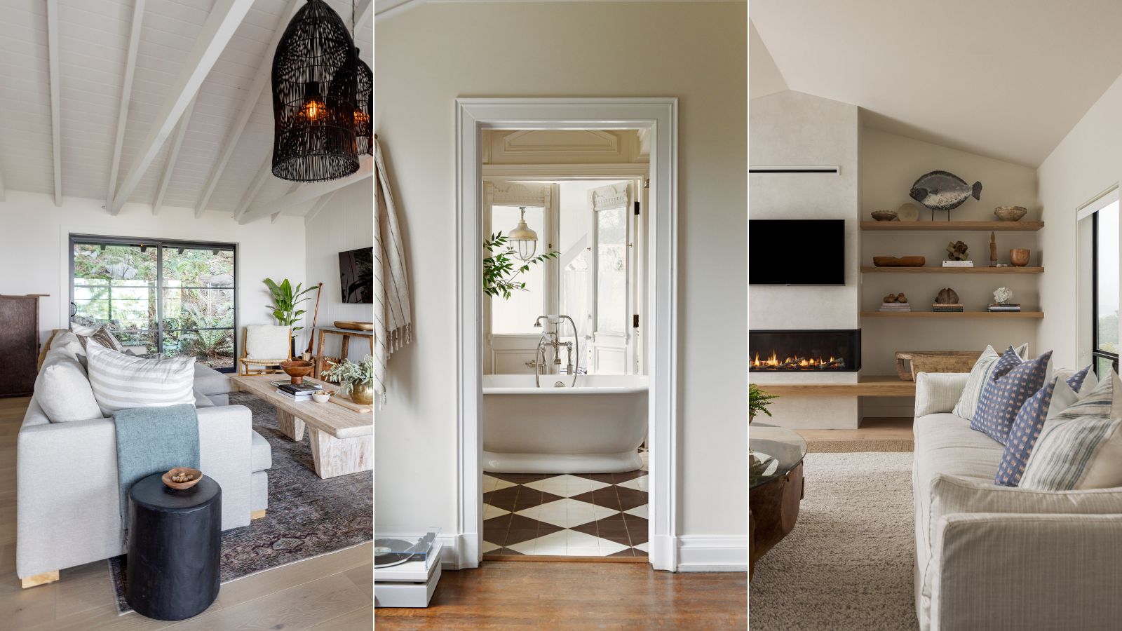
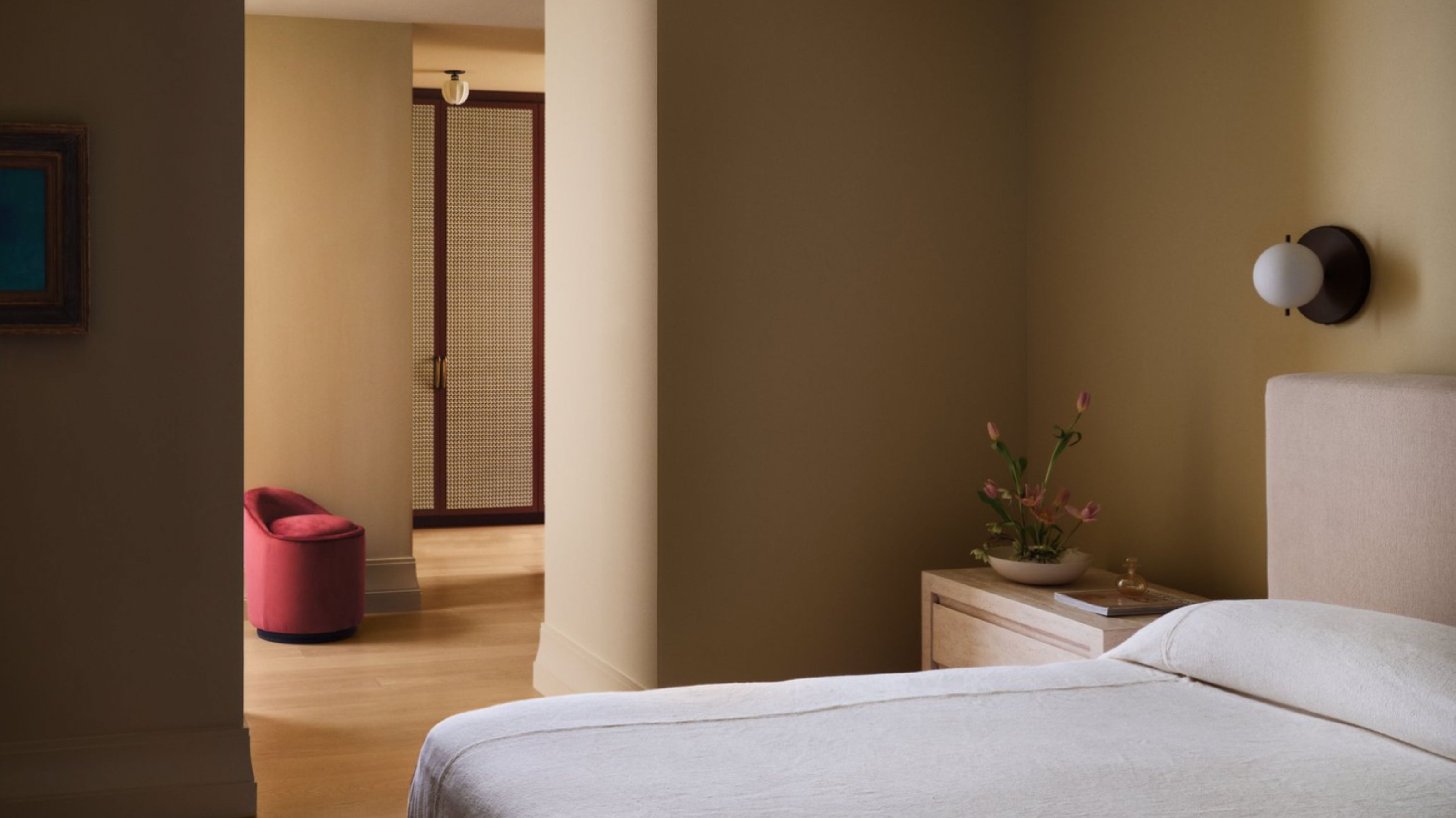
Light olive or golden-beige paired with cream can create a comfortable and modern atmosphere. An example shows a bar area with cream walls and a lime-painted ceiling, where Tatjana von Stein, the designer, used raw materials like wood and metal as neutrals. Deep green velvet stools, warm wood panels, and cool marble surfaces contribute to a modernist design concept. Blue is another favorable partner, with cream subduing bright blues like cobalt to create a more livable dining room. Yellow is mentioned for its ability to create a sun-kissed effect when combined with cream, fostering a light, zen, and peaceful retreat. Tatjana von Stein exemplifies this with tonal variations across different textures, evoking a comforting embrace with yellow shades and soft materials. Black and cream offer a classic pairing, with cream softening black's somber look to create a calming space, as demonstrated in a living room with cream walls and a black fireplace. Finally, red and cream create a visually appealing balance, as cream grounds the often-overpowering red, making it suitable for various rooms. Nina Lichtenstein advises using this combination in bathrooms or kitchens with neutral walls and tomato red accents.
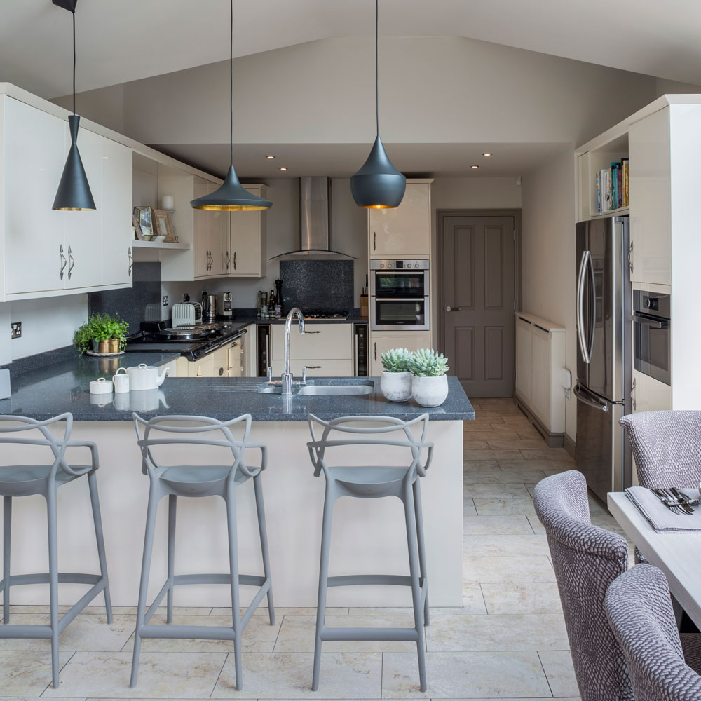
The article concludes by addressing common questions regarding color combinations with cream. It advises against pairing cream with neon or overly saturated colors, which can overpower its softness, and with shades too close in tone but slightly off, which might create a muddled look. It confirms that cream goes well with dark blue, with the warmth of cream balancing the depth of blue for a sophisticated and balanced space. Cream and gray are also affirmed as harmonious, offering a versatile combination for various design styles. Lastly, silver and cream are highlighted as an elegant and high-end pairing, where cream's warm undertones complement silver's cool metallic sheen, adding dimension and luxury to interiors.
#InteriorDesign #ColorTheory #CreamDecor #NeutralColors #HomeDecor #ColorPairings #DesignTips #ElegantInteriors #ModernDesign #InteriorDesign #ColorTheory #CreamDecor #NeutralColors #HomeDecor #ColorPairings #DesignTips #ElegantInteriors #ModernDesign
0 commentaire au total
 Aucun commentaire pour le moment
Vous aimerez aussi
What colors go with cream? 8 complementary colors for this neutral favorite
7 of the best cream wall paint colors, as chosen by designers – 'they look modern, and anything but magnolia'
Cream kitchen ideas – light and lovely spaces that prove beige is back
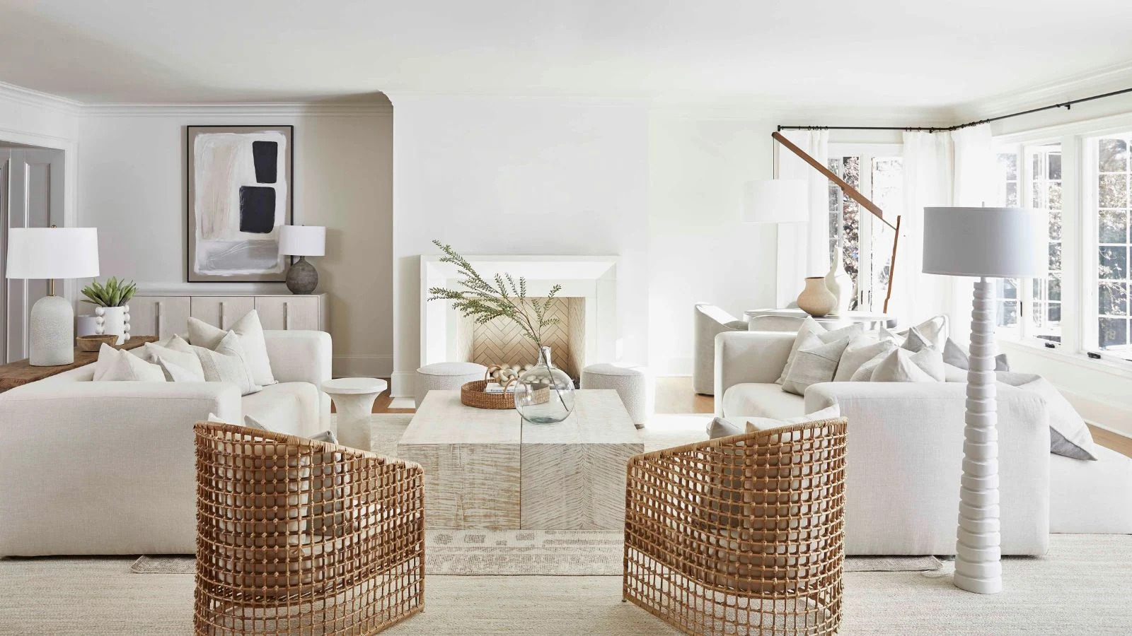
7 of the best cream wall paint colors, as chosen by designers – 'they look modern, and anything but magnolia'

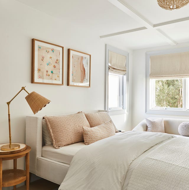
Here Are the Best Cream Paint Colors, According to Design Pros

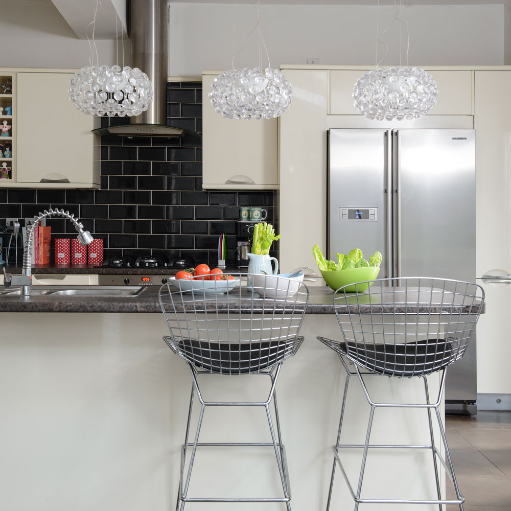
Cream kitchen ideas – all beautifully classic and sure to stand the test of time
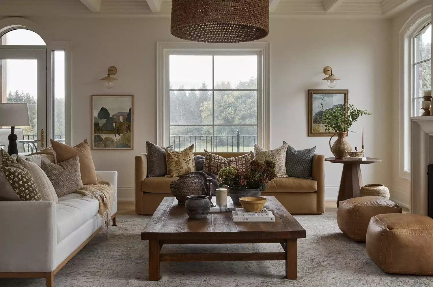
From the Living Room to the Bedroom, These Cream Paint Colors Work Anywhere


The Best Cream Colored Sweaters To Add To Your Wardrobe Now
Interior Designers Share Their Favorite Cream Paint Colors
23 Versatile Cream Paint Colors That Will Pair with Basically Anything

Cream living room ideas – 10 ways to play up this versatile neutral
White vs Cream: designers weigh in on these enduring neutrals
23 Versatile Cream Paint Colors That Will Pair with Basically Anything
5 best cream paints, as chosen by interior designers

14 Best CC Creams - Top Color Correcting Cream for Flawless Skin

It’s a neutral colour palette for the win at New York Fashion Week
Is cream paint back on trend? 7 ways interior designers use this once shunned shade

13 cream kitchen ideas that prove beige is back

10 Cream Bedroom Ideas That Prove This Velvety Shade is Anything But Boring
13 Multi-Use Cream Makeup Palettes That MUAs Rave About