




1/17
The Paint Color That All This Designer's Followers Ask About | domino
Interior designer Kate Marker, with two decades of experience, is celebrated for her distinctive blend of modern and traditional styles in home design. She notes that selecting paint colors often causes significant anxiety for homeowners, despite being the most adaptable and affordable element of any design project. Marker addresses this common concern in her new book, "The Love of Home: Interiors for Beauty, Balance, and Belonging," dedicating an entire chapter to the subject. She reassures readers that paint is the easiest and least costly aspect to change, encouraging experimentation with sample swatches to achieve desired moods and aesthetics within a space.
To simplify the color selection process, Marker shares her twelve go-to paint colors, categorizing them into whites and lights, and then moody blues and darker hues. For whites and lights, she emphasizes their ability to create airy, open environments that serve as ideal canvases for layering textures and accent colors. She highlights the challenge of finding white and light shades that remain true across various lighting conditions, free from undesirable undertones. Her recommendations in this category include Benjamin Moore’s Oxford White, a crisp, true white ideal for modern aesthetics and exteriors; Simply White, a balanced and bright white perfect for trim and walls; White Dove, a creamier, warmer option for naturally well-lit spaces; and Swiss Coffee, which introduces subtle gray and cream tones for a vintage feel. She also suggests Benjamin Moore’s Classic Gray, a delicate blend of soft gray and warm white, often used at 75% strength for an even lighter taupe, and Sherwin-Williams’ City Loft, a welcoming pale taupe-gray highly recommended for kitchen cabinetry.
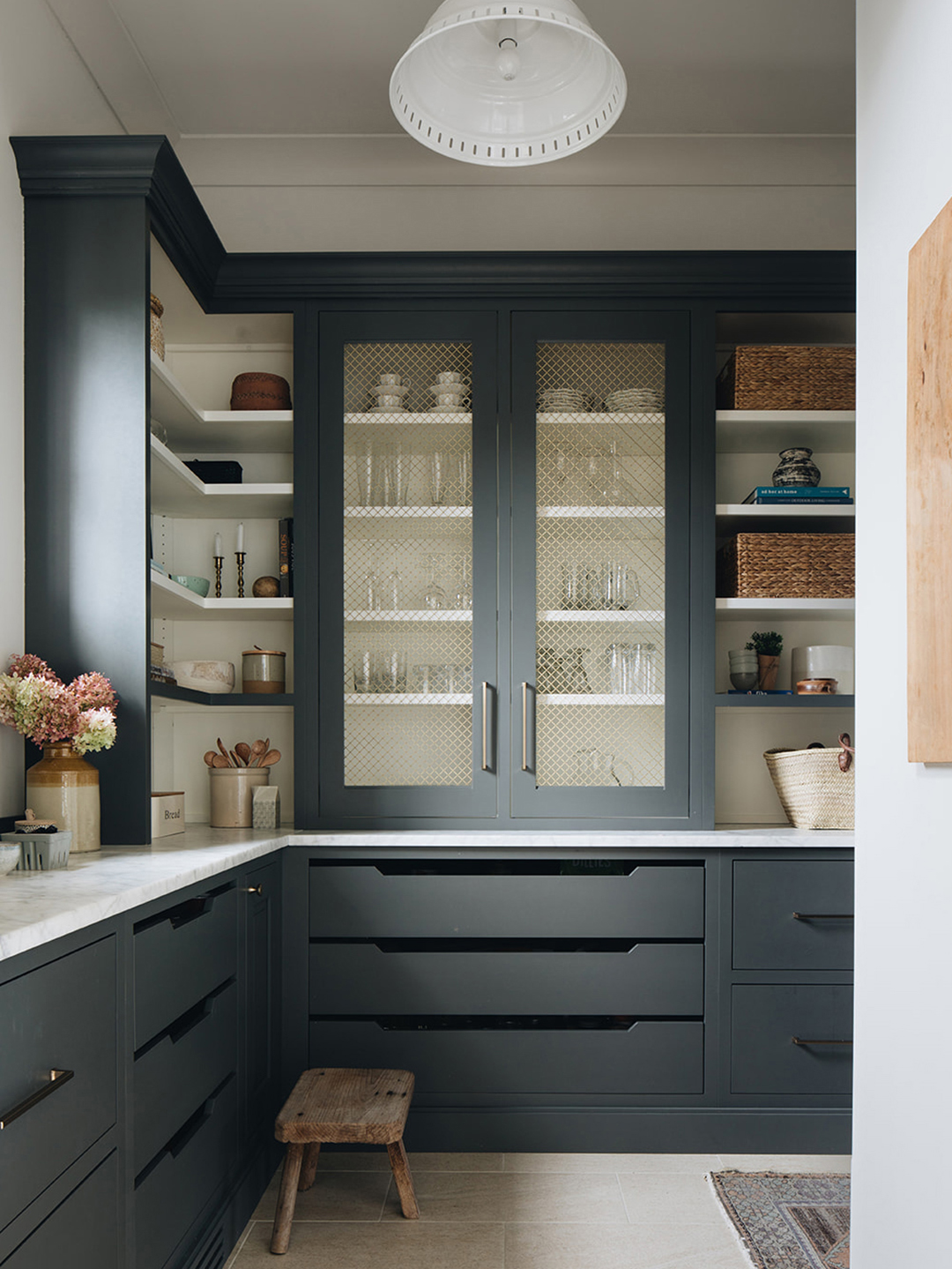
Transitioning to darker hues, Marker expresses her preference for deep grays, rich navies, inky blues, and various greens. She believes dark colors effectively anchor and define a space, imparting a sense of enclosure and comfort. She also points out the versatility of dark paints, noting how their appearance can be dramatically altered by hardware, lighting, natural light exposure, and art pairings. Her selections for darker shades include Benjamin Moore’s Wrought Iron, a classic dark gray with a green-blue hint, making a striking backdrop for metallic hardware; Kendall Charcoal, a sophisticated charcoal with a touch of brown; Farrow & Ball’s Manor House Gray, which offers beautiful gray-green nuances and blends well with both bold and subtle palettes; Studio Green, an earthy and refined green suited for contemplative rooms; and Down Pipe, a mysterious Farrow & Ball gray that shifts in appearance across different settings, making it one of her most inquired-about colors. Lastly, she recommends Benjamin Moore’s Hale Navy, a classic, true navy that is so versatile it can be considered a neutral, pairing effectively with almost any color scheme.
#KateMarker #PaintColors #HomeDesign #InteriorDesign #ColorSelection #BenjaminMoore #FarrowAndBall #NeutralColors #DarkColors #KateMarker #PaintColors #HomeDesign #InteriorDesign #ColorSelection #BenjaminMoore #FarrowAndBall #NeutralColors #DarkColors
 Aucun commentaire pour le moment