1/33
I Covered My Apartment With 20 Dusty Blue Paint Swatches—Here’s Where I Landed
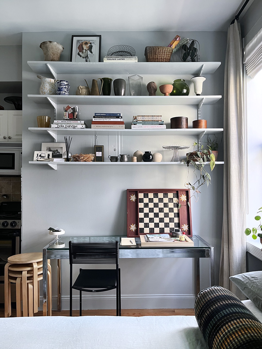
The article details the process of selecting the ideal blue-gray paint color for a Manhattan studio apartment. The author, a style editor, emphasizes that a single bold design choice can simplify the rest of the decorating process. For a 230-square-foot studio with standard white walls, the goal was to create impact without quickly becoming tired of the color.
Initially, beige was considered, specifically Benjamin Moore’s Natural Wicker, but the author worried it might appear drab. A decision was made to pursue a blue-gray hue for its calming and distinctive qualities, avoiding overly bold colors that might overwhelm a small space. This selection process involved extensive research, hours spent examining paint swatches, seeking external opinions, and pinning inspirational images.
Twenty initial blue-gray paint colors were considered, including shades from Sherwin-Williams (Rainsong, Dew Drop), Backdrop (On Tour, Skywalker, The Early Stuff), Clare (Summer Friday), Benjamin Moore (Dusky Blue, Colorado Gray, Gossamer Blue, Sterling, Stonington Gray), C2 Paint (Harmonic, Bel Canto, Esoteric), and Farrow & Ball (California Collection: Hazy, Cabbage White, Light Blue, Skylight, Parma Gray, Borrowed Light).
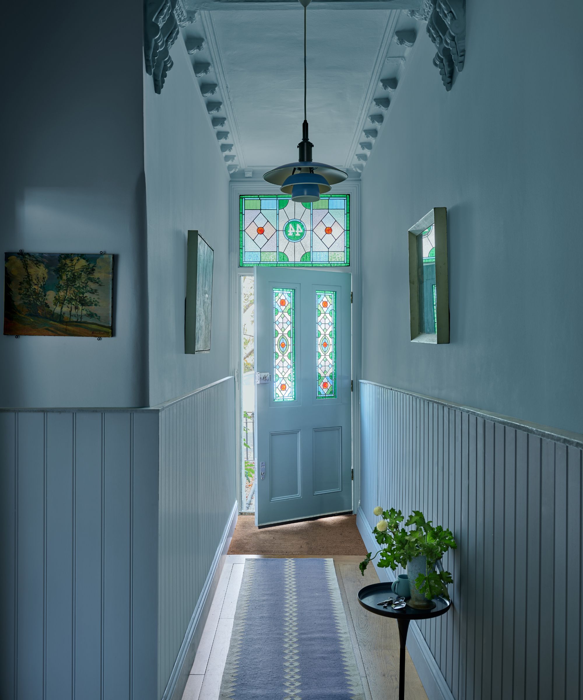
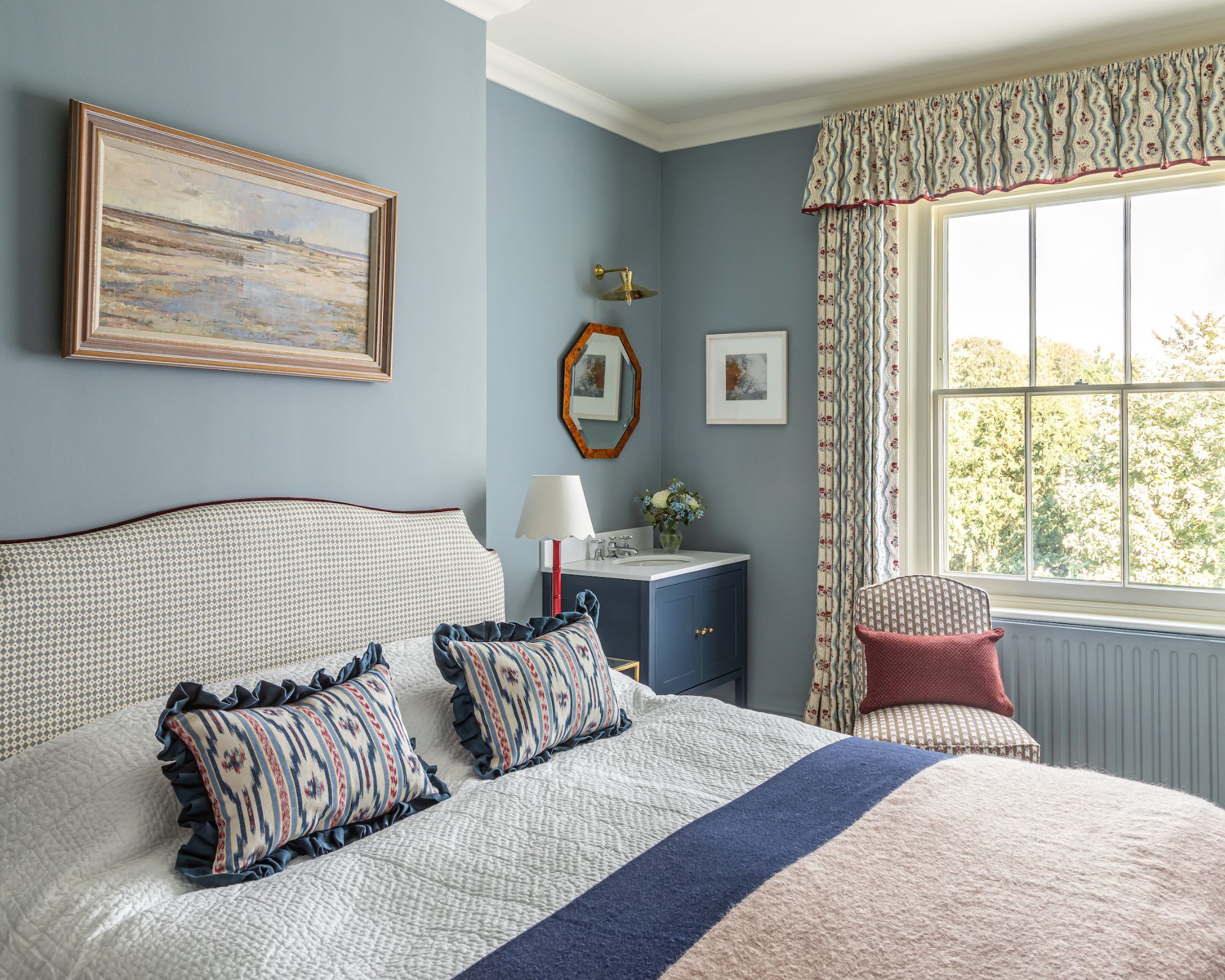
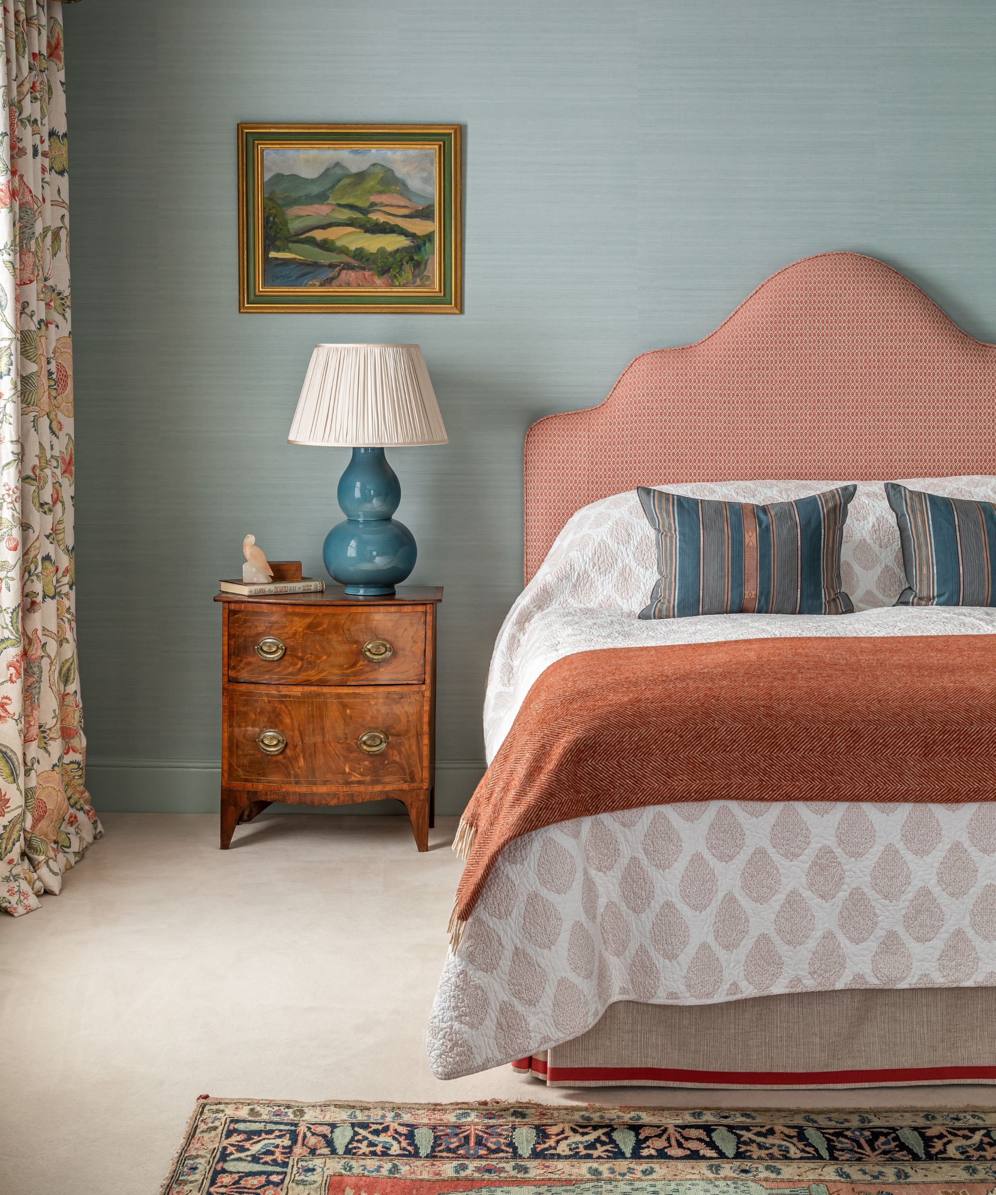
Inspiration for the blue-gray palette was drawn from various sources. The design of New York restaurant La Mercerie by Roman and Williams, with its blue-gray walls and deep velvet banquettes, provided a touchpoint for the desired saturation and subtle green undertones. Another significant influence was a room designed by Charlap Hyman & Herrero, noted for its layered blue tones and cohesive blue bedding, which created a calming effect. The Paris apartment featured in a Domino story, belonging to the owners of Raw in Milan, also showcased various dusty blue shades that harmonized beautifully with warm wood antiques and metals, reinforcing the author’s choice.
The selection was ultimately narrowed down to Farrow & Ball colors due to their vivid pigmentation and specific qualities, despite being a more expensive option, which was justified by the small size of the apartment. The author advises visiting a paint store to see actual swatches, as colors appear significantly different online. After in-person evaluation, brighter shades like Borrowed Light and Parma Gray were dismissed to avoid a nursery-like appearance. Light Blue was found to be too dark and green in the room's light conditions.
The final choice for the walls was Farrow & Ball’s Skylight, described as a happy medium—light, cheerful, and subtly gray, offering a sophisticated and neutral feel for long-term living. A scuff-proof matte Modern Emulsion was used for the walls, while a durable satin-finish Modern Eggshell was applied to Ivar cabinets, shelves, and trim. To maintain a classic style due to existing traditional window and doorframe trims, the ceiling was painted one shade lighter, using Farrow & Ball’s Cabbage White in chalky Estate Emulsion. The author expresses lasting satisfaction with the chosen color and intends to use it in future living spaces.
#HomeDecoration #InteriorDesign #PaintColors #BlueGrayPaint #ApartmentLiving #ColorSelection #DesignInspiration #FarrowAndBall #ManhattanStudio #HomeDecoration #InteriorDesign #PaintColors #BlueGrayPaint #ApartmentLiving #ColorSelection #DesignInspiration #FarrowAndBall #ManhattanStudio
0 commentaire au total
 Aucun commentaire pour le moment
Vous aimerez aussi
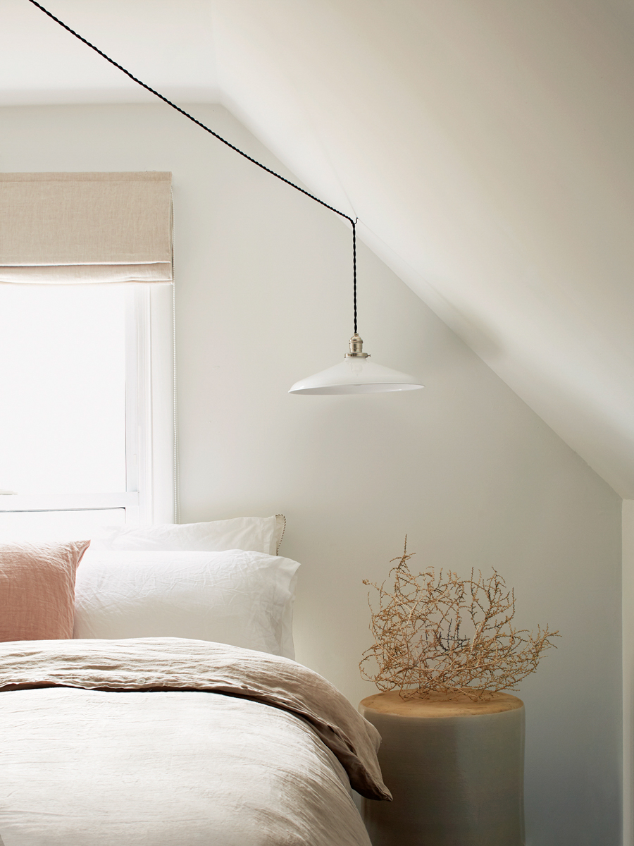
I Sampled 24 White Paints—Here’s the One I Chose for Every Room of My Home

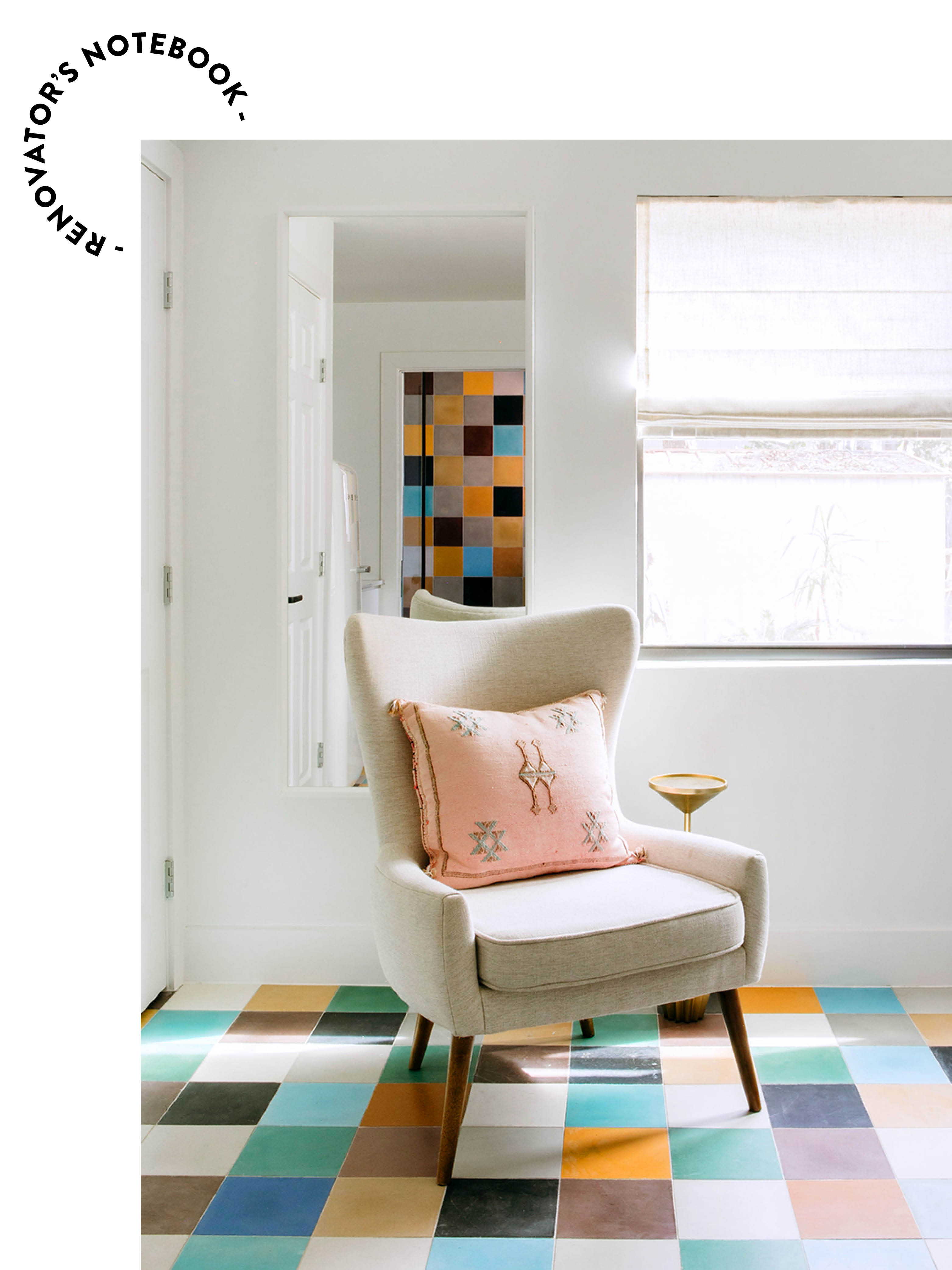
I Covered My 400-Square-Foot Guesthouse in Tile for $500


The best $79 I ever spent: Paint for my very own bedroom walls
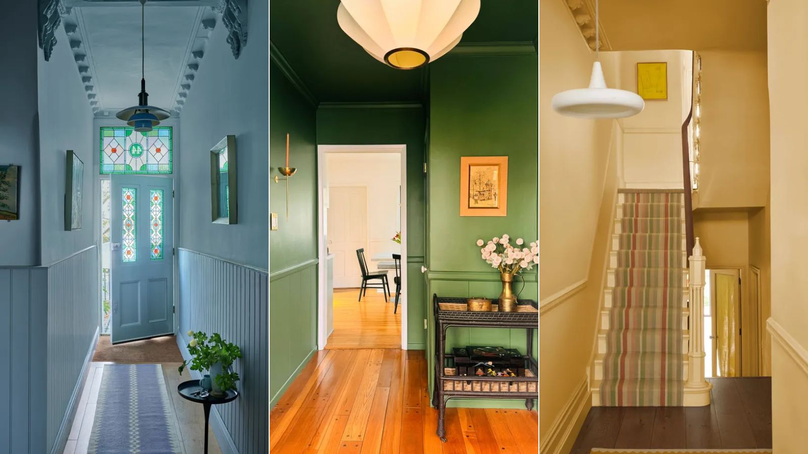
If you color drench any room make it this one

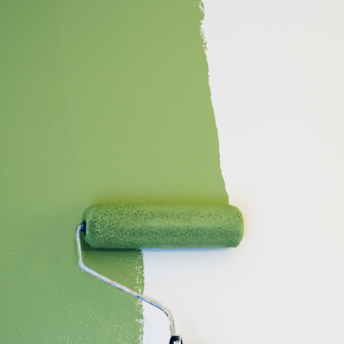
“After years of white walls, I painted my living room the viral matcha green colour”
20 Interior Paint Colors Decorating Experts Love

My closet is suddenly filled with baby blue – here's how I am bringing this on-trend spring shade into my home too

I Want To Cover Every Single Wall In This Electroluminescent Paint (Updated)
I Let a Paint Professional Find My Home's "Perfect" Colors, and I Loved Every Shade

“Burnt orange is the statement shade of the summer – so I painted my bedroom walls with it”

I Transformed My Living Space Without Picking Up a Paint Brush Thanks to This Easy-to-Use Product


I Style Homes for a Living—This Is the Color I’m Using Everywhere