




1/6
Turns Out, This Cool Two-Tone Curtain Trick Does Something Way More Important Than Just Look Good
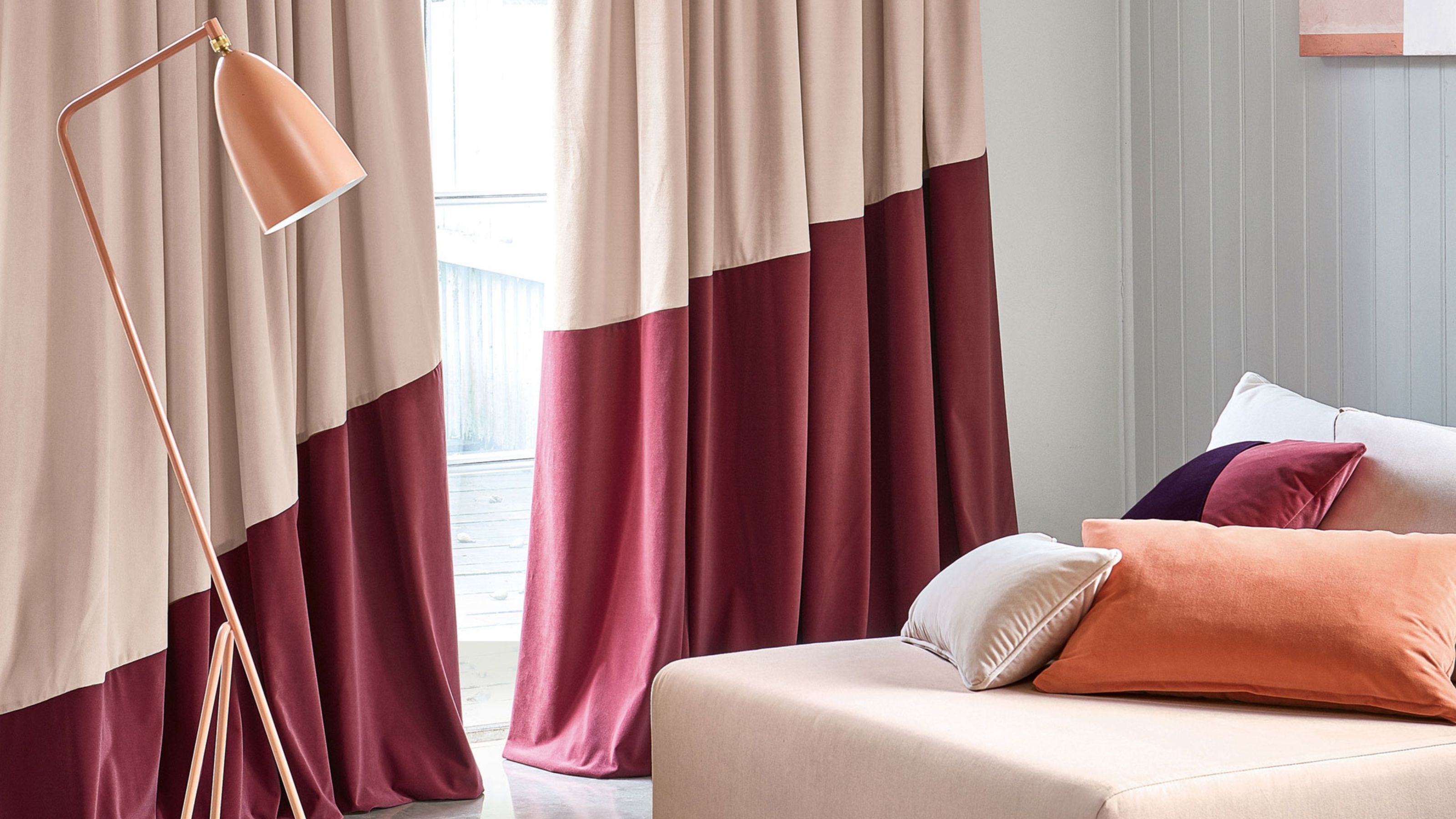
Curtains, often seen as functional fabric pieces for light control, possess significant potential to influence a room's design. The two-tone curtain trend offers a sophisticated method to introduce color and visual interest without overwhelming a space. This trend involves using two distinct color blocks, typically a solid color at the top and a different one at the bottom, which can either complement or contrast to achieve a desired aesthetic. Shannon Shlom, director of We Are Duet, highlights that this detail elevates a room by transforming standard single-color curtains into something intentional and unique.
The increasing popularity of two-tone curtains stems from their ability to offer a creative solution for color integration. They allow for subtle color introductions or the bold incorporation of tones while maintaining a light and airy feel in much of the room. Pat Giddens, a curtain maker from The Hackney Draper, notes that this trend strikes a balance between boldness and understatement, allowing for contrast or color in a tailored manner. By breaking up a single fabric block with a contrasting panel, usually at the base, these curtains add interest, ground the scheme, and can visually adjust room proportions. This style also accommodates various design preferences, whether matching wall colors, contrasting them, linking to accent cushions, or utilizing remnant fabrics, making it suitable for both modern and classic interiors depending on fabric and color choices.
Beyond aesthetics, two-tone curtains offer practical benefits. They are ideal for individuals hesitant to commit to a single look or to fully color-drench a space. The interplay of light and dark tones adds character, personalizing a room and contributing to a more designed and sophisticated feel. John Smigielski, marketing director of Linwood fabric brand, observes that designers are favoring expressive yet considered color combinations, and two-tone curtains exemplify how pairing two shades from a palette can appear bold without being loud, fitting for layered, mature interiors. The common practice of using a darker base contrasted with a lighter top helps to ground the room, creating a sense of gravitas by mimicking natural phenomena where heavier tones are at the base and lighter ones above.
When styling two-tone curtains, careful consideration of how the two tones affect visual balance and weight in the space is crucial. Shannon Shlom recommends approaching contrast band curtains similarly to bedspreads, emphasizing layering for depth, warmth, and a curated touch. Pat Matthew suggests using uneven proportions, such as 1/5 or 1/7 of the curtain drop, as these often appear more balanced and visually appealing. This style also presents an opportunity to refresh or extend existing curtains by adding a contrasting border, aligning with current trends in patchwork, color-blocking, and paneled textiles. Ultimately, two-tone curtains offer a versatile and impactful design element, capable of enhancing a room's aesthetic and contributing to its overall character.
#TwoToneCurtains #CurtainTrends #InteriorDesign #WindowTreatments #ColorBlocking #HomeDecor #DesignTips #RoomProportions #TwoToneCurtains #CurtainTrends #InteriorDesign #WindowTreatments #ColorBlocking #HomeDecor #DesignTips #RoomProportions
 Noch keine Kommentare