9 Interior Design Mistakes Making Your Room Feel 'Off'
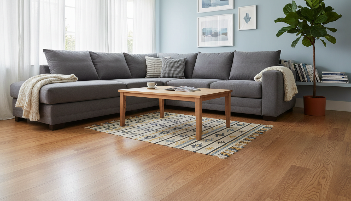
Does your room feel 'off'? You might be making common decorating errors. Learn to fix the top 9 interior design mistakes in layout, scale, lighting, and color to create a space you love.
Have you ever walked into a room you’ve just decorated, looked around, and felt a nagging sense that something is just… wrong? You bought the furniture you liked, you picked a paint color, but the final result feels disjointed, awkward, or underwhelming. This is a frustratingly common experience. The good news is that great interior design isn't about magic; it's about following a few key principles and, more importantly, avoiding a few common pitfalls. These missteps can turn a potentially beautiful space into a source of daily frustration.
Before you spend another dollar or move another piece of furniture, let’s explore the most frequent interior design mistakes and how to fix them. Better yet, let’s talk about how to prevent them entirely.
The Foundation: Planning and Layout Errors
The most fundamental mistakes happen before you even think about decor. A poor layout can doom a room from the start, making it feel cramped and illogical, no matter how beautiful the individual pieces are.
Mistake 1: Forgetting About Flow and Function
One of the biggest rookie decorating errors is designing for a magazine cover instead of for your actual life. This often results in blocked walkways, furniture that's too big for a high-traffic area, or a layout that simply doesn't support the room's primary purpose.
- The Problem: Placing a large coffee table too close to the sofa, creating a narrow path to the patio door, or arranging a living room in a way that makes conversation difficult.
- The Fix: Before placing furniture, think about the natural paths people will take through the room. This is your traffic flow. Keep these paths clear and wide. Then, define zones based on activity. In a living room, you might have a primary conversation zone, a reading nook by a window, and a small area for a desk. Arrange furniture to support these functions. An AI floor plan generator can be invaluable here, allowing you to map out these zones virtually.
Mistake 2: Pushing All Furniture Against the Walls
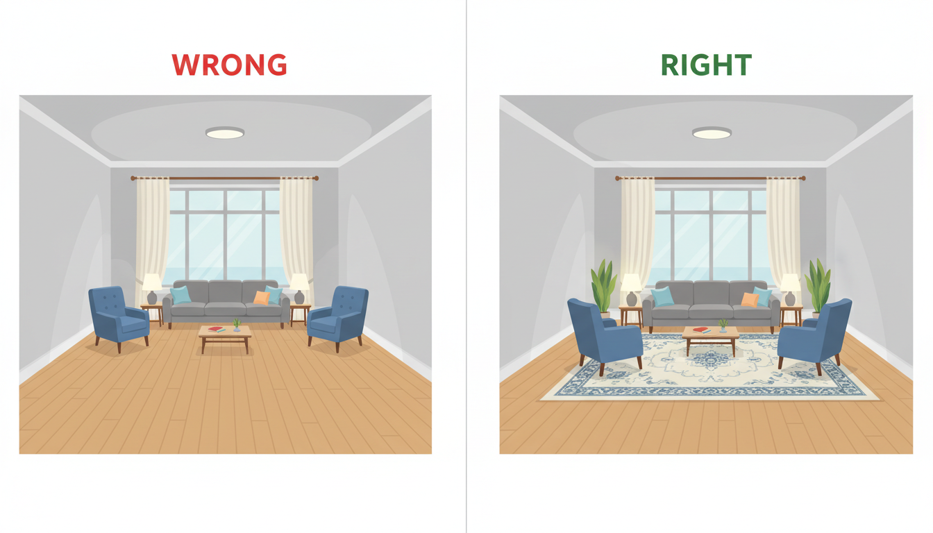
It’s an instinct many people have: to maximize "open space" in the middle of the room, every piece of furniture gets pushed up against a wall. This often creates a sterile, impersonal void in the center and makes the room feel like a waiting room or a dance hall.
- The Problem: Sofas and chairs are too far apart for comfortable conversation, and the room lacks intimacy and warmth.
- The Fix: Dare to float your furniture. Even pulling your sofa just six inches off the wall can make a huge difference, creating a sense of airiness and intention. In larger rooms, create cozy conversational groupings in the middle of the space, using a large area rug to anchor the arrangement. This simple furniture placement mistake is easy to correct and has a massive impact.
Getting the Scale and Proportion Wrong
Why does my room feel off? Often, the answer lies in scale. The relative size of objects to each other and to the room itself is one of the most important—and most frequently ignored—principles of design.
Mistake 3: The Tiny Rug Dilemma
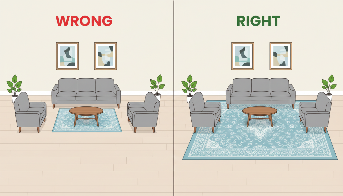
A small rug floating in the middle of a large room is one of the most common home decorating mistakes. It visually shrinks the space and makes the furniture arrangement look disconnected and accidental.
- The Problem: A "postage stamp" rug that only sits under the coffee table, with all other furniture completely off of it.
- The Fix: Follow this simple rule: at a minimum, the front two legs of your sofa and all chairs in a seating arrangement should rest on the rug. In a perfect world, all furniture in the grouping would sit entirely on the rug. A generously sized rug unifies the furniture, anchors the space, and makes the entire room feel larger and more cohesive.
Mistake 4: Ignoring Scale and Proportion
This happens in two ways: using furniture that is too small for a large room, making it feel empty and lost, or cramming oversized, bulky pieces into a small room, making it feel claustrophobic.
- The Problem: A tiny loveseat in a grand living room with vaulted ceilings, or a massive, overstuffed sectional that dominates a modest apartment living room.
- The Fix: Choose an "anchor" piece of furniture that is appropriately scaled to the room (e.g., the sofa in the living room, the bed in the bedroom). Then, select other pieces that are in proportion to that main piece. Vary the shapes and sizes of your items to create visual interest, but ensure they relate to one another harmoniously.
Color and Lighting Blunders
Color and light are the soul of a room. When you get them wrong, the entire mood can be thrown off, feeling either bland and boring or chaotic and overwhelming.
Mistake 5: Playing It Too Safe (or Too Bold) with Color
Many people are so afraid of choosing the wrong paint color that they default to bland beige or sterile white for everything. On the other end of the spectrum, some douse the entire room in a vibrant, saturated color that becomes overwhelming.
- The Problem: An all-neutral room lacks personality, while a room with too much intense color can feel agitating.
- The Fix: Use the 60-30-10 rule. Your dominant color (often a neutral on the walls) should make up about 60% of the room. A secondary color (perhaps on furniture or a rug) takes up 30%. Finally, an accent color (in pillows, art, and accessories) fills out the remaining 10%. If you want to experiment with bold color, start with an accent wall or use an AI room visualizer to test paint colors on your walls before committing.
Mistake 6: Relying on a Single Overhead Light
The classic ceiling fixture in the center of the room is one of the worst lighting mistakes in interior design. It casts harsh shadows, creates glare, and does nothing to create ambiance or highlight the features of your room.
- The Problem: The room is either too bright or too dark, with no nuance or mood.
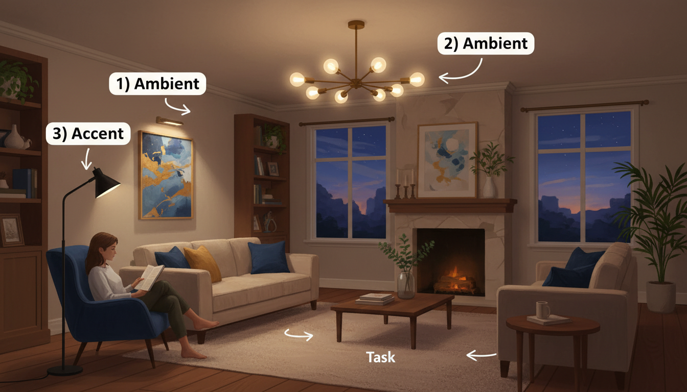
- The Fix: Think in layers. Every well-designed room should have multiple light sources:
- Ambient Lighting: The overall illumination, which can come from your ceiling fixture, recessed lights, or chandeliers. Always put these on a dimmer switch.
- Task Lighting: Focused light for specific activities, such as a floor lamp next to a reading chair or under-cabinet lighting in the kitchen.
- Accent Lighting: Light used to highlight architectural features or artwork, like a picture light or an uplight behind a plant.
The Finishing Touches Faux Pas
You’ve got the layout, scale, and lighting right. Now it’s time for the details that bring a room to life. But a few small errors here can undo all your hard work.
Mistake 7: Hanging Art Incorrectly
Art hung too high is an incredibly common issue. People tend to hang artwork as if the room were an art gallery, forgetting that it needs to relate to the human-scale furniture below it.
- The Problem: Art that "floats" disconnectedly on the wall, forcing you to crane your neck to see it.
- The Fix: The center of the artwork (or the center of a gallery wall grouping) should be hung at approximately 57 inches from the floor. This is average eye level. When hanging art over a piece of furniture like a sofa or headboard, it should be 4-8 inches above the top of the furniture.
Mistake 8: The Wrong Window Treatments
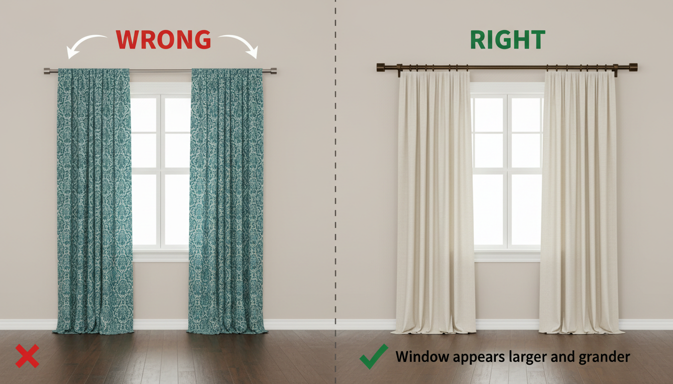
Curtains that are too short ("high-waters") or hung on a rod that is exactly the width of the window frame can make a room feel stunted and the windows appear small.
- The Problem: Hanging curtains wrong can visually shrink your room and block precious natural light.
- The Fix: Go high and wide. Mount the curtain rod 4-6 inches above the window frame and extend it 6-12 inches on either side of the frame. Your curtains should just skim or "kiss" the floor. This trick creates the illusion of taller ceilings and wider windows.
Mistake 9: The Clutter of Too Many Accessories
While accessories add personality, too many small, unrelated items create visual chaos. This is different from curated maximalism; it's simply a lack of editing.
- The Problem: Every surface is covered with small knick-knacks, leading to a cluttered, messy appearance.
- The Fix: Edit, edit, edit. Choose accessories that are meaningful to you and have some variation in scale. Group smaller items together on a tray to give them more presence. Follow the "rule of threes" by arranging objects in odd-numbered groups, which is more visually appealing.
Designing a home is a journey, and avoiding these common interior design mistakes is the first step toward creating a space you truly love. By planning your layout, mastering scale, layering your lighting, and paying attention to the details, you can craft a home that is not only beautiful but also a perfect reflection of you. And with tools to help you visualize every step, you can embark on that journey with more excitement and less fear.