


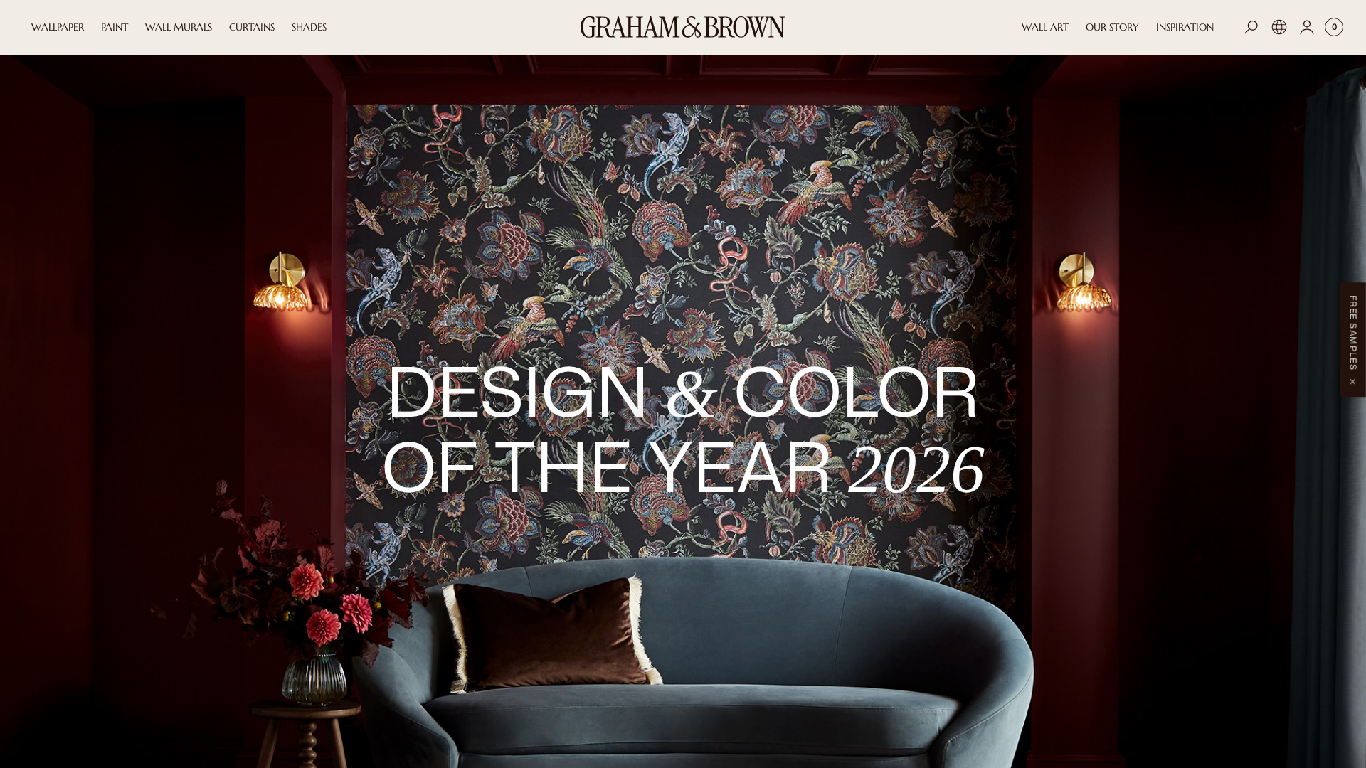
Color of the Year 2026: Cloud Dancer & Transformative Teal – Full Trend Guide
Color does more than just decorate a room; it tells a story about who we are and the world we live in. As we look toward 2026, the colors entering our homes are weaving a complex tale of contrasts.
On one side, we see a deep craving for calm, stability, and quiet reflection. On the other, a powerful push for change, vibrant energy, and bold expression. Navigating this diverse landscape can feel daunting when you’re standing in front of a wall of paint chips. Exploring these new palettes can be inspiring, but visualizing how a rich, moody brown or a complex, restorative teal might actually look on your walls is the real challenge. This is where technology can bridge the gap between inspiration and reality. With an AI-powered interior design tool like Ideal House, you can instantly render these 2026 color trends in your own space, allowing you to experiment with confidence and see the future of your home, risk-free.
The Two Big Stories: A Clean Slate vs. Dynamic Change
This year, the two most influential color forecasting agencies presented two very different visions for 2026, perfectly capturing the year's dual-natured spirit.
Pantone’s Quiet Reflection: Cloud Dancer
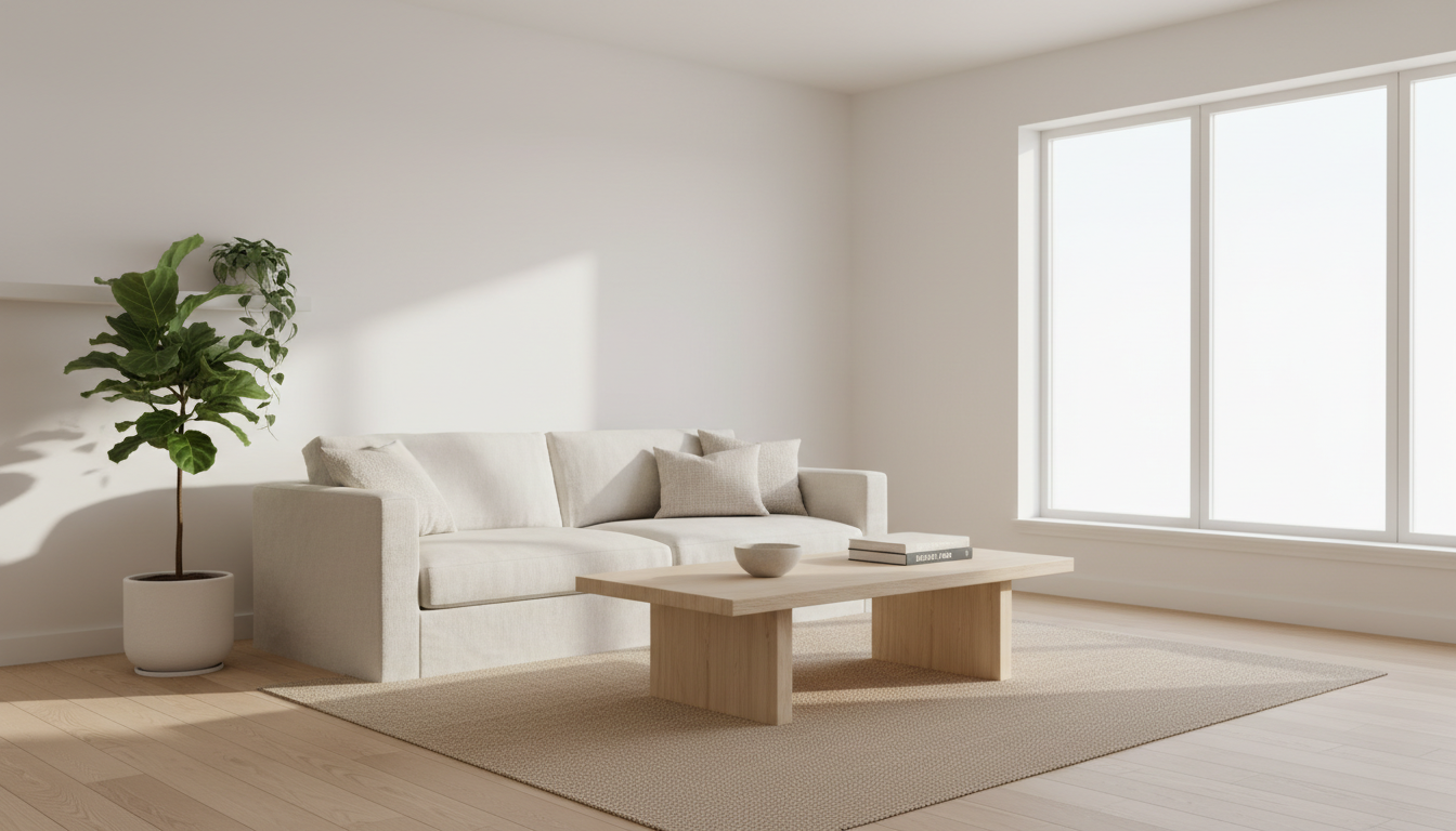
Pantone has chosen Cloud Dancer (PANTONE 11-4201), a soft, airy off-white with the slightest hint of gray. Breaking from years of more saturated picks, Pantone is championing a color that acts as a "clean slate." Cloud Dancer is about quiet luxury, minimalism, and creating a peaceful sanctuary from a noisy world. It’s not a stark, sterile white; it's a worn-in, gentle hue designed to be a calming background that allows other elements in your room—and in your life—to take center stage.
How to use Cloud Dancer in your home:
- As a foundational wall color in living rooms and bedrooms to create a serene, light-filled atmosphere.
- For kitchen cabinetry to achieve a look that is both modern and timelessly warm.
- Paired with natural textures like wood, linen, and stone to enhance its organic, calming feel.
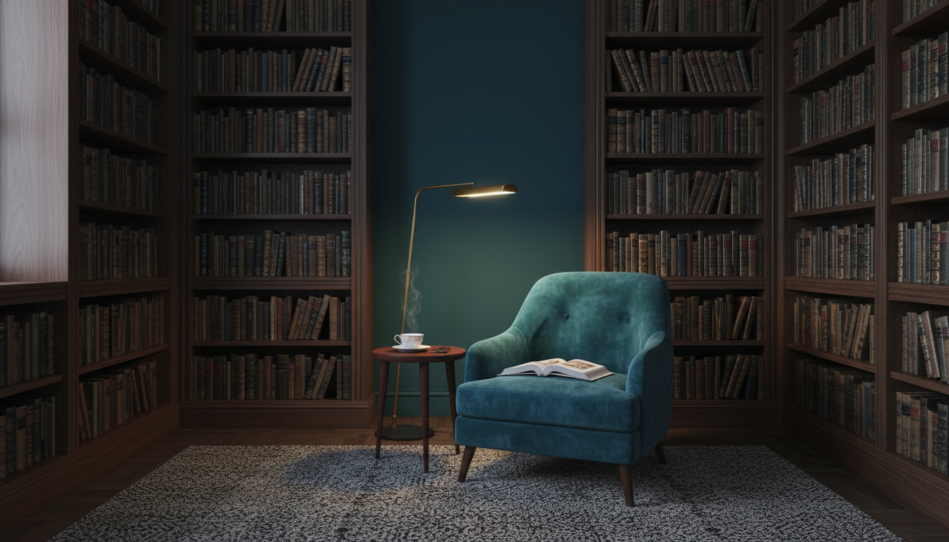
WGSN’s Call for Action: Transformative Teal
In stark contrast, trend forecaster WGSN, in partnership with Coloro, named Transformative Teal its Color of the Year. This fluid fusion of deep blue and aquatic green speaks to a period of change, redirection, and resilience. It’s a color with an "Earth-first" mindset, reflecting a growing demand for environmental responsibility. Transformative Teal is cooling and restorative but also carries a dynamic energy, inspired by finding novel solutions for our planet. It’s a complex shade for complex times.
How to use Transformative Teal in your home:
- As a dramatic accent wall in a home office or library to encourage focus and deep thinking.
- On a velvet sofa or upholstered chairs for a touch of sophisticated, moody luxury.
- In a bathroom paired with brass or gold fixtures for a rich, jewel-box effect.
A Return to Earth: The Warm Neutrals and Grounded Hues of 2026
Beyond the headline-making picks, a powerful consensus has emerged among major paint brands: warmth is back. After a decade dominated by cool grays, palettes are shifting toward cozy, nature-inspired colors that make a house feel like a home.
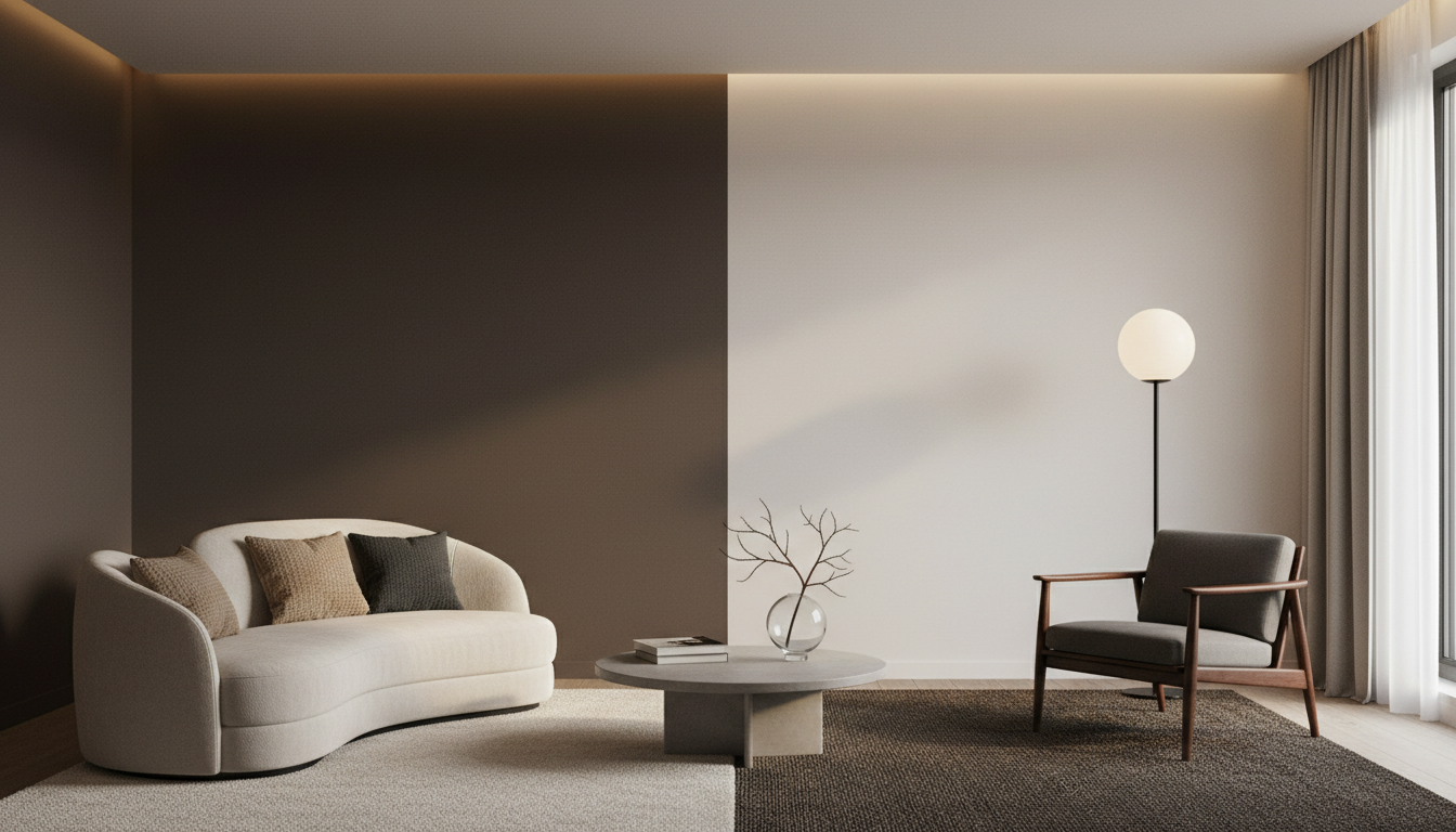
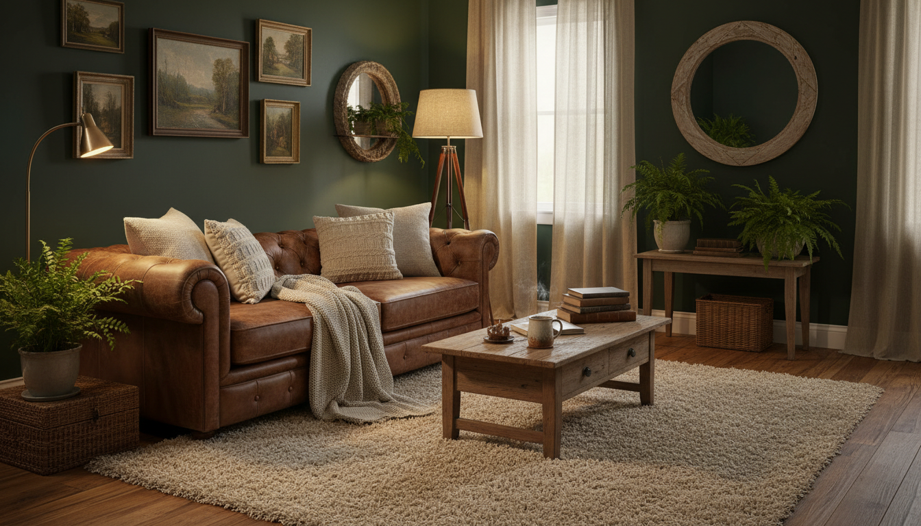
Sophisticated Browns and Charcoals
Dark, grounding colors are being used to create intimate, enveloping spaces. These aren't just accent colors anymore; they are foundational hues that exude confidence.
-
Benjamin Moore’s Silhouette (AF-655): A luxurious burnt umber with notes of charcoal and plum, this color is perfect for creating a chic, refined space.

-
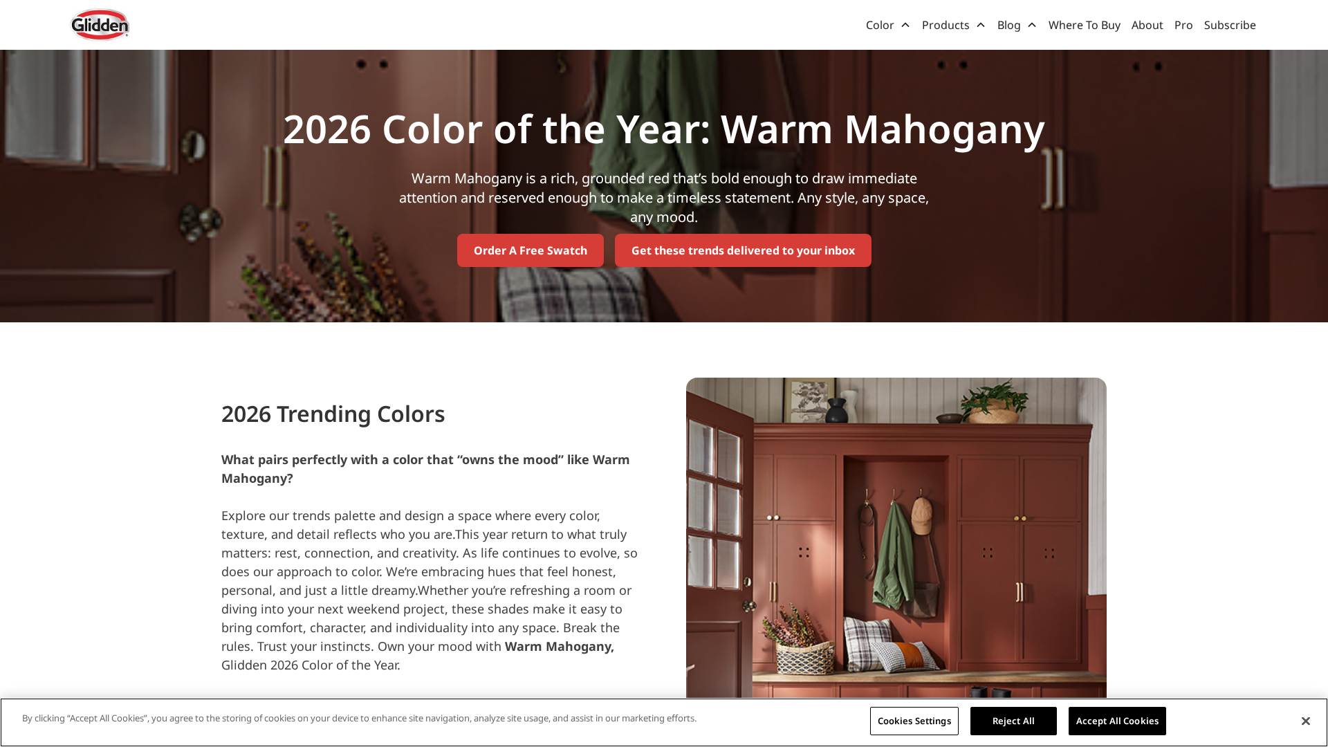
Glidden’s Warm Mahogany: A rich, grounded red-brown that taps into a nostalgic, mid-century modern vibe.
-
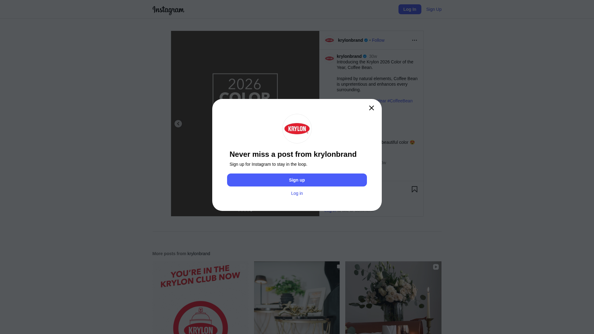
Krylon’s Coffee Bean: This deep, nearly-black brown is perfect for DIY projects, adding an elegant, modern finish to furniture and decor.
The New Generation of Neutrals
Say goodbye to cold, sterile beiges. The new neutrals are creamy, complex, and full of life, offering a soft, welcoming alternative to pure white.
-
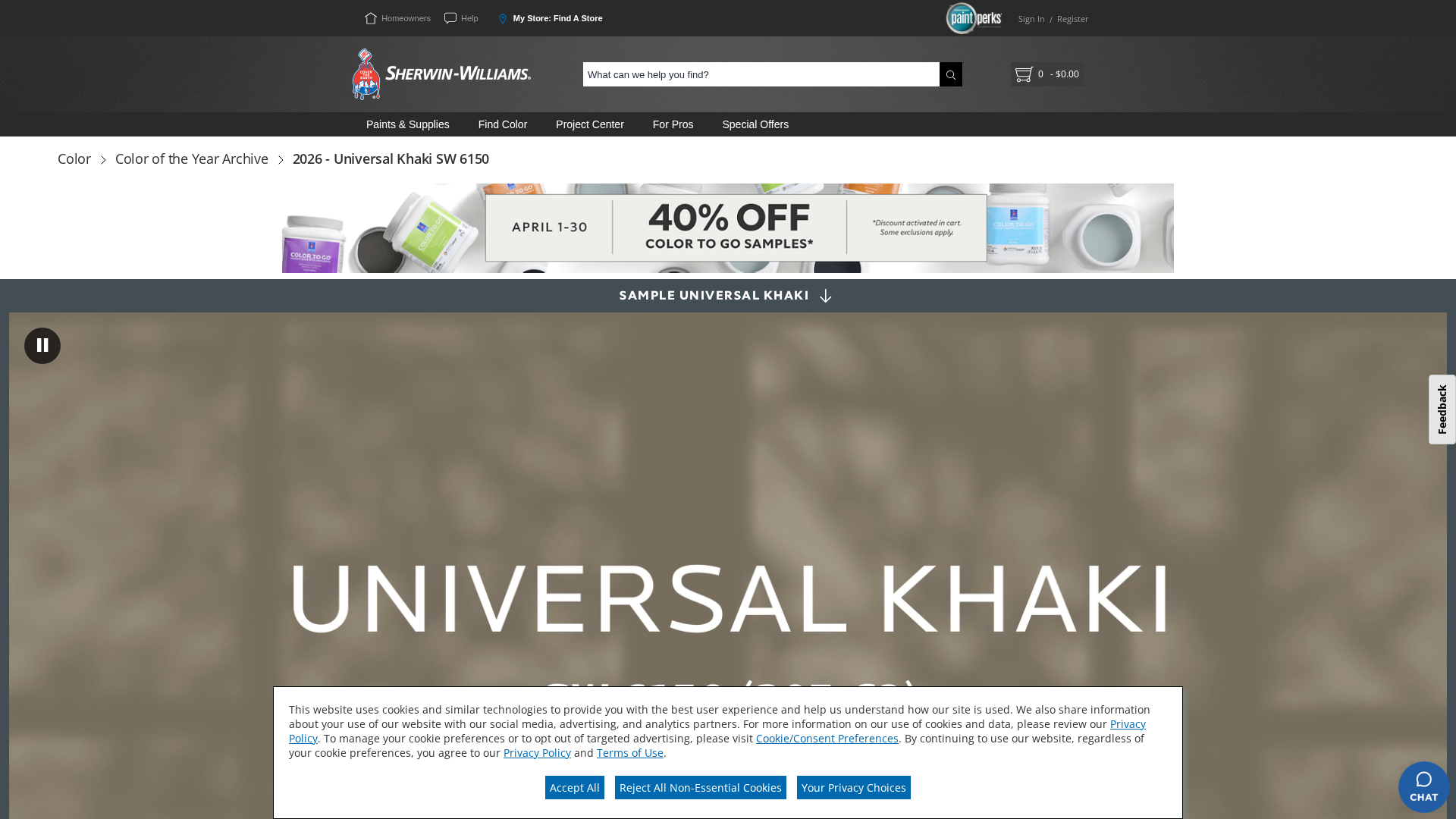
Sherwin-Williams’ Universal Khaki: A warm, earthy neutral that expertly balances beige and taupe, offering incredible versatility. HGTV Home by Sherwin-Williams also adopted this as their top pick.
-
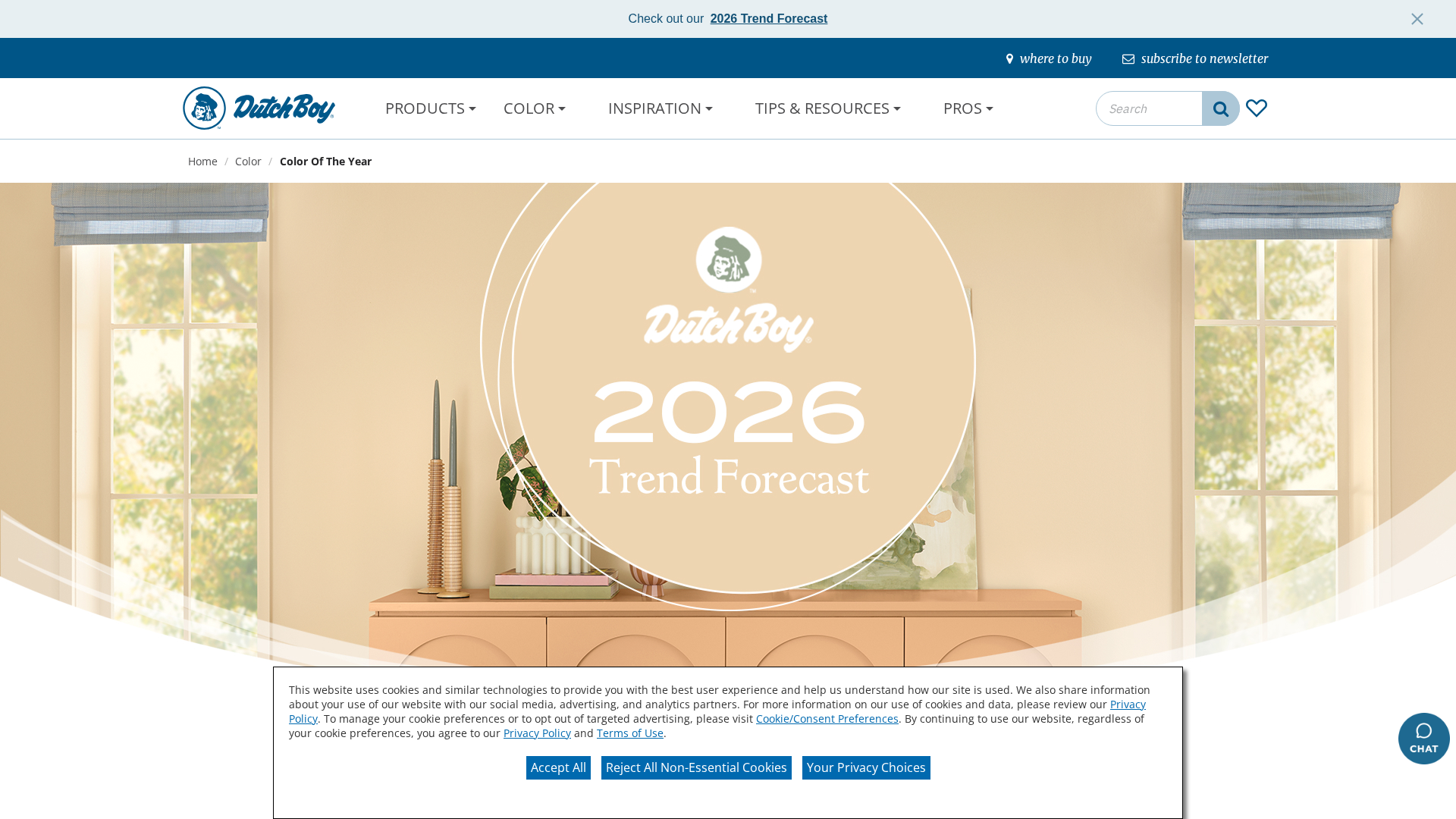
Dutch Boy’s Melodious Ivory: A warm cream with a nostalgic, elevated feel that layers beautifully with bolder accent colors.
-
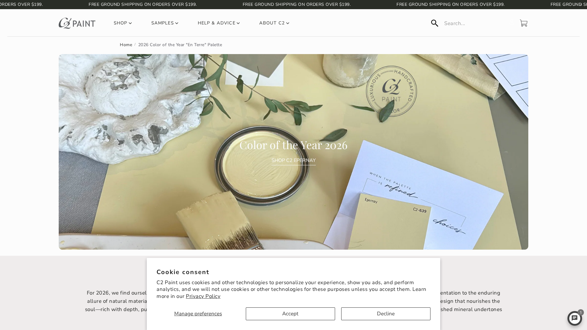
C2 Paint’s Épernay: A soft, sophisticated champagne beige that radiates a gentle, ochre-based warmth.
Nature's Palette: Greens and Terracottas
Biophilic design—the practice of connecting our homes with nature—continues to influence interior color palettes, with a focus on rich, organic shades.
-
Behr’s Hidden Gem: A smoky jade green with an air of mystery, this hue is a bold yet desaturated jewel tone suitable for entire rooms.
-
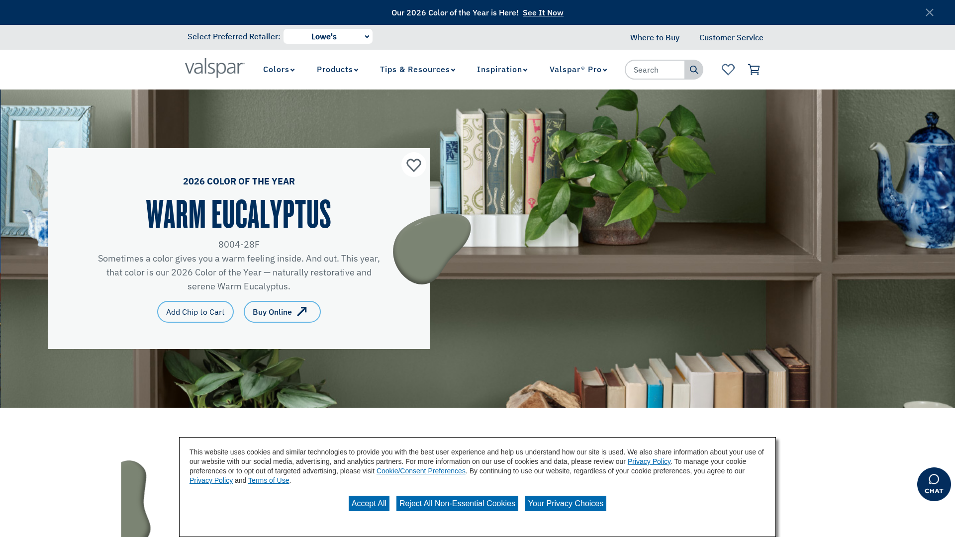
Valspar’s Warm Eucalyptus: A muted, earthy gray-green described as "restful to the eye" and therefore "restful to the soul."
-
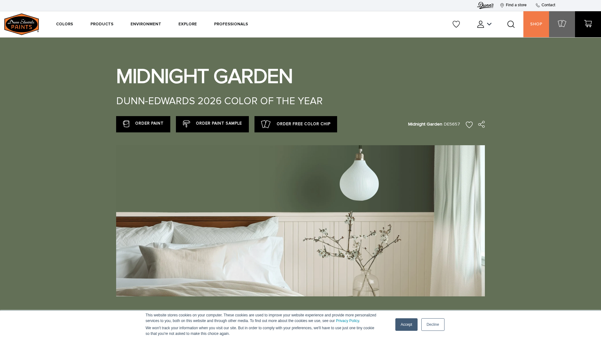
Dunn-Edwards’ Midnight Garden: A timeless dark green with earthy undertones that embodies the quiet elegance of a garden at night.
Pops of Personality: The Vibrant and Playful Counter-Trend
For those who find neutrals too quiet, 2026 also offers an expressive palette of vibrant, energetic, and even rebellious colors. These hues are perfect for injecting personality and joy into your home.
-
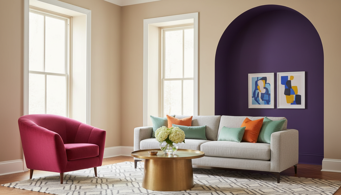
Electric Fuchsia: A vivid neon pink-purple that feels digital and provocative. Use it in small doses on a painted arch, a piece of art, or decorative pillows for a jolt of energy.
-
Plum Noir & Divine Damson: Deep, moody purples with rich burgundy undertones are trending. Graham & Brown chose Divine Damson for its luxurious, timeless feel, perfect for creating a dramatic dining room or a cozy reading nook.
-
Amber Haze & Persimmon: Rich, radiant yellows and red-oranges bring warmth and optimism. Pinterest identified Persimmon as a top trend, a cheerful color ideal for a welcoming front door or a vibrant kitchen backsplash.
-
Jelly Mint: A buoyant, youthful green that embraces playfulness. This color is fantastic for a child's bedroom, a creative workspace, or as a fun, unexpected color for bathroom vanities.
Bringing It All Together in Your Home
The true art of design is in the combination. These trends aren't meant to be used in isolation but rather blended into cohesive palettes that reflect your personal style.
Example Palettes for 2026:
| Palette Name | Base Color | Key Accent 1 | Key Accent 2 | Vibe |
|---|---|---|---|---|
| Grounded Serenity | Universal Khaki | Warm Eucalyptus | Melodious Ivory | Calm, organic, and restorative. Perfect for a minimalist-yet-warm living space. |
| Quiet Drama | Silhouette | Cloud Dancer | Amber Haze | Sophisticated and moody with a pop of warmth. Ideal for a primary bedroom or study. |
| Earthy & Authentic | Midnight Garden | Warm Mahogany | Épernay | Rich, nature-inspired, and timeless. Creates an inviting and storied atmosphere. |
| Playful Modern | Cloud Dancer | Transformative Teal | Jelly Mint | Fresh, energetic, and creative. A great choice for a family room or multi-use space. |
Whether you find yourself drawn to the quiet calm of Cloud Dancer or the dynamic energy of Transformative Teal, 2026 is a year for making your home a more authentic reflection of you. It’s about choosing colors that not only look good but feel right. Instead of guessing, see the future of your home with confidence. Use a tool like Ideal House to test these palettes on your own walls, and start designing a space you'll love for years to come.